May Prompt Attempt #2 - Critiques Welcome
-
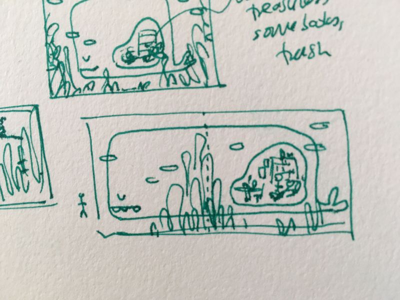
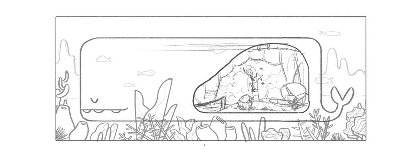
After taking advice from my fellow artists, I started thumbnailing again while really focusing on storytelling. This time, I landed on a Jonah and the Whale type of image where a character gets swallowed by a whale and has been living inside the whale for quite some time collecting bits and pieces of things that the whale swallowed to create furniture, etc. I'm thinking the layout will mimic a book spread. We'll see how this goes. Any suggestions on how to make this better is always welcome!
 Loving all the WIPs I'm seeing so far!
-
Such a fun idea! I think making it into a book spread is a good plan!
-
@aprilshin That's such a cool idea April! This reminds me of the Bible story 'Jonah'.

-
This is exactly the kind of concepts I was hoping to see for this prompt. Fun, unexpected, and unique. Good job!
-
@Mirananemone Thank you!
 I hope I can pull this off, haha.
@Elisheba That's exactly the story I was thinking of!
Aaahh, thank you, @Lee-White! I'm learning so much from SVS!

-
tl;dr - Any feedback is much appreciated! A fisherwoman was swallowed by a whale and decided she liked living there.
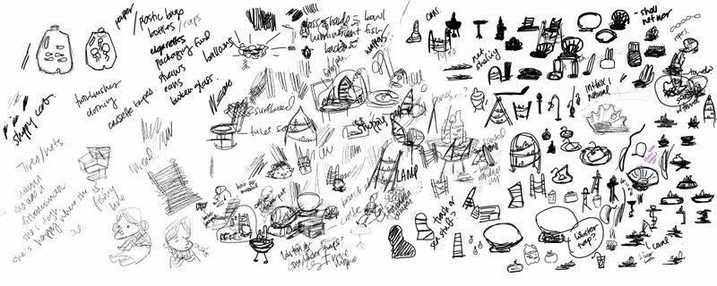
I spent hours figuring out the furniture (shout out to Jake Parker's prop design class) and then a few more hours figuring out how to draw ocean plants and coral. I'm not sure if all my shapes are speaking the same language, though. Would appreciate any feedback if you see any areas where I can improve!
This is what my exploration phase looked like. It probably won't make sense to anyone but me.

This is what I have so far
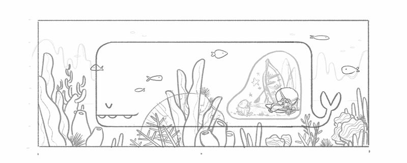
The story is that a woman was out fishing but she and her boat got swallowed whole by a whale. She found out she actually liked living inside the whale since she could survive off of the food the whale eats and make other things from the occasional trash/debris that gets in. She has with her a basket and her fishing gear. She uses the basket to store the things she collects. She turned her boat into a bookshelf where she likes to display what she considers treasures. Her blanket and rug are made from random nets/ropes/straws/plastic bags she's collected over the years. Her chair/bed is a large clamshell. And her side table is a lobster trap. She's also hung some starfish on the "wall" for decoration. The woman is currently taking a nap.
Things I'm seeing now that I've taken a step back: The woman could be mistaken as dead; I should have her do something active. I think the plants are too big and busy and taking focus away from the fisherwoman. I may need to crop in closer as well. I could push the prop designs more and perhaps give more story to the whale's character design, too. I'll work on these and any other issues people see. Thank you again!
-
@aprilshin wow! I love seeing your process. So cool!! Can't wait to see the final piece.
-
@aprilshin This looks great! I love your design so far. I agree that she might come off as dead if napping, and she probably should appear more active. It would be fun to think about what kinds of hobbies/activities she'd have in a whale.
-
@aprilshin Such a fun story! Great sketch as well! I agree with having the lady in a more active pose (and glad you were able to figure that out yourself!) Maybe if you can, show her expression as happy/content because she likes living there (little detailing on the face).
The plants may not necessarily take away focus. It'll depend on how the values and contrast play. If you're planning to have them super colorful, then yeah, they may steal focus. But you can also lower the contrast by having all the water elements in different hues of the color of the water. I guess you'll get to that during your color study.
Did you consider increasing the space of the "room" inside the whale? So that it actually looks like her house? Right now it looks a little like she's trapped in a small room. But that's just my opinion, please do whatever feels right to you!

Looking forward to see this develop!
-
Great sketch! I love your concept to. My one advice is maybe to expand the whale’s stomach more. Instead of showing the stomach at the rear part, why not expand it to the mid section. Add more details to indicate this a whale stomach. Maybe add more debris. May be add a sailboat, a submarine, and all those fun stuff. I think you have a good thing going on here.
-
Thank you @Mirananemone for the input! That's a good idea to think about how exactly she's enjoying her time in this place. I'll be thinking more about this!
@Neha-Rawat you're right about contrast and color being a factor with focus. And I had not considered increasing the room only because it feels like such a daunting task to create more of an "environment" which is something I struggle with a lot. But this is a contest, after all! I should give it my best! Hahaha
@Nyrryl-Cadiz Thank you for your input! That's a great point you have to take into consideration the actual anatomy of the whale and to show more things this whale has swallowed to show that he is not picky about his food! Hahah.
I appreciate all your advice, everybody! Thank you so so much!


-
Okay, I've done another sketch and here are some of the changes I made:
- made the room slightly bigger
- included whale spine and ribs to solidify that she's inside the whale
- changed the woman from napping to painting a mural on her sail from her sailboat, which she has attached to the ribs of the whale
- I removed the boat as a bookshelf and kept it "docked" to the left. I felt like the bookshelf was making it look too cluttered.
As always, any and all feedback is welcome! Thank you!
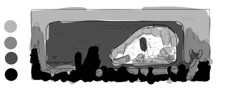
Here are the values I'm planning to go with:
-
@aprilshin What a fun idea! I look forward to seeing how it comes out.
-
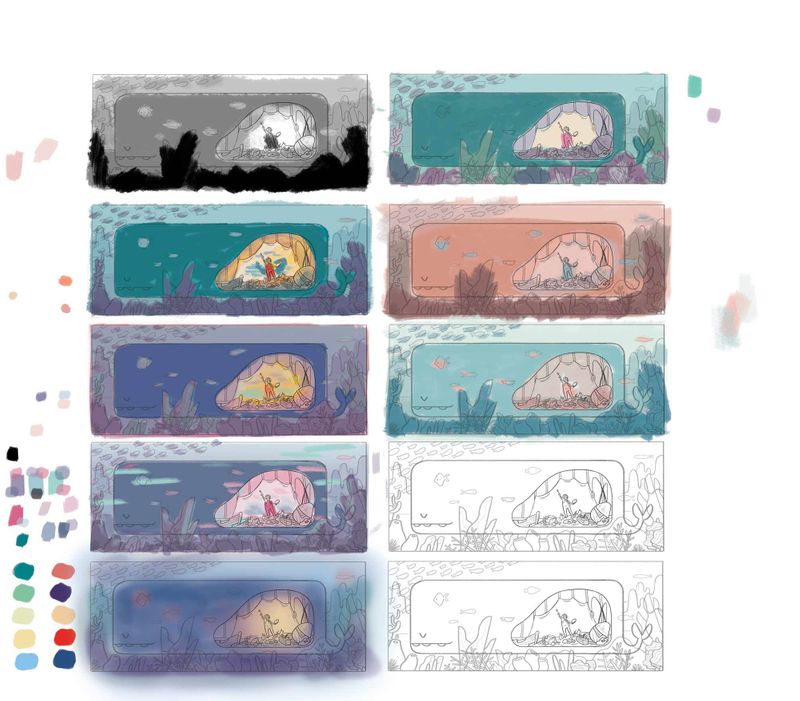
I've been following Lee's "How to Make Art You Love" checklist and have struggled through every step! I think my issue with color is that I still have a hard time applying all the theories. I feel like I have all the ingredients, but I don't know how to create a recipe. Hopefully with more trial and error and more experience, I'll figure out color eventually, haha. My plan is to go with the last one on the right side. I figured I should start with a limited palette. Mostly 2 colors. We'll see how it goes!
