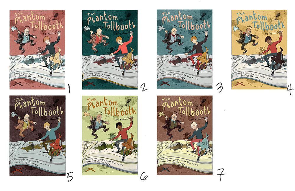
Phantom Tollbooth book cover WIP from Ideation course
-
The last project for the Ideation class was to take our favorite study to finish. I had a conceptual piece for Phantom Tollbooth. That is, it wasn't illustrating a specific episode from the story, but a thematic quote from near the end of the book: "Many places you would like to see are just off the map."
The theme of the book is the true spirit of learning and he travels around in a fantastic world, so I'd say the keyword here is exploration. Maybe conceptual exploration. I had chosen focus on the next to last chapter, the one where the three friends escape from the irrelevant knowledge of the Senses Taker finally meet Rhyme and Reason. The quote about the map is one of the bits of wisdom that Rhyme and Reason give Milo, the main character.
I decided on a book cover because that seemed like the most appropriate use for a concept piece. Milo is stepping off the Senses Taker's open ledger, to which I added a map to illustrate the metaphor. The story talks about the Senses Taker being covered in ink, so I used ink blots as texture.
Right now I'm at the rough sketch/color study stage. A lot of the drawing may remain as it is at this point, as I've gotten some good feedback and refined the positions, but I am still open to ways to refine it further.
I originally had about 12 color studies, but I eliminated some of them. I can also change individual elements within any of them, naturally. For instance, I rather like the dark green background in 2, but now Milo's shirt is so bright that the theme looks a bit Christmas-y. I may revisit that shade of red. I like 3, but it may be too close to the color scheme of the original cover.
Anyway, I'd like to hear your feedback! Does the concept work? Does it fit with the idea of a cover? What do you think of the overall design? And which is your favorite color scheme?
Thank you!

-
@LauraA I like the color in #3 the best. I do like #7 as well but the man in back gets lost a little.
-
I like #7 and #5