MARCH WIP: Critique always appreciated.
-
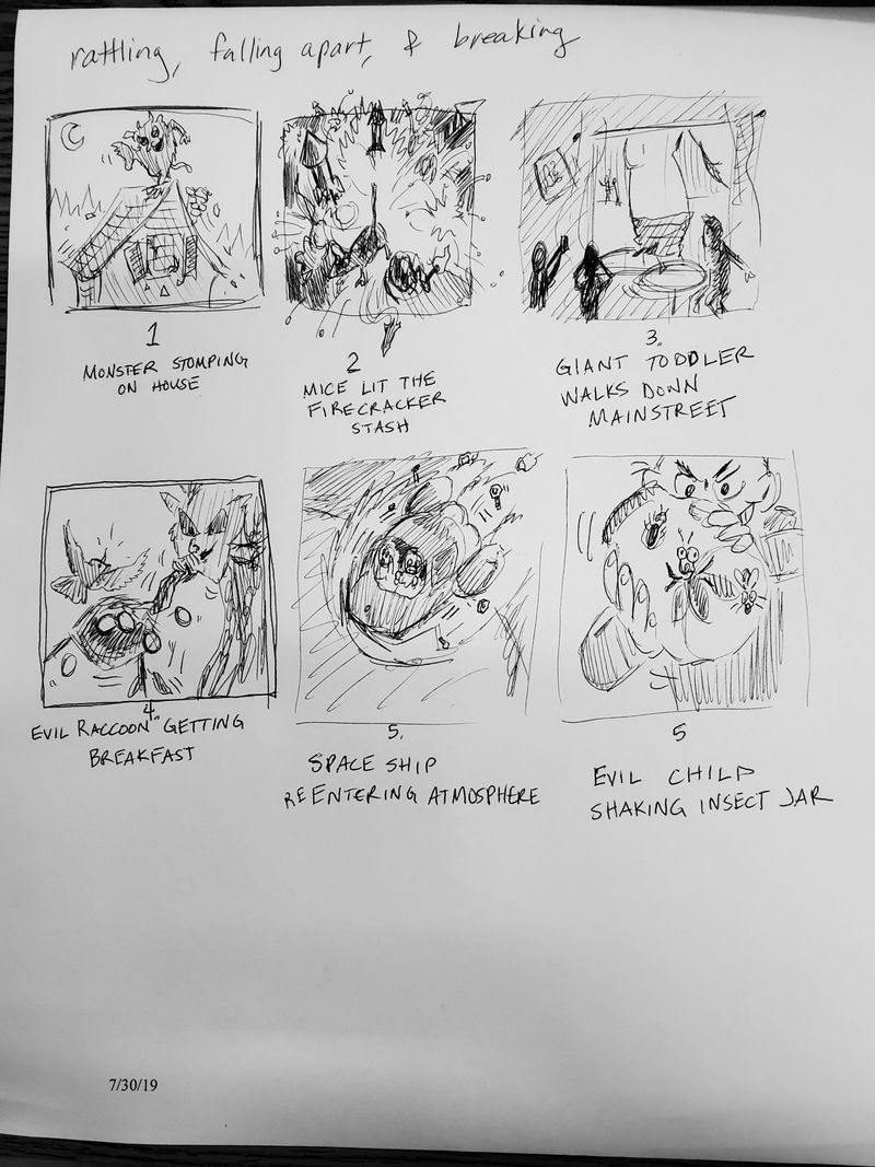
So since I am not nearly clever as some of you and don't know how to create a voting button thingy... which idea would you like to see or think my style would be best suited to. I will probably paint it again with lots of line work. I have labeled and titled them.
Edit: I thought of two more ideas: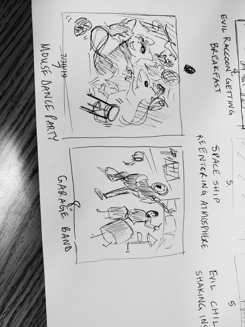
-
@chrisaakins love the 2nd idea so much!!
-
I love your mice - I would go with the firecracker or dance party. ...Though the raccoon idea caught my attention, too.
-
Really great brainstorming for ideas! 1. Now that I know what the monster was up to, it adds a lot of humor to your last piece where the monster is falling outside the boy's window.

That being said, I think 2 and 5 are my favorites. I do like 4 and 6, but I think they'd work better in a series, where you'd get more context and resolve for the trauma that's happening to the characters.
-
My choice is 2!
-
Ooh, I like 7, the mouse dance party or 2, the firecrackers. Probably 7 over 2 for the idea but 2 over 7 for the potential wow impact of the image.
-
TWO! The mice with the fireworks. I love the POV and the idea.

-
@chrisaakins FYI. I THINK the poll is this button.

-
Did no one notice I put 5 twice? It's been a long day...
-
@chrisaakins I did notice and actually mentioned 5 in my first comment twice, but changed one to 6 to avoid confusion.

-
@chrisaakins #2 right away jumped out for me. I love how you do your mice and that would fit great with your other work as well.
-
I like 2! Looks really dynamic and immediately caught my eye
-
I like numbers 2 and 5!
-
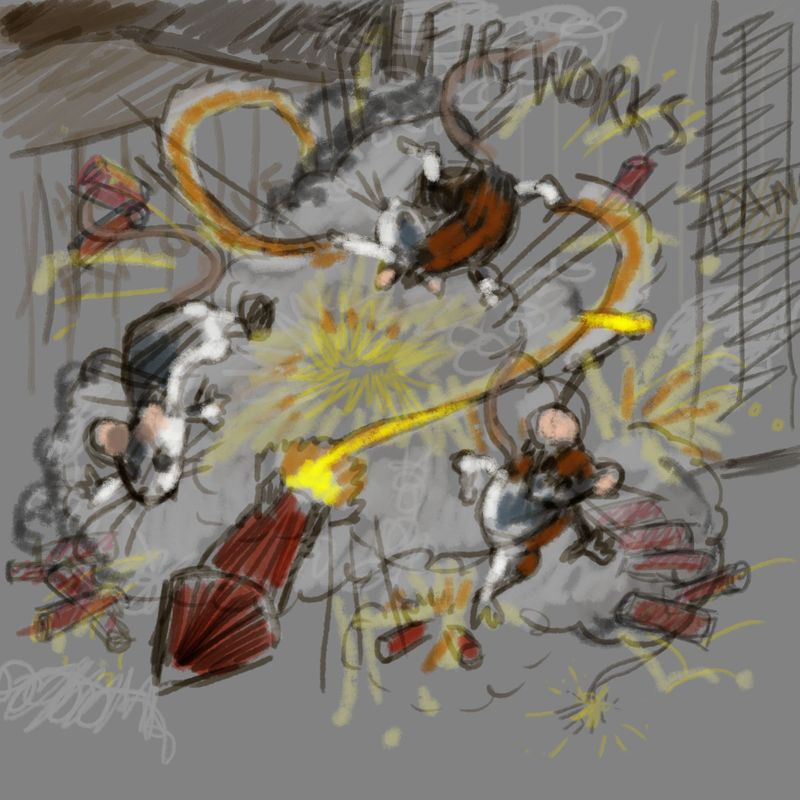
Here is a color study and a potential layout.
Questions:
How is the compositional layout?
What is working?
What would you change?
Does it read that the mice lit the fireworks?
Does it fit the theme?
Should I include a little "whistling kitty chaser" reference? (Why else would the mice be into the fireworks?)
-
@chrisaakins one thing that made the thumbnail of this stand out for me was that the fireworks broke the frame of the image. Are you planning to keep that in the final image? This larger version feels a bit tame now compared to the thumbnail.
-
Here is more progress. Thanks for the critique @neschof I changed it to make it a more centered composition and made it so they are breaking the frame.
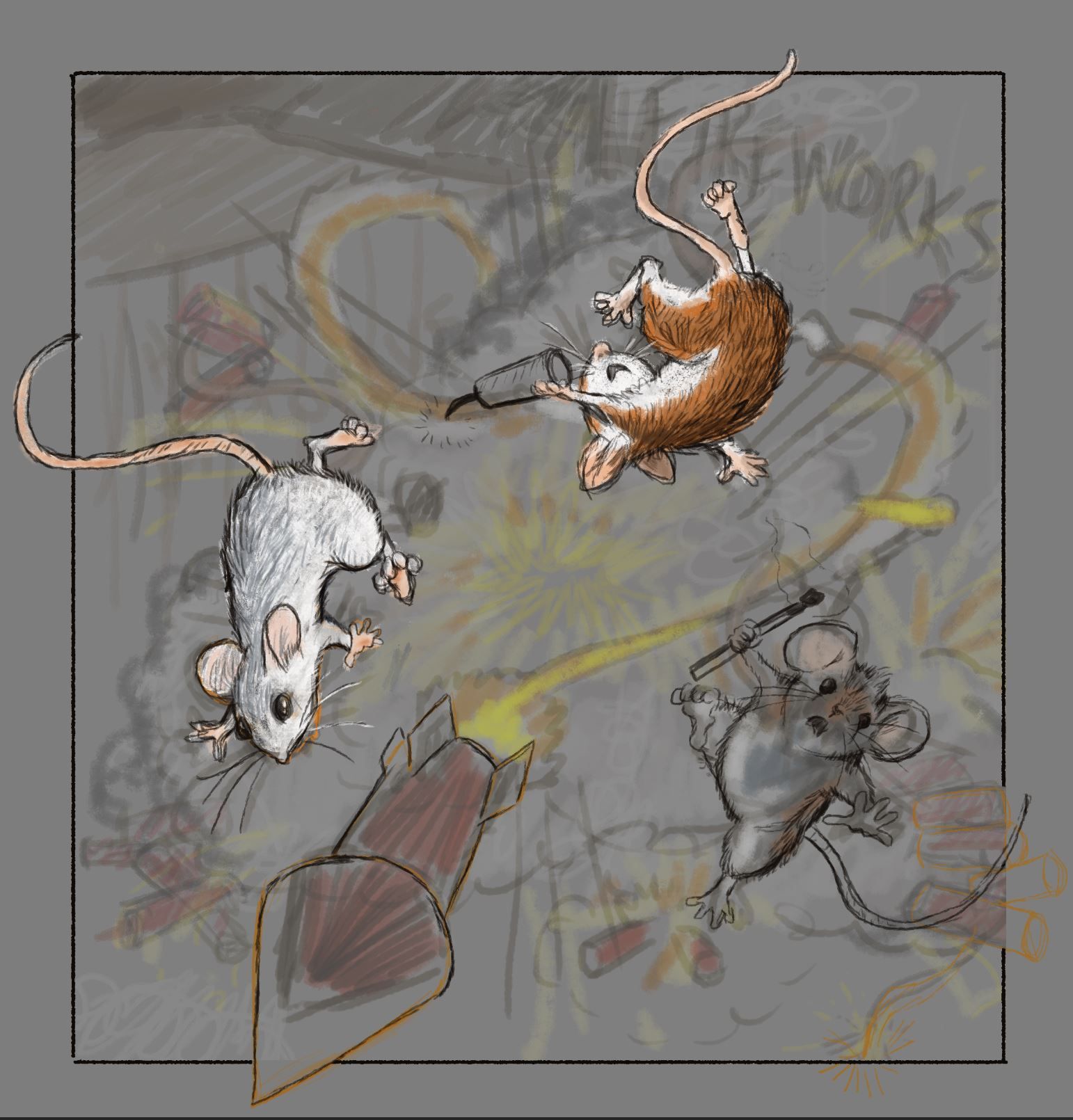
-
Adding texture as I begin to paint my background.
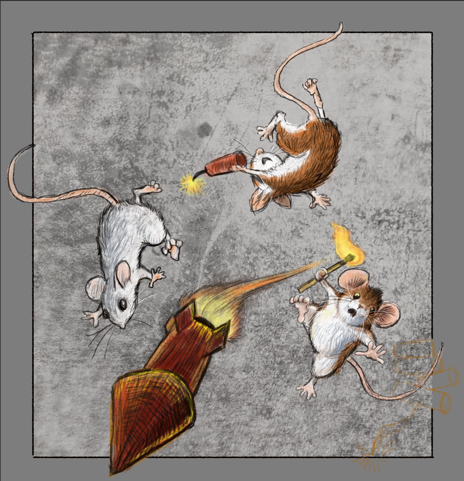
-
@chrisaakins Great job so far! I also loved the mice breaking the frame - glad you added it back in.
-
Hi @chrisaakins, I like #1 because it flows well with your last piece!
-
@chrisaakins looking great so far!