Society of Visual Storytelling

    SVSLearn Forums

    • Register
    • Login
    • Search
    • Recent
    • Tags
    • Popular
    • Users
    • Groups
    • Search

    Can I get a quick vote on my value structure?

    Artwork
    6
    9
    332
    Loading More Posts
    • Oldest to Newest
    • Newest to Oldest
    • Most Votes
    Reply
    • Reply as topic
    Log in to reply
    This topic has been deleted. Only users with topic management privileges can see it.
    • TessaW
      TessaW last edited by TessaW

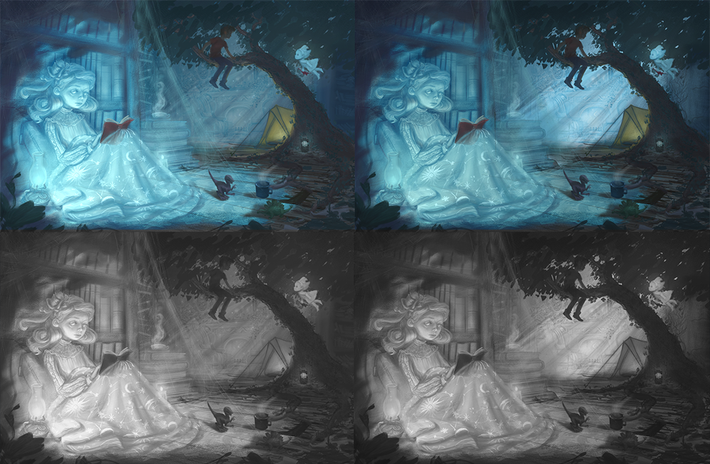
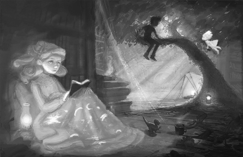
      Hello! I thought I'd take advantage of the poll feature after seeing Braden use it. I'm on the home stretch of this piece and am starting to refine things. Do you like it with the darker background or the lighter background? Thank you!

      Background values.png

      Website: www.tessawrathall.com

      Instagram: www.instagram.com/tessawrathall_art/

      StudioLooong Nyrryl  Cadiz 2 Replies Last reply Reply Quote 0
      • StudioLooong
        StudioLooong @TessaW last edited by

        @TessaW In the lighter background I lose the floating girl in the dappled light coming through the trees.

        Taylor Woolley
        (Formerly Taylor Ackerman / StudioLooong)


        Website: www.woolleystories.com
        Instagram: https://www.instagram.com/woolleystories/

        TessaW 1 Reply Last reply Reply Quote 1
        • TessaW
          TessaW @StudioLooong last edited by

          @StudioLooong That's a good point, and something I would definitely have to tweak if I went with the lighter version. Thanks!

          Website: www.tessawrathall.com

          Instagram: www.instagram.com/tessawrathall_art/

          1 Reply Last reply Reply Quote 0
          • deborah Haagenson
            deborah Haagenson last edited by

            What if you darkened the light in B a little bit, maybe between A and B.

            TessaW 1 Reply Last reply Reply Quote 2
            • TessaW
              TessaW @deborah Haagenson last edited by

              @deborah-Haagenson Thank you, I'll play around and try it out.

              Website: www.tessawrathall.com

              Instagram: www.instagram.com/tessawrathall_art/

              1 Reply Last reply Reply Quote 0
              • Nyrryl  Cadiz
                Nyrryl Cadiz SVS OG @TessaW last edited by

                @TessaW i think a middle ground between both of them would be great

                Portfolio: nyrrylcadiz.com
                Instagram: https://www.instagram.com/nyrryl_cadiz/
                YouTube: https://www.youtube.com/channel/UCbJCF1Im8ZO7hpGWTKOJMuA

                1 Reply Last reply Reply Quote 1
                • marek.halko
                  marek.halko last edited by

                  Hi Tessa,
                  great image, nice concept and really beautifully drawn .
                  I would go for a lighter background (light and atmosphere influenced). The values tend to go a little into the midtones, blending with the foreground character and tend to jump a little ouf of the local value range, in some places might be simplified to strenghten the silhouletes. (did a rough paintover to see my idea. didnt know how much you want the foreground character to glow though.)

                  1582061147068-background-values paint over.png
                  1582061147068-background-values pain over black and white.png

                  1 Reply Last reply Reply Quote 1
                  • Melanie Ortins
                    Melanie Ortins last edited by

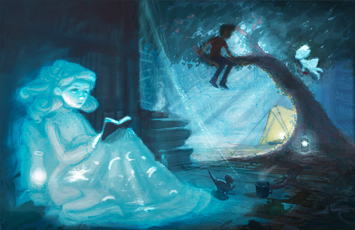
                    It depends on where you want your focal point to be. I would keep some light on both of them, so maybe the lighter background, but make sure either your background or your foreground girl is brighter than the other, to make one stand out

                    http://www.melanieortins.com/
                    https://www.instagram.com/melanieortins/

                    1 Reply Last reply Reply Quote 2
                    • TessaW
                      TessaW last edited by

                      @Nyrryl-Cadiz Thanks for your input! I think you might be right, I will try it out.

                      @marek-halko Thank you for taking the time to do a paintover! I love the subtlety you introduced with all the lighting touches. I do love how the darkened book shelf makes the ghost stand out. I'm trying to convey the idea that the house shows up as it once was, when the moonlight hits it, which it why I made the book shelf so light, but it has been causing trouble with readability. Again thanks for your paintover, I'll definitely incorporate what I can.

                      @Melanie-Ortins Thank you! I'll keep my eye on that as I try to finish it up.

                      Website: www.tessawrathall.com

                      Instagram: www.instagram.com/tessawrathall_art/

                      1 Reply Last reply Reply Quote 0
                      • First post
                        Last post