Nightfall Roughs for feedback...
-
First posting in a long while. I saw Lee White talking about the number of thumbnails, value studies, color comps prior to a final. So I thought I would post a few initial studies for the "Nightfall" challenge. After doing a series of thumbnails I have 4 favorites...they may be hard to read as they are rough but feedback likes/dislikes welcome. Wondering if they convey "story" or if there is a favorite to pursue. Thanks
!
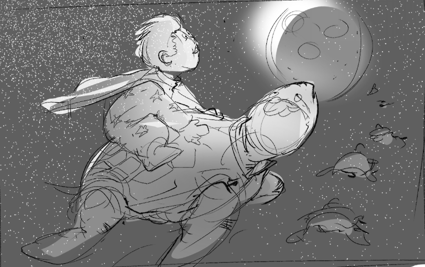
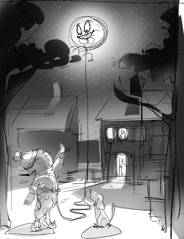
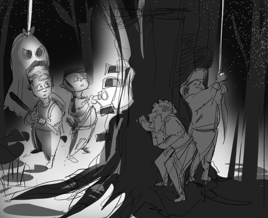
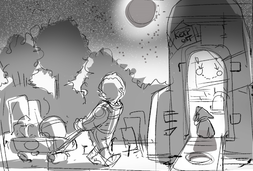
-
Hi, I think any of them could work but personally I find the 3rd one conveys more of a story then the others so it seems the most compelling to me
-
@jbleau I like all of them my favorite is 2 though 3 could be a contender given a few tweaks
-
I think 2 has a unique story to it and is easily readable. I really love those slippers!
-
I love no.2 as concept. I would play a bit more with the composition of that concept. right now the position of the moon and the string seems to divide the image equally.
-
I like the 3rd one.
-
I am loving the second one.
-
A refinement of the Lasso the Moon concept. Experimenting with composition and value refinement...not sure if the moon is working in this...
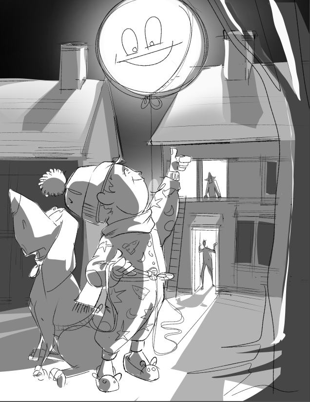 pushing the main characters as a more central focus...
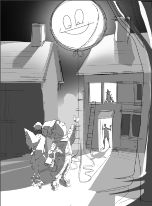
Closer to the original concept...