Lessons from the last contest (add your own!)
-
I spend quite a bit of time thinking about my idea first, so I don’t really use thumbnails to create my initial idea. Then I use post-it notes to create thumbnails. I find it more beneficial for me to use a pencil and eraser on the same post-it note until I see my idea come to life. This seems to work better for my flow, instead of creating the same image over. This time I am going to create more thumbnails afterword for value studies though. Someone did that this time and I realized that would be very beneficial.
I then sketch my drawing with a traditional pencil first. As I am getting more and more comfortable with the PS brushes, I am drawing less and less detail before scanning into PS. I learned more about defining brushes this month and using the spacing feature. I am getting better at blending, using the blending brush and changing the opacity.
I am also now creating silhouettes for each character and larger objects, each on a different layer, so they can be positioned just right, I can easily remove backgrounds and the sketch or line work doesn’t get in the way. They also keep me from doing too much line work initially.
Two classes that I benefited from this month were a character design class with Will and Jake and the 5 steps of goal setting with Lee.
I benefit from everyone in this group in so many ways. This month I asked for a little bit more feedback than I have been regarding my initial design for the contest and it was really helpful. I made several changes based on the responses. You also come up with great ideas for personal projects. I am working on replicating Book Covers right now. This is such a great way to learn digital techniques. I am also working on drawing 300 heads and 50 hands (per Jake in the character class).
-
This is a great thread! I just wanted to add two additional "tricks of the trade", which a friend taught me and I used for this contest:
- Add a top level layer set to the saturation blend mode, and fill with pure white (or any unsaturated color) so you can see what your image looks like in black and white. I find toggling this layer off and on as I'm adding colors helps me control the values better and see if I'm getting off track.
- Another trick my friend taught me is to take a painting/illustration (by yourself or another artist) where you like the value distribution, and make small black and white copy you can refer to as you work (I put it on my phone). This can also keep you grounded as to the balance of values, e.g. it can help you notice if your illustration is getting to dark overall or doesn't have enough contrast.
-
@LauraA great post!
I used thumbnails for the first time via yellow sticky notes and it helped a lot! It took the pressure off trying to make something good right away.
This community is awesome too! It was my first submission and I plan on doing every month.
-
@Braxton Great tips!
-
Hi Laura - thanks for sharing. What do you mean about the horizontal flipping thing? Thx
")
-
Great additions, guys! Thank you!
@deborah-Haagenson and @Jeremy-Ross Great idea about the sticky notes. It seems freer and easier in many ways than using a digital template. I may try it!
@Braxton I have never heard of your method of checking values. I'll have to try that too. I have been using another method, which I happened on by chance and will link here because it seems to be very accurate and well-explained, and once you set it up, it's extremely quick and easy to do: Method: Checking Values: Ctrl+Y
I totally agree about value checking! In fact, I didn't do it as much as usual this time and that may be why @Braden-Hallett had to do a drawover in the end. I was always a bit confused about how dark the snow should be in the moonlight.
@Rachel-Horne To flip your work, make a flattened copy or else put everything in one folder. Then select all, cmd+T to create an edit box, and go to the menu and select Edit>Transform>Flip Horizontal. There is a vertical flip too, which would also help, but horizontal already does a lot for me. You can also do this with any .jpeg in Apple's photos app, or even on your phone, with Edit>Crop> flip symbol (within the crop tool).
Another weird thing I noticed this time was that although in my style survey I said I didn't want to focus too much on light, this piece was largely about...moonlight! Obviously I still have a ways to go stylistically.
Bravi! Keep 'em coming!


-
@Rachel-Horne Hey Rachel, I hope you don't mind if I pop in to answer your question
When people say "flip horizontally" they are referring to the process of having a mirror or your digital program (e.g. photoshop) flip your image along the middle line.Here is an example using my sketch:
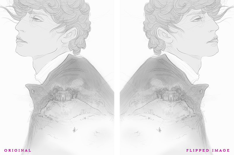
By flipping your image, you are able to recognise structural problems or things such as the tendency to slant to one side easier, because it refreshes the way you look at your piece.
Hope this helps
-
@Jeremy-Ross I love the idea with the sticky notes! Am def. going to try for this month's competition.
-
@LauraA Ooo, thanks for the tip on how to check values quickly!
-
@LauraA Hi Laura - thank you for all the info', I think maybe my question was badly put, what I really meant was, what does flipping the image actually do? Does it help notice anomalies more? Thanks
-
@Cat-De-Pillar Thanks for your input, yes, I was interested in knowing what the point of flipping the image was.
-
@Rachel-Horne Ah, ok! Yes, it's just a way to see the drawing more objectively. It kind of tricks the "left brain."
-
I have been using thumbnails (definitely not 50) which has been helpful in letting me play with my ideas. I always use linework but need to start relying a bit more on color than line in order to improve my color skills.
Along with these things I also need to incorporate stylizing my drawings. The way I do this (in the last like 2 weeks) is after coming up with a composition I like I play around with the shape designs and character design on a separate piece of paper then incorporate all those components into the main illustration.
instagram and twitter: @artofaleksey
alekseyillustration.com -
@Rachel-Horne I can't tell you the number of times when I flipped an image and discovered that a character's eyes suddenly looked strange, or the profile was a little out of whack, or my lines were slanted. It's weird that I can't see those things until I flip it but it really helps.
Laurie DeMott
instagram.com/demotlj -
@LauraA Great discussion! Learning from all the lessons you guys mentioned. I'm definitely going to try the flipping trick next time
Here's a few I picked up on:- Start earlier in the month.
- Keep doing thumbnails until truly satisfied.
- Don't skip the values/shading step.
- For subjects farther away, use lighter color line work or none.
- Work on it consistently.
- Get feedback from others.
- Aim to finish a week early. Then, go back in a day or two and check - does it still look good?
-
@Aleksey That's a good point and I forgot to mention it. Sometime after the thumbnails but before the final drawing, I'll do character studies using reference. In addition, I'm figuring out that I definitely need a rough sketch stage, in which I work out all the problems that result when you try to take what looks like a perfectly good thumbnail and work out the details, especially of anatomy and perspective, because they may change the composition. The character studies go with this stage.
@demotlj So this slanting thing is universal? I thought it was just me. I wonder why it happens?
@uzma I really like your list. All the steps are important, but I'm especially trying to work on the thumbnails and the finishing early. So much happens in that last few days and often you do need a day or two of rest to see straight. Otherwise there's a lot of danger of overworking the piece and ruining it, or at the very least wasted time working on details that don't help the whole.
-
@demotlj that's really interesting, I would never have thought of doing that!!
-
@LauraA Thanks - I'll try it next time, I'm interested to see what happens.
-
I did a lot of thumbnails last month and started early which was good. I also found I went through that stage of feeling that it was very ugly. I get that feeling a lot and I wonder how much other people do? Something gets a bit lost between thumbnail and larger sketch, particularly with the characters. They're really ugly for a while but I keep working and ignore the uncertain voice in my head and eventually I can improve it.
Once I had my larger sketch I didn't really do a value study though. I need to do that. I think it was in this thread I read about having a layer, filled with white and turned to saturation mode? I tried that yesterday with my little mouse and that's helpful for sure! Tho I suppose that's an along the way value check and not a value study beforehand. Also. No color studies. So I have to get better at those and maybe even",steal" a color scheme from another illustration.
I also have trouble with too many layers. I get confused and maybe the color value studies will help!
I also think I threw in a bunch of falling snow at the last minute and blurred it too much. I think I overdid that but maybe some things come down to experience. And maybe some last minute decisions are good and some aren't
Great thread