Critiques requested for Wizard of Oz....the re-work
-
Hello Artists,
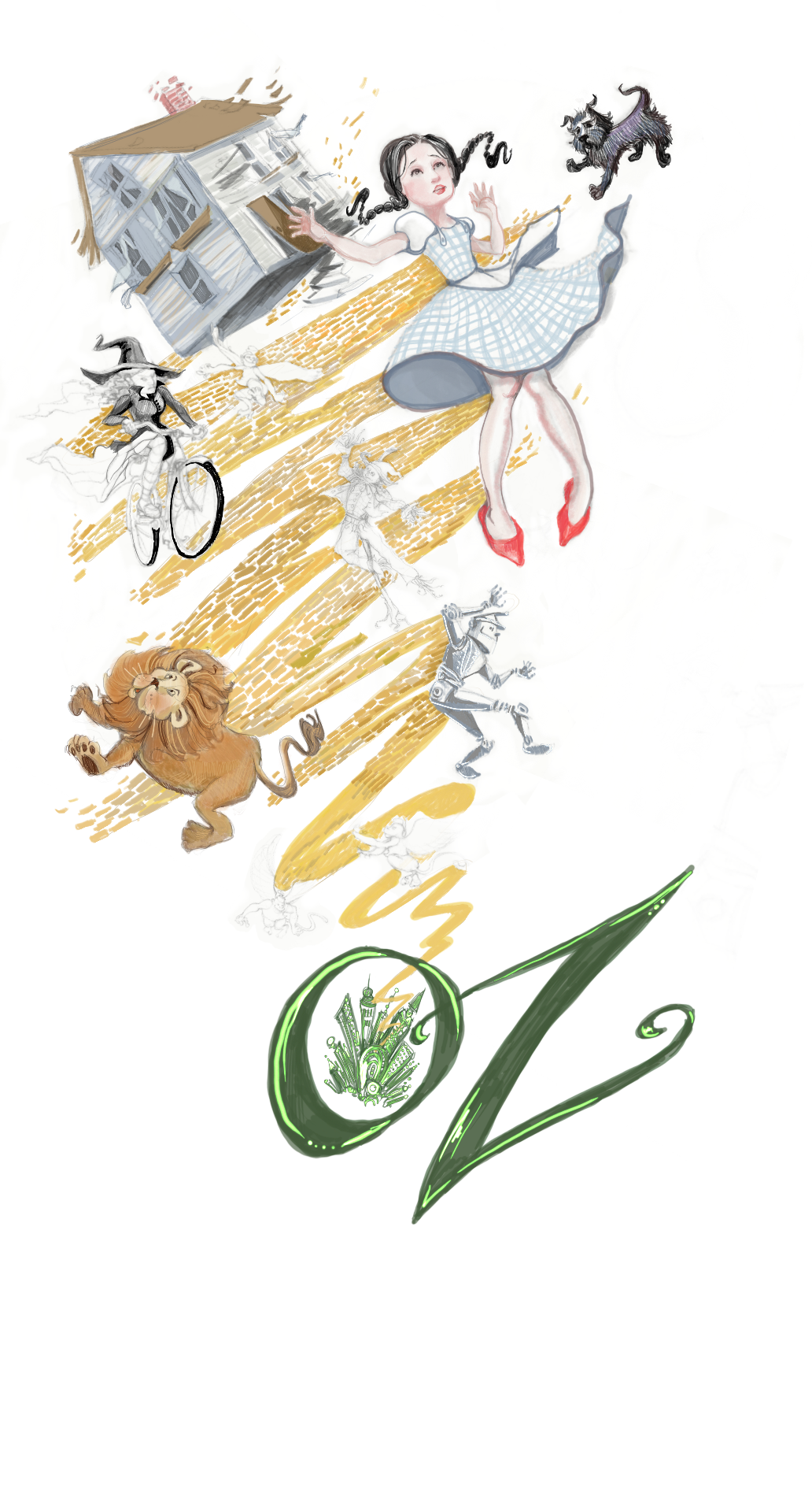
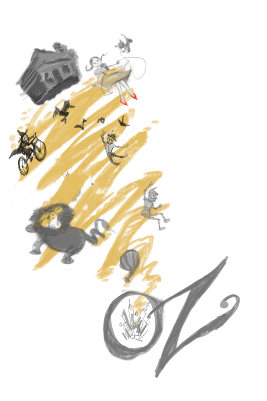
So...I'm working on fixing/finishing pieces in my portfolio in preparation for my first ever SCBWI Illustration Conference wherein I'm signed up for portfolio reviews...and I'm kinda freaking out about it. I have three months to work on my stuff...and I want it to be my best "right now" Over the summer I took the interactive class for Book Covers with @Lee-White and Jamie Zollars (It was fantastic--please do more interactive classes!!!) And so I am re-working one of my pieces: a book cover for Wizard of Oz. One of the crits that I got was that my characters were not tispy-turvy enough for their situation.... I'm showing my old art first, then the line art for my rework... Any advice/critique would be appreciated before I begin value/color studies.Old art:
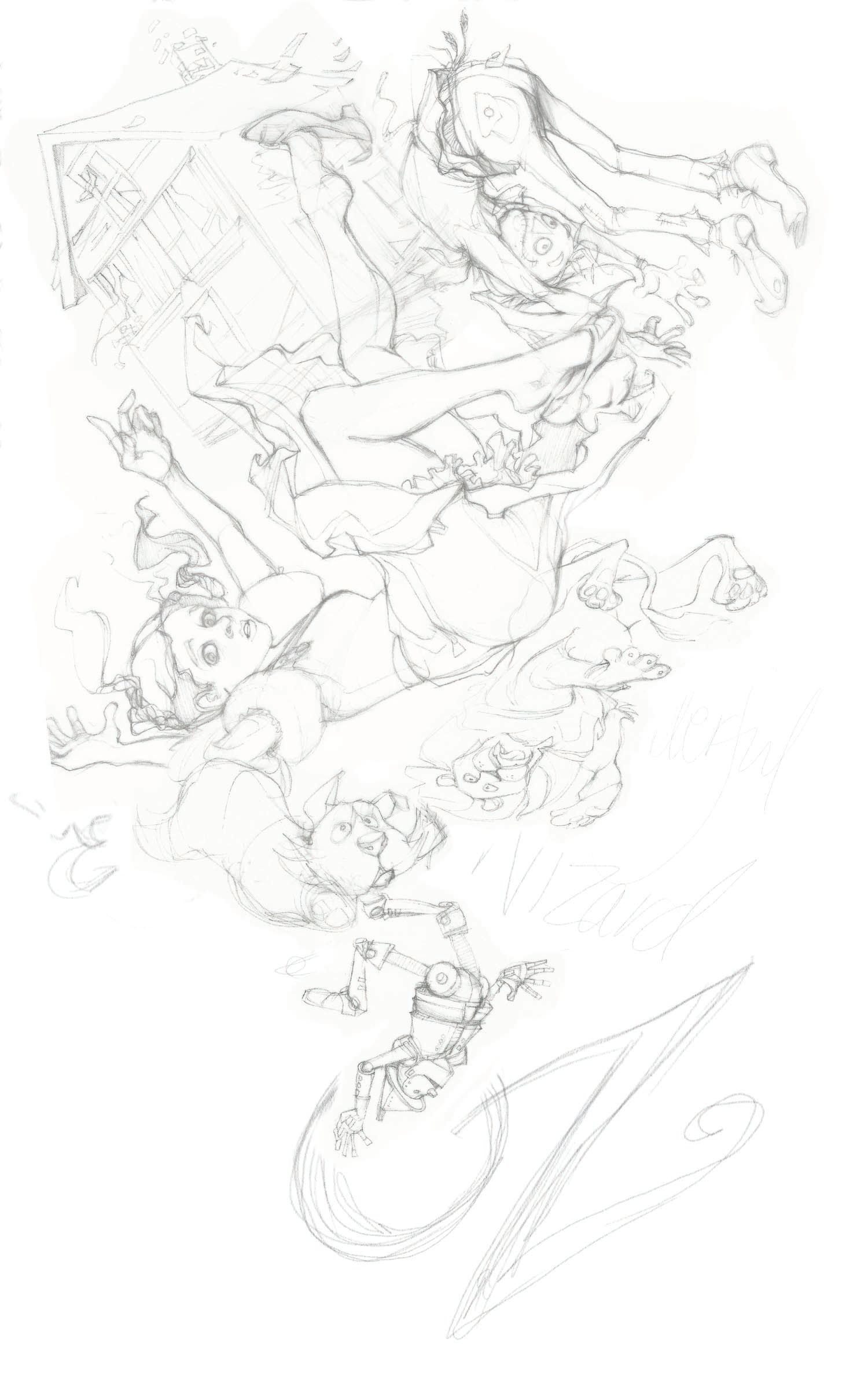
My line art re-work:
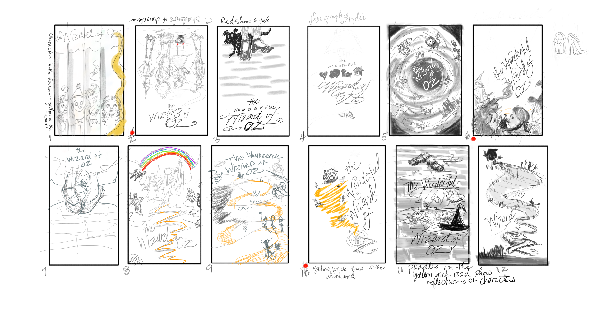
Just in case you need a point of reference for where my head was at- I've included my rough sketch and thumbnails ideation work below:
Thanks for advice in advance!!!!
Love you all.. -
Amazing!
-
Nice work! I really like your new sketch, you've improved loads since the old one! I like the chaos of all the characters poses and the falling into the 'O' in Oz. I also love the eye contact Dorothy is making with the reader.
My only critique at this stage is to be more considerate of the placement of the book title (I assume this is a book cover and not just an illustration from the book). At the minute the title feels a bit like an after thought pushed to the side.
Instagram and Twitter: @eriberart
Website: www.erinmcclean.com -
Very nice line work of course and I love your attitude to go back and see if you can try it again to get something better.
That said, I think you have taken it too far in this stage as there is no thumbnail that looks like your current version. It's too easy to get caught up in "drawing" at the comp stage you are at now vs. "designing" which is what needs to happen there. While I like each character individually, I think they will be heavily competing for attention when toned and colored. Go ahead and try to do a black and white comp of your current design and you will see what I mean. I would recommend trying to vary the sizes of your objects more and give them some breathing room.
I wanted to bring up something else, but I'm not sure of it so I'd love to hear what others think about this next point. I feel like Dorothy is very much a late teen/early 20's in this and almost takes on the look of a pin up model. Not sure if you are trying to switch the genres like that, but just be aware of it. She definitely doesn't look like a kid. Which is fine, but just make sure that is what you are going for. In your comps she looks much younger so that is why I bring that up. Again, love to hear what others think there.
Keep up the good work! This is all gonna pay off huge!
SVS Faculty Instructor
www.leewhiteillustration.com -
I have to affirm what Lee brought up because I have an 8yo daughter and would specifically not choose a version of this book with a cover where Dorothy looks like a pin-up model. It's hard to admit this because it sounds blunt, and I love your drawings so much! Maybe these can be a kind of art that has more to do with the movie, or a type of comic based on the book, or even a new concept for a movie (although in that case i think you might have to rethink the style choices as something other than based on the movie).
I've noticed that when I choose to read a classic book out loud there are so often popular versions of the story that have overtaken the actual story that I choose the covers especially carefully. I choose for original context. The pin-up style doesn't present the book as having been published in 1900, and in particular to speak to the difficulties of that time. The movie is so glamorous but it was a story that kind of dealt with all the brutalities of life on the prairie, like a hallucination.
Parenting a daughter is interesting. They sell heels for her age and I've grown very sensitive to those kinds of things when I wasn't before. I just want her to be a little girl for as long as possible and that means that I control her media consumption to some extent especially to do with girls wearing grown up things like heels. That would mean determining the age of the young girl in the story and paying attention to how she is depicted in art. I think the red shoes really are something they made up for the movie. Personally, I'd like to see the characters all wearing green tinted spectacles, or just something no one knows about because of the movie.
-
@Lee-White Thank you for the feedback. And you are right-I LOVE drawing the characters, so taking a step back to make certain I have a solid design is great advice. Also, (and in response to @carolinedrawing) I AM looking at portfolio reviews by fantasy art directors in nearly the same time frame as the opportunity with SCBWI--I've noticed my work tends to lean towards wanting to make images that are leaning towards an older young adult audience...(I also am raising a daughter, so I'm aware of the imagery consumed by her age group.) Is it possible for my portfolio - specifically this piece to straddle both markets?
-
@eriberart Thank you! I am thinking of reworking the design to make certain title is front and center...
-
@Laurasketches so interesting, you've given me so much to think about! I think the short answer to your question is basically no, I don't think this piece can straddle both markets. I'll do a quick disclaimer here because I really am so in the beginning of this thing, 2020 is my year to create my first portfolio with both writing and illustration, but I am also coming from the background of being a librarian (not a children's librarian, but one with a healthy level of concern about how things are classified and the sort of 'aboutness' of books). Also I haven't even looked at this book in decades so my memory of it is hazy at best.
My particular requirements of the cover for this book would be probably closest to editorial objections. So aside from my reaction to her heels and her figure (emphasized by the puffy sleeves and nipped waist) being an unnecessary thing to emphasize (I am very much in favor these days of chubby children if i can manage to include them) I would bypass this cover because when I read to my daughter we see the cover every day, and this is so clearly drawn from inspiration from the musical, and not the book. To me, this artwork is about the musical, not just because her clothing style is taken from the movie, but because the title isn't right (i think for the book it's The Wonderful Wizard of Oz) and if it were based on a close reading of the book, I would expect it to include something that is purposely different from the imagery we see from the movie.
Anyway, it's really interesting how telling certain things can be - this drawing really appeals specifically to those that like the musical because it uses recognizable things to draw you in and experience what you know of the story in a new way. Perfect for the fantasy thing i think you're talking about but I don't know anything about (i'm clueless). haha. I think that's a great thing, but it's for people that love the musical and it's a pop culture thing. For me, i'm kind of meh about the movie, it's weird to me that judy garland plays a girl, and I won't even touch books with covers that have a photo from a movie made based on that very book - because ultimately, to me, the cover should have a truly unique way of capturing what's in the book, not marketing a movie! But you see, there will be (probably) very little overlap between my very firm opinions, and what appeals to people in general.
But In all honesty I would look at this cover and assume the illustrator had not read the book. And so my purest self would just not do what you would want your market to do - I specifically wouldn't pick up the book. My guess is an editor would probably have a problem with that, because there needs to be a really good reason to put new art on a classic. And it's to get more people to pick it up and read it instead of just knowing about it.
-
@Laurasketches I think YOU can straddle both markets, but that is asking too much from a singular piece of artwork. So I would recommend having that separation in your portfolio. Clearly label and separate what is for young audiences and what is young adult. A lot of people have those different areas on their website. BUT, even for the young adult market, I'd watch out for making a character too sexy if they are typically for the young audience (as in Wizard of Oz). Publishers are scared to death of that kind of thing right now (in my opinion). In the game market and comic market there is a little more flexibility there.