Portfolio WIP - serious critique requested!
-
Hi guys,
So I’m planning on working on my portfolio over the next few months. There’s only so many tutorials I can see and articles I can read before I finally start implementing them!
I’ve planned on a 3 illustration narrative to be included in my portfolio. This is really rough stage and I would appreciate feedback on the story narrative as well as the composition. My values aren’t absolutely right yet but it’s just to get an idea of the scene.
Part 1:
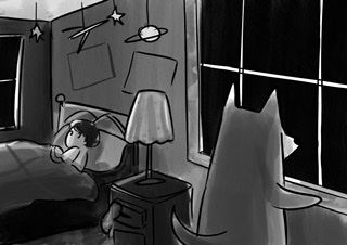
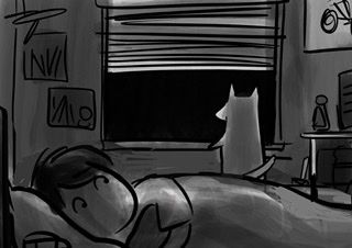
Which perspective do you prefer? I’m leaning a little more towards the one with the dog in thr foreground but I’m wondering if the dog being in the foreground looks repetitive in the 1st and 2nd part...Keywords: suspense, night
Part 2:
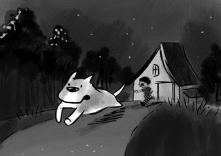
Keywords: dynamic, scary/fear
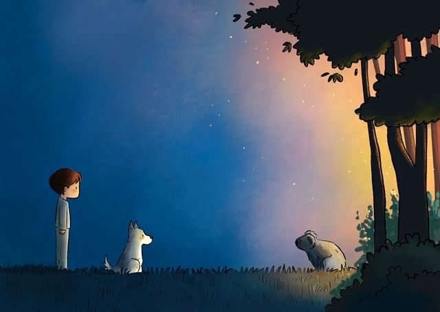
Part 3: So I’m still contemplating this scene. With all the horror news about the Australian bushfires, I wanted to include something related to that. So this will complete darkness with a fiery glow from the forest.
Another version to make it fictional would be to replace the koala bear with a magical creature of some sort. Thoughts?Keywords: calm before the storm
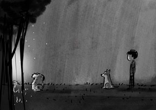
Feedback greatly appreciated!!!
-
@Neha-Rawat I really like the whole concept and agree with you on the dog being in the foreground in the first illustration. Including a light glow in the window in that illustration would help tie the images together too. I really like how little background there is in that last illustration as it creates a sense of loneliness which I imagine the koala is feeling. Make sure to make the side that the boy and dog are on look subtly more inviting to contrast where the koala is coming from. I think what you've got is great. Please make sure to post any progression in here. I'd love to see
-
Hi @Neha-Rawat, I love the concept and the mood that you are conveying with these. Here's my 2 cents worth:
For Part 1, I think the second option (dog in background) leads the eye better across the illustration, from the face of the kid all the way to the dog, making us wonder what exactly is going on outside (suspense). Also, the fact that we see the face of the kid in close up helps to convey emotion more effectively, which I feel is a weakness in the first option (dog in foreground with back towards the viewer). Finally, I think deciding who is the protagonist in this story may also help you decide where to focus the camera on this first shot.
For Part 2, I feel it is already pretty strong. I would perhaps increase the space between the dog and the child a little bit, just to help lead the eye across the entire illustration.
Lastly, I think Part 3 is just perfect.
All the best with your portfolio, it's looking great!
-
Hi @Neha-Rawat !
I love this idea a lot!I agree with @Gustavo-Ruiz that for Part 1, the second option with the dog in the background and with the boy looking over his shoulder draws the viewer into the illustration more and evokes emotion and interest (at least for me :face_with_stuck-out_tongue: ).
The others I think are great, love the last one. Simple but yet very strong!
Great work! -
@Frankie-Rogers Thank you so much! I didn't of the subtle contrast in the backgrounds of the last one. I think that's a great point! Thanks!
@Gustavo-Ruiz Yes, I think you make a strong point on the east read of emotions with the dog in the background. Thank you! I think I'll go ahead with that option

@KajsaH Thank you so much!

-
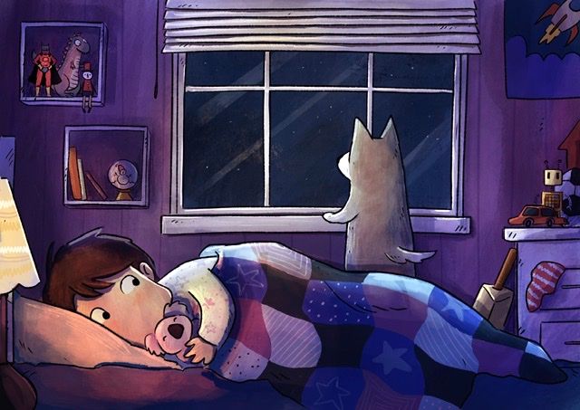
I coloured the first illustration of the series. I added a lamp I. The foreground for another light source.
Is the suspense element still coming through? It’s sometimes tricky to translate your vision into a thumbnail into a sketch into a full colour illustration especially when the lighting is doing the talking.
Any feedback would be appreciated! Colour palette, values, detailing etc

-
First off, good job with the refined illustration! I just noticed after looking at the image a second time that you added the detail of the stuffed Koala bear, which is a great emotional link between the first image and the third.
To answer your question about suspense, maybe consider having the dog barking? Not like an angry bark but a "Hey human, there's something out there!" kind of bark. That way it answers the question of 'why is the boy awake?'.
I also like the colour choice of yellow light, with cooler shadows, though would suggest changing the colour of the action figure in the top left corner to a cooler colour. This is to keep focus directed more to the boy and the dog. And I realize that realistically the figure would be lit the way you have it, and toys are usually be coloured with bright colours like reds and oranges, but hey, we're the illustrators and we can fudge reality a bit if we want to

But in all, it's a cool short story, and could probably turn into a bigger project if you wanted to!
-
@Josh-Schouwstra-0 Thank you so much! That's great feedback!
Having the dog barking would definitely make the situation more readable.
Also, my values for distracting background elements is still something I'm struggling with so thank you for pointing it out
-
The first illustration looks great. The only thing I'd add is that if your story is about bush fires have an ominous glow of orange in the distance that the dog is looking at. Not too obvious but a little hint. You could also use that glow to add some warmer lighting to the dog. I hope that helps. It's looking really good. I can't wait to see the next piece!
-
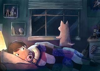
@Neha-Rawat Cool project! My only feedback is that possibly lowering the saturation of everything but the focal points could help guide the eye better to the story elements - the mullions in the window are very high contrast with the night sky behind - possibly bringing them down in value would be good - did a quick paint over to show what i was thinking - could be wrong of course - feel free to ignore
 really nice work
-
@IanS Oh yeah! I could definitely try that out! Thanks!

@Kevin-Longueil Wow! Thanks for taking out time to do a paint over. Now that I compare it, you're right, the mullions DO look really high contrast. (Also, thank you for teaching me the word "mullions" :P) The paint over is definitely helping focus on the right spots. Thank you so much!
-
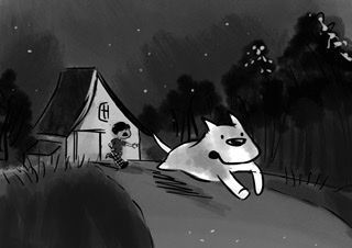
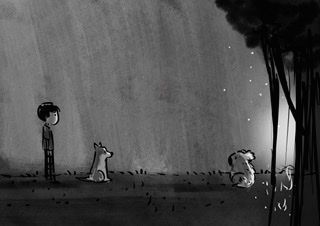
Also, I had another question. I've started working on the 2nd piece of the narrative, and I was wondering about the direction of the read.
Does it make sense to flip the 2nd and 3rd images so that they help with the page turn and read?
(Again, seeing the picture in a certain way and then flipping it completely throws me off so I'm unable to make a judgement)
-
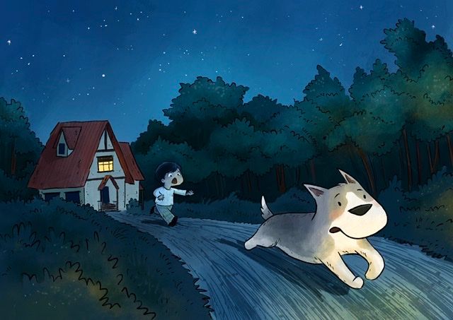
I’ve coloured the 2nd illustration in the narrative sequence. Colouring this scene was trickier than I thought. I knew I wanted an overall blue night feel, but I wasn’t able to include any accent colours initially. It looked a bit monochromatic.
So I changed the roof from brown to red to make it pop and also lit up one of the windows. The tress were also shades of blue at first, after which I added a green tinge to them.
I’m still contemplating the yellow glow on the trees. They don’t look quite right to me.Feedback are welcome!

-
3rd one! I completed this colouring pretty fast since there’s not a lot of detailing here so my brain is making me doubt that It’s still incomplete.
One concern I have is that The koala’s face is in the shadow. But is it easy to read that it’s in distress?