Serious Critique Requested
-
Okay. I’m putting myself out there and I’m a little nervous with so many talented artists out on this forum, But I want honest feedback. I have a goal to interact with more artists online. And I’m tired of the “It looks good” response from family and friends and I want to improve.
I am a graphic designer wanting to improve my drawing an illustration skills. I have an Etsy shop Nichole Marie Printery and am I wanting to roll out some more quality illustrations rather than just simple graphics and lettering. But I think you can get a feel for my style a little bit from my shop listings.
Anyway, here is my drawing:
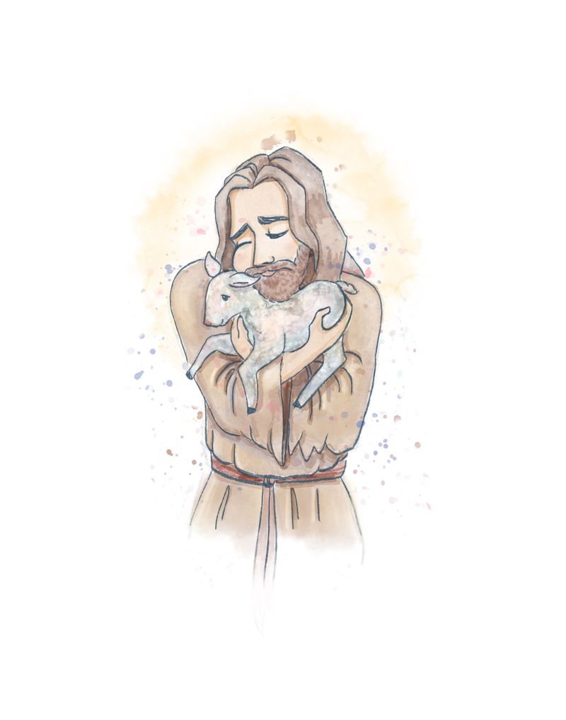
It was all done digitally on Procreate.
I would really like to make it better and have something ready for Easter. So lets have at it. Honest to Zeus truth. What isn’t working? How can I make it better? Is this something you would buy for yourself or gift to someone for Easter?
On a more technical/process side, any tips with you’d recommend on Procreate that can help would be greatly appreciated.
Side note: Am I following the correct protocol in posting this critique request? Just want to help keep things organized and help this post get found.
-
Something that helps me with images for an event or holidays is to think about the feeling you want others to have when it comes to this holiday thats happening and whats the message you’re trying to convey?
I’m not christian so im not 100% sure if im taking the correct message from this drawing so forgive me if I’m mistaken, I think it looks like you are trying to depict jesus embracing a lamb?
a
One thing that may help is to be more direct with the emotion you are trying to show on jesus’ face when he is embracing this lamb.b
The other might be the silhouette of the overall drawing. You can trying raising his arms up above his head as if he is lifting the lamb up, like in the lion king opening but facing jesus rather than a crowd (unless you think that would be more impactful for what you’re trying to show) and Jesus laughing (if you want to show happiness or joy that is).I hope this is helpful
instagram and twitter: @artofaleksey
alekseyillustration.com -
@NicholeMarie This is really cute and I like your rendering. Looks a bit watercolor like, I like the lightness of it.
The pose isn't quite working. It's a little bit awkward with the shoulders so high but most of all the front angle isn't ideal. It's kind of flat and like @Aleksey mentioned makes the silhouette a bit of a blob. It would have been good to do a few quick sketches (thumbnails) beforehand to decide what's best. A 3/4 pose would untangle the lamb's silhouette from Jesus'.
Apart from that, I'm not 100% sure it's best to have Jesus looking so sad for a print to sell. Maybe a more happy/peaceful feeling is better suited to evoke? You seem comfortable with hair, faces and the fur texture is done really. Compared to that, your skill at the clothing folds seems to lag slightly behind. Maybe it would be a good idea to do some studies of drapery to get a better hang of it. Folds are a notoriously difficult to master and studies can be really invaluable to learn them.
So my best advice would be to plan a little better! When you get an idea for a drawing, spend some time thinking about the concept, what you want to convey and how best to convey it. Do several thumbnails to try different poses and compositions. Pick out the best they look for some reference (in this case lamb, tunics..) until you feel comfortable with the subject. Really nail that sketch before painting, and don't hesitate to post the sketch here to get comments on it before you spend hours coloring! Best of luck!
")
vanessastoilova.com
instagram.com/vanessa.stoilova/Check out my Youtube channel for tips on how to start your career in illustration! www.youtube.com/c/ArtBusinesswithNess
-
@Aleksey You're spot on with the depiction. It is Jesus holding a lamb. I like that suggestion of thinking about the emotions I want to convey. I'll work on that.
-
@NessIllustration I have gotten similar feedback about the pose. I plan on sketching out some thumbnails on different poses. Someone suggested looking up more dynamic and interesting poses, and potentially finding a course that teaches anatomy and poses. Have you taken any courses here on SVS learn that will help with that?
Thank you for the input, in the future I will study and plan more.
-
@NicholeMarie For anatomy, nothing better than figure drawing
They probably have a course on SVS about that, but I haven't taken it myself. -
Hi @NicholeMarie,
I'm also a graphic designer, I was in your position about 3 years ago when I was trying to improve my illustration skills.
Would I buy this piece? I don't know about a print but a coffee mug? sure!
I agree with @NessIllustration better planning on your illustration helps a lot. Once I hit the pose I'm going to draw I usually do it 2-3 times over just to get the linework as smooth as possible. Then, I proceed with color. I would suggest a richer color palette for this piece.I know it might be overwhelming to put your art out there to get some feedback. But this is part of the process and a very important one. Feel free to show us more pieces.