December prompt WIP - Sad - Critiques welcome
-
@Heather-Boyd The mouse is separate, it was just the first sketch on the page, then I started sketching around it. I didn't push the thumbnail line through it's head because I liked the mouse and wanted to preserve it for something else.

The one with the girl holding her hand out, was intended to be supporting her weight as she is leaning forward. That pose was my least favorite, but felt believable. I'm tempted to take the girl from the lower right, and paste her on the left scene.
I've never seen inside out, will have to look it up.
") Heard Lewis Black voices Anger, that alone made me want to see it. Heh.
Heard Lewis Black voices Anger, that alone made me want to see it. Heh. -
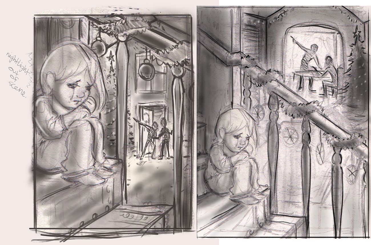
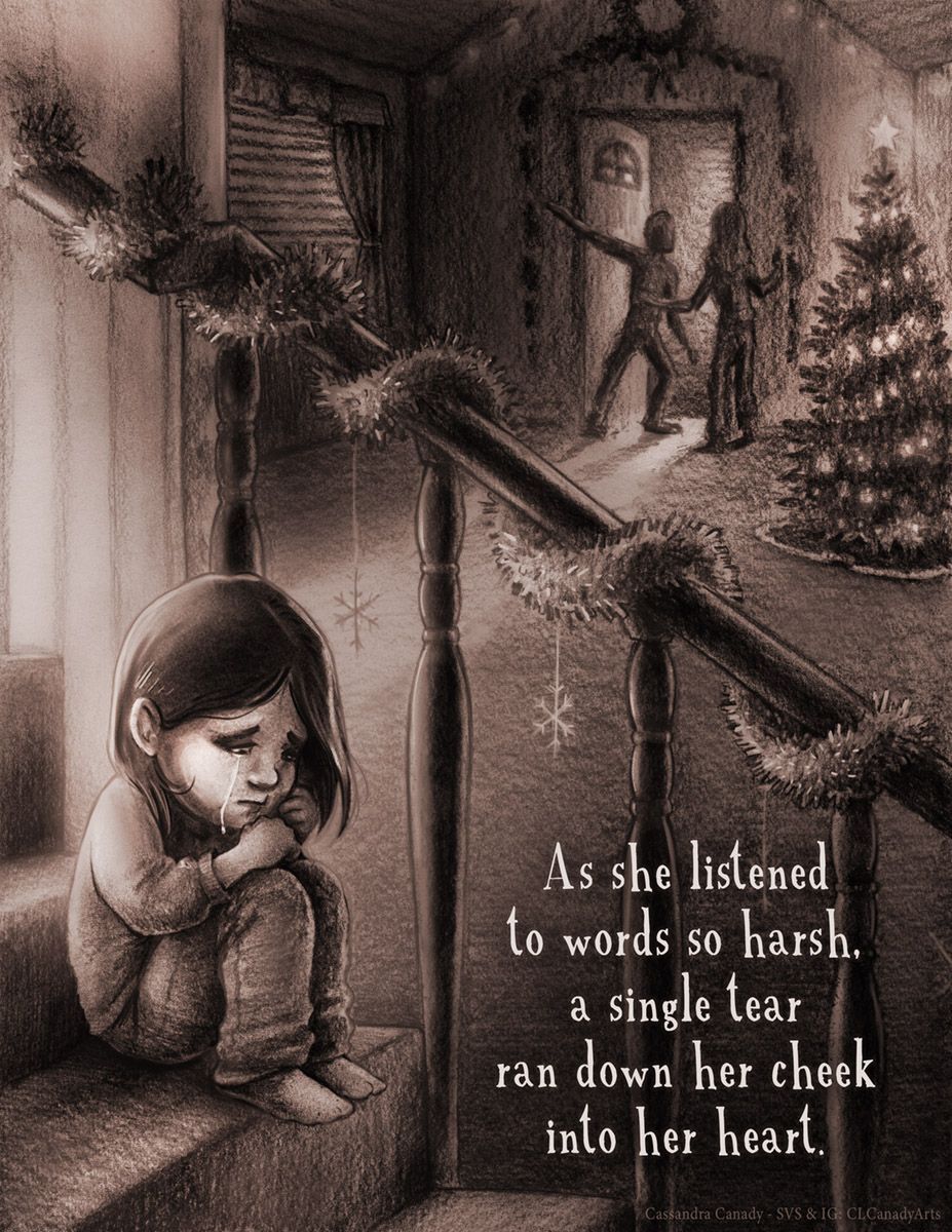
Did some thumbnail mashing and draw over. I think I like the left one better, the focus is more on the girl, but I really like being able to see more of the banister, but the right scene feels like she is less important. I don't want the focus to be on the argument.
Quick simple greyscale to give an idea of shadowing.
Edit, the larger tree and house makes it look like a wealthier family.. I don't like that. Could be a smaller but taller house on farm land, and they cut down their own tree..
-
@CLCanadyArts I really like the second one - something about the composition with the floor level (bottom of Xmas tree) being above her head and the more zoomed out view just make her look so tiny and alone

But yeah, I definitely see that in the first one she is clearly the main focus and her face is bigger so you can put in more expression.
Tough call.
Nicola Schofield
Twitter: twitter.com/NSchofieldArt
Instagram: instagram.com/NicolaSchofieldArt/ -
@neschof I do like the idea of tiny and alone, more vulnerable.
-
Just my initial reaction at a very first read (not seeing it at all until right now), the first one immediately caught my attention and the focus was super clear. The second one I wasn't sure where to look between the child and the parents.
-

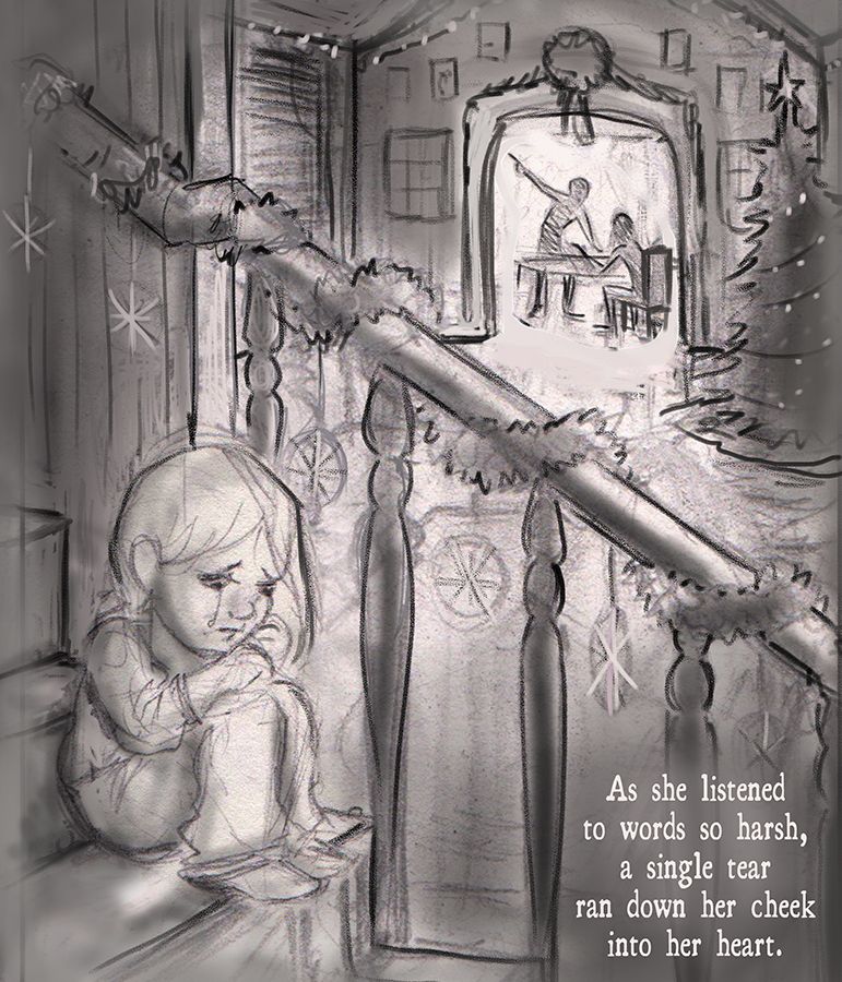
Refined the 2nd idea. Added a bit of text. Might not be needed, but I thought it added to the storybook feel.
@jdubz Tried to rectify that issue with this update. I noticed that too. Torn between this latest one, and the first one in the last post.
-
@CLCanadyArts The only issue I'm seeing is that the way #2 is shaping up is that it's forcing you to make the parents the subject matter because based on the scene, it has to have the brightest light and highest contrast.
It might end up being totally fine and it really makes the image though.
On the #1, the adults are more in shadow so the girl can be the most lit thing in the scene and you can really control that.
You might toy with making the #2 scene use the front door like #1 so you can choose to put the lights where you want.
-
@jdubz Good point, I will try that out right now.
-
@CLCanadyArts One thing I thought of also (if I'm not being to presumptuous lol) is the words could definitely take up more space and not feel crammed down there.
The 3rd-4th banister up is essentially dead space so you could push that back a bit with contrast and get those words nice and spaced out. I mentioned on someone else's post that Will Terry's words are really sticking with me when he said if you're going to put the words in there, make sure you're treating them like another element on the page that is supposed to be there with as much importance as everything else.
-
@jdubz That makes sense too. I was timid about it, and it does feel crammed into a tiny space. Thanks for your thoughts!
-
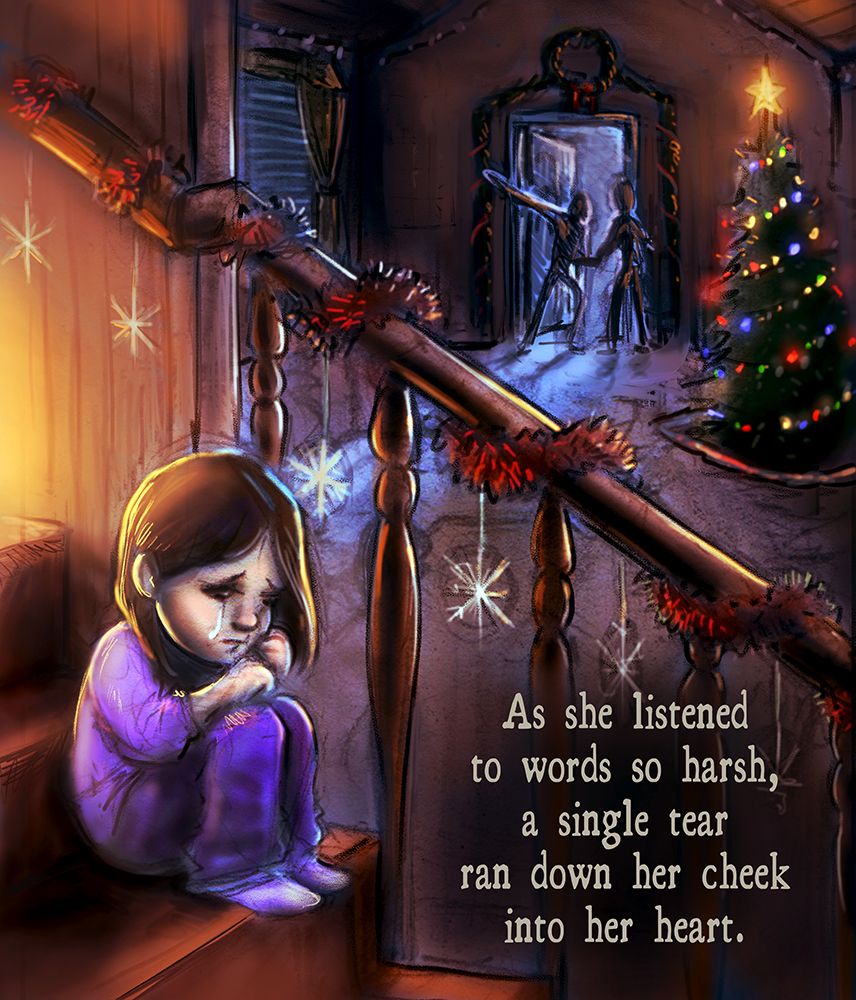
Switched the dining room to the front door. Enlarged the text. Did a rough color mock-up.(too much black at the moment, i'll refine the colors. I think I'm about ready to start refining and inking this. Need to work out perspective and detail. Thank you all for your feedback.
-
Nice! I think it's reading really well at least for me.
-
@CLCanadyArts I absolutely love this!


-
Wow amazing job, your composition, lighting, color, use of line for focal point; this is an amazing piece, congrats!
-
Is someone cutting an onion in here? Wow man you nailed the emotions with this one.
-
This post is deleted! -
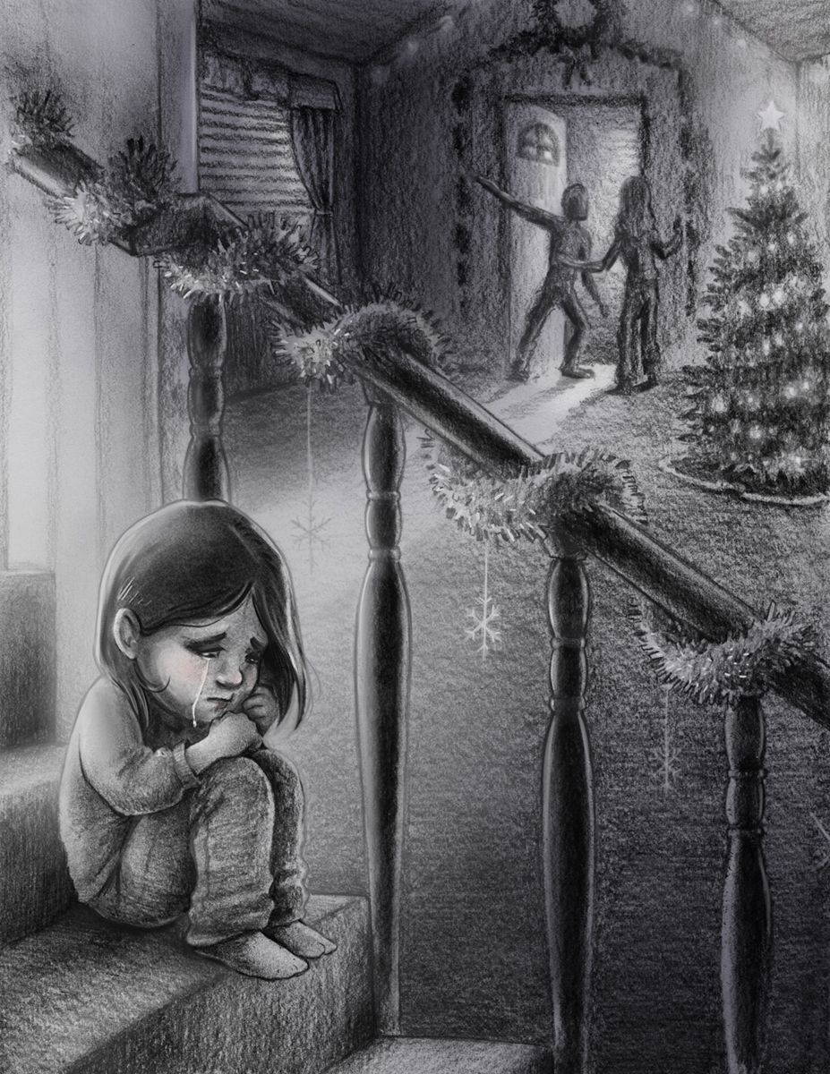
Giving up on this one for now. I rushed it again, but I'm tired of rushing art. I spent about an hour penciling this and it shows, so much heavy grain from quickly shading... Digitally fixed her face, and some light and dark values.
Too much going on between holidays, family showing up, people showing up, other freelance work that is more important.
I might go back and redo this in the future.
-
Overlaid some color, and slapped the text back on. Going to submit even though Im not 100% happy with it. Would still be nice to possibly get some feedback on at least the composition, feel, etc. I actually think the monotone adds to the sadness a bit.