Slovember - feedback welcomed!
-
Hi everyone!
I was really stoked when Lee White announced the Slovember challenge but I was really busy so started the whole process really late. I didn’t do enough research or experiments as I would have wanted to. I have this tick of wanting to finish every piece in one sitting... which is not always the best strategy.This challenge was a very good reason to take things slow and create a portfolio worthy piece. (Not that there’s anything stopping me from creating any other time, but still)
I knew from the beginning that I wanted to create something detailed. I’m not particularly confident of creating indoor spaces so wanted to explore more in that area. I decided on a toy shop theme.
These were my inspirations (Also Will Terry’s ‘Draw 50 things’ challenge)
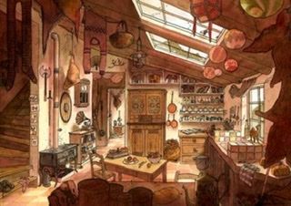

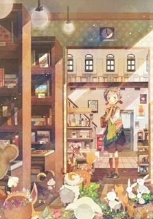
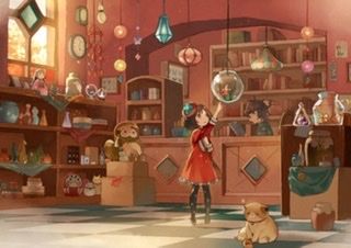
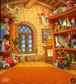
I started with creating my own space layout And perspective but nothing was feeling right.
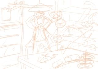
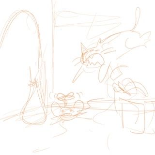
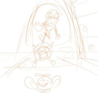
Finally I chose one of my inspirations images and created a similar space layout with making a few modification in the structure.
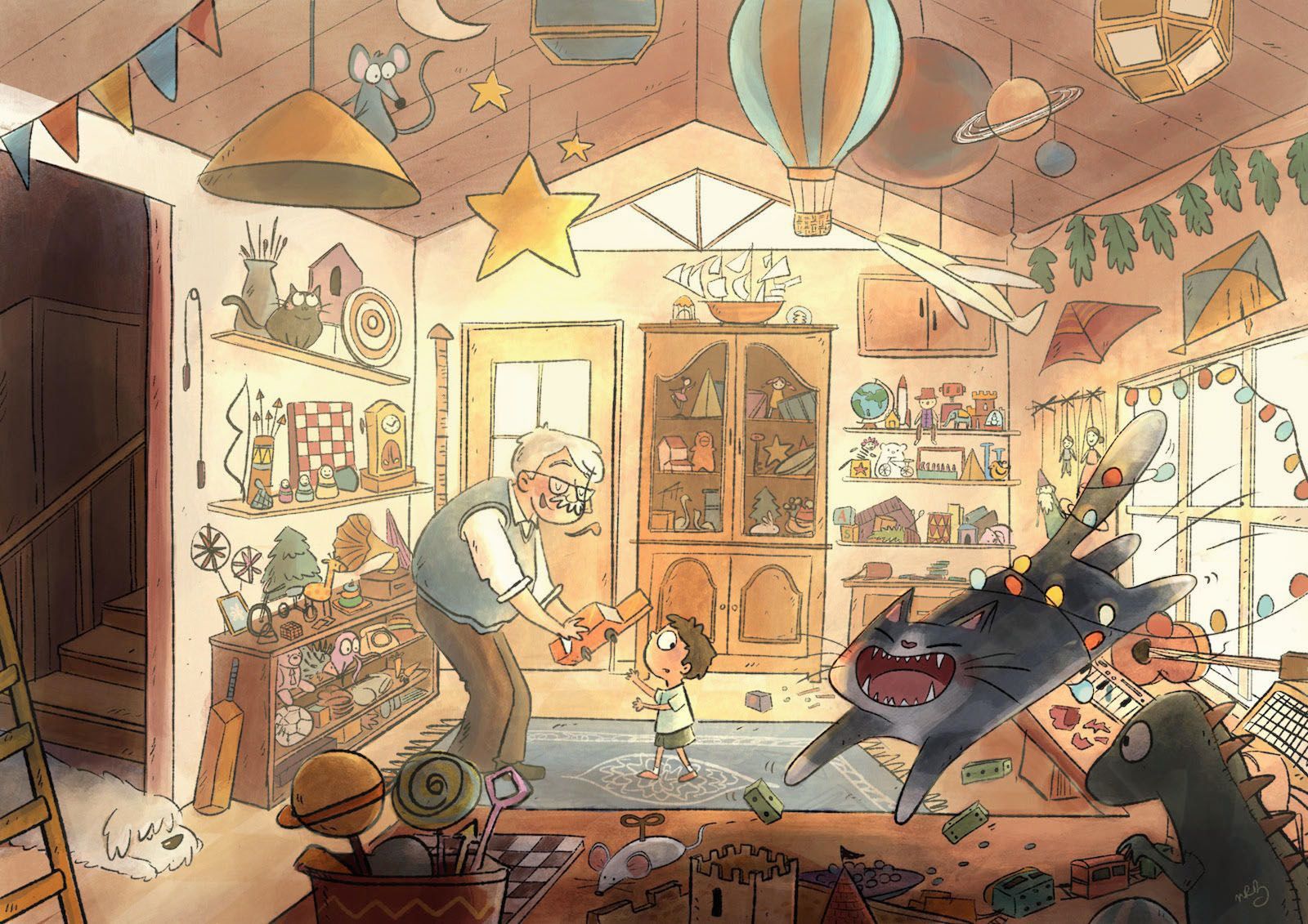
Initially I was planning to have the old man freak out about the cat creating chaos in the shop (as you can see in my draft sketches) but finally changed it to a more calmer mood. The cat is still creating chaos but now it’s like an everyday-thing.Feedback’s are most welcome! If there’s anything I can do or improve my piece in the next 2 days I’ll definitely do it!
Here’s my latest render.
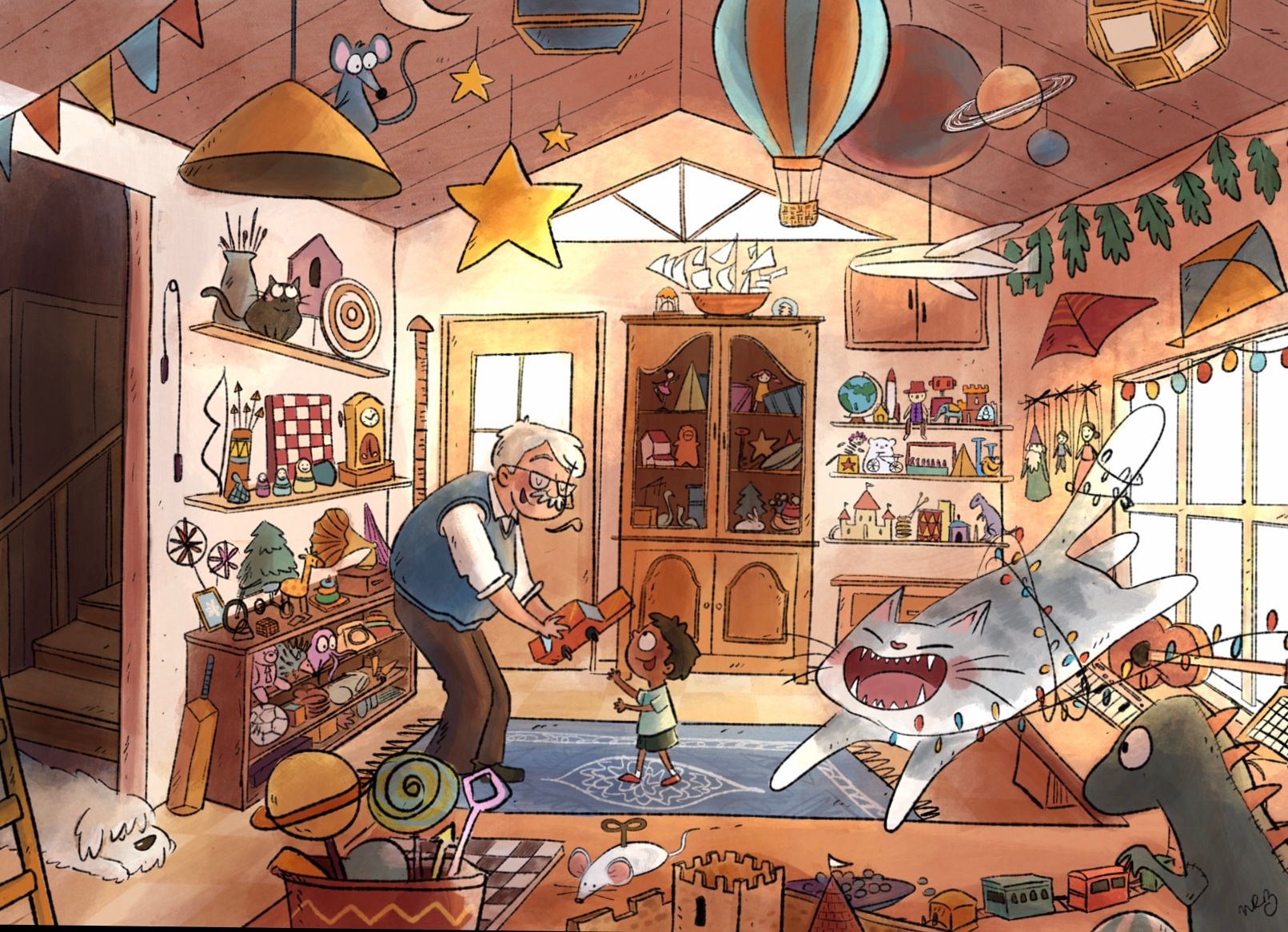
-
HI! I really like your reference, your feel, your technique, your character design, your colors (nice mix of warm and cool, even within the same area of local color at times), your details (you got the 50 things in quite successfully), and man that was fast!
Here's what I see that might be improved:
-
The (hilarious) cat, being the largest thing in the scene, literally leaps out at us. But he's the only chaotic thing, and as such, it reads as an anomaly. Think about what would happen if there were more physical chaos in the shop, but the owner remained cool. I haven't thought it through, but it might take as little as a few overturned toys behind him, just to create a trail. And I wonder (not at all sure but it's just an idea), what it would be like if the boy were reaching for the toy, but he's looking out of the corner of his eye at the cat? In all, maybe it's a focal point issue. What is the story about, the gift or the chaotic cat?
-
Your composition is quite centered, perhaps 1 point perspective (not an expert, but that's how it reads to me). Every detail is interesting (haha, just noticed the mouse taking refuge on the hanging lamp and the other cat watching him!), but maybe over the next couple of days you could get a mask and try a few crops to see if there is a way to skew it just a bit.
At any rate, I'd say it's a quite successful 50 Things exercise! Looking forward to seeing the final product!
P.S. What is that first reference photo? I particularly love it!
-
-
I think this is very fun! 1 point perspective doesn't bother me. I only have one small addition and if I have missed it I apologise. The chaotic cat -where is his/her shadow to place on the counter space. I see a little but I had to look for it -and not sure that's the shadow for your cat.
-
@Neha-Rawat this is so pretty!!! I love all your reference illustrations too. The colors are inviting and warm. I have two suggestions. 1. I think the focal point is a bit lost. The cat is a different color and he’s so big in the foreground that he draws the eye. But, the people in the background are also pulling me. I’m not sure which one is supposed to be the main focus. I think it would be a fun surprise to find the cat making trouble in the picture when you look closer. So, my instinct would be to tone him down and push the lighting to highlight the people. 2. The space looks more like a home than a store. There’s no counter or register visible (which may not be necessary). It actually reminds me of those old shops that have a home above them. Maybe you could put a couple of signs up to make it clear. “Toys and Repairs” somewhere and, maybe a diving rope and a sign that says “Private Residence” or something blocking the doorway to the stairs...
It really is lovely -
Thank you so much for your feedbacks! I agree I totally missed the focal point. It started out by being about the cat but the addition of the other characters and the lighting sort of diverted the focus.
I've made some subtle changes:- Changed the kids expression to focus on the cat
- Tried creating a trail of mess (this was quite challenging since all the details are so small - should have planned this out in the beginning!)
- Darkened the foreground / cat and brightened up the background characters.
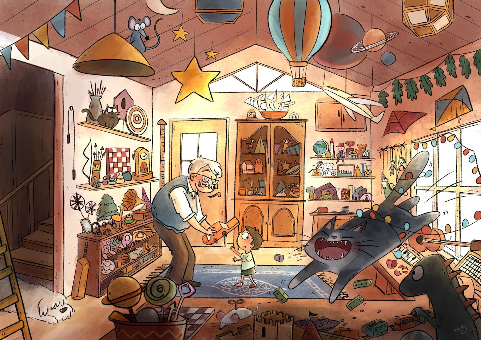
I've never been so confused with the coloring before! I really want to highlight the cat in the shadow but I'm not sure of which colors are looking best.
I tried 3 color variations for the cat. I think the 2nd one looks best but I'm not a 100% convinced. Help!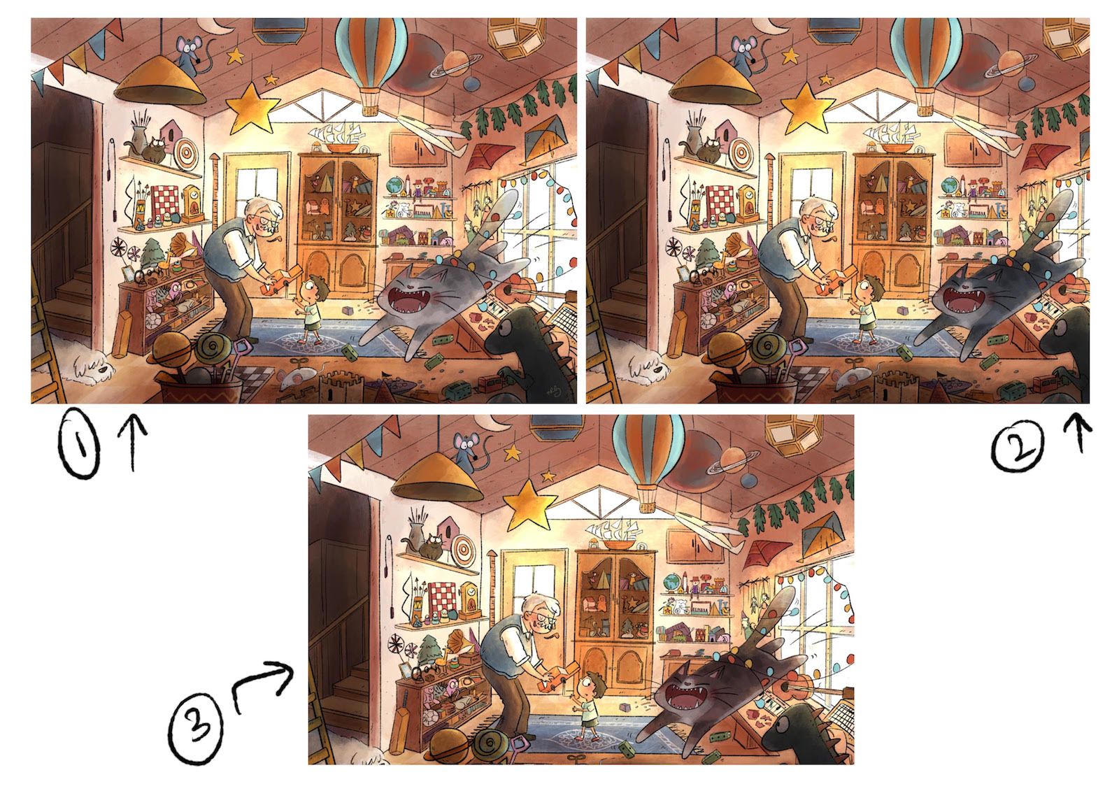
-
Great work so far! Concerning the cat: Why not turning on the lights? You could make them glow, and before that maybe even darken the area around her (shelves) so she can pop?
-
@Neha-Rawat Really lovely illustration! :smiling_face_with_open_mouth_smiling_eyes: It feels magical

with dealing with focus. Once you introduce human characters in your illustration the focus goes right into them. If you wanna have the cat as main focal point as it is. I think you need to downplay the characters and surroundings and lit the cat well. I agree with @Meta on that. And maybe there is dust from all the things sitting there for years so maybe you can create some sort of "fog" in the room behind the cat so there is less contrast on the area behind and greater contrast on the cat. I will try to make overpaint once i am at home.
But I think it works well even as the cat is second read. That it is more about the boy noticing this cat all of a sudden.
 Anyway good luck.
 -
I like both 2 and 3. 1 blends in. And good job upping the chaos!
-
Here is a real quick paint over just to show what I mean. I just added a light layer and erased the parts when more contrast was needed. It is done very roughly but I hope you get the idea.
Just a suggestion tho! Do what you feel is best for your idea

Oh, and the table in the foreground is touching the carpet on the ground. So it looks like there are on the same plane.
