A little late for Fall!
-
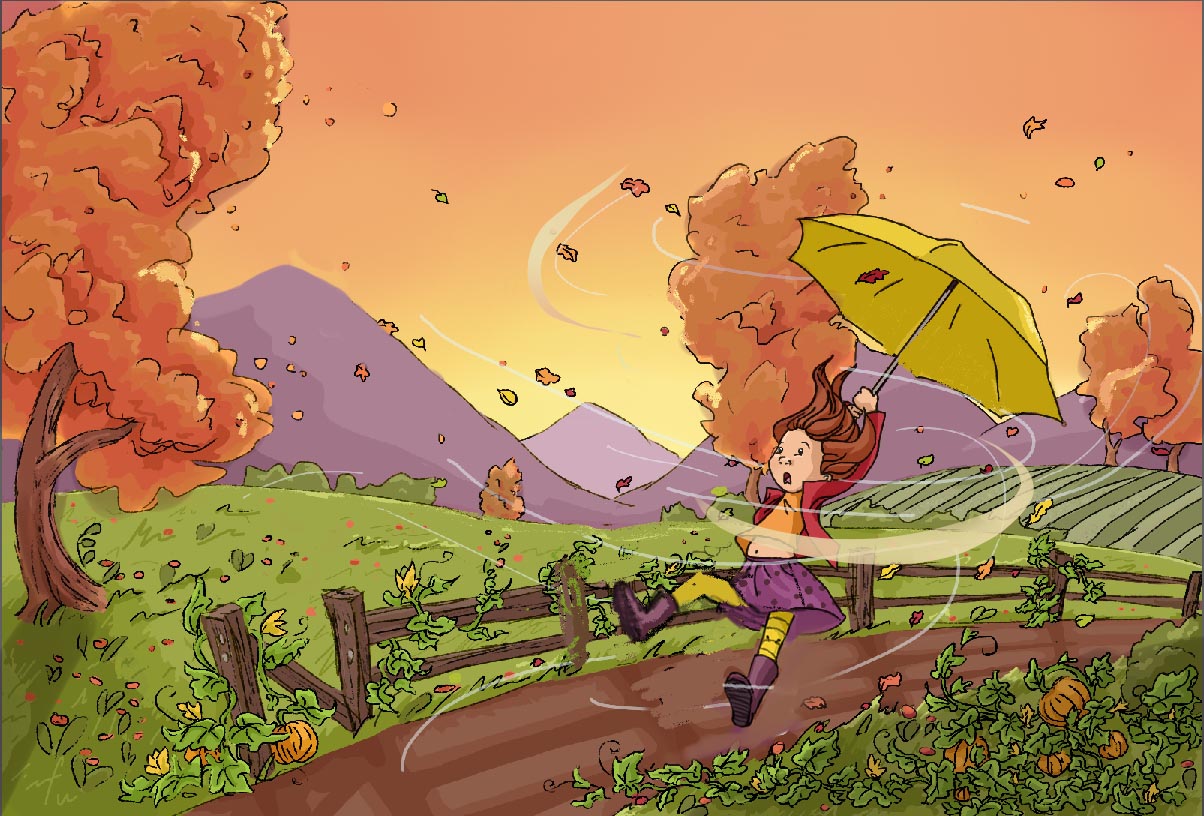
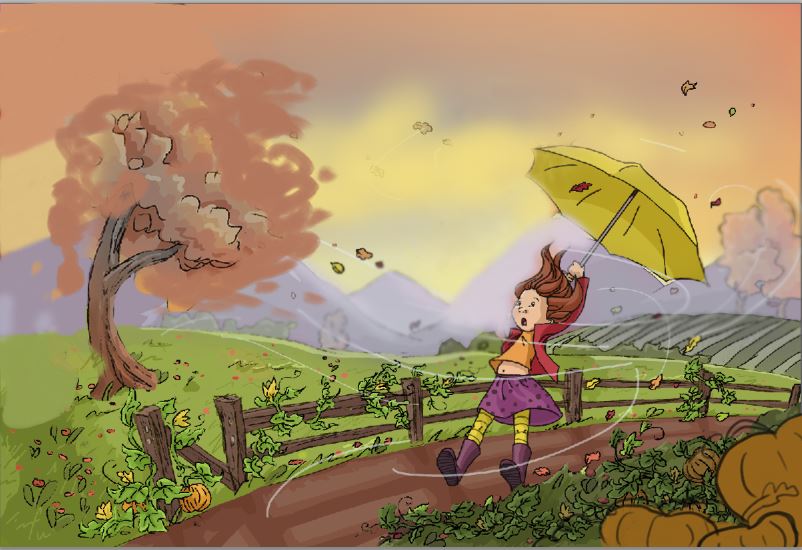
Hey all, just wanted to share this small piece I did for fall this year.
") Any comments or critiques are welcome and I'm still very much in learning mode! Thank you!
Any comments or critiques are welcome and I'm still very much in learning mode! Thank you!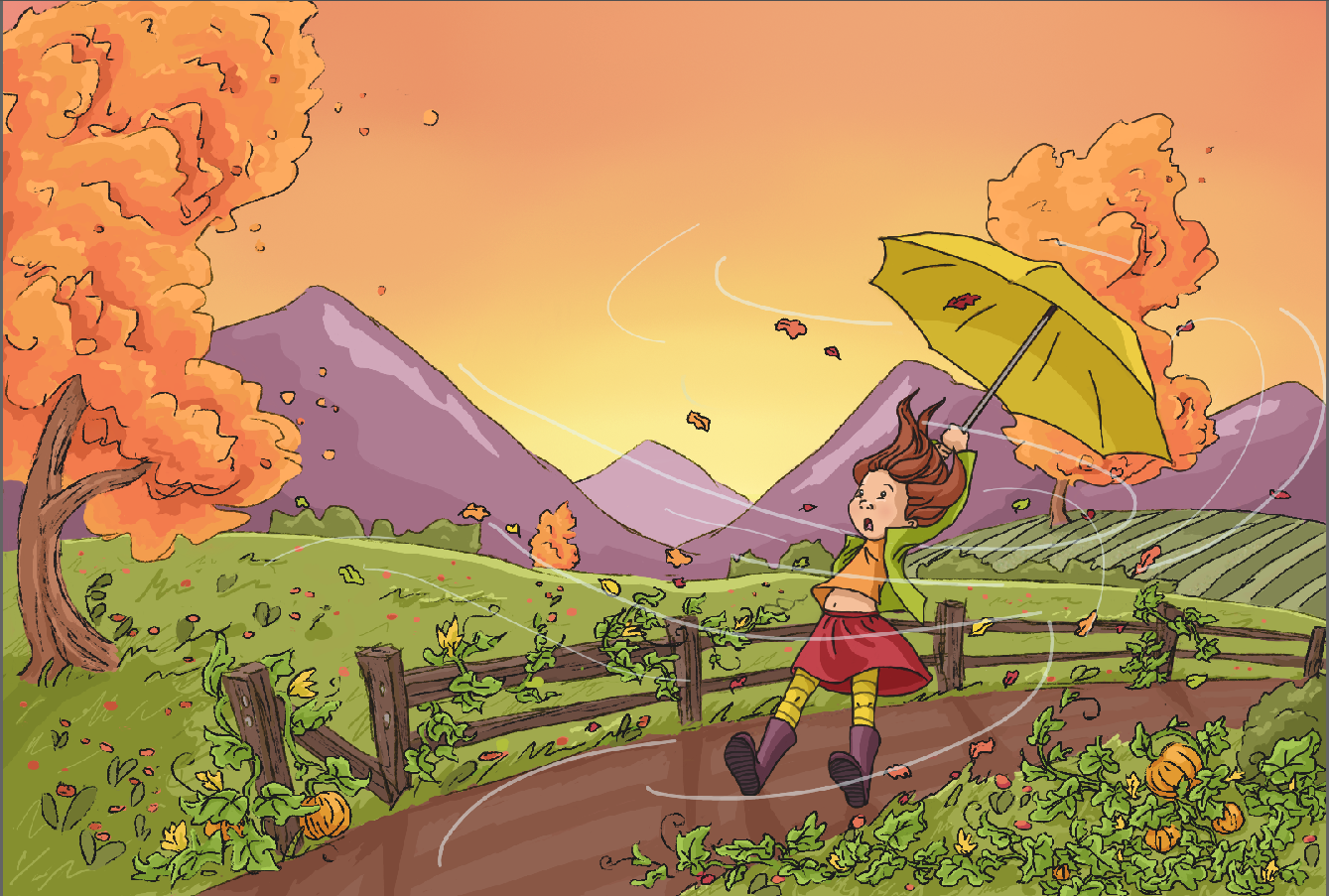
-
Hi! This is really a very nice piece.
Here my two ideas to even improve it. I found the tree right behind the umbrella a bit distracting. Both seem to be in direct contact on the first glance. Maybe you can shift the tree a bit to the right? The second point is that I missed clouds. With such a stormy weather it would be very likely that there are some interesting clouds showing up. They would also be the reason, why she is walking with an umbrella.
The colors are really appealing. -
@bharris I agree with @Jana and would move the tree. Also I would suggest changing the color of the girl's coat to perhaps...a dark value to help her stand out from the green of the field. There are a lot of great things about your image as well. You have used color well and I like your limited palette. Very nice!
-
@Jana, Yes I'm seeing that very clearly! I played with clouds but couldn't seem to get them quite right! I'll keep working!
@Rob-Smith I will work on that tree, it is a little too close. You're right about her coat, I was too close to see that was part of the reason she wasn't standing out.
-
yes Jana is totally right about the tree. Moving it somewhere else would improve this greatly! I love the feel of the wind in this and you did a great job!
-
I agree with everyone else about the tree. Love the movement you have in the girl's pose!
-
This post is deleted! -
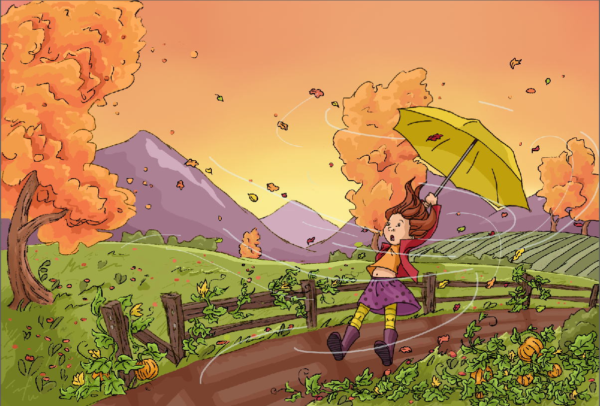
It this any better or should the tree not touch the umbrella at all?
-
For me the perspective is much more clear now.
-
@bharris The problem for me is not necessarily the tree. It is the fact that nearly everything is full chroma in the image. If you leave the character full chroma and reduce the saturation of the tree behind it will be less distracting. Also, if you turn the image to grey scale you will see that the values are very much the same throughout the image which give you a feeling of not knowing where to look first. Try darkening the pumpkin patch in the foreground and reducing the contrast of the items beyond the first hill. Push the contrast and shadows from the large tree in the left and from the fence. Use the patch of green not in shadow to the right of the tree to direct the viewers eye to the girl.
-
I took a lot of suggestions and here is my result. Thank you all for the help!
-
@bharris So much better!! What if you darkened the most grass/leaves in the foreground a little to given even more of a sense of depth to the image. Just a suggestion for an already great image. Your drawing is so nice! I feel the girl stands out much more now that you have added that red coat.
-
Thanks Rob, your suggestions are really helpful!
-
@bharris said:
should the tree not touch the umbrella at all?
Your new update looks wonderful - but I think that perhaps the tree behind the girl is distracting - My eye goes right to it, and it competes with the girl as to subject. I don't think you need it, You have enough going on interest wise in the girl. Love her new red coat. Try blocking the tree out and see what you think, perhaps?
-
Yep, I think you can skip the tree too. Its a real nice illustration! maybe add some more leafs?
-
I hope you don't mind me doing this! I really liked this piece! I was reading through the comments and saw these suggestions so I thought I'd try them out.
That big tree on the left felt like it was blocking the wind and it was really bright so it caught a lot of attention. I made it smaller and moved it over so the wind could get through. I also desaturated the orange to push it back.
I darkened the foreground and added big pumpkins for size variation and to push the girl into the middle. I painted out the middle tree. That middle tree was all up in her business.
The mountains in the background were pretty purple but they didn't feel far away because they were so bright and defined. The mountains weren't that important to the story, the wind and the girl are the main players, so the mountains can be pushed back with less color or blurring.
-
I think my problem with the concept is any wind strong enough to bend a tree, would probably make a human fly... which could be a much more fun pose to think about. I also prefer the saturated colors you used in your original, as I think it plays well with your almost tv cartoon style. You're really good at showing the action in this piece, I think that's its strongest point.
-
@gimmehummus I don't mind at all, it helps to get reference. I really liked the up close pumpkins, the clouds and taking out the tree and moving the other one, I think that will be my next move. The reason the colors are this way was because I was challenging myself to work from a pre-made color pallet I found and inspired me.
I like the darkness though if I was going that way.
@Bobby-Aquitania I think she is just about to fly
") Thank you!
Thank you! -
Definitely keep it bright like you have around the girl. It's a lively color palette. My husband looked over and really liked the bold colors. Lightening and darkening that palette, to add a sense of depth and pull out your character, wouldn't be going against your challenge.
-
What a lovely image. This has a great animated quality and I love the color palette.
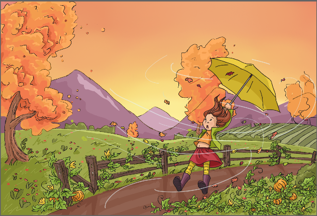
Here's a couple of suggestions. I love the "dragged" quality you have with both heels still on the ground. But with how active the wind is, I wondered if maybe changing her leg position would help add some energy. So I gave it a whirl here to see if it worked. Feel free to adjust as needed of course.
I think you could simplify some areas too. I darkened the trees a bit and lost some of the highlighting around the image. The wind marks you have by using a single weight line seem like they need some help. I added two marks that show more of a "thick to thin" type mark which can add some design element there. I'd change all of them to have some sort of weight variation.
Really cool image! : )