Portfolio piece- Critiques welcomed
-
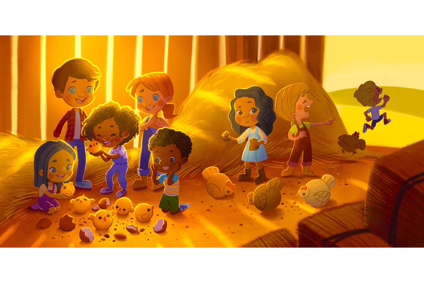
Hi, everyone. I’m back at it again. I’ve been advise to add more kids of various races in my portfolio, I’ve already finished 1 piece below and I’m working on another one. I aim to finish 1 piece per week for this week, finishing 3-4 pieces this month.
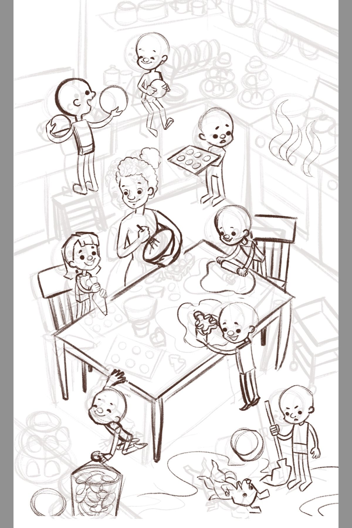
Please feel free to give critiques for my second piece. For this illustration, I wanted to show kids helping their teacher perhaps to cook cupcakes an cookies for an event. This sketch is still very rough tho.
Critiques are greatly welcome. Thank you very much.


-
Gorgeous finished piece! The sketch is wonderful too. Maybe the kid in the bottom left is leading us out of the comp? Not sure, but it's something to look out for. Can't wait to see the final. You are very productive lately. :smiling_face_with_open_mouth:
-
Hi, @Nyrryl-Cadiz what sort of critiques are you looking for? Composition? character development? I really like the first one. The lighting is really good. Some of the characters look very similar in ethnicity/race. For example, I couldn't tell if the little girl was supposed to be Latina or Asian/pacific islander or Mediterranean, or Arabic. I like that personally because it leaves more room for kids to see themselves represented. Is that what you were going for?
As far as the second one goes, I think that you might want to increase the size of the kids slightly and subtly as they get closer to the viewer to create more depth since you are looking at a larger space from an expanded perspective.
-
@Nyrryl-Cadiz Cute, and lots going on

One thing my eye keeps getting drawn to is the angle of the table compared to the cupboards in the background. The table is just slightly rotated and so reads as a bit off. I think you could try either aligning it with the cupboards or (probably better) rotate it a bit more so that it looks definitely deliberate.
-
I love the little baby chics in the first one, they're adorable and the chicken chasing the kid, so funny!
On the sketch, One thing maybe to look out for would be tangents. These could not even turn out to be an issue when you get to render but the kid at the bottom left hand and jar of cookies. The kid holding the cookie tray, his feet are very close to the other kids head, I would move so they're overlapping or not so close. Similarly with the kid with the cookie cutter at the table, his feet are very close to the kid under him, well his mop.
I would look out for mirroring too, in the poses. I notice it here in the legs and feet of the kid washing dishes, kid holding cookie tray and kid holding mop.
I love the vibe of the piece can't wait to see it come together, you could maybe play with scale a little to add depth.
Hope that helps

-
I LOVE the finished piece - the lighting is awesome and it reads well - I love the flow, the way you take in the group of kids oohing and awwing over the baby chicks, to the girl feeding chickens and hearing the commotion, to the boy laughing at his classmate, to finally, the comedy of the boy getting chased by the chicken. The storytelling is wonderful, and I think this piece leads the eye to read it in levels in a great way.
The sketch is great too, it also gives your eye a direction and flow. I agree with the poster who said the character in the bottom left may be leading the eye off the page a little, but that may be the way the cookie jar is cropped. I would be curious to see what the character in the middle behind the teacher is looking at (is the stove boiling over?) Would love to see it when it's finished!