Urgent feedback on thumbnail
-
Hello SVS-ers!
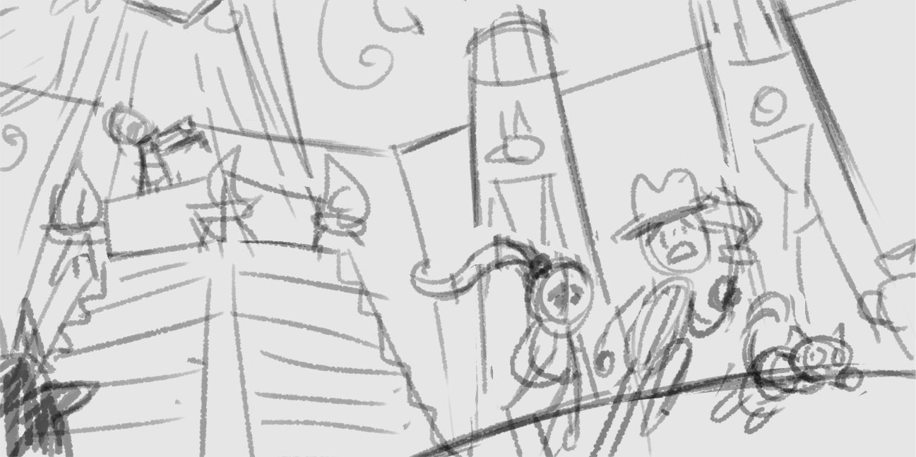
I'm going to be participating in an Halloween feature at my new agency. Yay! The theme is classic horror stories and I chose the mummy. It's a great opportunity and fun theme so I obviously want to challenge myself and do a very good piece, but the deadline is also very tight! I have to hand in the sketch Monday and due to a lot of contracts in the last couple weeks I only started yesterday. I'd love to hear what you think about my thumbnail:

I managed to do about 30 thumbs this time (progress, I usually croak at 10!) but this is the only one that really speaks to me. Would love to hear what you think of the composition and if there's any glaring problems I haven't caught. Thank you so much!
-
Looks good! I would make the figures in the foreground bigger so we can really feel that dimension. And the indiana jones fellow should be the biggest so we all see clearly that he's in the forefront
-
@NessIllustration looks good.
Just my thought process when I look at your thumb, for what it’s worth, I hope it helps and best of luck with your piece.
I take it they’re inside the pyramid. Are they hyroglyphics on the pillars?
Do you know how the lightings going to work? Is it going to be back lit from the tomb where the mummy is. Are the figures at the front to be in shade or lit?
Is the mummy to be lit up?
Is the perspective on the pillars slightly off due the style/ design of the drawing (I like it when you see illustrators play around with perspective) is it angled to the mummy for emphasis or could they be made wonky to make it feel uneasy .Love your work Ness, best of luck and I hope this helps.
-
@Perrij Great advice! With the wonky perspective, I'll be extra careful to differentiate the figures by size to create some depth!
-
@peteolczyk Thank you so much for your feedback and questions!
Right now what I'm imagining is the biggest light to come from the little opening in the ceiling over the mummy, bathing the mummy in white light. The characters fleeing will be back lit, and also get some light from the torch the guy is carrying to put them in focus a bit more. The rest will be mostly in darkness! Thanks also for making me notice the pillars are way off. My style is a little bit of wonkiness in the perspective, but certainly not that much! I'll have to tame that during the sketch. Thanks so much for your time, you were so helpful! -
I would prefer to see an overhead shot of the mummy looking down at the people running away. The mummy looks small and far so it doesnt feel intimidating and since everyone else is already ready running it comes off safe and cute. Which is fine if thats what you want.
If you dont wanna change the angle, make the hat fly off as they are running out of there!
-
@NessIllustration thanks Ness Can’t wait to see your finished piece
-
@Aleksey That's a great angle idea and would be a lot more scary, but you hit the nail on the head with me wanting something more safe and cute! I cannot image my style working with anything scary (lol) so I'm going for a children's book style safe retelling of the story with a more fun and cute feel. The idea of the hat flying off is so fun and I LOVE that, thank you for the suggestion friend!!
-
@NessIllustration i think your work looks pretty solid!
-
@NessIllustration keep at it! Glad something I said was helpful!
-
Everyone else had great feedback so I'm just going to add a bit to that. My first thought was kind of along the lines as @Aleksey with it looking rather safe for a chase scene. If you are okay with wonky perspective, you could try playing, exaggerating, and pushing the perspective to create dynamism and a sense of shakiness and unease. You could also try falling rocks to go with the perspective stuff to indicate danger. You do great work, and this sketch looks awesome already, so go with what you like/have time for.
-
@Zachary-Drenski Ouuhhh I like the fallen rocks idea! It could be like those booby trapped, self-destructing chambers! That would be wicked cool! Thanks for the idea Zachary

-
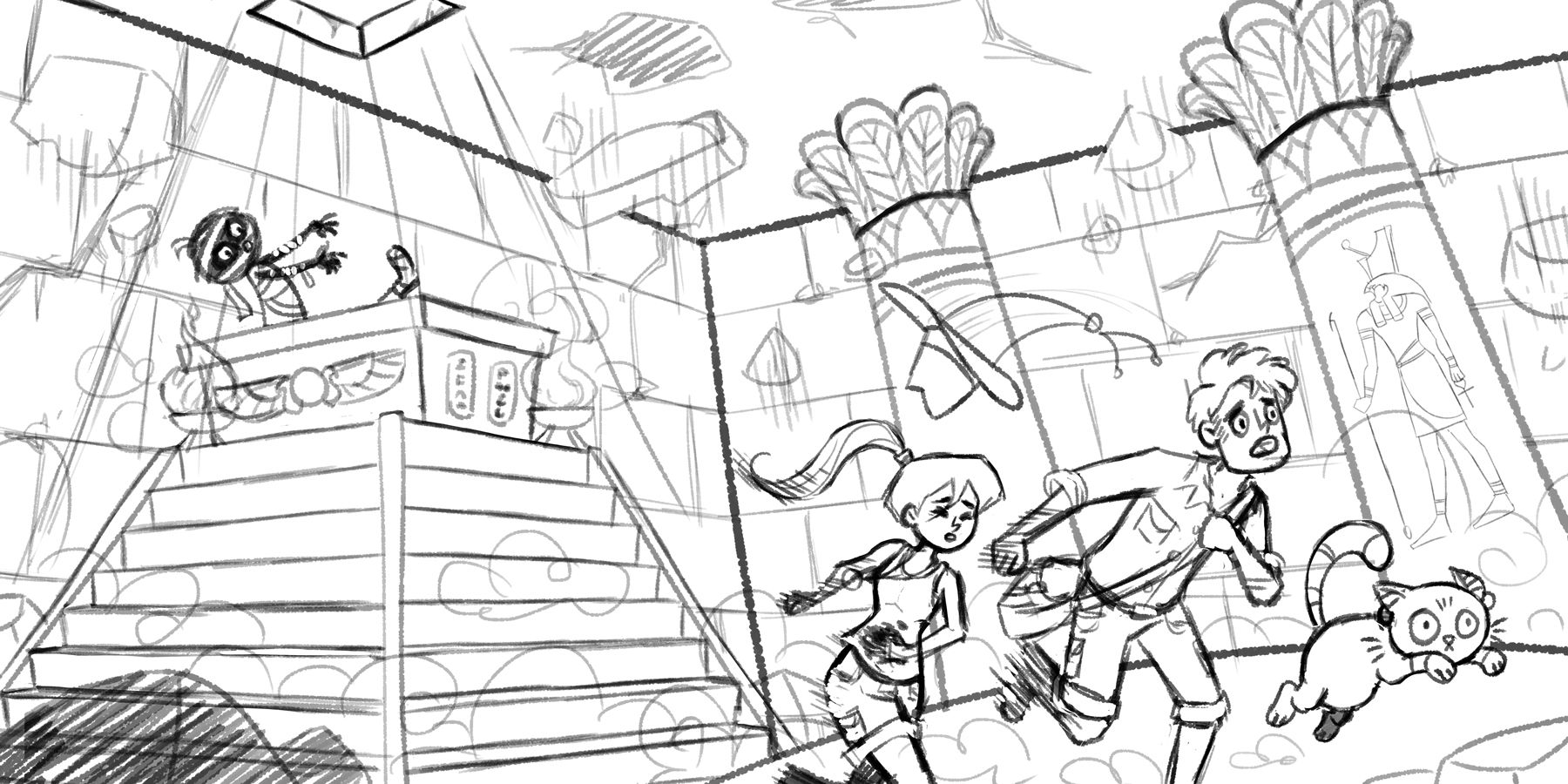
@Aleksey @Nyrryl-Cadiz @peteolczyk @Perrij @Zachary-Drenski Thank you so much again for your feedback! Here is my sketch.. What do you think?

-
@NessIllustration I think that’s great Ness
-
@NessIllustration the middle guys leg or arm positions should be reversed (opposite arm/leg) and make the hat flying still but closer to the guys head so it still feels like his hat and not a random hat flying off of someone.
-
@Aleksey Great advice for the hat! For the limbs though, are you sure?
 He's bringing up his right leg now so he's in the middle position - where his arms should be in the middle as well. His right arm is currently moving back, opposite the right leg, and the left arm is holding on to the bag so staying relatively put. This seems right to me, but I may be wrong cause sometimes I mix it up with these running positions
 -
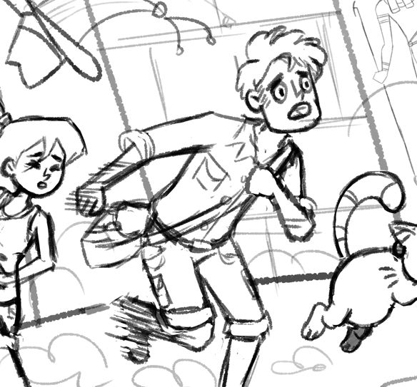
@NessIllustration if you take his bent leg and bring it forward instead of back it will look better. Try it! It’s a minor thing though i dont think it matters because hes clearly running and some people run differently from others maybe i run weird...
-
@Aleksey Do you mean like this?

-
@NessIllustration i cannot tell the difference
-
@Aleksey Oh.. Then probably not what you mean ^^''' I brought the right leg forward, closet to the other leg..