Inktober practice for day 1 prompt and advice appreciated 🙃
-

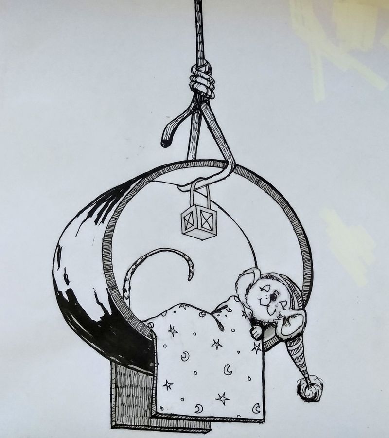
I am planning on doing inktober, first time and I'm just learning inking now. Done a bunch of practice exercises but this is my first sketch I've ever inked, tho to be fair I sketched it 4 times before this ( all today tho)! Combo of micron technical pen and my pocket brush that just showed up a few hours ago LoL. Oh also a value 3 Winsor Newton cool grey brush marker to see how that went.
I'm looking for feedback and especially interested in the ring ( it's supposed to be a wedding band found by a mouse and used for a bed). I want it to look shiny. I think maybe it looks more like wood? I watched inking videos by Jake where he shows how to do shiny stuff but not sure I'm getting it. Also the value is so dark.
My goal in doing inktober is to take part in about half of the prompts and I'm more interested in practicing perspective and composition, characters and story as well as learn about inking. I've done so many rough sketches this year I want to finish up some illustrations.
Any advice or thoughts are quite appreciated! -
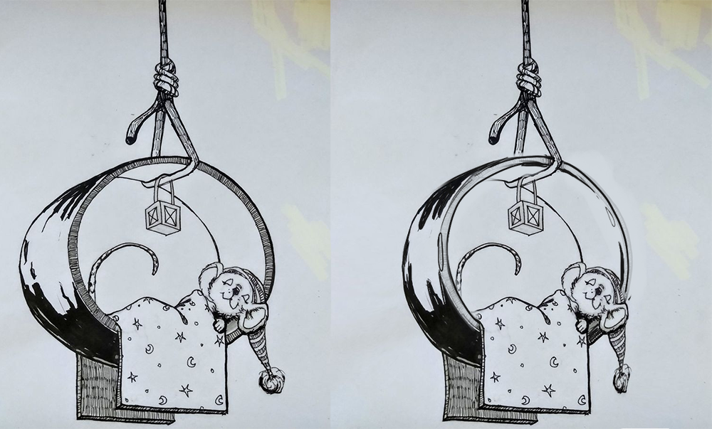
Hi @Coley! This whole concept and overall drawing are A+! I love it. I think it would read better as a wedding ring by being a little more subtle with the way you handle the contours and by maybe smoothing out the dark reflections in the metal. One tip to remember is that circles will start turning into ovals the more they turn away from the viewer. Since the ring is a circle and it's turning away from us, I find the width of it a little jarring. My paint over is very rough, but hopefully you can better see what I'm suggesting. I'm not exactly sure how to render metal in just black and white ink, but I think the contours take it a little closer than before.

-
@TessaW thanks so much! That makes a lot of sense. I had trouble with the perspective on the ring and tried putting a box around it and my points on horizon line, I struggled with it a bit....ok a lot Ha ha, I think the redraw looks right to me. I think your dark ink shadows are a bit simpler than what I had too and look better. Maybe I had too many thinner pieces and that's why it looked a bit like wood.
Anyhow thank you so much! -
@Coley i gotta say i just finished drawing a rope in one of my ideas and i really like how you drew yours
-
@TessaW's advice is spot on. I just wanna say great work on the contrast and hatching though

-
@Aleksey thanks

-
@Amanda-Jean thank you! And yes, Tessa's advice was perfect!


-
@Coley It's tough to make it read as gold in black and white. You might consider using a gold paint pen. I've seen many artists supplement their inking with metallic tones for good effect.
-
@chrisaakins thanks for the idea. I bought a gold pen the other day, will play around with that. I think it's a gel pen (pen and ink is new to me). I guess a paint pen is probably different, I'll look it up, not a lot of art supplies where I live so I have to order stuff in! although we have Staples here, maybe there would be something there if gold pen doesn't' work. I am planning on coloring the illustration in photoshop later anyhow.....so much to expiriment with
