How to ink 2.0 Group Runthrough Week 2
-
Hi guys! This is where some of us are working through How To Ink 2.0 in the weeks running up to Inktober! There are 5 weeks to get through the meatier bits of the course, which gives us just enough time

Everyone's welcome to participate, but in order to have access to the classes and homework you need an SVS subscription. It's worth it.
If you wanna join and want to catch up, feel free to check out week one here: https://forum.svslearn.com/topic/7905/how-to-ink-2-0-group-runthrough-week-1/123
Feel free to do digital or traditional. It's all good.
This week.
Watch:
'Contour line' series of videos.
I'd watch the demo, even if you don't think you need to. There's all sorts of interesting little tidbits of information that sneak in.Homework:
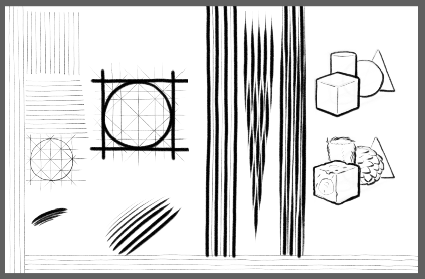
Do the exercise that Jake shows with the shapes.
AND
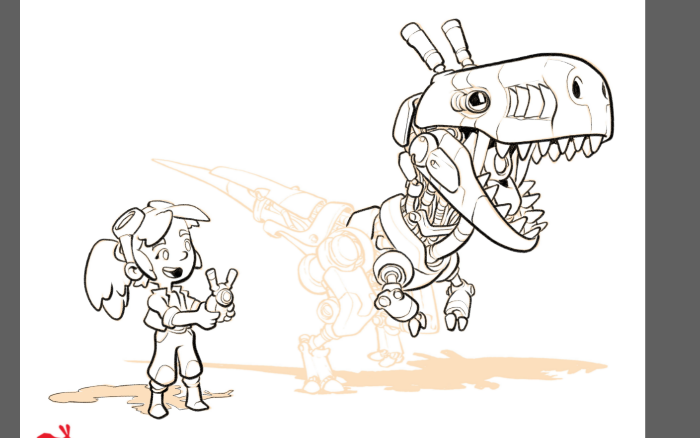
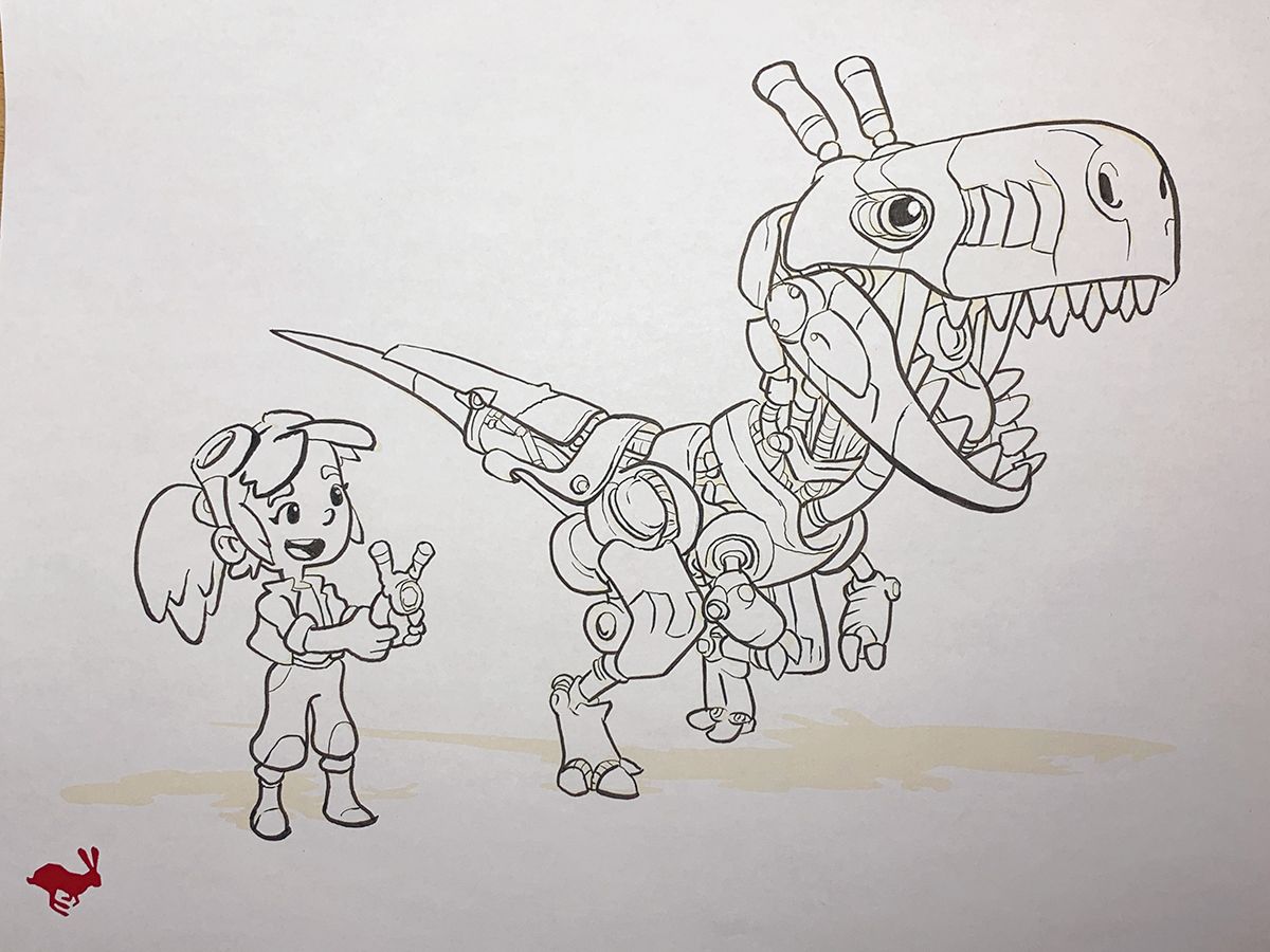
Ink over the example with the little girl inventor. Really think about those contour lines. Don't feel overwhelmed if you have a hard time keeping track of all the things that contour does in a drawing. There's a LOT of hatchets to juggle this week
")
Extra special awesome homework that all the cool kids are doin':
Do the exercise that Jake shows with the shapes every day this week as part of your line practice.
AND
Render the shapes with a texture (feathers, cloth, rough metal, wood, etc.) so you have a cube of fur, or a sphere of scales, etc.
Feel free to post comments/questions/homework and ask for feedback here
!And have fun

** edit **
If anyone wants to chat (like, microphone chat) or have a conversation in a non-forum format, there's a lot of us using Discord. Feel free to PM me and I'll shoot you a link to join
-
Here's my exercise and ink-over for this week. I had to stop the ink over a bit early, but'll get back to it later
It's amazing how MUCH information varying line width can convey in a drawing. I really need to work on increasing the number of gears I have when it comes to line width. Right now I have three; small, medium and large, lol.
One of the things that's really stuck with me so far this week is how often the words 'suggest' and 'imply' are used. It's hard to remember that we're using ink to imply that something is there on the page.
I'm learning a lot already and I'll be doing the exercise as part of my linework dailies
-
@Braden-Hallett nice and smooth!
instagram and twitter: @artofaleksey
alekseyillustration.com -
@Aleksey Slow and steady makes nice smooth lines
-
Well, you win some, you lose some. My line work was horrendous in these exercises. I am a little sleep deprived and I am hoping that has something to do with it, otherwise I'm really bad with a brush pen
 ...which is okay too I suppose.
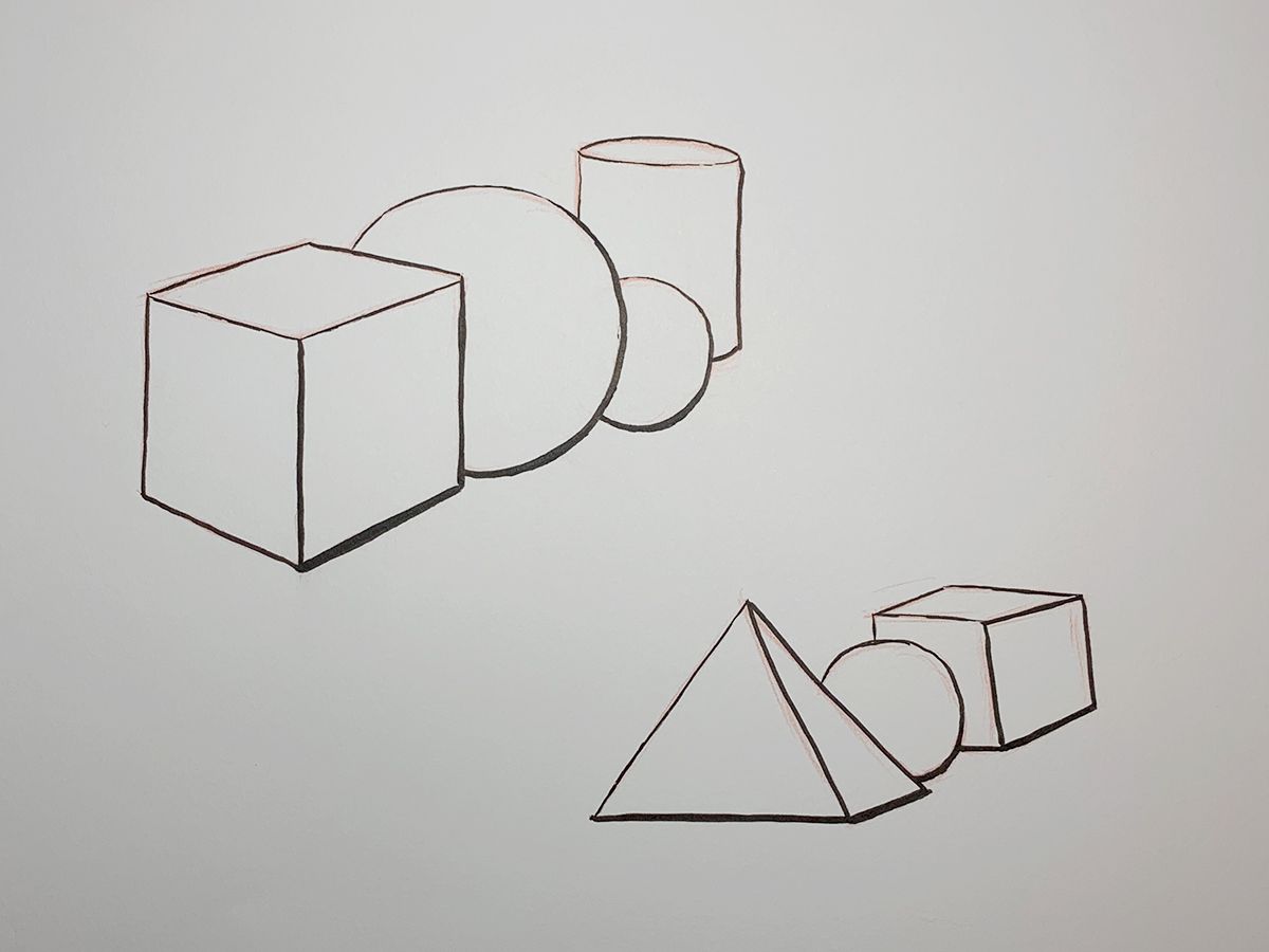
-
@Erin-Cortese said in How to ink 2.0 Group Runthrough Week 2:
I'm really bad with a brush pen
It always seems that way until suddenly you're actually pretty good with a brush pen

It blew my mind that thicker outlines on closer/more prominent objects makes them pop. Yours look pretty good
-
@Erin-Cortese Also, when it comes to a physical brush pen you're miles ahead of me
")
-
@Braden-Hallett really? It usually ruins mine
-
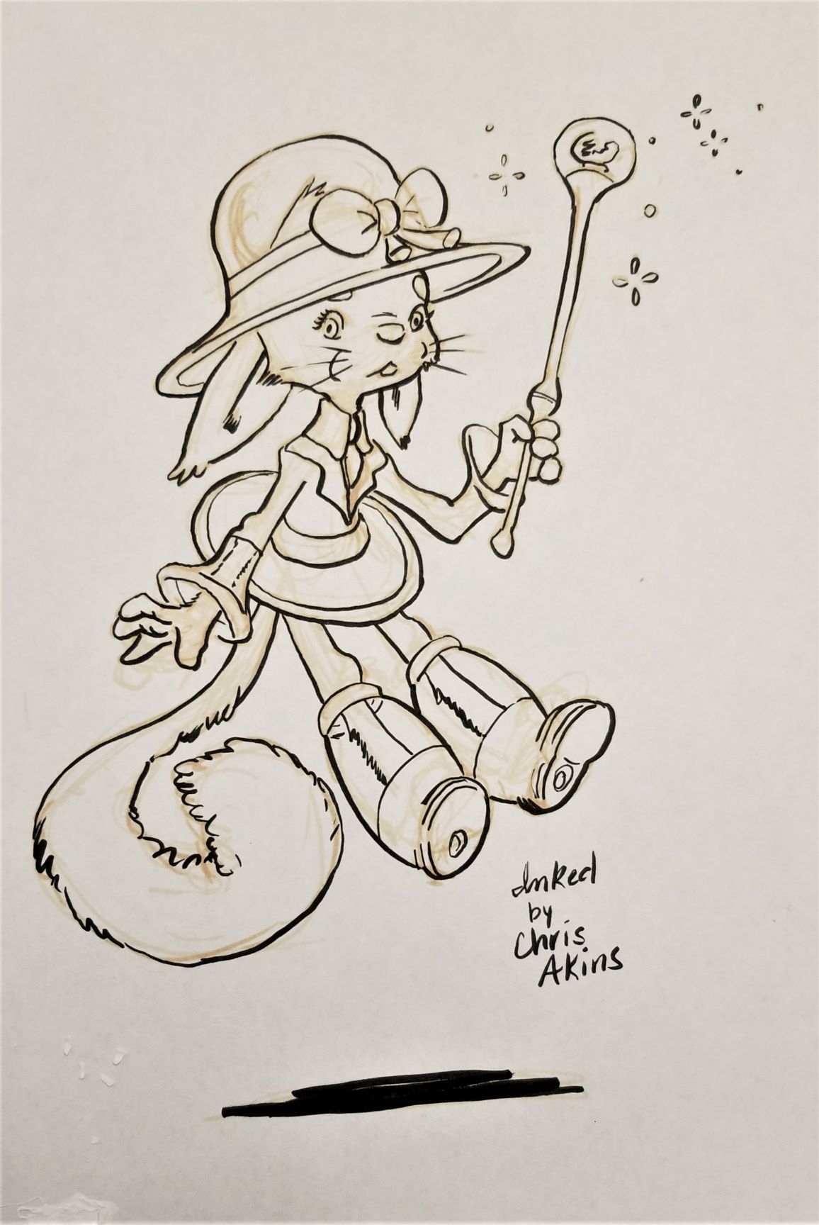
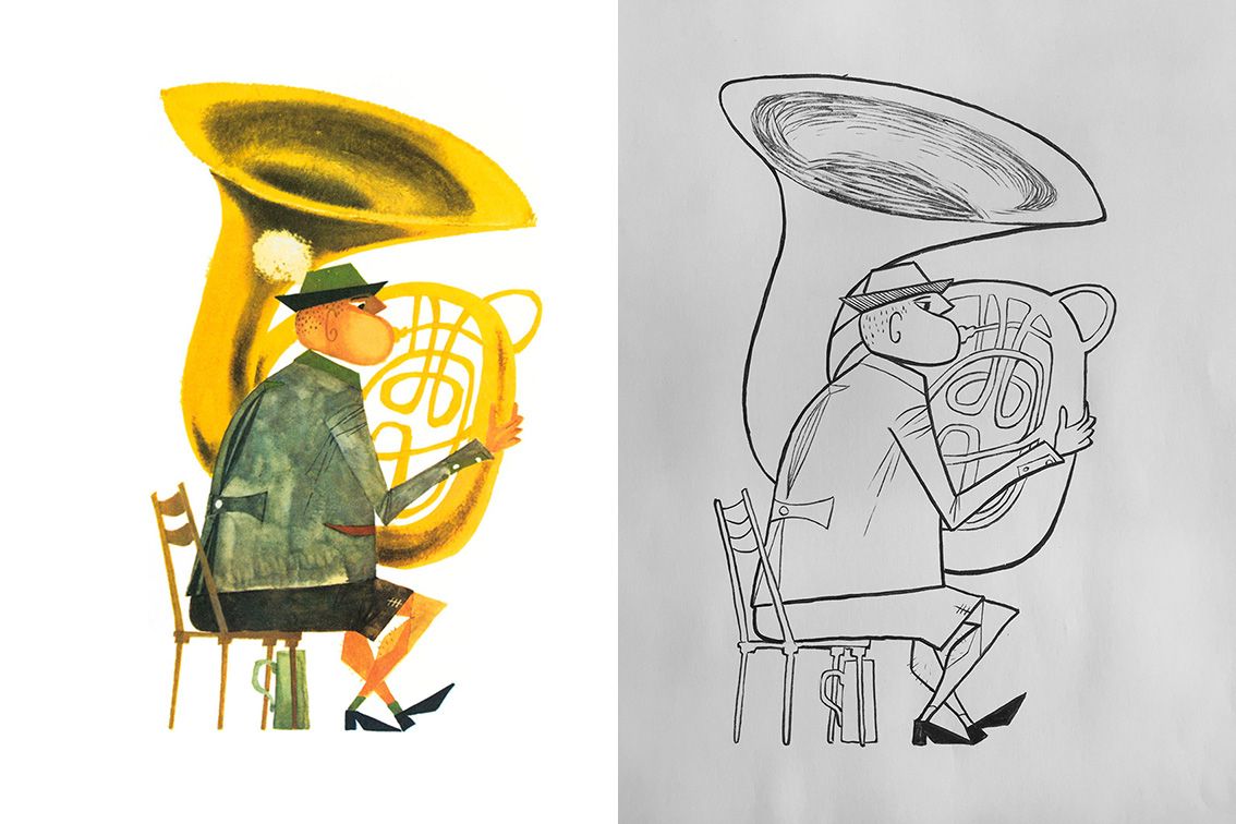
Ohhh, THAT inventor girl. Well, next time I guess. Welp here is the bunny girl...aaaannnd...What the heck! I can ink (a little bit)! This is so much better control than I had last Inktober. It sorta actually looks like a comic artist inked it. Not that it is perfect, but I am thrilled with the progress.
Does anyone else notice that when you have work in person you think, "it looks so great!", but then when you put it on the forums you can see every last dang flaw? Maybe the orange helps it out in person.
-
@Braden-Hallett Thanks for the encouragement, I’m going to try and stick with it. I thought the effects of different line widths was pretty neat too, even the way it can imply lighting.
-
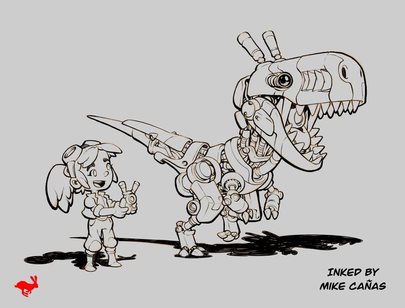
This exercise was a lot of fun and helped me learn quite a bit! Looking forward to week 3!
-mikecanas.com
-Instagram: @mikecanasart -
I inked in between chores and back to school night classes today. It was not very productive or helpful because I had to keep stopping. I will not be doing THAT again. Lol.
The little girl is from last weeks practice. I forgot to post it. A page from a Precious Moments color book.
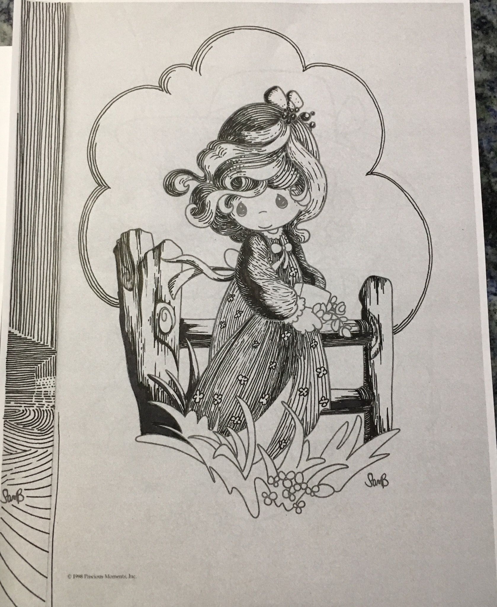
Lisa Burvant
www.lisaburvant.com
Instagram & Twitter & SVS: @burvantill -
For todat's practice, I did inking of a character from Sasek's illustration. Struggling keeping the line consistant in weights, also lots of decision making process on when to use which line weight. It is harder than it looks.
-
I was watching the video on Contour - Light, in which Jake drew three circles to show how line thickness can show the direction of light. As an aside, he said something like, "You can have line that doesn't vary if you don't want the line to be a dominant feature of the painting." This raises the question I've had. While hatching etc. can go along with pretty traditional looking illustrations, when I vary the thickness of the contour line, it starts to look more like comic book or cartoon illustrations. Am I just varying it too much or do you all think that some illustration styles should avoid fiddling with contour line style?
Laurie DeMott
instagram.com/demotlj -
@demotlj
I think it depends, ultimately, on what you are going for. Maybe if the overall thickness of the line was minimal then it wouldn't be as noticeable. I think Jake mentions varying the thickness to go along with the way you are planning to light your illustration, which might minimize it even more. -
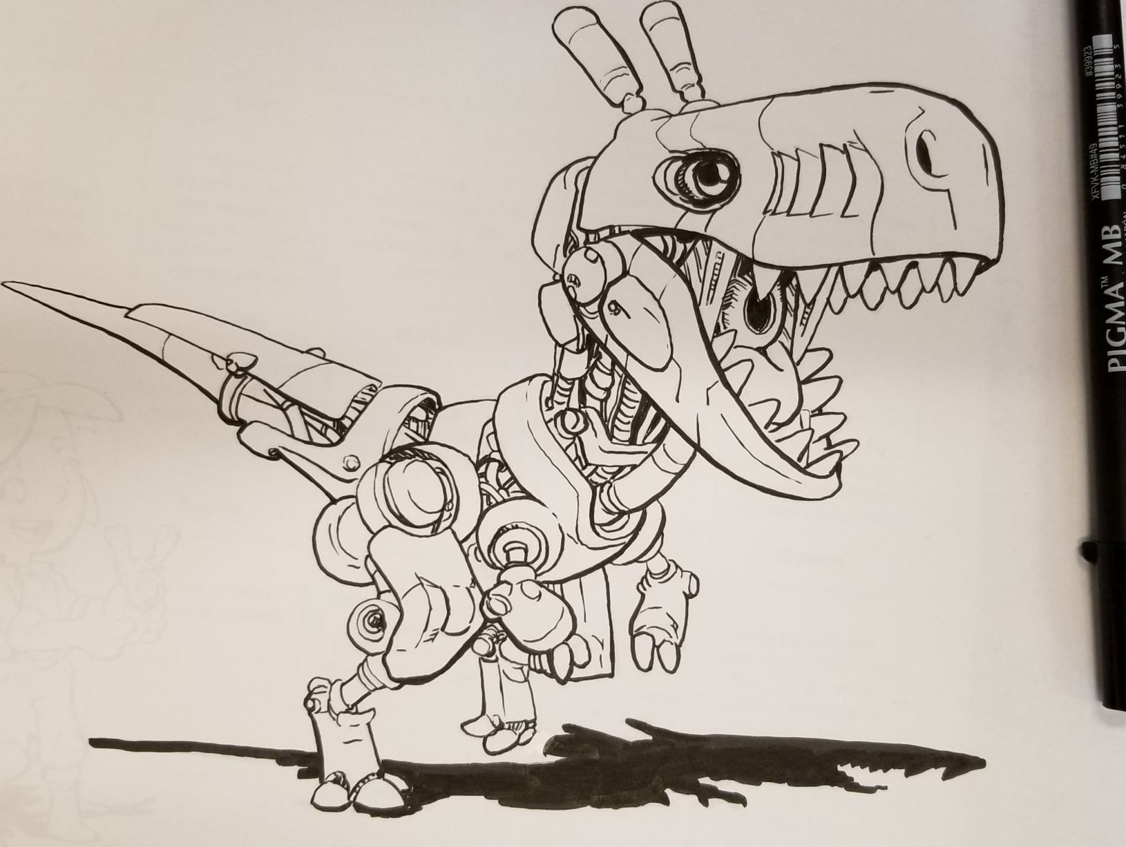
Haven't quite gotten to the girl. I remember when watching the inking 2.0 videos that @Jake-Parker said he didn't ink exactly as he penciled especially on small details such as the "innards". I took that to heart with this one. I am getting old and I couldn't see all the little parts even with my reading glasses so I took liberties. Enjoy.
Also, you really learn a lot about how you can improve in your own drawings when you copy a master's work. I wish all the great comic artists would send me penciled in work for me to ink. It would be so fun.
-
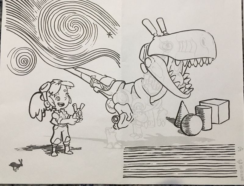
@burvantill Going for a little Starry Night, I see. I love it. I am having my kids do Zentangles in my High School classes right now and I think Van Gogh would have loved creating those.
-
@MikeCañas good work! Looks like a pro job to me! I like how you increased the weight of the lines on the bottom even more than the drawing. I felt like I should have done the same but I was trying to stay true to the original. After seeing yours, I should have trusted my instincts. It is my practice sheet, right?
-
@xin-li said in How to ink 2.0 Group Runthrough Week 2:
also lots of decision making process on when to use which line weight
I know what you mean! Up til now I've been focussing only on light and not thinking about proximity, weight, material, etc. It seems like there's a long list of rules and a longer list of when to break them
-
@demotlj said in How to ink 2.0 Group Runthrough Week 2:
Am I just varying it too much or do you all think that some illustration styles should avoid fiddling with contour line style
Ligne Claire tends to not vary line weight at all