Superstition WIP
-
Hi everyone
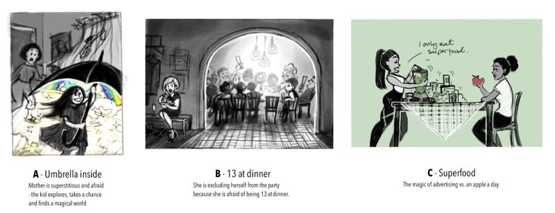
 I’ve been working on some different ideas for the superstition competition. These are all sketch fase, open for critique and changes. I’m not sure which one I want to move forward with, so any feedback on which one you like better would be much appreciated!
-
I like A!
-
I think story wise, A is the most clear one. B and C are hard to get without text. Although I love the girl's expression in B - it is very funny.
-
@karolifo I like B the most, we have this superstition, if there are 13 guests, You have to prepare the table for 14 people, or it brings unluck.
But if You go to children's books market, I would go with A -
Wow, I like your sketches.
 To me, B has the strongest composition and clearest story. If you wanted to lean it more towards children you could make the characters younger, if you'd like, or stylize the characters differently (for instance, make them animals, farmers, Vikings, people at a birthday party, etc.). Maybe you could add text to whatever illustration you choose to clarify what superstition you're illustrating.
I like the idea of A, but I'm not sure what's going on that the mom is superstitious of, and the overall composition isn't as easy to read. I think that one would be my second choice though.
Looking forward to seeing which one you choose and how it comes out. -
I really like A. I imagine it's all gloomy and then there's a "FWOOSH" sound as she opens the umbrella and all the light and rainbows come out.
B is really good, too. It's a nice composition and I'm impressed how you got 12 people around that table in that little space.
-
@karolifo i like A, it would be cool if everything was black and white besides what is under the umbrella.
-
Oooh, it's a coin-flip between A or B for me as I like both ideas. But would probably go with A because it is so playful and the rainbow would be fun. I'm also inclined to agree that it is the easiest to read the context of.
-
@karolifo I love B. To me it tells the story the clearest a d the composition is wonderful. I love the contrast between light and dark. I'm sure there is a creative way to emphasize the superstition.
-
@Chip-Valecek that sounds like an interesting treatment
-
Thank you all for the feedback, it was very helpful

I decided to push both A and B further to try to clarify the story in both, and did some more research and thumbnails. I need some storytelling (and interior scene) practice, so maybe I’ll finish both if they turn out good

Any thoughts about the storytelling in these images now?

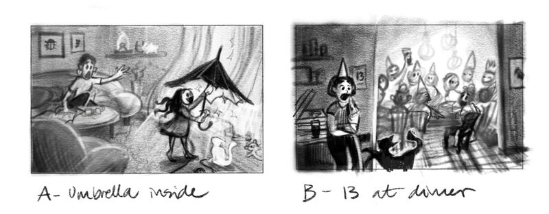
A - It’s bad luck to open an umbrella inside
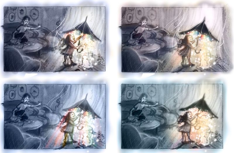
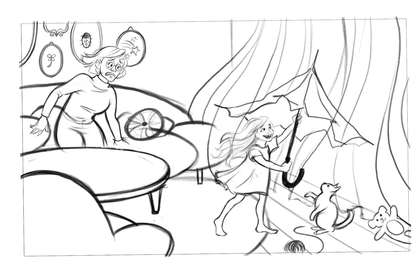
I decided to change the timing, and show this in action - as the girl is opening the umbrella. The mother is freaking out, trying to stop her, because she is superstitious and thinks it is bad luck. To show that she is superstitious I plan to include details that hint at this - good luck symbols all over the living room. Also the furniture is all very soft, round shapes, so that the umbrella really stands out as something dangerous.
I read somewhere that superstition is really just a way to try to control the uncontrollable (read: life). The idea here is that the mother is anxious that something bad will happen, so she tries to shield the kid - but the kid wants (and needs) to explore the world.
@Chip-Valecek - interesting idea about the colour treatment. I’m not sure I want it to be completely greyscale though, but maybe some sort of a monochrome, desaturated color for the room, so the inside of the umbrella really stands out

B - When 13 people eat at the same table, one will be dead within a year.
Thanks @KathrynAdebayo for your suggestions - I think I’ll make this into a tween birthday party instead

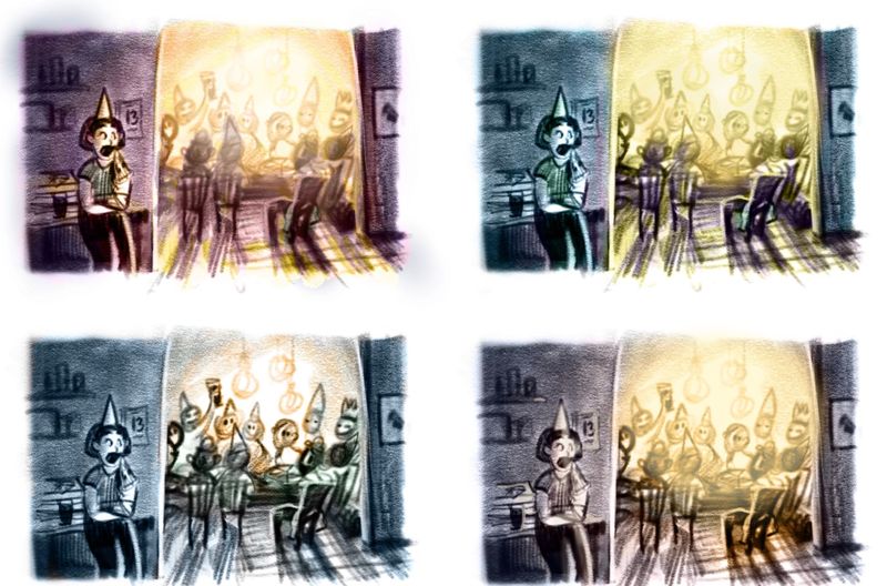
The superstitious girl is now in the kitchen eating pizza from the box, which I think makes a lot more sense story wise. I made the empty chair more prominent, and will connect it visually to the girl by having the same color on her clothes and a jacket on the chair. Then I’ll include some more bad luck symbols as hints - a calender with nr. 13 on it, she is afraid of the black cat. Also changed the composition a bit to make it less static.
-
@karolifo Your ideas look like they are coming together. I like the little details you are thinking of to clarify/enhance the story. I would warn against making your compositions to cluttered with detail. For example, showing the girl in B being both afraid of being the 13th guest at dinner and a afraid of the black cat may muddle the clarity rather than help. But the subtle details like the matching color of the girl and the chair and the luck charmes in A sound like great ideas. Can't wait to see were these go!
-
Ok, so this is moving along a bit more slowly than planned. Did some small adjustments to the rough sketches (removed the cat, thanks for the tip:)) Colour studies, and then a cleaned up sketch for the umbrella one. Hopefully I will have time to finish it tomorrow in time for the competition!

