Character Design Critique and selection
-
Hello SVS folks!
I am in the development stage of creating characters for my first Graphic Novel/Comic Book. Periodically I will through characters up here to get some much needed feedback because I never get myself to a final design in any of my characters. I'm constantly tooling around, discovering new features and adding and removing elements. It makes it hard to finish anything.
So since My background is in graphic design and I always limit my first draft iterations to 3 versions I will do that for my characters.
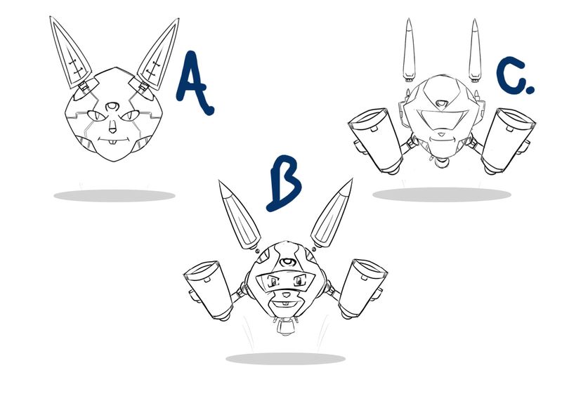
Rabbot: A fully self functioning AI Bot that takes it's personality from a pet Rabbit of my main character.

The Bot was originally an education robot from an advanced civilization.
key characteristics:
Friendly looking but can turn into a war machine (More on this later)
Rabbit features/characteristics.A is the original design
B. Is a more friendlier cartoonish take
C. Just the frame but a more Robot look.Whats your vote or ideas? And do you need more details?
Thanks for all the help!
-
Cool! I like 'em all, although the first one looks kinda villainish to me thanks to that expression and those mechanical lines next to his eyes...those remind me of veins and it kinda creeps me out.
I have an issue with B and C though and it comes down to the fundamentals of design and shape language in general. B and C are much more interesting with silhouettes and there is much more goin on, however I feel like the shapes in both of them are too repetitive.
If you'd ignore all the details and looked only at the big shapes here ( I mean the body, the ears and the cannons) , they may vary in width but the height of each of the shapes is pretty much the same. If you wish to play around with the designs more, I'd suggest looking into that.
However, If you wish to proceed with what ya got here, I'd personally merge B and C! You see, B has a slightly bigger variety in shapes but has a bit too much rabbitness (?) to it. Doesn't look like a robot to me, more like a floating rabbit head in a high tech helmet.That would be all I've got to say bout that! Best of luck with your project!
-
@IgorWoznicki Awesome! Thanks for your input!
The shape language makes a lot of sense. I struggled with making sure an orb style framework looks robotic in nature. Do you suggest I just block all the components out in basic shapes?
Also on a side note (C) I quickly just merged the arms from B without distributing the shape correctly. I was hoping to get an overall feel for it. But if the sizing is an issue I can adjust that.
A. Does look creepy, especially with the eye design along with the lines. Almost a blank stare too. LOL Thanks again!
-
These look really great so far. I especially like the "eyeless" version for C. I do agree with @IgorWoznicki that combining B and C is your best bet. I think you could also push the fact that your character is a rabbit bot a bit further. His silhouette doesn't read as a rabbit, if that is indeed what you are going for. Adding more rabbit like characteristics could really help your design and potentially make it even more interesting when he switches to his war bot form. Great job so far! I'm excited to see where you take this design.
-
@jthomas I am looking forward to follow your path with this.
 I vote for C.
 -
Why a more friendly version in the helmet, and one that is warlike without it?
-
@dorrismillerrr Think of it as different versions of software that creates Rabbot's different personality states. When in defense mode the software changes and its demeanor changes with it. I use warlike as just a throw-away phrase.
-
I like A and B equally.
-
Here's a quick update for those interested. I took some votes and input from you guys and combined a few elements from all three.
*Edits
- Shrunk arms
- Changed Viser shape
- Added Ears from B
- Added mouth style from A
- Added Eyes from B (More expressions here
Without arms is just normal mode.
