My Mermay WIP
-
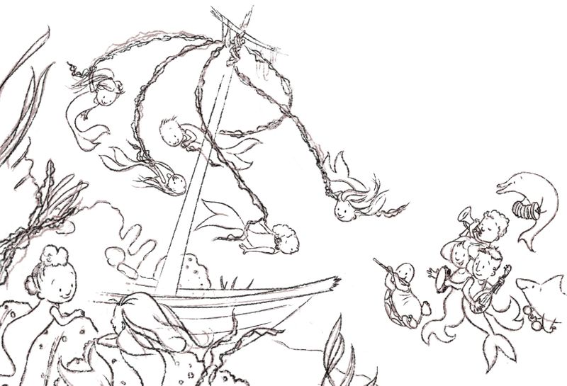
Here's what I'm working on, if any of you see any glaring errors feel free to let me know. I have not yet turned off the sketch layer so it looks a bit messy yet. Fun looking at what everyone else has been doing. Good luck!

-
I actually like leaving the sketch layer on. I feel like it gives the lines more energy or something like that. This is a fun piece!
-
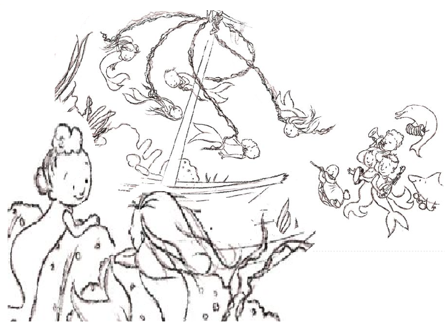
@RHirsch I love your idea and all the fun characters in there. I am just wondering, how the reading would change if you work a bit with the perspective? Like making those 2 girls that are clinging to the rock a bit bigger? I tryed my best to show you what I mean, but since I am at work I can only use the good old "paint tool". Of course you would have to arange the other components as well. I hope I could help you somehow and I am looking forward to see your final illustration :).

-
This is so full of life
 I really like it. I think what @mellebluesworld suggested adds a lot of depth to it too. Can't wait to see the finished piece!!
 -
very cute. Love the energy in this piece. looking forward to see the progress

-
This is so cute and I love the movement you've got in all the characters and their tails! Also, that turtle is AMAZING! What a great character! It would be awesome to see a little turtle, dolphin, shark band as a separate illustration one day as they're brilliant!
-
I really like the concept and the character design is super cute. Can't wait to see it in colour.
-
I literally just said "this is one of the cutest things I have ever seen," outload. Great story telling! Love the May pole idea brilliant!
-
@mellebluesworld I see what you're saying, I'll play with it. Thanks!
-
@lmrush thank you!
-
Oh my gosh, this is adorable! I love that little turtle with the flute but I think you've drawn his legs as more of a land tortoise or a freshwater turtle. Ocean turtles would have more fin-like legs - just something to consider.
-
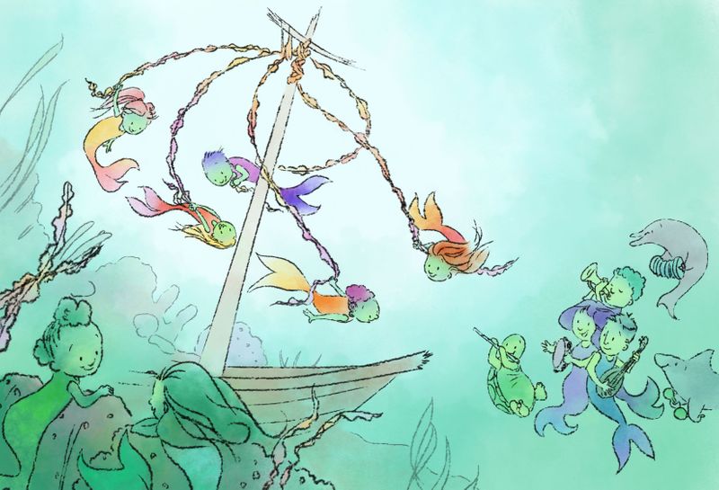
Progress. I plan to play with the water a bit, not sure I'm satisfied with it. Also, thinking the blue tailed merboy behind the mast stands out too much, might mute him to purple or orange. Are the colors on the sea floor too muddy? Thoughts on that and other comments/ crits welcome.

-
@RHirsch This is looking pretty nice.
I think that the reason you might be thinking the sea floor is getting muddy is that your value range is really narrow. If you punched up the darker values I think the piece would maybe read better. If you made the bottom of the boat and the nearer mermaids much darker I think you would get a better feeling of foreground and background.
Just some thoughts, have fun with it.
-
@theprairiefox Agreed. I flipped it to gray scale and lo and behold, shallow values. I've stripped the water paint off and am redoing it. Hopefully will get it done in time to submit to Mermay, but I won't if I can't get it done to my satisfaction.
-
This is so great! @RHirsch it reminded me Ponyo
 - the little goldfishes
 -
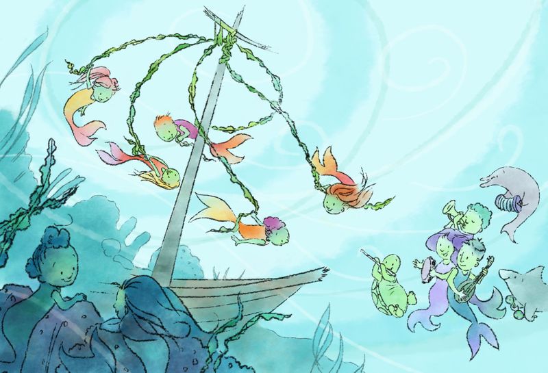
Okay, played with the water and values because I wasn't happy with either. I'm thinking this will be the final, just need to clean a few things up. Thanks for the help, Forum folk! I appreciate you more than you know.
