Group run through creative environment design week 6 art and feedback
-
@Coley if this is a study I'd focus on how the values and composition make the piece feel. If this is going to be a finished piece, then detail away
")
-
@Erin-Cortese I think that works nicely, now! Having that power pole fade away behind the tree's will look pretty awesome.
-
@Aleksey Are you still working on this penguin farm? How is your progress?
Instagram: www.instagram.com/heatherboyd.illustration/
Website: https://heatherboydillustration.ca
Shop: https://www.inprnt.com/search/products?q=HeatherBoydIllustration
Ko-Fi: https://ko-fi.com/heatherboydillustrationBe blessed,
-
Not sure what week to add this one too so week 6 it is!
A step by step to final. Improved on colour and thought I would put my pinterest to better use and tried some of the techniques out for applying colour.
If you have a favourite -let me know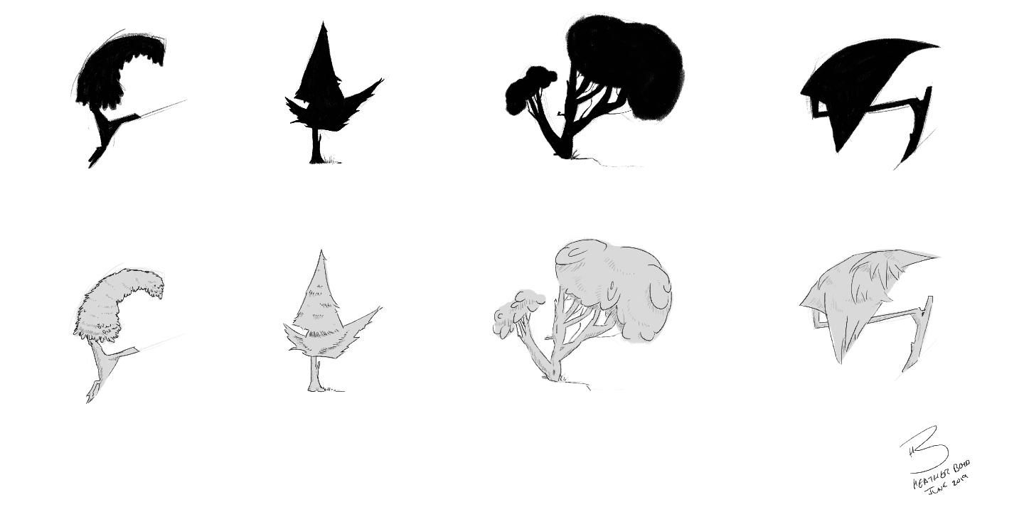
Instagram: www.instagram.com/heatherboyd.illustration/
Website: https://heatherboydillustration.ca
Shop: https://www.inprnt.com/search/products?q=HeatherBoydIllustration
Ko-Fi: https://ko-fi.com/heatherboydillustrationBe blessed,
-
@Heather-Boyd im taking a break from that because of my residency. I got to the rough sketch phase and stopped.
-
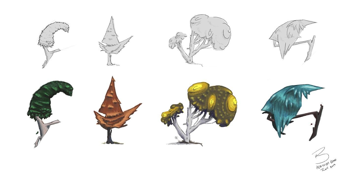
@Heather-Boyd These look so good! I like them all, but the 4th (far right) is my favourite. I was planning on being done with environment design after my subjective is finished, but seeing these makes me want improve my exercises and do a coloured sheet of thumbnails.
-
Aww your sweet- let me know if you want me to inspire you with more work lols. The 4th one took me the longest - but once I found that colour it was happiness exploding (second colour I chose). I may consider building my final around one of these. Thanks

-
@Heather-Boyd I like far right one the best too
they're all interesting though, great work. -
@Heather-Boyd Very cool.
-
Colour is still a thorn in my side
 , I would love some feedback on these colour studies. Which one works better? Are my values ok? These are just the local colours, no highlights or shadows included.
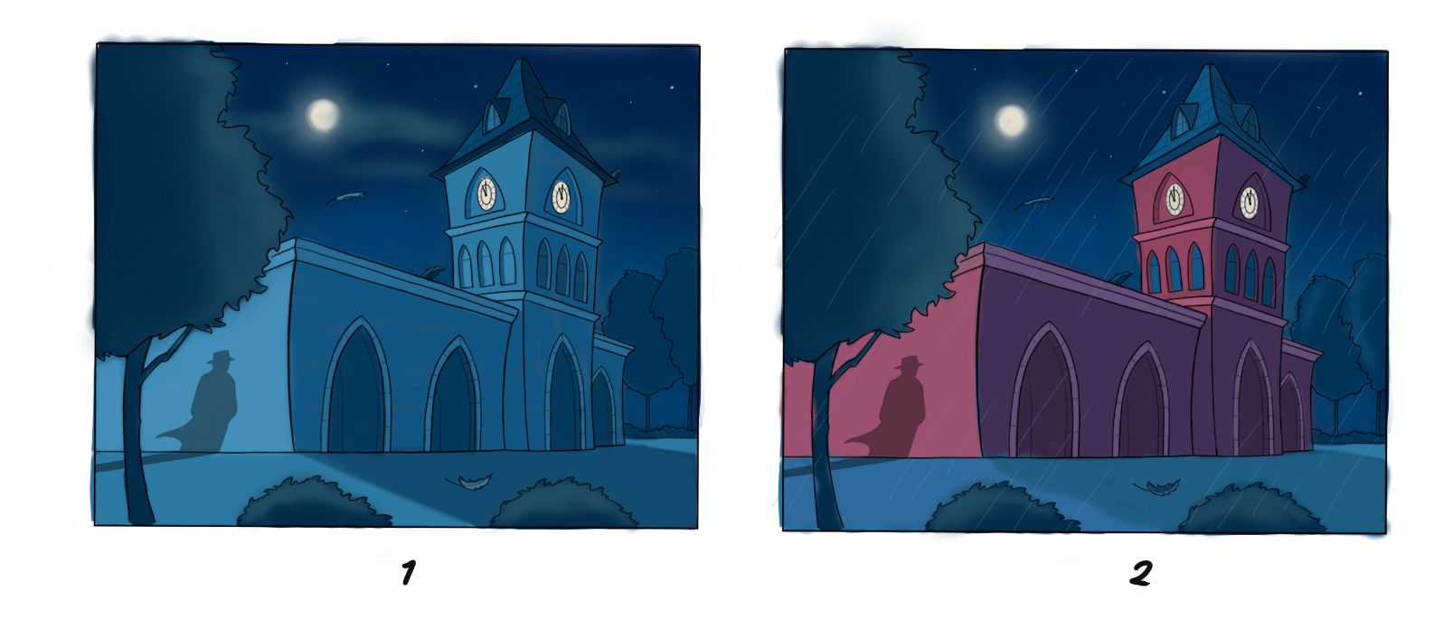
-
@Erin-Cortese Colour's a thorn in all sides.
I'm partial to option 1. It gives a nice sense of moonlight. If you really dial up the warm light behind the clock it would make a nice warm contrast in all the cool.
I'm less partial to option 2. The red's nice and cool, but it makes me feel like there's a big ol' spotlight somewhere off camera.
I think the values are working fine
-
@Erin-Cortese I agree with @Braden-Hallett both in that color is also my Achilles heel and also that #1 is my favorite. It feels more unified and sets a nice mood.
-
@Erin-Cortese I also like the first one. Colors are harmonious.
-
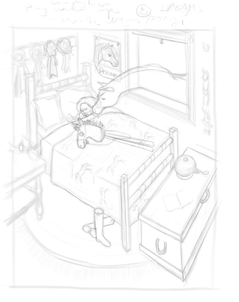
this is worthy of slowvember! slowly picking away.......opacity turned down but I am reinforcing lines and re-drawing things, mostly things on top and right hand side are re-done at this point. slow and I feel like a pain posting it in a way but it makes me feel like I am making SOME sort of progress..........dealing with a busy life and kids studying for finals and I am having some eye strain lately that is a real pain in the butt for getting this sort of work done
 Will keep picking away at it.
I intended the horse to be a regular horse (went from horse to unicorn back to horse) but now I wonder once I sketched it and you could see the lines of the window through the horse if it might be fun to play around with the horse being a dream (translucent/see though) .........so I will toy with that.
and yeah I guess I am putting characters in an environmental final lol but I thought that's eventuallly where I am going so am plowing ahead with that -
@Coley Nothin' wrong with working on a thing slowly
I think it's shaping up nicely! -
@Braden-Hallett thanks!