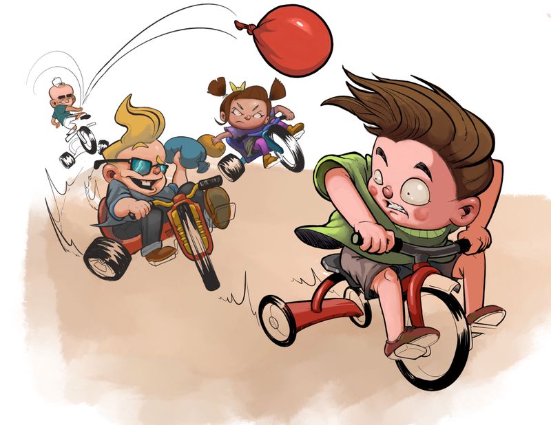
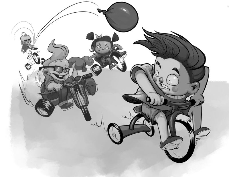
WIP, any and all feedback much appreciated
-

-
@MikeCañas Great line work. I also like how you are using red on the focal point of the balloon. My only suggestion is to give more room to the middle kids. Maybe move the girl up and over to the right a little and the boy down and to the left. This will separate them all.
-
I'll just echo everything @Chip-Valecek said. The balloons in the middle between the kids are creating a mild tangent even though there is a little overlapping.
-
Are those water balloons? Is there a way that clear...? Nice movement through space...At first glance I thought the farthest boy was peddling away...maybe take another look at the gesture to make it clear his body action belongs to chucking the balloon....? Great characters!
-
@Chip-Valecek @Jon-Anderson Thank you guys for the feedback! I see what you mean about those water balloons. I’ll take your advice and adjust those two characters a bit. Thanks for the help!
-
@Laurasketches Thanks! Yeah, I see that it is a bit difficult to tell if those are water balloons. I was thinking of adding some water droplets trailing behind the red balloon. I’ll work more on clearing up the character in the back to show he is throwing the balloon.
-
Hey @MikeCañas , this is looking great! I agree with everything that has been said already. My suggestion would be to maybe add some line work on the bottom to create a motion blur effect. I think this piece is very dynamic already but maybe that could really push things.
-
Nice picture, I love your use of line and how dynamic the line are. I think you might want to push the values a little further apart to make the characters read better. Right now your values are all hovering in the middle to the dark side of the value range. I would push the lights lighter and you will get more bang for your buck.

-
@Gabriel-Lung I agree! I was just looking at some other artists that have done this so I can get it right. Thanks for the suggestion!:smiling_face_with_open_mouth_smiling_eyes:
-
@theprairiefox Yeah, I see what you mean. I’ll definitely mess with the values, maybe on the middle and back characters, and see how it comes out. Thanks for the help!
