Group run through creative environment design week 3 art and feedback
-
So many awesome designs!
Week 4 work and such is up!
-
-
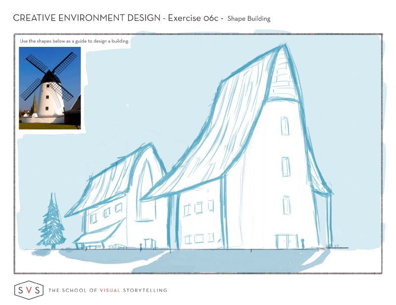
@Coley Nice work! I particularly like the first couch. You got real ambitious with the silo on that barn

I'll do a draw-over of some thing later on today.
Sorry it took me a little while to get back to you! I've been out of town/busy.
-
@Braden-Hallett no worries! I realized after you were crazy busy!

-
Week 3 I am here.
 lols I will be doing two other houses, so week 3 will probably push into week 5 as well. This first one frustrated me a lot and the reason why I omitted the roof tiles for wood. But I am happy with it at the end of the day. It really pushed my shape and perspective building work.
-
Okeedokee!
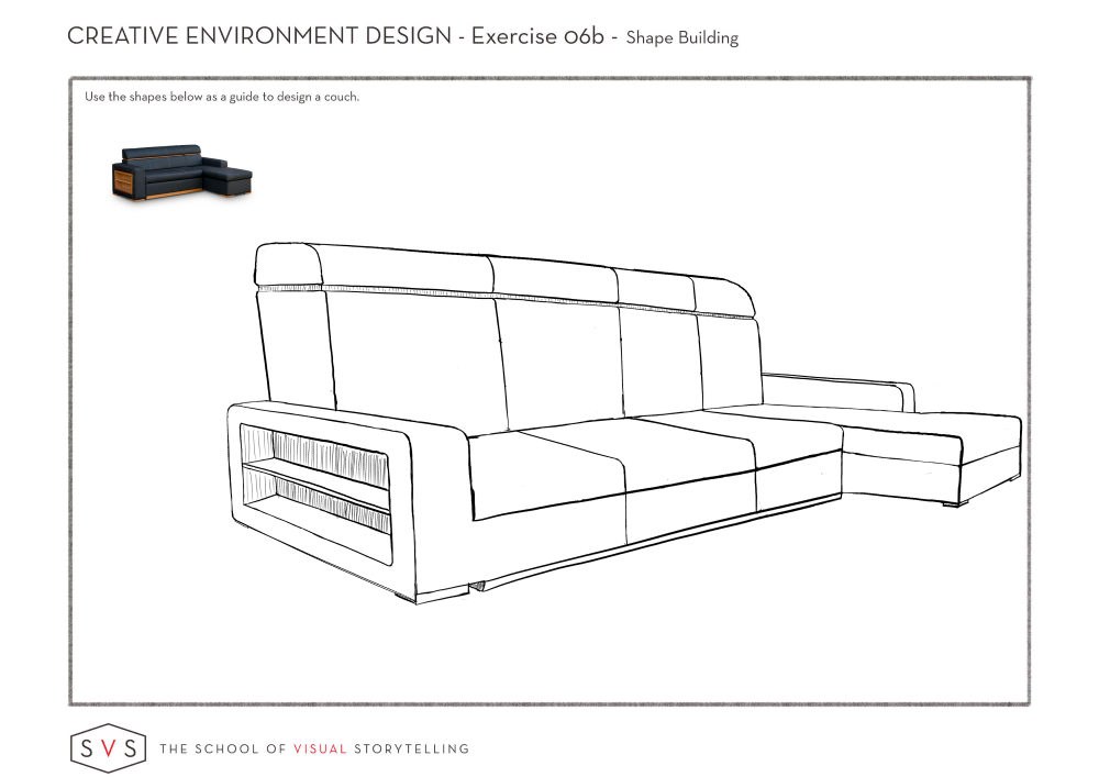
So with your couch, I'm gonna try and think of the design lessons we're learning. At first glance, it looks to me like it's a couch that's fairly symmetrical.
I messed aboot with aligning it more along some thirds, and it came out a bit more interesting (I think?) It's hard to juggle both design principles AND perspective rules


Which brings me to the barn. I like the design! i always have a hard time with roofs, so that nice multi angled slant to the roof is neato.
However, when it comes to the silo, I would revisit how to construct spheres and cylinders in perspective (take a look at the 'how to draw anything' class). the top of the silo is a half a sphere plopped on top of a cylinder, but it looks a little elongated to me.
Nice work so far

-
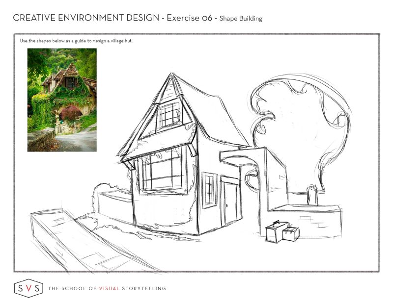
@Heather-Boyd It looks great, I really like your shapes. The curved base around the house and retaining wall is a really nice addition!
-
@Braden-Hallett Your draw over of @Coley couch is really helpful. I’ve been vague about how to apply the third and fifth rules to these and that made it much clearer.
-
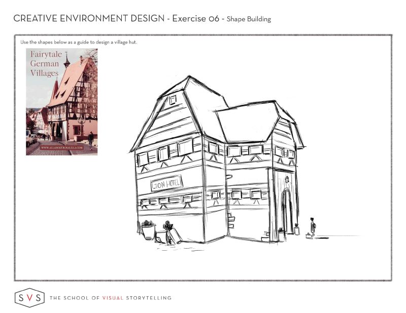
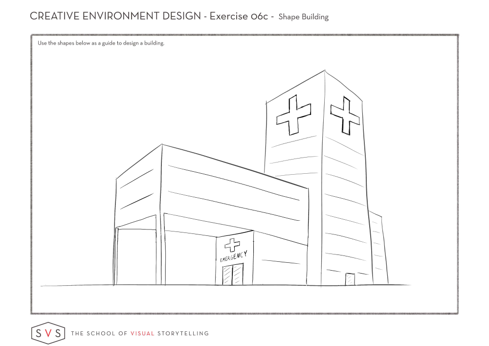
2nd House/Hut/Village Hotel lols. Do my roofs look correct? I wouldn't mind a draw over if you can spare some time. And is my person too larger for my rooms? Thanks
-
-
@Heather-Boyd You picked a hard design to copy! That kind of roof is something I'd have a really hard time with. I don't have time at the moment to do a draw over (maybe in the next few days?).
I don't think your character is too big for the rooms. However, the windows on the main floor are placed in such a way that they're well above head height if on the main floor, or foot level if they're on the second floor.
I think your roof is close. Very VERY close
 My one fix would involve finding the centre line of the left roof to realign it. I'll show you when I do a draw over
Nice work! Like I said. Really challenging roof!
-
@Braden-Hallett ahhhhhhhh..........yes I see what you mean on the top of the silo..........I did do how to draw everything but sometimes I have to keep repeating the exercises to really get things to sink in.........!
I was motivated to get back to understanding perspective more after these last few exercises so I totally burned my way through mastering perspective this week! All the video and exercises tho I just can't seem to make a good car no matter how hard I try lol. I will keep trying. The principles sank in a little more and the figure drawing exercise really helped for sure. I am learning so much.
the couch was slightly skewed, not totally symmetrical, I like how you emphasized the cruve on the back tho, it was great to look at thumbnails and rule of thirds. It just helps the puzzle pieces stick together in my brain to revisit these things! I know you had a busy week so thank you for taking some time to critique! -
@Braden-Hallett
Yes don't worry, when you have time.
I figure if I am sitting down and drawing I push myself to work on something even harder than I planned to. I am not too sure how to set up roofs aligning them in proper perspective. I did use some other roof references to help me. I just wish there were steps I could work within or rules to draw them, without being so flustered.
I will edit the windows thanks.
-
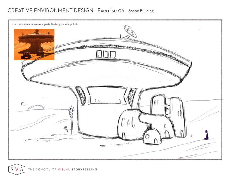
I strayed a bit for my last "village hut" I did "s'" . Anyways I had fun.

-
@Heather-Boyd Just a bit

Looks nifty, though! And really, fun is the point of the exercise

-
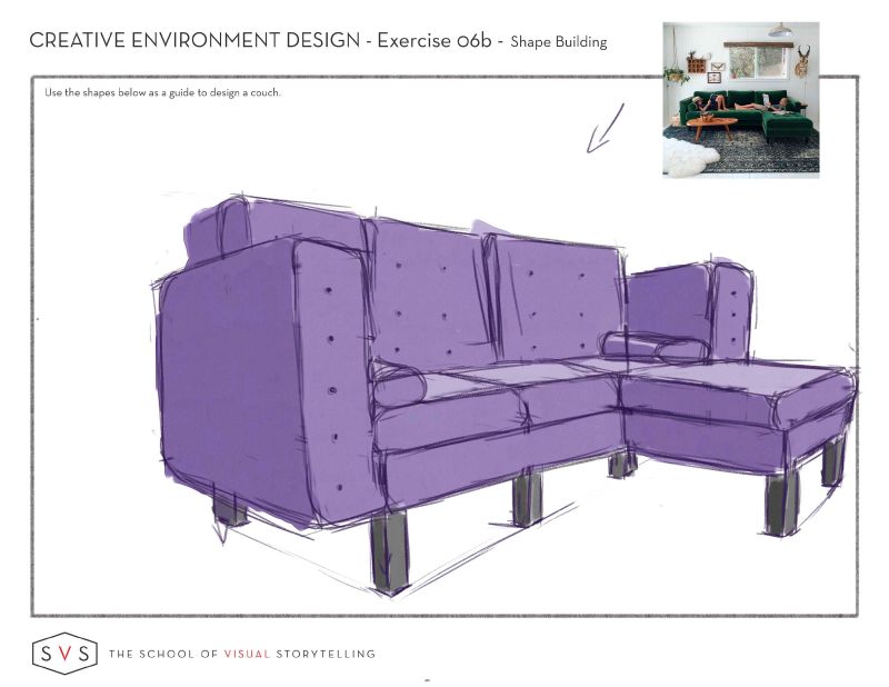
I had to set a time limit or I feared I would neither start or finish the couch. 48 minutes set and finished 2 minutes early. I also squeezed in a bit of colour and value.

-
@Heather-Boyd setting a timer's a good idea
 I tend to spend WAY too much time on these studies (partly because everyone's turning in such awesome work
  )
) -
@Braden-Hallett
That's the excuse we tell ourselves. haha but thanks
-
@Heather-Boyd I agree that time-blocking can help me unblock and get something down and from there I've got a start. I love the purple couch!
-
45 Minutes again. Week 4 tomorrow

