Group run through creative environment design week 2 art and feedback
-
@JerrySketchyArt Interesting take on this exercise. I never would have thought to go abstract like this.
-
@Aleksey Admit it... you're addicted to this exercise :smiling_face_with_open_mouth_closed_eyes:
-
@JerrySketchyArt Cool, man
 Very 'framed ink'!
 -
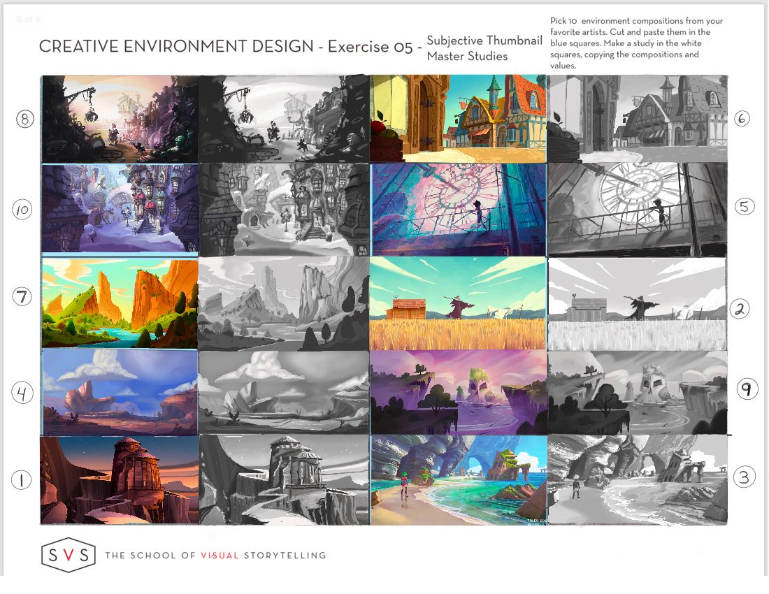
Whoo, these were tough but I learned sooo much! I decided to go in a different direction with these and really focus on values and shape - almost like a master study in thumbnails. ***I had to update this because I just realized the exercise is literally titled “Master Studies” - I thought Master Studies were supposed to be detailed. Anyways, I went with detailed!
I am so glad I did because I learned so much about how the artists use values to visually organize the composition and draw attention to certain objects. At that size, everything is a random shape and value and it was really neat to see how the values literally lead your eye through the composition and give the piece balance. It made me realize that very little is random, and these artists are making conscious choices for every single value and shape relationship! I also learned a lot about my own process and bad habits - to pull these off in this detail I had to begin with large shapes and work my way to finer details later (which my brain always fights), and l discovered why it is easier to work from back to front like Disney artist Laura Price does with her compositions.
*I worked out of order, so I labelled the order that I completed these in.

-
@murielle i doooo
@ErinCortese nice! Really good work.
-
@Aleksey Thank you! I spent a lot of time on them, but it was worth it.
-
@ErinCortese These are super detailed -first time through I probably will avoid it but I think it would be beneficial. Very nicely done -very impressed! I also like your choice of artists.

-
@Heather-Boyd Thanks Heather! Honestly, I had a hard time understanding the benefit of doing master studies until I did the exercise. I understood the concept of them, but I did not understand how copying a composition would help me understand an artist’s process or technique. But it did! I probably shouldn’t be this excited about it, but I really learned so much. The learning process can be so intense and frustrating, so it feels amazing when the fog clears and I actually get something.
-
@ErinCortese Wow! If I didn't know better I might think those were run through a photoshop filter! Very very detailed. As long as you learned something, right?

I might do one or two more and see how simple you can get in order to get some practice on the other end of the spectrum.
-
@Braden-Hallett Thank you! That’s kind of how I was thinking of it when trying to choose values...basically how would it look if it were greyscale. I may just convert them to see how close I came. I also used Jake Parker’s suggestion of squinting at them to try and see value, and it definitely works!
-
@ErinCortese Oh yeah! Squinting is super effective
 I'm starting to find myself squinting around town just checking out building silhouettes 'n such.
 -
Welp, the fact that I got aggravated completing this exercise tells me I need to do it more. A LOT more.

Something I noticed is that in these compositions it's not just the shapes that are balanced, but the lights and darks seem to be, too. It's something I wouldn't have thought about if I hadn't done this assignment


-
@Braden-Hallett I feel like row 1 number 2 and 3 and row 2 number 3 -have really nice compositions as you have nicely valued them. Some of them definitely look tricky. I will find a variety.
-
@Braden-Hallett nailed it i think
-
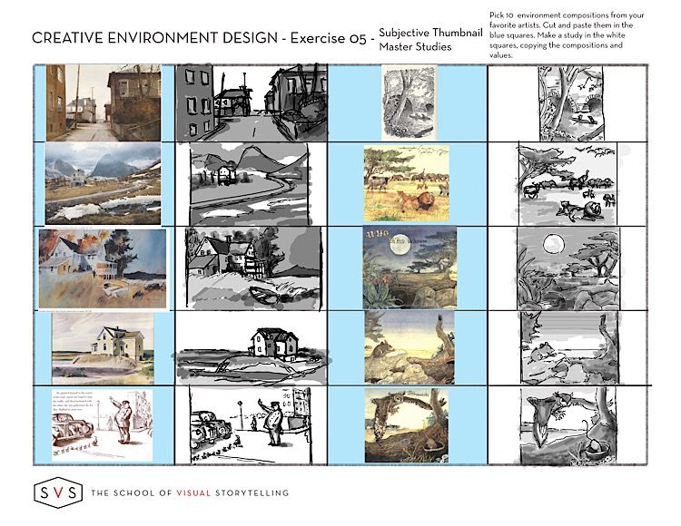
I didn’t have much time to work on this this week (Minister + Holy Week = no time for art... or breathing.)
I had already done the first four last time I watched the course so I tried to do a little every day to finish up and deliberately used Good Notes instead of Procreate to really severely limit my tools so I’d keep it loose and quick. It was interesting comparing the “fine art” pieces I had done before to the more classic illustrators I did this time. This is really good practice.

-
@demotlj Great work! Yeah, this weekend must be crazy busy for you

That's a really good idea to use a program that limits the amount of detail and value your capable of using. I know that in procreate you can really zoom in, even with something thumbnail sized, so using goodnotes was just smart

-
@ErinCortese These are absolutely stunning

-
Started a thread for week 3!
-
Once again, If anyone here wants more critiquey feedback on their work, post it and tag me with an @ and I'll give you a short critique.
If you want a critique but DON'T wanna post it here for whatever reason feel free to PM me on these forums or DM me on discord

I don't feel AS comfortable critiquing these, but I'll do my best!
-
@murielle Thank you!