The moment before you lose all your shtuff WIP
-
When you put your pack down thinking it’s stable, and it’s not.
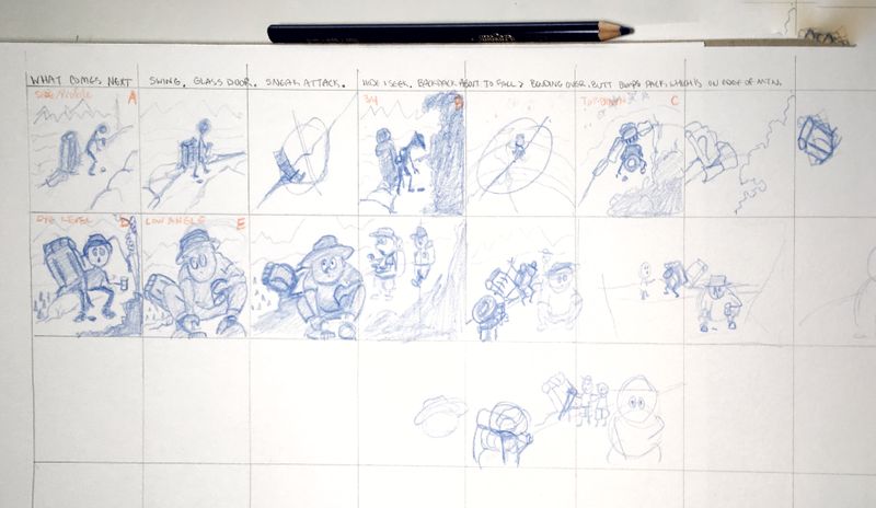
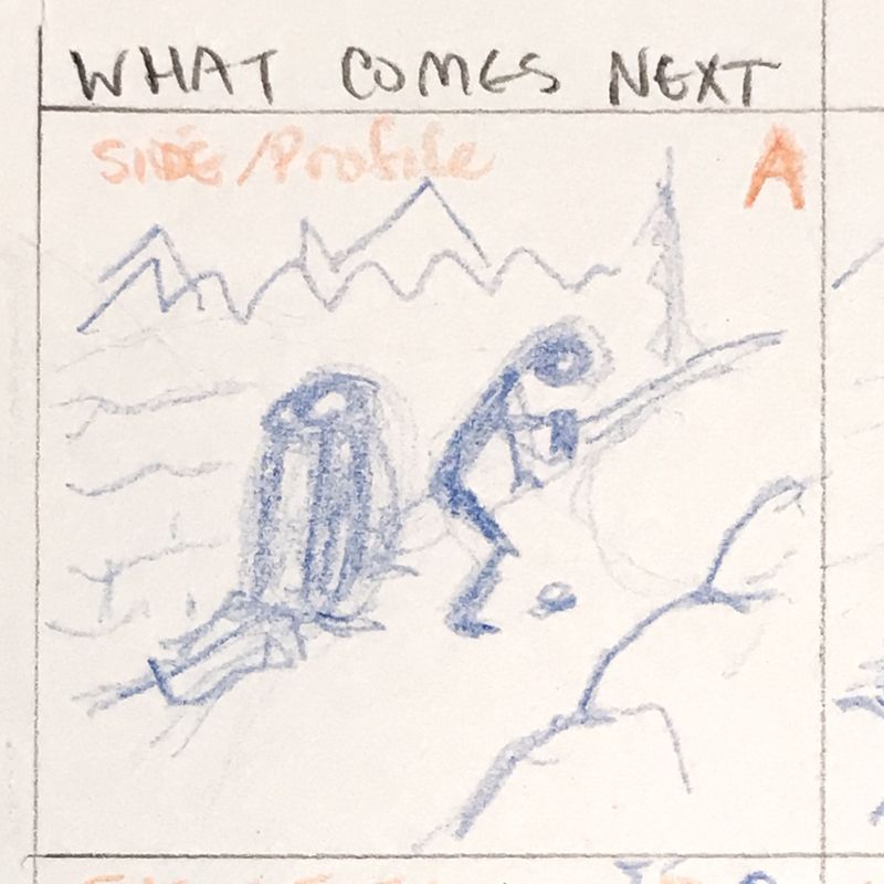
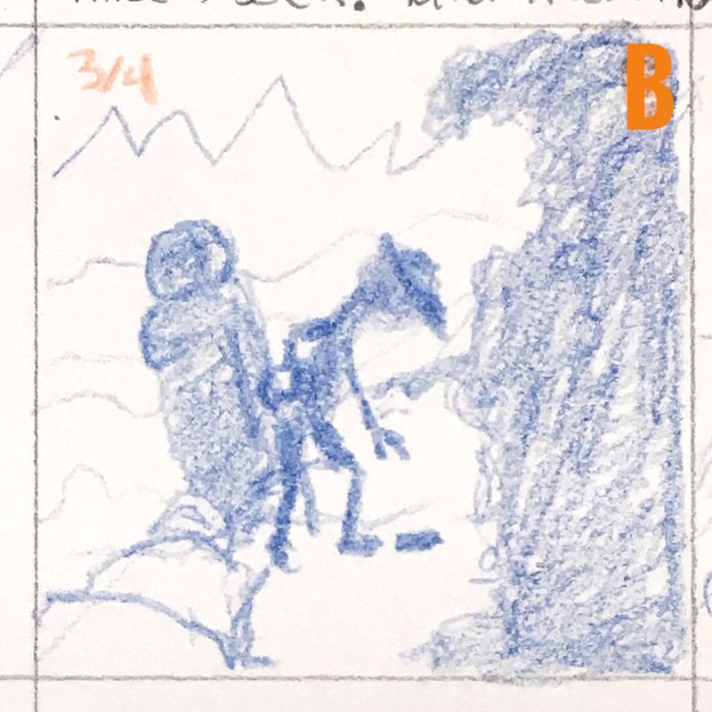
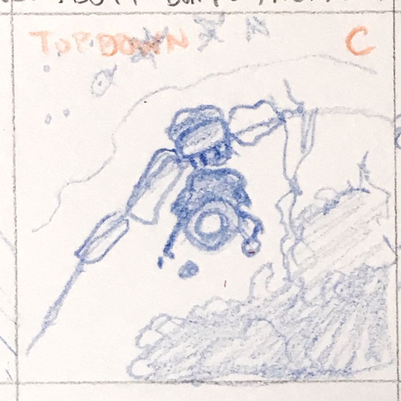
My goal is to catch the moment before the backpack is gone for good. I like the low profile one the best because you get the idea that the pack is actually tipping.
Im wondering if it’s too busy with the added scouts.I borrowed my thumbnail grid idea from @Braden-Hallett, his was so clean. But I was stupid and made squares instead of rectangles
 . You’ll just have to imagine at this point that the composition is centered in a rectangle.
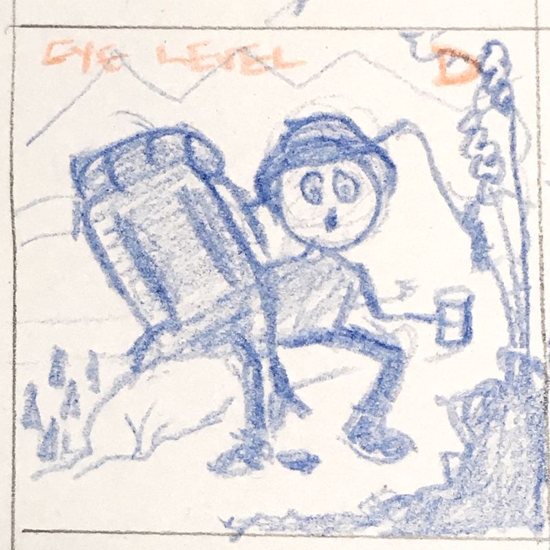
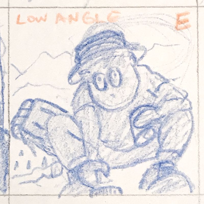
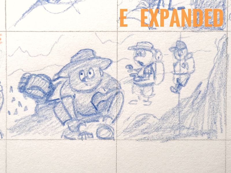
-
I think the added scouts really sell the story personally!
-
I decided I like the square format. I have it all drawn out on my stretched paper on my new Incredible Art Board (thankyou again to @Lee-White for mentioning it). I’m trying something a tiny bit different than my norm. No ink. Just pencil and watercolor. I think I use ink as a crutch and I want to see how this turns out without it.
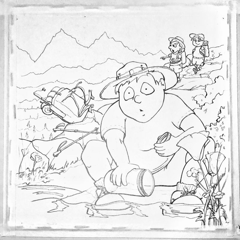
-
Hahaha! This is great! It made me chuckle
 Excited to see how the experiment goes
 -
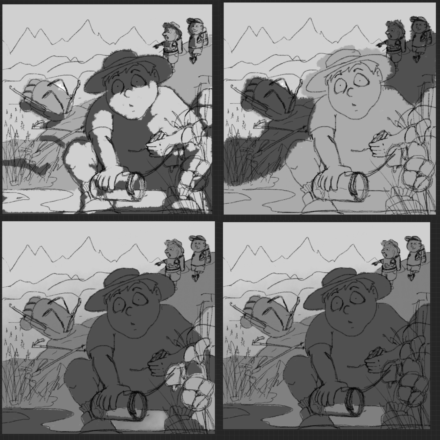
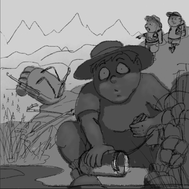
Working out values
-
@burvantill that bottom one is the winner for me. Maybe lighten the eyes up a little.
-
@Chip-Valecek i agree. Thankyou. These are just rough value schemes, I will definitely lighten the eyes.

Below are my color schemes. I have found that when I decide on value then move to color that the color doesn't work as well when I stay true to the value scheme I chose. I cheated a bit on some of the color comps. I used my value schemes as a guide for different color schemes through out the pic. Am I making sense? Lol. One lessen I learned in Color Theory class is the 70-20-10 split where 70% is the general non supporting area, 20 is the main supporting area and 10 is the focal point. Can I pull it off. We will see.

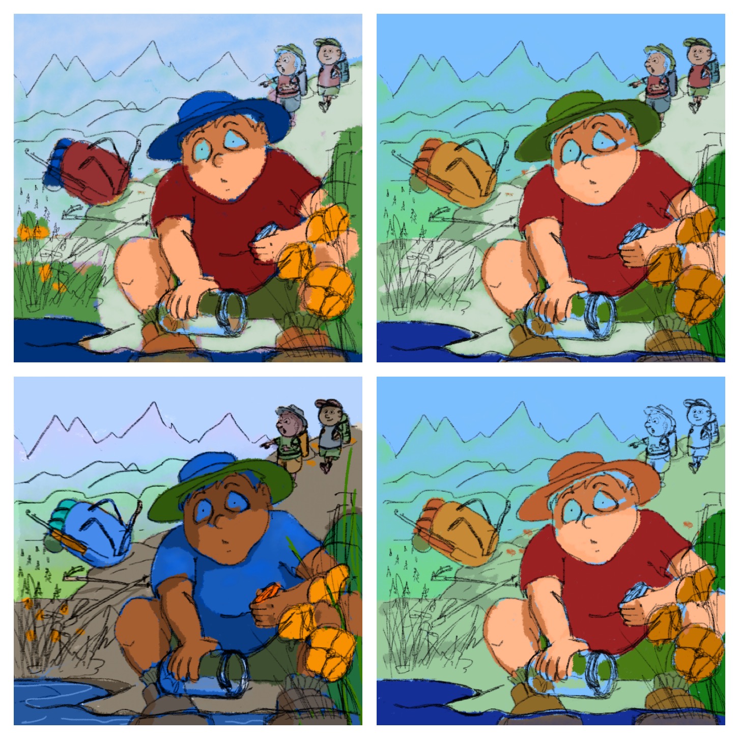
The bottom left is the one that I stayed true to the value comp. -
@burvantill do you use layer modes when you are placing your colors over your values?
-
@Chip-Valecek I do both. Color mode and just eyeballing. I normally sample the value then try and match it in the colors window (procreate). I didn’t like how dark the main boy was getting with the color mode on this one so I went off script
 . That just tells me that I need work on my value schemes. I’m happy with the upper left color scheme. With a couple adjustments. I started painting after lunch today.
-
@burvantill usually if the color mode is to dark i will use overlay mode and that seems to be bright enough most the time. Looking forward to seeing this one painted.
-
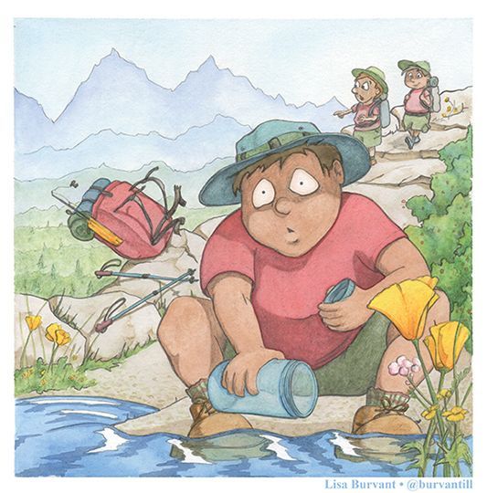
Here’s my final. Just for giggles I turned it greyscale in PS and it was not even close to my value studies. Lol. Granted I was making some changes on the fly. The choice to make the path lighter than the background was a conscious one.
-
@burvantill i love his blank stare, its almost like you can here him saying "Oh Sh*T"
-
@Chip-Valecek awesome. That is what I was going for. I drew about 10 sets of eyeballs just trying to get the right expression


-
@burvantill I think you nailed it. Great work.