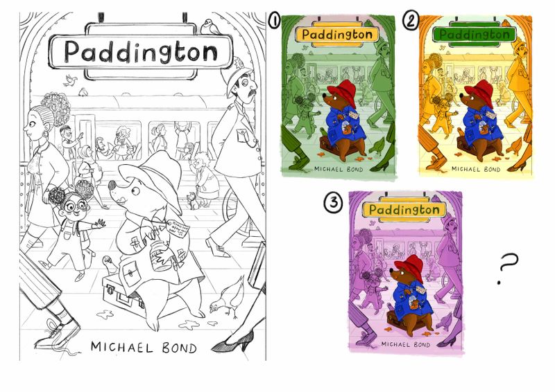
Paddington book cover - thoughts?
-
@hannahmccaffery No problem

The woman and daughter, the police officer, and everyone near/on the train all look as if they exist in the same space. For the look I think you're going for, I think they look ok as is. It was just the suitcase and bottom left person that looked out of place.
-
@demetrius Ah okay then, i'm in the middle of fixing the suitcase now and i'll work on the man too, thank you
 maybe once i add colour the people in the background won't look at though they're in the same place
-
@hannahmccaffery Really like your cover design. The policeman's sideway glance and the little girl pointing are a nice touch. One note I do have is that I feel like the title is a bit small. Almost insignificant to the cover. I was a commercial artist/Art Director for 20+ years and I'm pretty sure a publisher would want that title bumped up in size a bit. Otherwise, looking forward to the final art.
-
It’s looking really good
-
@Susy-Barton-Garner I was kind of worried about that too to be honest so I'm glad you've mentioned that it bothers you too, so i'll definitely look at it and make it much bigger
 thank you
-
Hey everyone!
Thanks so much to those who have given me all the brilliant feedback, I've really appreciated it and it helps so much!
Here's a little update on the piece, i've made the title bigger like you suggested @Susy-Barton-Garner and you're right it looks much better, I know it should probably be even bigger but i'm worried about ruining the composition
I think i've managed to adjust the suitcase and foreground @demetrius , i can see where you were coming from now so thank you!
Hopefully his paws don't look like pig hooves now @Dima-Eichhorn ? haha! And I fixed the little girls gaze direction @MichaelaH thank you again
I've done some quick colour roughs so I'm just wondering which you all prefer? Or none of them? I'm wondering whether I should drop the whole same colour background idea, however all the people will have more detail on them and be shaded etc.
Also do you think the foreground works with the walking legs and the size of the new title? It overlaps the policeman a bit, so i'm worried that it looks a bit cramped with the bird plonked on the sign too!
Anyways, thanks everyone!

-
I think it is ok, that the polie man is behind the sign, because the sign, it comes to me, as it would be the first thing in perspektive. I like all the changes
 It looks beautiful.
Color: I don't like any of them. The green and lila not at all and the yellow, I like it, but don't like the green of the sign. What about some light brownrosa to go with the bear as background color or if yellow, than the sign in other color. The bear is to saturated now, I think you will change it later.
Your cover is really my favorite, so loooking forward to see it finished. -
@hannahmccaffery It's better!
 I like first one.
 -
@Dima-Eichhorn Thank you!
@MichaelaH I don't like any of the colours either to be honest, it didn't look the way I was hoping, but maybe the yellow has more potential if i change the colour of the sign like you say, that's a good idea of incorporating some more browns to go with the bear. Thank you for your feedback
-
I especially love the yellow one. Paddington just pops out from the background.
-
@nyrrylcadiz Thank you
