WIP book cover Alice in Wonderland Critiques are welcome
-
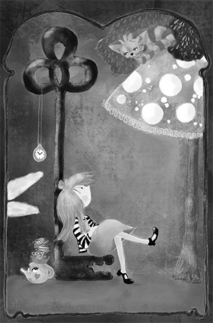
Hi guys, this is how far I got with my book cover design so far, I can see a few things that still needs to change but I wonder if other eyes can see more. I would love to hear/read what you think and if you have any suggestions how to make this better. Many thanks.

-
@anitabagdi
I love the texture of it! Alice is also very cute.")
Maybe it would be a good thing to make all the eyes in the same style, now Alice, the cat and the teapot all have different eyes, so they look like each of them belong into a different story?
I would love to help more, but it’s difficult, without the title in there. Are you designing the illustration together with the title, or are you planning to add the title once the image will be finished? It might be a good idea to design both together, so it fits nicely! -
Very nice! One suggestion though, keep an "empty" space for the title and author so it doesn't cover important parts of the art.
-
This is a cool idea to incorporate different parts of the story into the book cover but I'm thinking maybe you have a little bit too much? The watch is great and symbolizes the white rabbit so maybe lose the ears, i'm not 100% on the teapot having a face, maybe just make it plain and then add a little mouse or the mad hatters hat leaning on it? Also, is the cheshire cat sitting on a toadstool or is he in a tree? I really like your cat, his colours and his face are brilliant, but I think he needs to stand out a bit more so by replacing the toadstool with a tree branch and putting more leaves behind the cat, that might help to make him stand out? Really like your Alice character, she's got a modern/rebel twist and she looks really cool, and I like that she's sat on a key

Sorry I've rambled on a bit there, overall its looking great, there's just one or two small things to rework or look at again in my opinion! -
I love your take on Alice! She's very cool, and the way you've styled her has a nice feeling of flair!
I think you might need to pump up the contrast on some of your values, especially around the cat. I hope you don't mind, but I desaturated your image to grey scale to look at it. I think the greens behind the cat could go much darker to help him stand out more. I might like to see the polka dots toned down a little bit, too. They're so bright, it's the first thing my eye is drawn to.
Great progress so far! I like the textures you've incorporated in this piece. Keep up the good work!
-
@mag Thank you for the lovely feedback!
Yes I will add the title, planning to place it between Alice and Toadstool, will post it asap to show")
-
@jennymwine Thanks a lot, this is uber useful, I really appreciate your help and will.play with the image a bit more! Thanx again!
-
@hannahmccaffery No way, this is a great help! This is why I asked you guys to find out what you can see and how you would make it better! Madhatter is a great idea, you see it didn't come to me! Yes I deff will do more changes now! Many many thnx for the advice!
-
@therealcpg Thanks a lot for the suggestion, the title meant to be not too big, will add it soon to show
but you may be right, I should make a little more space for it!.mny thnx! -
Hi
Below are my suggestions:The rabbit ears are in an awkward position and cropped off -what reason did you have for not including all of him? Maybe if he was jumping up to get the pocket watch.
The tea pot with the face reminds me more of Beauty and the Beast rather than Alice in Wonderland.
I like how Alice is sitting on the key and looking at the Cheshire cat (which I wish was not so high -same height as the key).
You have a lot of playful elements of the story - I just think you need to focus on 2-3. I like how you have detailed your tree leaves.
What are your plans for the background? -purple right now -with the frame it looks like a world you can step into but that purple is flat/ stops you from going any further.
I definitely struggled in the what "elements" I should include because I just recently finished reading the book and there are so many characters and smaller stories hidden. I will not be finishing it for the contest but am satisfied I have a solid idea (with the elements organised -my drawing is not up to where I want it for this contest).
It is nice Alice will get into the contest - by your interpretation
-
@Heather-Boyd Thank u for the comment Heather, I will take it on board and do changes for sure!
-
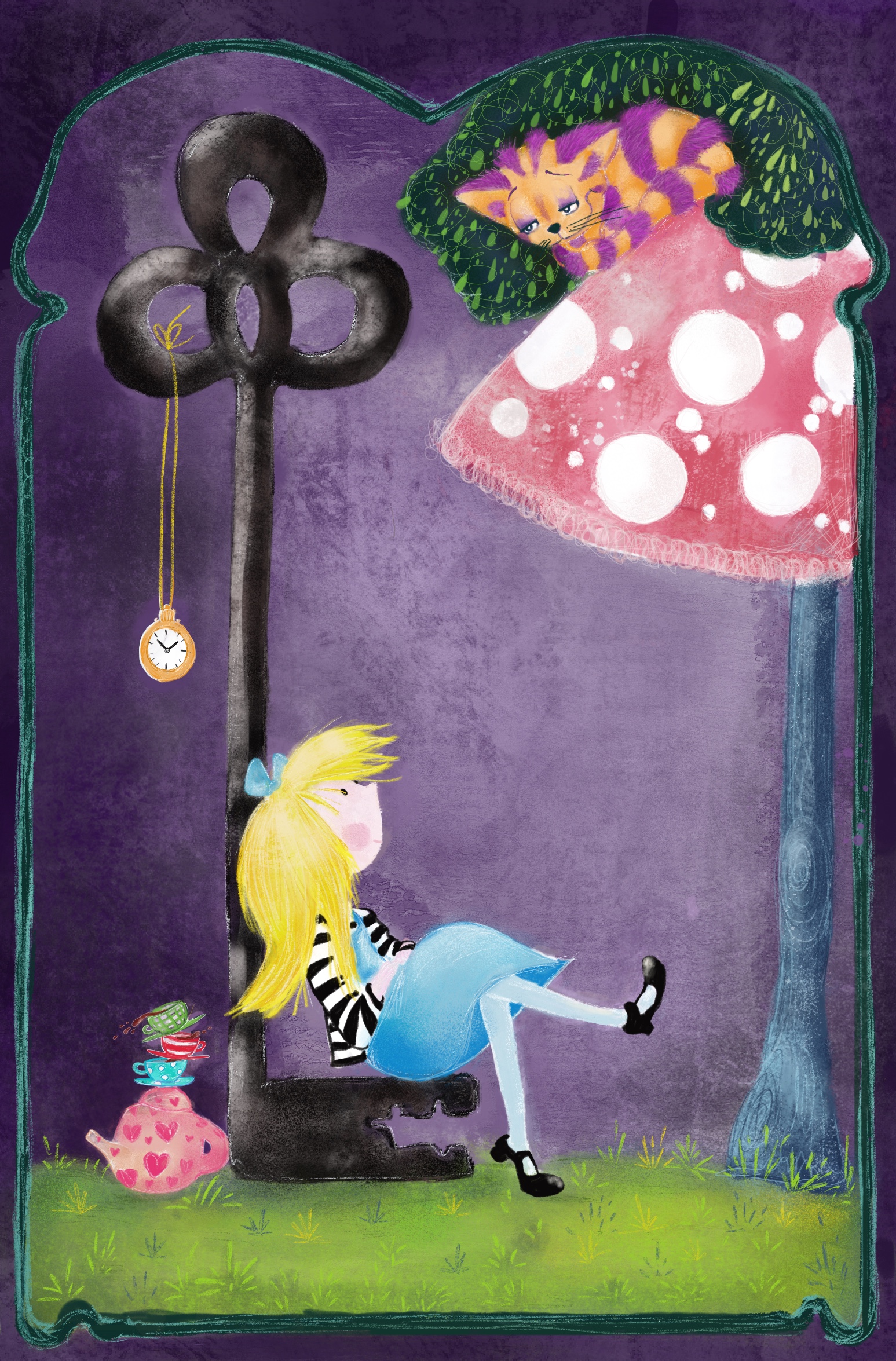
Hi, I have done a few changes according to your advice, I wonder if it looks any better.
-
@anitabagdi Those areas which you removed things help reduce the distraction and focus on the elements you want. I just noticed how the watch is hanging above the tea cups/ kettle -illustrates "late for tea", I think that's clever -I just wished those two elements were more worked into your piece instead of on the edge - Alice doesn't notice or interact in any way with them. i really like your Alice though if I didn't mention her before -sorry.
And it be really cool to see the title/author included -to ensure you have enough space and still as visually wrapped up nicely.
-
@Heather-Boyd thanks for the helpful comment Heather. I have the finished piece on my computer with the title and author, I can share it as soon as I am at home
-
Hi guys, I do apologise for not being able to show you the final one, I couldn't even enter last month's competition at the end as I had problems with my computer and couldn't access my work. I just wanted to say I still really appreciate all your input and help with the book cover piece! Thank you.
-
When you get things fixed and up and working - I'd like to see it anyways.
-
Me too