Creative Composition - Full Render
-
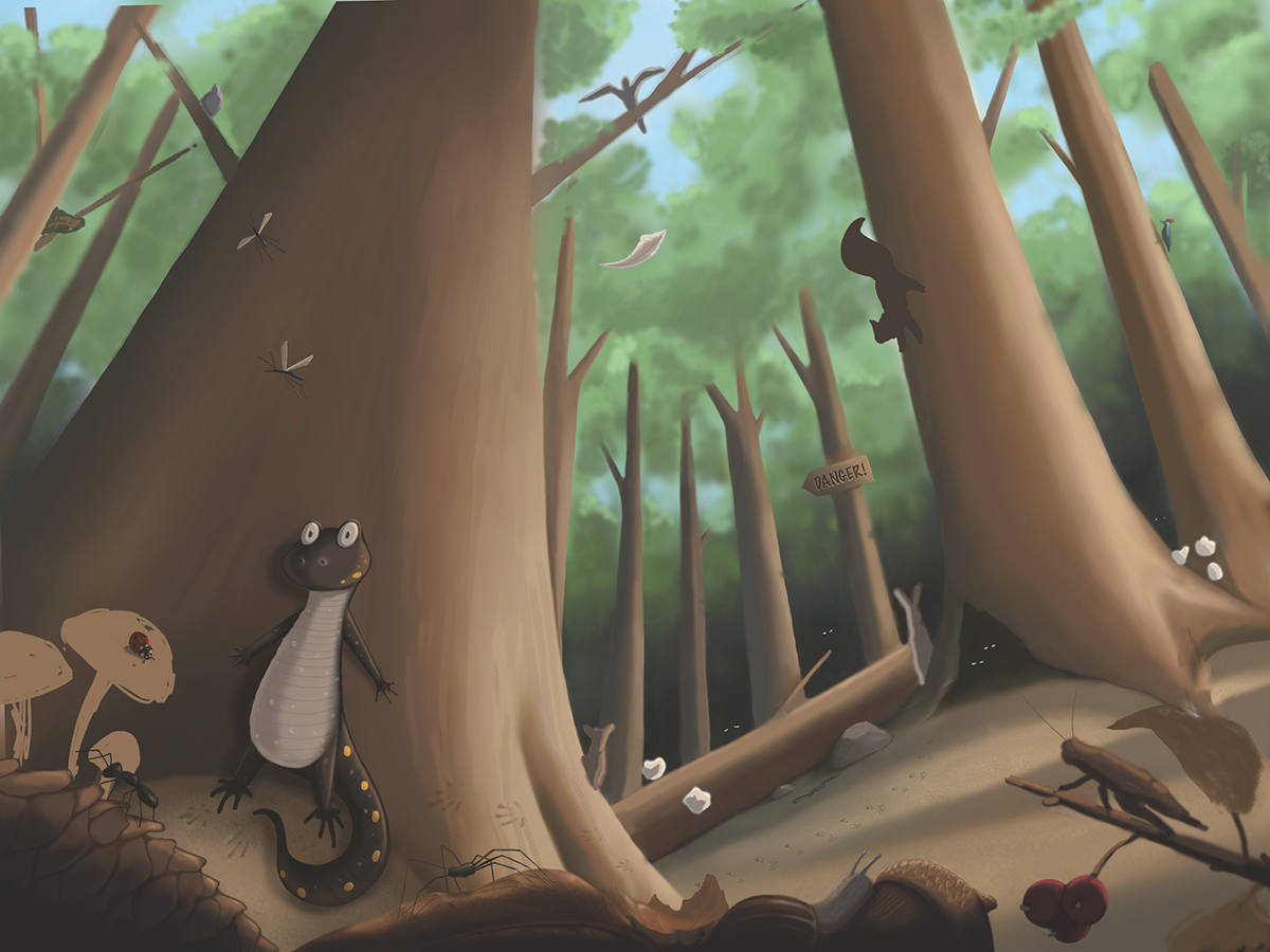
Months ago I began to render the sketch I did for the Creative Composition class, but have not yet been able to finish. It has become a piece that I do a little work on from time to time, but it feels like it is hanging over my head and I would really like to finish it.
When I first took this on, the concept was beyond my skill level, and still is in many aspects! But...I'm not ready to give up on it. Below is where I am at currently, and I feel like I have hit a wall and could use some feedback. Keep in mind there are many things still not rendered like the background animals, cricket, mushrooms, etc.
- How is the overall perspective?
- ****I cannot seem to get the perspective right on the squirrel, advice? I have drawn it numerous times and it still doesn't feel right. I am not sure what to do, or if perspective is the real issue. What do you do if you just can't draw something right?
- Is there something glaringly wrong that I am missing?
-
This has worked out really well, the perspective is great and I love the little details you've added in the foreground. To me the squirrel looks fine, but I'd make him smaller as he looks about the size of a cat at the moment, maybe also look at adding a bit more colour to the little newt character or to a few more bits in the foreground - just to break up all the brown!
")
-
@inkandspatter I agree with @hannahmccaffery the squirrel is good. I think once you add some value to it, it will read better. There is a tangent on the bottom right leaf that is running into the bottom of the tree. Maybe cut that back a little. Also I am not sure what the object in the sky is behind the tree branch. Is that a bird?
-
@inkandspatter I really like how you are refining the foreground creatures -looks so polished. Just saw those little had prints on the tree -that's really nicely done.
Perspective wise I have an issue with the second tree from the left side -it looks slightly tilted more to the left than than others -that are converging more to the proper right.
What are the pops of white in your image?
Instagram: www.instagram.com/heatherboyd.illustration/
Website: https://heatherboydillustration.ca
Shop: https://www.inprnt.com/search/products?q=HeatherBoydIllustration
Ko-Fi: https://ko-fi.com/heatherboydillustrationBe blessed,
-
I am having a little problem with the perspective. You are going for a "worm's eye view" right? The tilted ground plane is a bit confusing. Even if you are going for a bit of a tilt in the persepective, the trees should converge towards a point that is perpendicular to the ground plane (unless it is a hillside?). If you lighten up the value on the squirrel it should pop a bit more. it can still be in shade, but should be lighter than the tree trunk
-
@Taigyo Thank you I will try to adjust the perspective. I guess it is somewhat of a worms eye view, I didn’t think of it that way, but that is definitely the feeling I am going for. With that it mind, I am not achieving the perspective here. The squirrel is currently just a blob of colour for placement purposes, I would definitely lighten him up.
-
@Heather-Boyd Thank you, I see the tree issue now that you mention it, I will adjust it. The pops of white are going to be flowers. I was hoping to add some dappled sunlight, and I wanted some to be hitting the flowers. Sorry, it looks confusing with so many unrendered blobs of colour.
-
@hannahmccaffery @Chip-Valecek Thanks, I will try the changes you guys suggested.
-
Funny concept and I think your character is hilarious!
I agree that the perspective needs some work, I think the ground plane that your main character is standing on is a bit confusing. It feels like the tree is sitting on a small mound. Maybe you could extend the roots towards the bottom right corner of the image and that may help your perspective as well. I think something else that can help your piece is reducing the contrast of your background because it's competing with your foreground and i'm assuming that is your first read? You could try grouping your values more in the background or maybe adding some atmosphere to enhance the mood as well.