WIP Book Cover Peter Pan
-
Hi guys,
I've decided to jump head first into this forum and enter the competition. I've used this as an opportunity to try out some of the painting techniques in the SVS videos. I'm enjoying it as its such a huge step away from my more cartoon style but my energy is lowering the more hours I put into it.
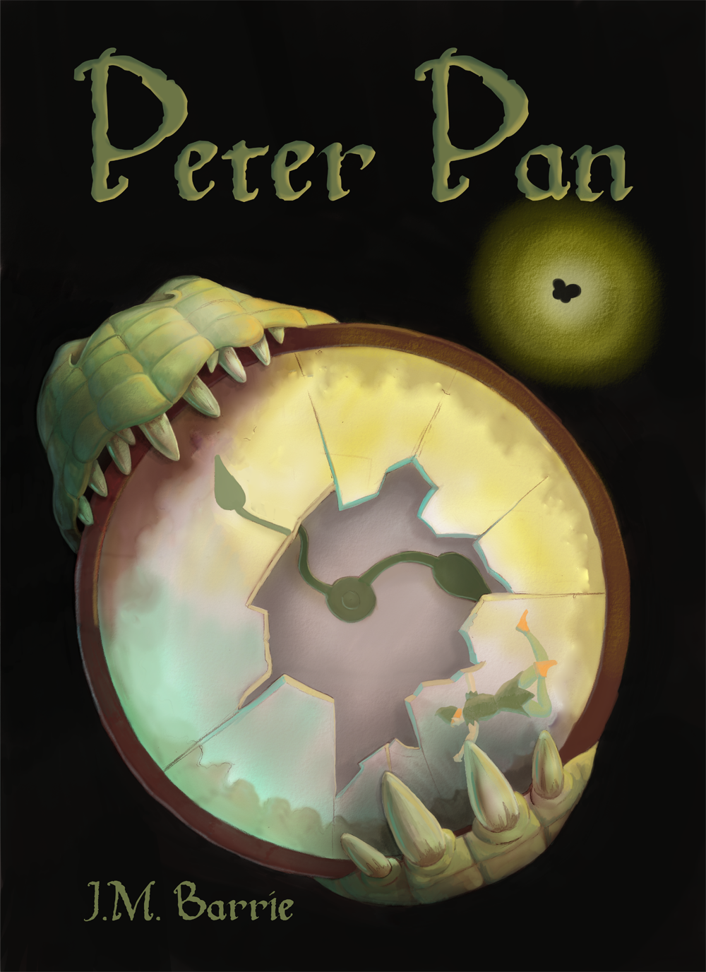
Here is where I'm currently at with the painting. The bottom image shows my initial idea of including Peter Pan, Hook's hook and Big Ben as reflections in the different shards of glass. I'm trying to work out if that might be overdoing it though.
Any feedback on composition, colour, technique or whether the image captures the themes of Peter Pan would be great.
Thanks,
Daniel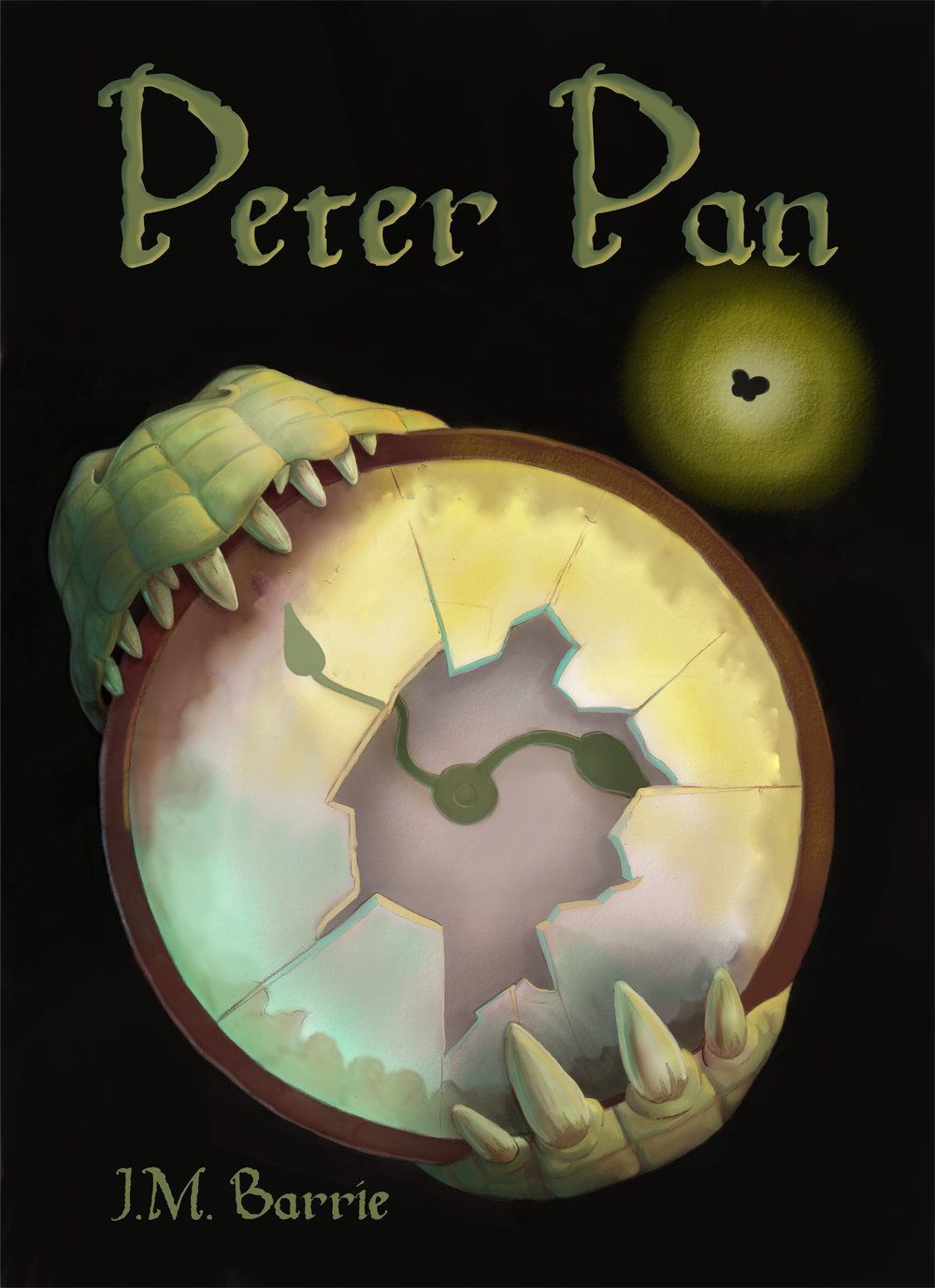
-
Yes, I was gonna do Peter Pan. I changed my mind at the end.
I love your take so far! I will try to take out Peter Pan out of the clock and bring it outside. That way I can see the silhouette of this kid who can fly.
Jose A. Galue
www.instagram.com/artofjosegalue/ -
Thanks @josegalue25 that's not a bad idea. Silhouette could work really well. I'm going to try having them silhouetted in the glass and outside. See which works better.
Thanks for the suggestion.
-
A really nice take for the cover! I can't wait to see how it progresses. I do like the bottom design with the characters played out.
-
I think your rendering is really solid. You have obviously put a lot of time into this.
I have a few thoughts on storytelling
- Where is this? I'm asking because it feels odd to just be taking place in a black void.
- In addition to that, I would take a look at this peice in a black&white version to study your values. The title "Peter Pan" is a pretty dark value and I have to strain a little to see it.
- You have a little watercolor texture around what I presume is Tinkerbell but nowhere else in your composition and that feels off.
- The butterfly silhouette is what I presume is Tinkerbell? I would add more detail to sell that that is a fairy not just a bug.
- The shards of glass are really nice, I love that you offset the one arrow in the refraction. But I would be sure to show the other arrow doing the same thing.
- The crocs top jaw really feels like it is going around the clock, the bottom one has the lips a little to flush with the clock. It's hard to describe but basically, the bottom jaw looks flat, unlike the top. Let me know if that doesn't make sense and I can draw it.
- I like your idea on the bottom to show more elements in the shards. I would be careful not to make it too busy. But I think it is important because the top version isn't immediately recognizable as a Peter Pan book cover.
Best of luck! As I said, I love your rendering, those digital painting classes have paid off, keep up the great work!
Cheers,
Anderson Carmanhttps://www.andersoncarman.com/
https://www.instagram.com/andersoncarman/ -
@djly thanks for the feedback
")
@andersoncarman thank you very much for taking the time to write such a detailed critique. That's exactly what I was looking for from this post. I'm absolutely going to take all of your points on board. I hadn't even considered most of the things you'd listed but the bottom jaw had felt off from the beginning.
-
Oh this is great! The frist thing I saw when looking at your picture was the glowing Tinker Bell. Maybe soften down her sparkly presence a bit not to make her take over your image? I had to look a bit for Peter too. Maybe you can make him stick out more by not blending him in as much with the rest of the clock?
It looks great! I love your take on Tick-Tock clasping the clock between his jaw. Love the detail you gave his teeth. Can't wait to see how you develop this one further.