Front Cover Wip
-

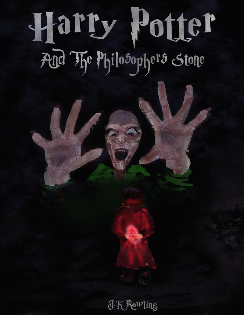
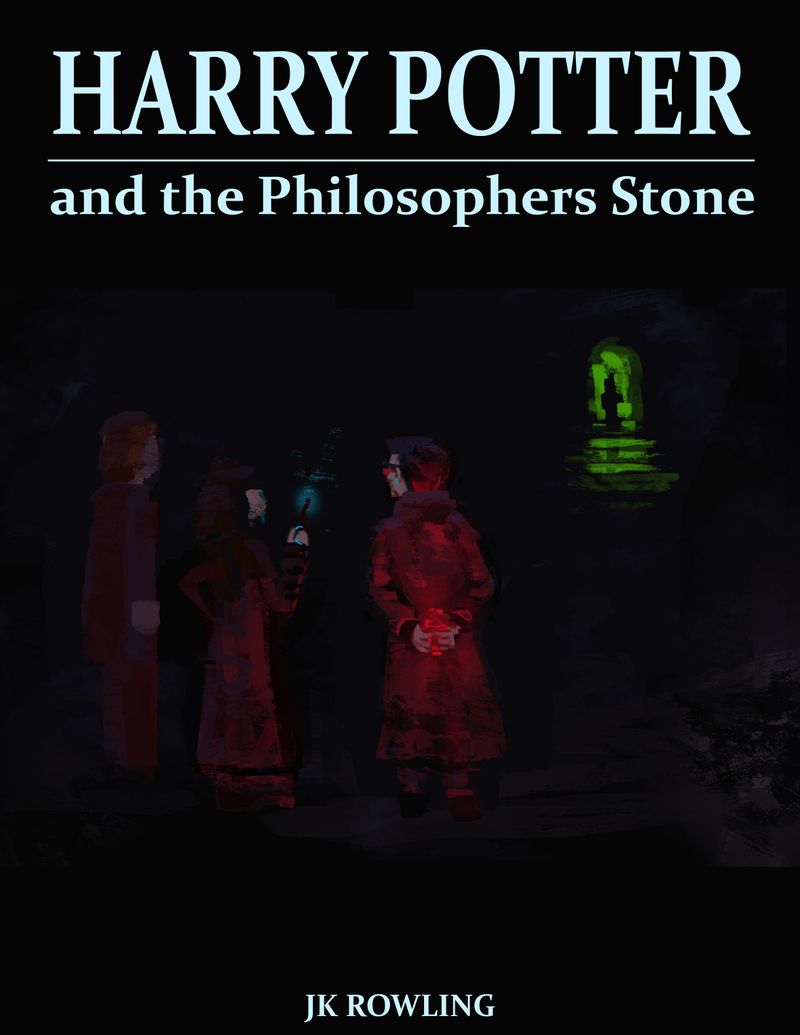
I have just created this front Cover and played a bit with colour, just thought I would see if anyone could see anything I could improve upon other than the rendering.
Open to critiques on the wip.

-
What a great interpretation of the book. One thing I notice is what I assume is Harry hiding the stone behind his back, feels a little unnatural as well just the back of Harry’s head isn’t as exciting as another pose.
Also the hands of Voldemort appear flat. Maybe having some of the fingers bent or angled towards the viewer could give a more menacing look.
Just some thoughts. But fun idea.
-
@eddysage Yeah I agree with the harry pose it was a little rushed. I have actually since changed my idea which hopefully gives more thought than shock to my cover.

-
@Jason-Bowen - I like the new cover and the menacing doorway in the background. It really builds up some nice anticipation!
The only feedback I might have is bringing Ron in a bit and have him turned toward Harry/Hermione a bit more - perhaps even with Hermione overlapping a bit? Just to get a bit more expression on Ron and have him look more included.
I can't wait to see the final version!
-
I actually like the first cover idea. Very in your face shocking. In a good way, lol. I think with some thumbnails variations for composition and value, and then take a little more time on the rendering you could make it look quite good.

-
I’m digging the second cover. Very dramatic and great color scheme. That being said the body postures of the characters seem either unnatural or are lacking something to do. Maybe have Ron in a more shocked pose, Hermione doing something clever, maybe a book in hand, and Harry being the brave one. Really play up their personalities as shown in the book.
While I like the drama of the darks, maybe some highlights of either red or green on some pillars or something to show the structure that they’re in.