Piece for the Live Critique on Tuesday
-
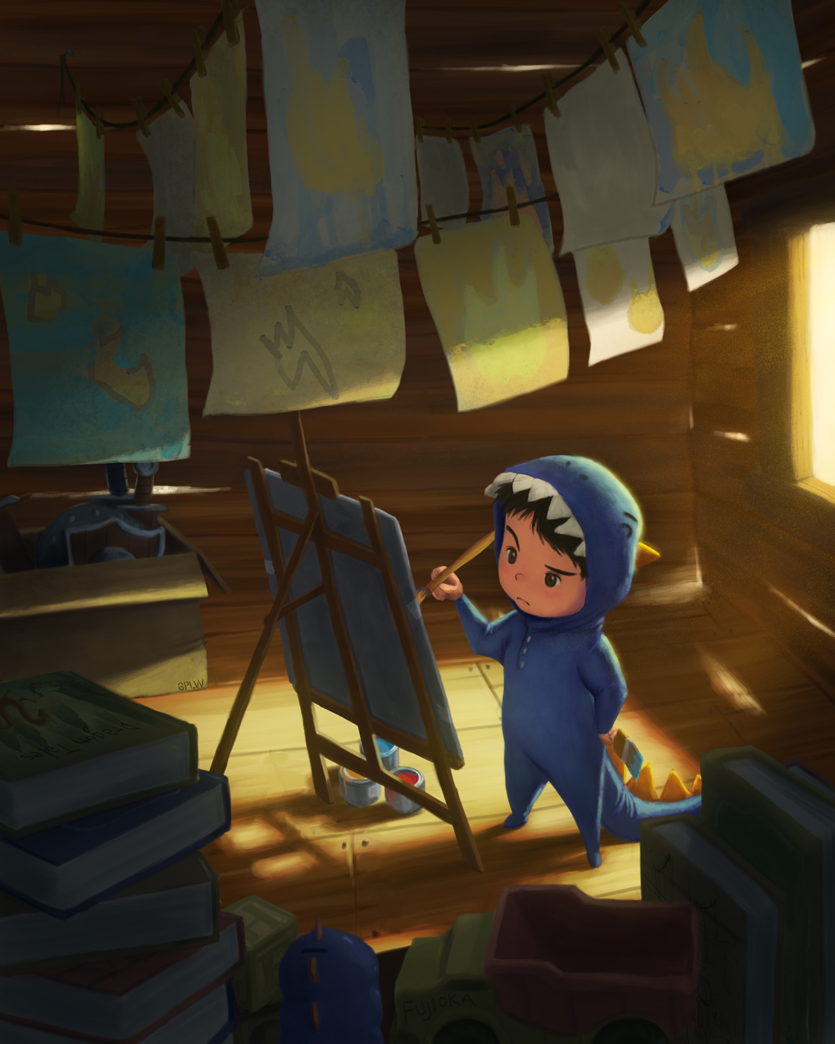
So I have a vague idea for a story that I'm going to explore and see where it goes. It's about a little dragon that doesn't know how to breathe fire, but is determined to figure it out.
I created this image with that in mind and also to submit for the live critique on Tuesday. I thought I'd share it here as well and get as much feedback as I can. (But I already emailed it, so I won't be able to make changes before the critique).
-
Wow - really beautifully done - very tight image - nothing to say but Wow
-
Love the image. It has a clear focal point. Good job with the lighting. I think a bit more time can be spent on the hands and I feel the thinner paintbrush is a bit out of scale. The perspective is a bit off especially on the wall on the right. These are all very minor issues that really don't distract me, but I was struggling to come up with issues in this image. I never like to just say good job when others are looking for critiques.
-
I agree with the others that it is hard to find something to improve on this piece. I love the lighting and the limited palette. I also feel that the perspective is a little off. But this is really minor. I was a bit distracted by his feet. While all the proportion over the whole body are pretty realistic the feet are really tiny. But as I said, I just saw it while starring and looking for "mistakes".;-)
-
This piece is really wonderful. I also agree that the feet of the boy look a little bit too small but I had to really spend some time looking at this to even notice that. I really love the lighting and overall composition of this piece. Nice work!
-
One other thought... I noticed that your edges seem to be a bit haphazard. for instance, you have some soft edges in the background, on the box and part of the easel. This seems to be an issue with working digitally. when things are kept on separate layers it makes working much more efficient, but the hard edges can break the illusion of the traditional feel. Look at the books in the foreground and how hard the edges are. I like to save hard to direct the viewers eye to areas of interest and soften the areas that are less important.
-
You did a really great job on this piece. I will leave the critique up to the professionals!!
-
What Rob said! Hehe, i love the expression on his face...so deep in concentration! I can't believe he doesn't have paint on him somewhere

-
Really beautiful, I love the light peeking through the wood.
-
Yeah, I was thinking about slightly increasing the size of his feet, and then I thought that if I increased the size of his feet, I'd have to adjust the shadows on the floor as well. So my laziness got the best of me. But since it was pointed out, I guess I'll have to suck it up and make the change
")
shinjifujioka.com
https://www.facebook.com/shinjifujiokaart
IG: @shinjifujiokastudio -
lovely work here! You are getting good!
-
@shinjifujioka said:
Yeah, I was thinking about slightly increasing the size of his feet, and then I thought that if I increased the size of his feet, I'd have to adjust the shadows on the floor as well. So my laziness got the best of me. But since it was pointed out, I guess I'll have to suck it up and make the change
You wouldn't have to change the size of the feet if they are a design choice.
Overall I have no real critiques. This is a beautiful piece and you've done a masterful job. Seems pro-level to me.
-
I love the little feet and his costume. Beautiful piece. The only thing that feels slightly off to me is that the face seems rendered in a harder edge style than the rest of the piece, which feels lovely soft, fuzzy.
-
I can't wait to critique this one Shinji - When a piece is really good it's easy to make subtle suggestions and then take credit for it - HA! ...really nice - hope we come up with some good suggestions...
-
This is awesome! I really like the character, the lighting and those little tiny paintings hanging there really add a lot to the story. I remember him from your "frustrating piece" you posted some time ago haha. Btw what is GPLW?
-
@Naroth-Kean You got that right, haha, he is the same character from my "frustrating piece". If you take a look at the cover of the book at the top of the stack, that is the illustration that I originally was going to put him in.
And GPLW stands for "Great Power Lies Within". Sometimes I just put little made up acronyms in my illustration kind of as a message to myself.
-
Will this critique be available for everyone to watch? Maybe posted on YouTube later?
-
Stunning work!
-
@mattramsey According to the class description, the critique will be viewable by other SVS students. But I'm not sure when and how...
-
That's fantastic @shinjifujioka !
I'm gonna be in the critique session too. My work's nowhere near as good as yours though. Looking forward to it anyway.
Craig