Last Minute Love WIP- critiques please
-
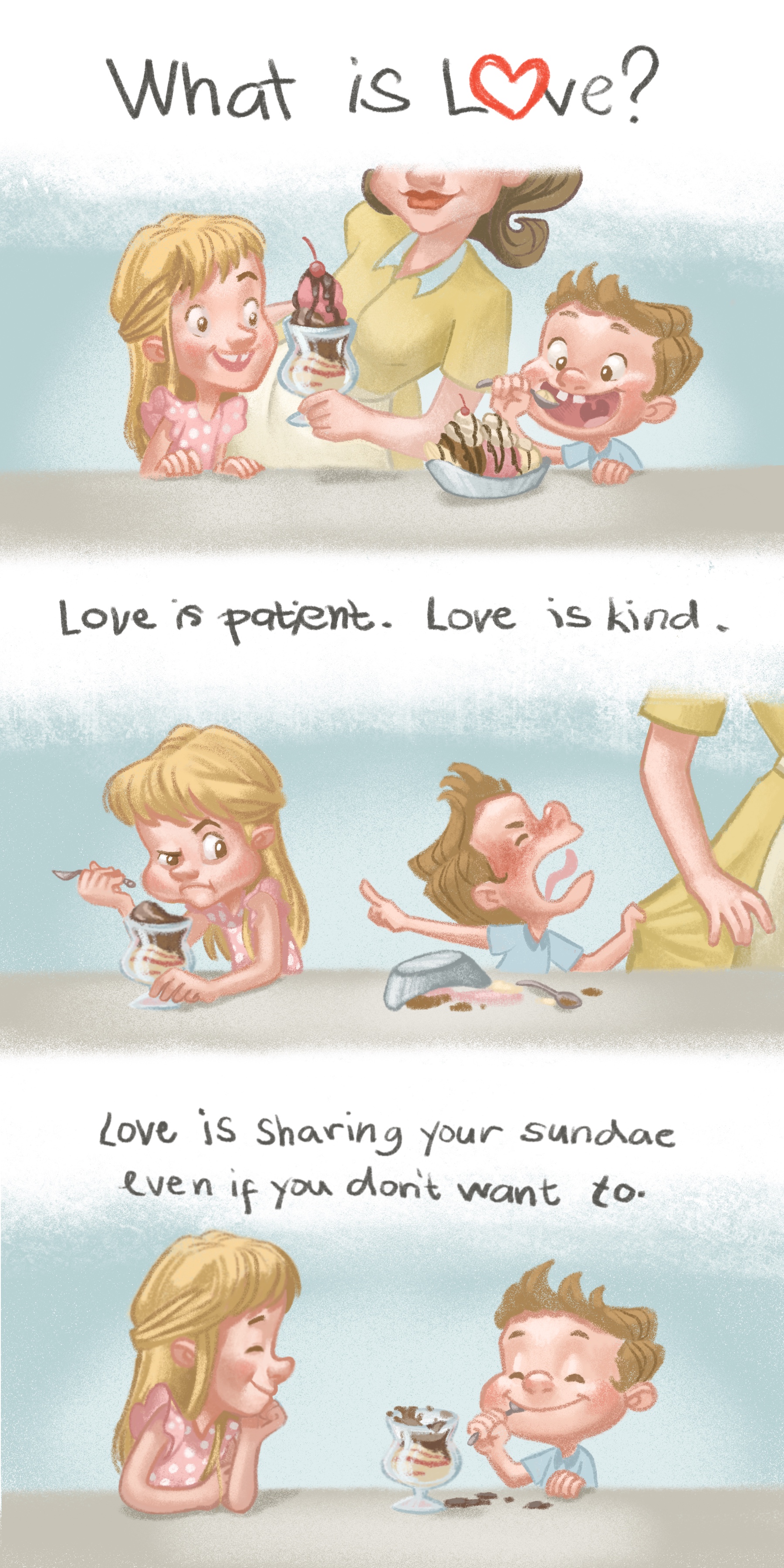
Hi, everyone! Sorry for the last minute post. This month has been very hectic for me. I almost considered not entering this month’s contest. Luckily, I found some spare time and put together the illustration below. I really need your help.
For this month, I wanted to try something more simple, simple story, simple scene, simple background. My portfolio is really lacking some narative pieces and I also wanted to show that i can replicate characters through multiple illusrations. I also need more vignettes because I don’t I even have one in my ortfolio. I hope I accomplished that second one though. I’m not really sure
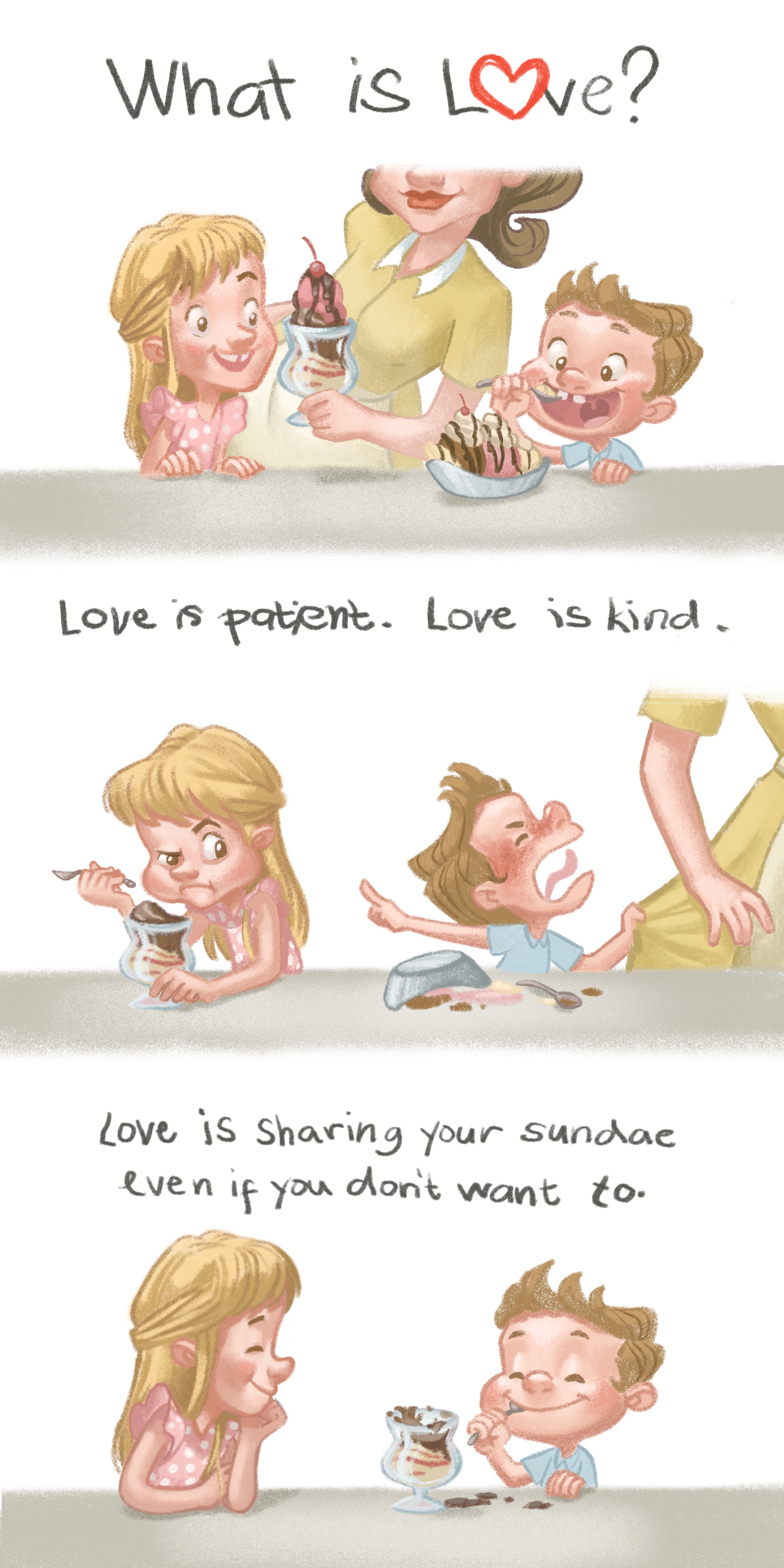
 Anyway, i need your opinion on which background to choose. Should I choose the simple white background or go with the blue one which kinda helps our characters pop out more. Also, what do think about phrases i used? Do you think it’s alright or do you have something better in mind?
Also feel free to point out any wonky elements. I tend to overlook those things at this stage. It really helps. Thank you so much!


-
@nyrrylcadiz I think the blue adds depth. Cute concept!
-
I like them! the blue is my favorite. Theyère very fun!
-
So cute! I love it! I love all the details you put into the piece, from her polka dot dress with fluttering sleeves, to the layers of sundae and reflection of the glass (looks really yummy, ha!) and the missing front teeth.

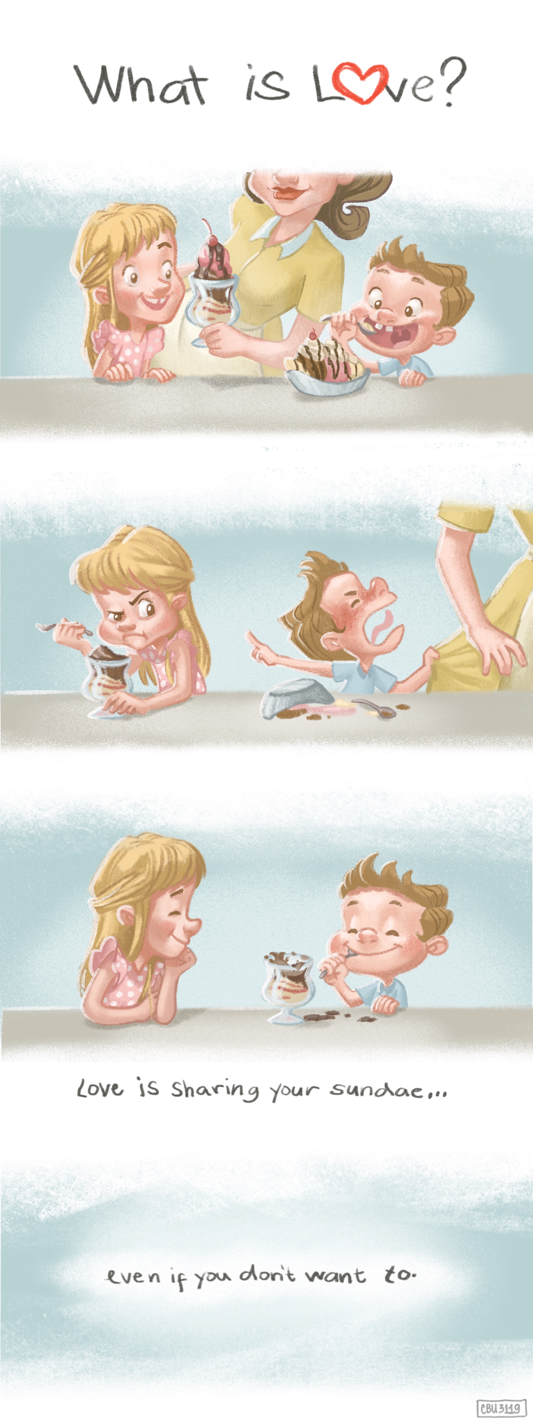
Personally, I like minimum words. I would just say: "What is love? (Then at the end, below the last picture:) Love is sharing your sundae."
- "Love is patient, love is kind" - I don't think it's necessary; your picture number 1 matches what a normal person would agree to what love is: Mom, heartwarming, kindness, family, siblings, precious moment etc. I would love to have the space for imagination, rather than the writer defining everything for me. Then at the end, the simple line "Love is sharing your sundae" is totally expected and a nice, heartwarming surprise.
- "even if you don't want to" I dont' think this matches your last picture since the sister seems to be very happy to share. In fact if she is happily sharing, it is a more appealing definition of love.
This looks like a nice portfolio piece. I think the emotions are captured nicely. I too like the blue background. Love it!
-
Wonderfully drawn characters with lively expressions. I vote for the blue background. It draws me in more and anchors the characters in that space.
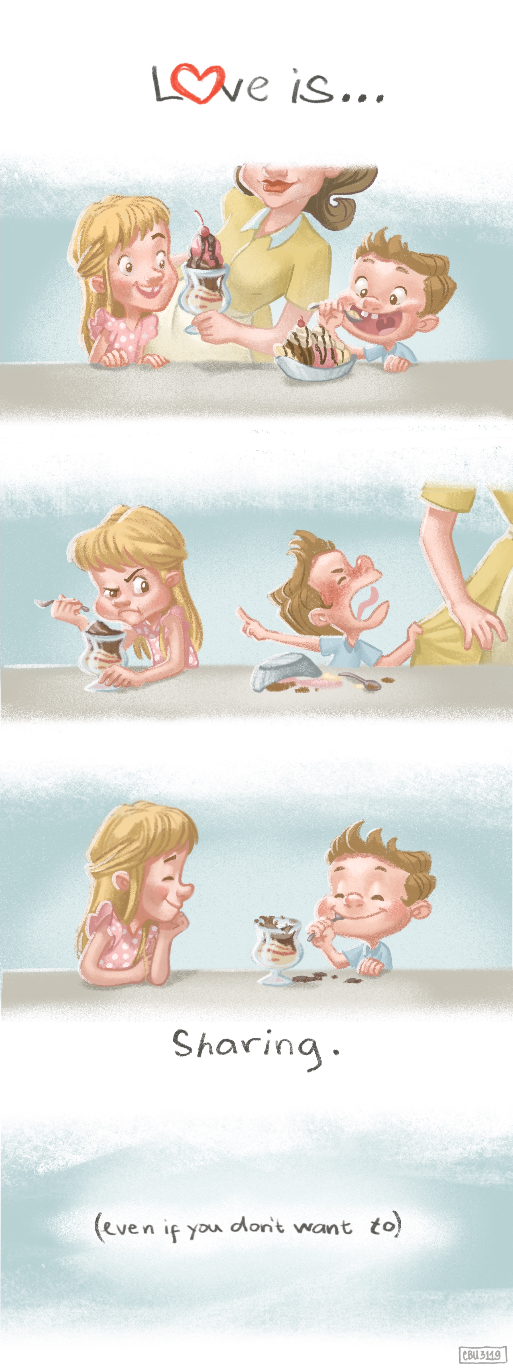
Regarding the words, I tend to agree with @lisanganart. I feel that the words are unnecessary and distract from your beautiful illustrations. I would either go completely wordless, or make the text minimal. For example: first panel (Love is...), middle panel (no words), last panel (sharing.).
-
@lisanganart I really like this idea! I’ll try this out. Thank you so much.
-
@Johanna-Kim Good idea! Even less words!
-
Hi, everyone here is my updated work. I hope you like it. @Coley @thiskatecreates @lisanganart @Johanna-Kim Thank you so much for your feed back. @Johanna-Kim I think I’ll also give your suggestion a try. I love the idea of going with lesser words. Again, thank you everybody!

-
This on is based on @Johanna-Kim ‘s suggestion. I think I like this more. Fewer words.


-
Thank so much to everyone who shared their comments. I’ll be posting this piece in a few hours. Please let me know if you have any suggestions left and we’ll see if we can make them work. Thank you so much!