Society of Visual Storytelling

    SVSLearn Forums

    • Register
    • Login
    • Search
    • Recent
    • Tags
    • Popular
    • Users
    • Groups
    • Search

    (Last Minute) Love WIP

    Artwork
    6
    14
    192
    Loading More Posts
    • Oldest to Newest
    • Newest to Oldest
    • Most Votes
    Reply
    • Reply as topic
    Log in to reply
    This topic has been deleted. Only users with topic management privileges can see it.
    • ThisKateCreates
      ThisKateCreates last edited by

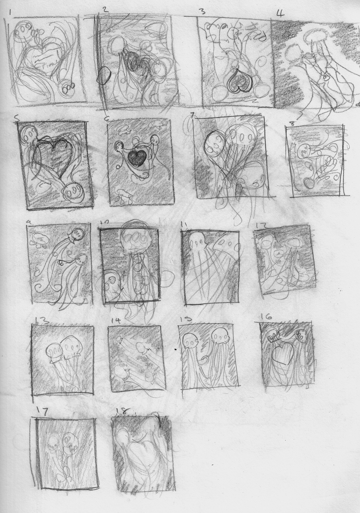
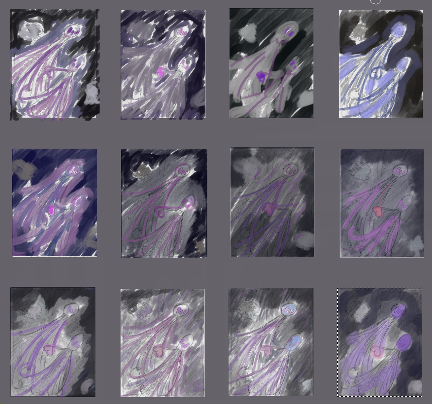
      I struggled with the idea and now it's crunch. Running short on time but if anyone has critiques I would love to hear your thoughts.

      Jellyfishthumbnail.png

      jellyfish sketch.png

      https://www.instagram.com/thiskatecreates

      Heather Boyd Kevin Longueil 2 Replies Last reply Reply Quote 2
      • Heather Boyd
        Heather Boyd @ThisKateCreates last edited by Heather Boyd

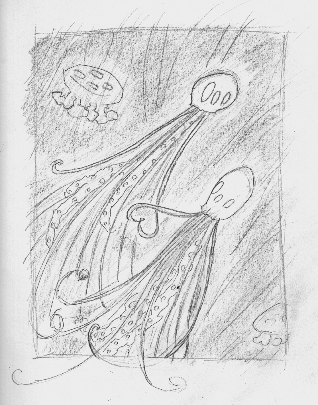
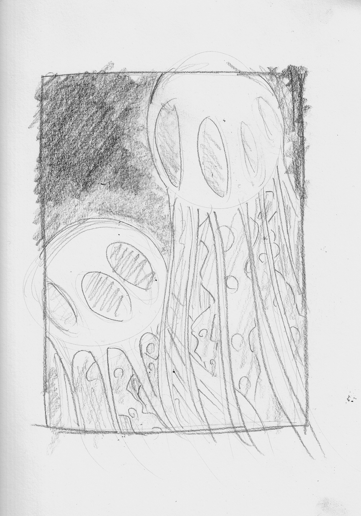
        @ThisKateCreates I like number 10 and 11. Though the bottom left of number 10 -could be moved more into the work (maybe up and in the middle a bit more). Instead of the circles in number 10 making up the octopus (sorry edited Jellyfish) maybe hearts - just a thought that popped into my head as I was writing this. I like the movement in 11 reminds me of Wali and Eva dancing in space. 🙂

        Instagram: www.instagram.com/heatherboyd.illustration/
        Website: https://heatherboydillustration.ca

        1 Reply Last reply Reply Quote 1
        • ThisKateCreates
          ThisKateCreates last edited by

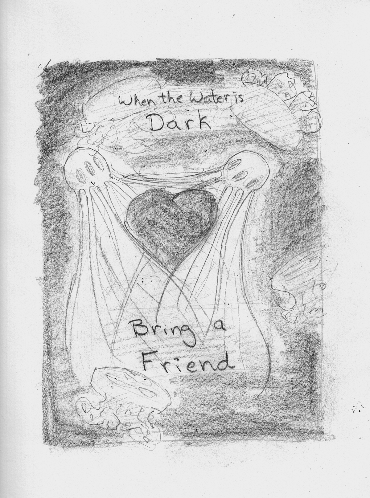
          I may do a few sketches and decide then. The jellyfish are supposed to glow to help light each other's way in the dark. The original comp had text to that effect. I liked 16 or one with a heart but going kind of art nouveau with the strings. Someone else like 9 so I sketched it initially. See what I can knock out in time. XD

          https://www.instagram.com/thiskatecreates

          1 Reply Last reply Reply Quote 0
          • JerrySketchyArt
            JerrySketchyArt last edited by

            I like #6 personally.

            1 Reply Last reply Reply Quote 1
            • Kevin Longueil
              Kevin Longueil SVS OG @ThisKateCreates last edited by

              @ThisKateCreates They are all nice - i do like 9 the best - maybe with a slightly larger heart element?

              Portfolio: kevinlongueil.com
              https://www.instagram.com/kevinlongueil/

              1 Reply Last reply Reply Quote 0
              • ThisKateCreates
                ThisKateCreates last edited by

                Expanded ten and not super excited for it. But the close crop does have a nice design and bring you in. Hmmm.
                jellyfish sketch2.png

                I'll play a bit more before going forward. >_>

                https://www.instagram.com/thiskatecreates

                Y 1 Reply Last reply Reply Quote 0
                • Y
                  yeungtina @ThisKateCreates last edited by

                  Personally, I like the overlap in 4 and 11. The hearts read a little literal but I think the coloring could help sell it if you decide to go that way. Love the overall concept!

                  1 Reply Last reply Reply Quote 1
                  • ThisKateCreates
                    ThisKateCreates last edited by

                    The more sketching I do the harder it is for me to choose....
                    jellyfish sketch3.png

                    https://www.instagram.com/thiskatecreates

                    1 Reply Last reply Reply Quote 1
                    • ThisKateCreates
                      ThisKateCreates last edited by

                      dd6d77a1-9765-43e2-9ef0-396121451ea9-image.png

                      https://www.instagram.com/thiskatecreates

                      JerrySketchyArt 1 Reply Last reply Reply Quote 0
                      • JerrySketchyArt
                        JerrySketchyArt last edited by

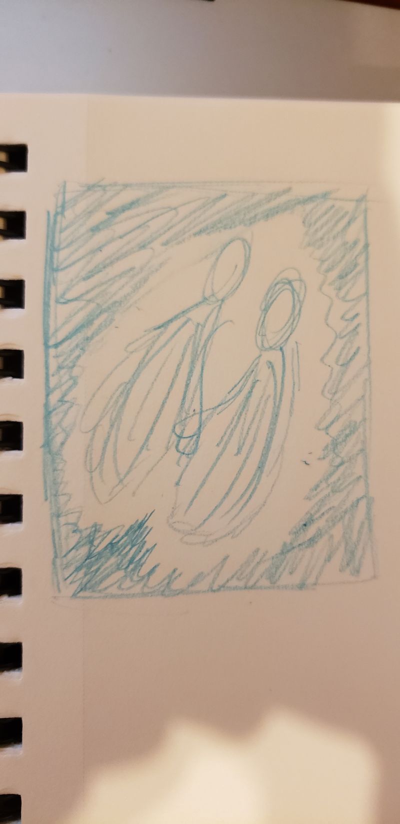
                        I noticed their forms kind of form a heart around them naturally. Might want to consider framing them with a bit of an off angle heart since you said they are emitting light? Kind of like this:

                        20190227_183322.jpg

                        ThisKateCreates 1 Reply Last reply Reply Quote 1
                        • JerrySketchyArt
                          JerrySketchyArt @ThisKateCreates last edited by

                          @ThisKateCreates As for the ones you posted, I personally like the contrast and negative space of 8 and 9.

                          1 Reply Last reply Reply Quote 0
                          • ThisKateCreates
                            ThisKateCreates @JerrySketchyArt last edited by

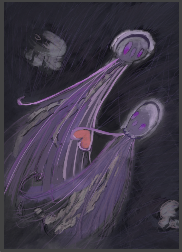
                            @SketchyArtish The original thought was they formed a glowing heart but didn't quite hit it yet. hmmmm

                            https://www.instagram.com/thiskatecreates

                            1 Reply Last reply Reply Quote 0
                            • ThisKateCreates
                              ThisKateCreates last edited by

                              Finish is going kind of sideways. May have to start over on paint. Hope I can get it in today!
                              efd2240e-9e4c-4720-91b9-c873c6624ab5-image.png

                              https://www.instagram.com/thiskatecreates

                              1 Reply Last reply Reply Quote 0
                              • Coreyartus
                                Coreyartus Moderator last edited by

                                This is developing nicely! I wonder if you might increase the value range a bit, making the lights lighter and the darks a bit darker. Contrast always makes a picture pop.

                                But the thing that I think you're going for here is a phosphorescent glow effect. There are lots of ways to accomplish that, especially if you're using Photoshop and you don't mind watching YouTube vids. Here's one example that demonstrates a couple ways:

                                https://www.youtube.com/watch?v=vBlnP8oHGuA

                                Perhaps you could experiment with some different layer styles of glowing highlights? That might go a long way to increasing the contrast in your image IF that's something you think needs to happen. Just a thought! 🙂

                                Children's Illustration Portfolio: https://www.coreyartusillustration.com
                                Art Portfolio: https://www.coreyartusimagery.com

                                1 Reply Last reply Reply Quote 0
                                • First post
                                  Last post