I'd "Love" some help with color WIP
-
Okay forum friends,
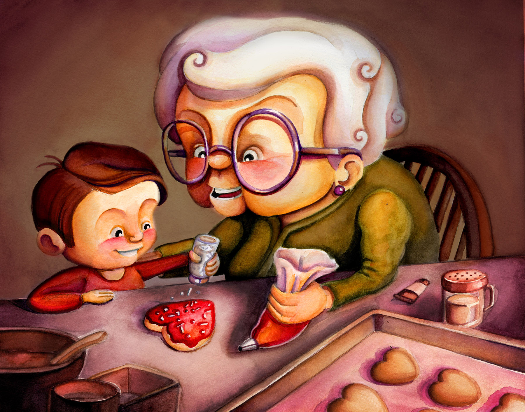
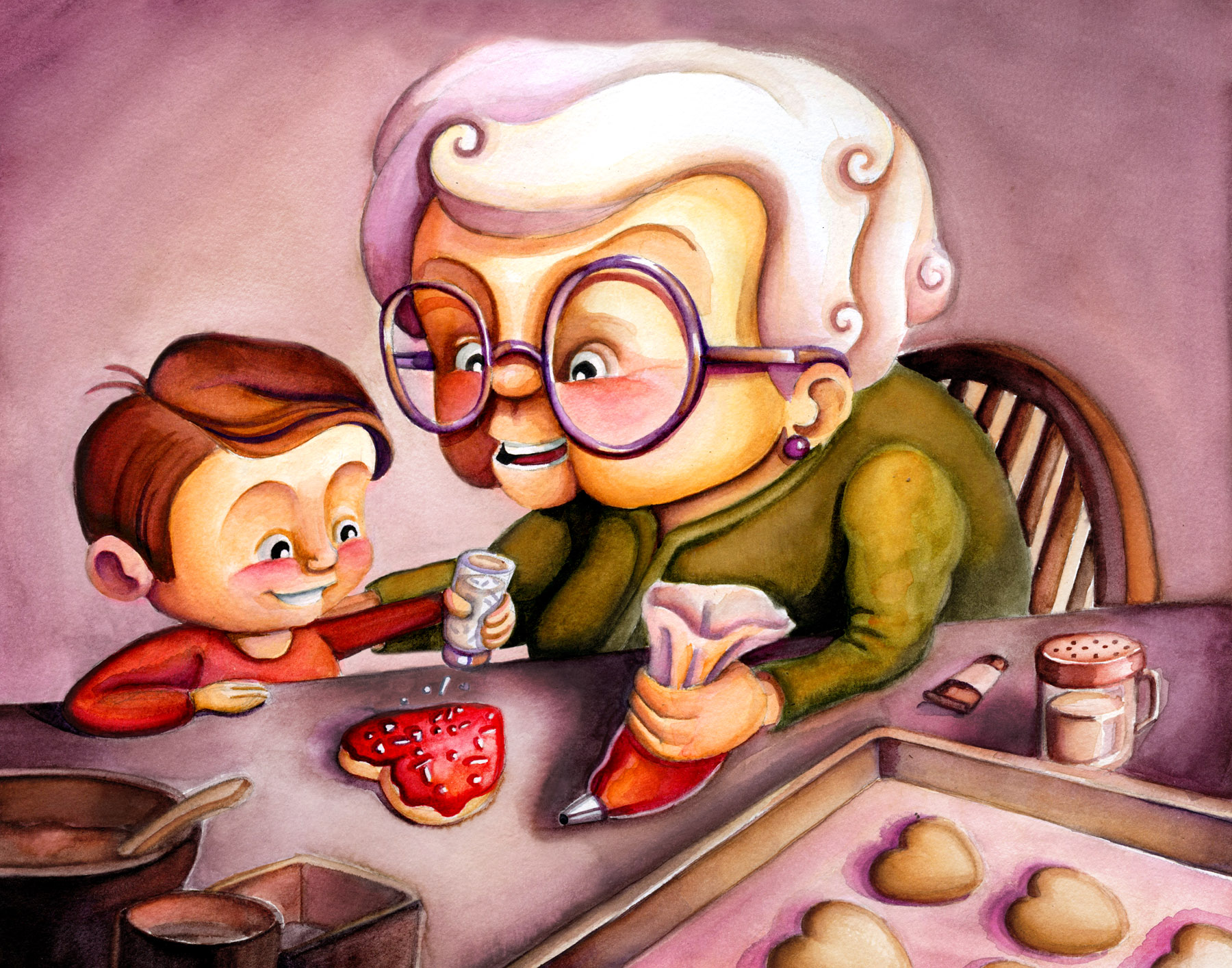
I just finished up my painting for this this month's prompt... but I'm struggling figuring out which color situation I prefer. I feel like I'm getting in my own way at this point and would "love" your input or paint overs.
Option 1 - Darker, but I like how it draws the eye and feels a bit more intimate.
Option 2- Bright and feels lighter, says more Valentine's Day with that pink/purple background. (Maybe more kid friendly??)
-
I prefer the darker too!
-
@artwithashley I think the first (darker) option's better. There's more contrast between the light table and the darker heart cookie. With the second option the table and the background are very similar in value so there's less of a draw to the heart cookie.
-
@artwithashley Darker! It's nice and cozy feeling
") The second one, her hair kind of blinded me there for a second!
The second one, her hair kind of blinded me there for a second! -
@artwithashley i really love the first one. The dark background makes the characters pop. It also adds another level of emotion to your piece. It feels warm, cozy, and really loving.
-
Another vote for the darker!
-
I like the darker one the best. Nice color balance!
-
@artwithashley I prefer the lighter one but if you darkened the background a bit more I think that will do it for me!
-
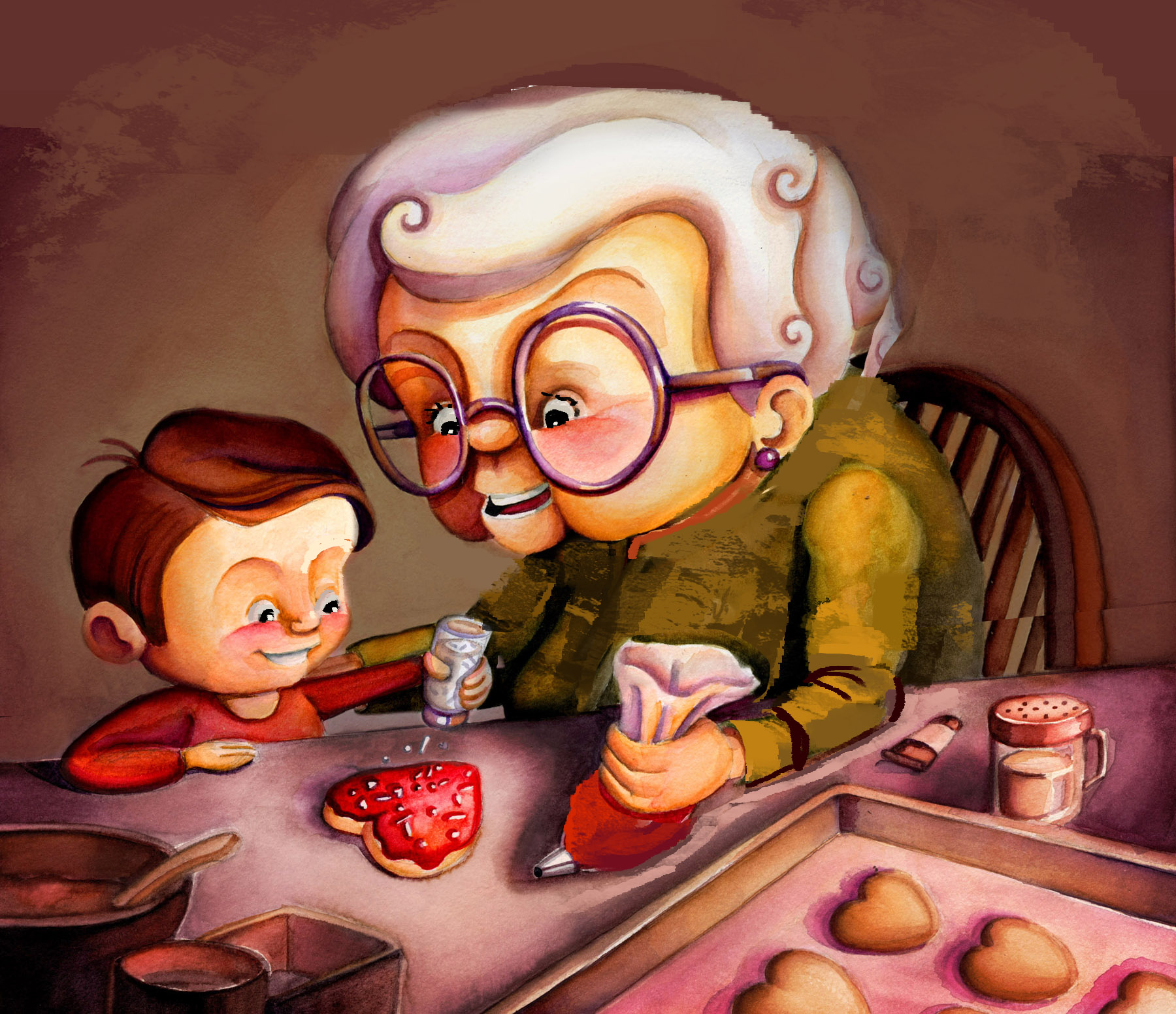 -
-I think your colour is nice on the first one. I thought the womans arm was a little too small. I did a quick paintover to show what I mean. Might help