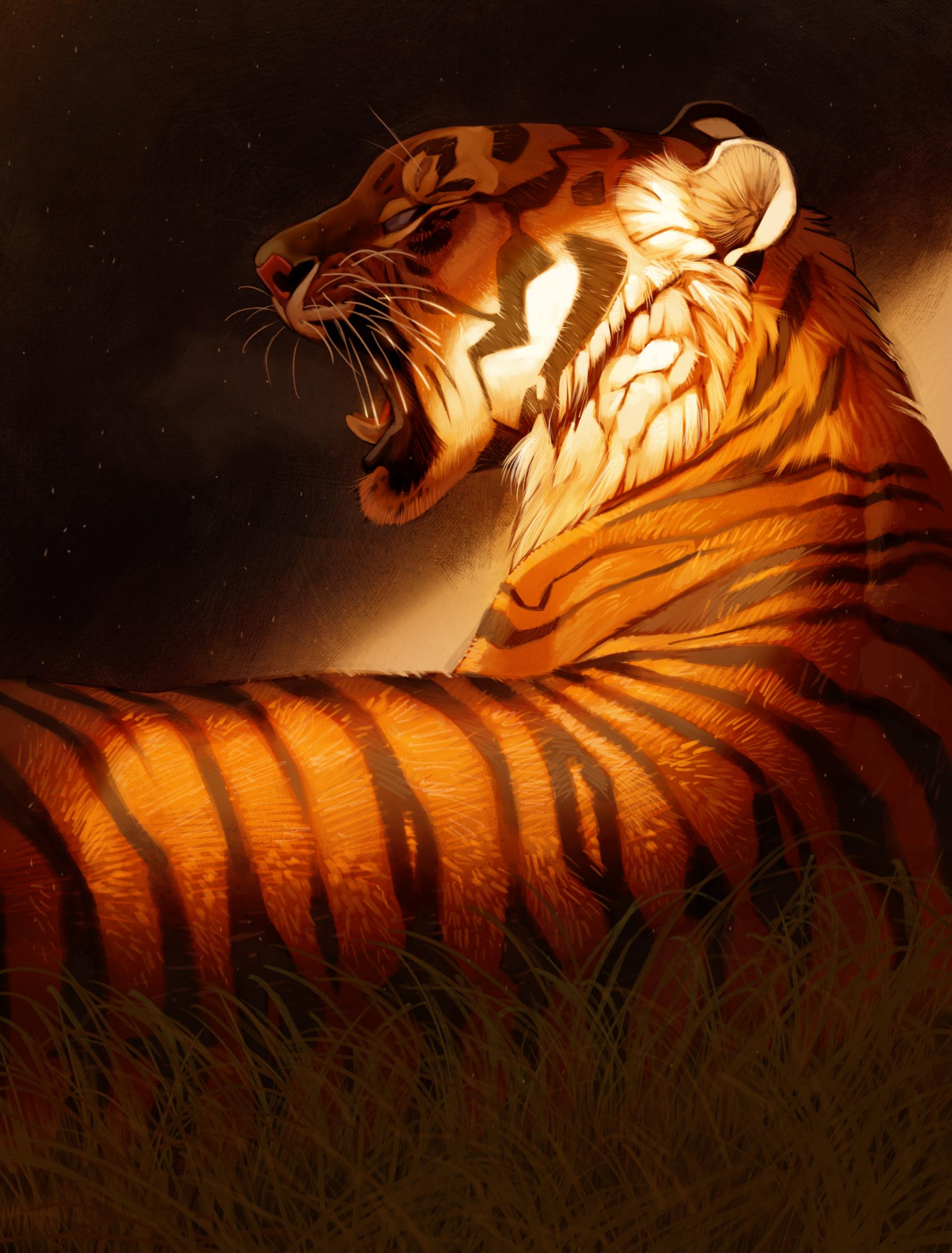
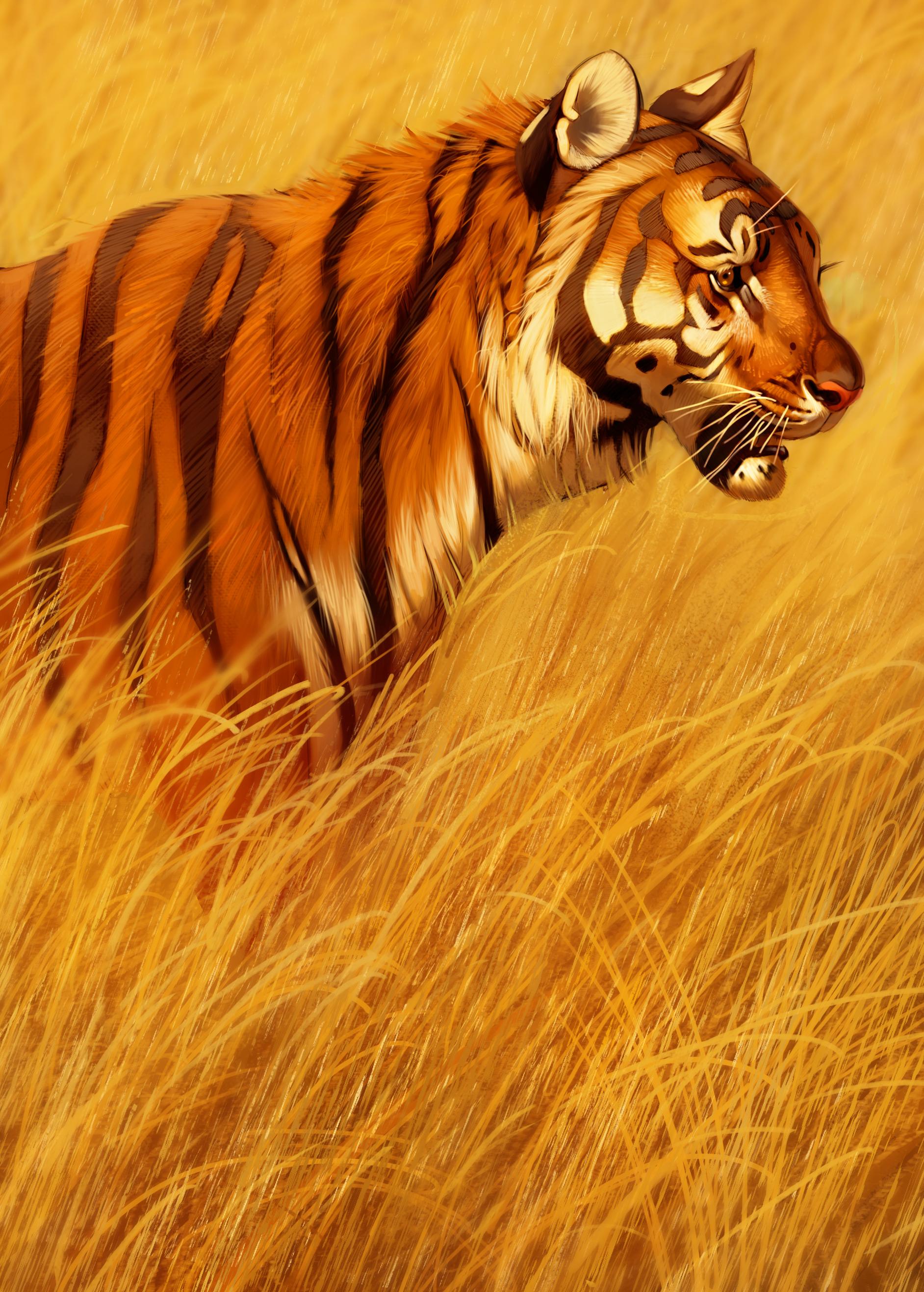
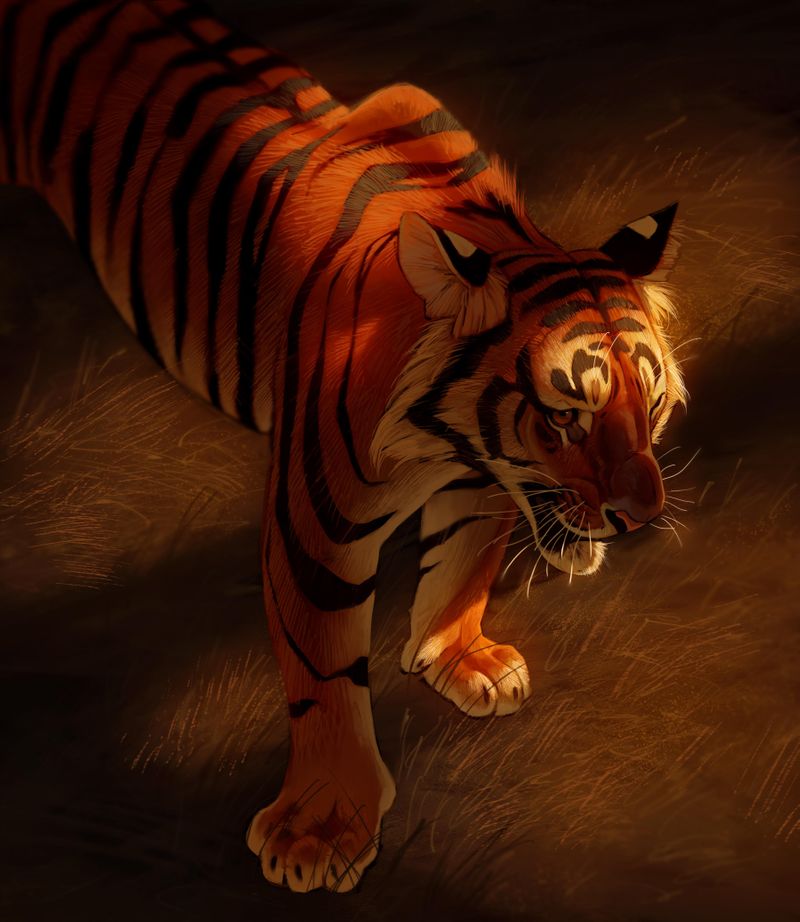
Which tiger painting is the strongest?
-
Hi everyone! Here are my 3 most recent tiger paintings. I am wondering which one is the strongest piece. If you think one is more strong in composition but one has better anatomy or lighting, that would be valuable information for me to hear as well as well. Any other feedback or criticism is welcome as well. Thank you!


-
@Amelia-Bothe i prefer the first one. The lighting is just so dramatic. As for proportion, I think all of them are great.
-
I agree, the first one. I like them all but 1 & 3 have the most drama. 2 is just lovely to look at.

-
I like the first one.
-
How do you define strong? This could differ depending on which person you ask.
I like the second one, because of the clear facial expression. Eyes are usually the first thing I look at. In the second one, the eyes can burn a hole through whatever they are looking at.
In the first one the lighting is stunning, but when I looked at the eye it felt like something was wrong with it. It doesn't look like an eye to me. I think it's half open, but it doesn't focus on anything like it does in the second drawing. Otherwise, the first one would have been the strongest for me.
None the less, all three of them are amazing!
-
@Amelia-Bothe I have no idea. They all seem amazing. As a stand along I like the second. The other two the lighiting is so dramatic I want to know the story behind them. It seems like there is something going on and i want to know what!!! The eye is a little strange in the first one. I agree with that one. But they are all stunning!!! Which is the strongest would depend on the context of where you are showing them and what else is with them with. So, give us more of where you are sharing them and they may help us give you a clearer answer. But super strong work! You are asking us to choose between three amazing pieces. Not easy! Great job.
-
@Amelia-Bothe Fabulous and beautiful work! The colours are vividly striking!
-
However in the first tiger its fur looks like it's going in the wrong direction -with highlighted light it looks like its starting from the back (left) to the front (right) where as in your other two works the direction is going down the back.
-
It might be just me but the second ones eyes look pushed back/ or been stubbed. It might be an issue with its nose and mouth shape. Something or a bit small compared to the rest of the body.
I love the red tones in the 3rd work and really like seeing the shoulder bone emphasised. The lighting is beautiful and composition is nice.
-
However the forward right foot looks a bit turned too much the outer right. And a tad bit too big (even though its more forward then the left one).
-
Just looking at a larger view of the first one - its body looks a bit long (like a slinky snake). I haven't looked at tigers recently but that's how I see it.
I am really glad you shared these works with us! Thanks so much, they are lovely.

-
-
@Amelia-Bothe Wow these are beautiful! It’s hard to say which is the strongest, but it is definitely between #1 and #2. The first one is the most unique of the two, with beautiful lighting and a lot of visual interest. The second has gorgeous colours and texture, I love the contrast of the tiger and grass. Incredible work!
-
@Amelia-Bothe All three of these are really nice! I really like the lighting and the feeling of all of them. If I have any criticisms I think there are a few tiny areas where things are maybe not quite aligned, which throws things a little bit off. For example, on the first one, the nose is slightly angled toward us, while the jaw looks like it's slightly angled away from us, which makes it look like he's got a crooked jaw. It's super subtle, but it makes it feel like something is just a little bit wrong.
I really like the lighting on that first one, but I feel like there are some other details about the face that might be slightly off.
My favorites are 2 and 3, depending on what mood you're going for, they just have different feelings, so I wouldn't say one is better than the other.
Great stuff!
-
Such a great job! I prefer the feel of the first one, but I love how crisp the 2nd tiger's face is.
Maybe a critique that I would see is that in the 3rd piece, even though the light isn't shining on the eyes, is that maybe you could could still put a glow in the eye. It isn't necessary, but it would draw more attention to the eye and maybe even give a dream-like feel. -
@murielle Thank you for your reply! Someone else mentioned the eye on the first one, i will go back and and see if i can fix it up. I didn't look at a reference for the eye, thats probably why it looks off. Thanks for your input!
-
@Heather-Boyd Thanks for all your great input!! I agree with your 4th point haha, i was trying to find a solution but i may have to repaint his body completely. Thank you again!
-
I love the composition in the first one, it's only the eye that I think needs looking at like you've already said, but I loooove the lighting in the 3rd one, maybe you could let the light fall on the tigers eye so that they really stand out?