SCBWI prompt and portfolio piece WIP (feedback welcome!)
-
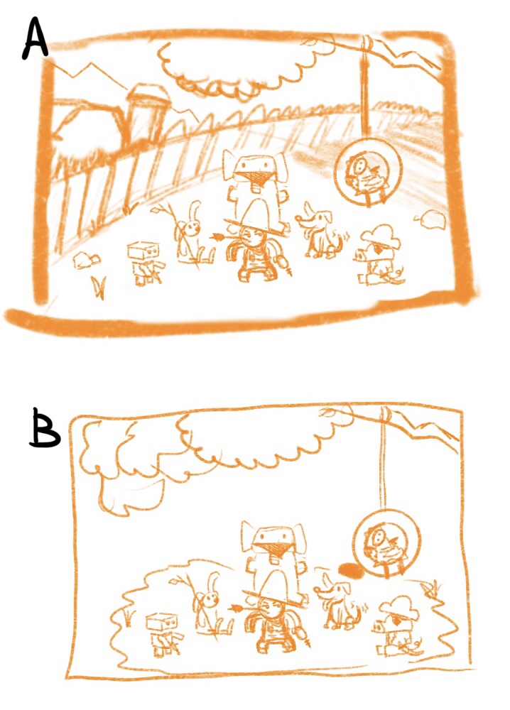
Hi everyone. I’m making something to enter into the scbwi February prompt. The prompt is “stand-off” I have 2 compositions that I like but can’t decide which of the 2 would work best. Would appreciate any input anyone has.
A has a background in it but if the entention would be to be in a book, there would be no space for text, unless I erase the barn I think.
B has room for text but has no background. I figured if there’s no barn just a fence isn’t going too bring much into the drawing.
-
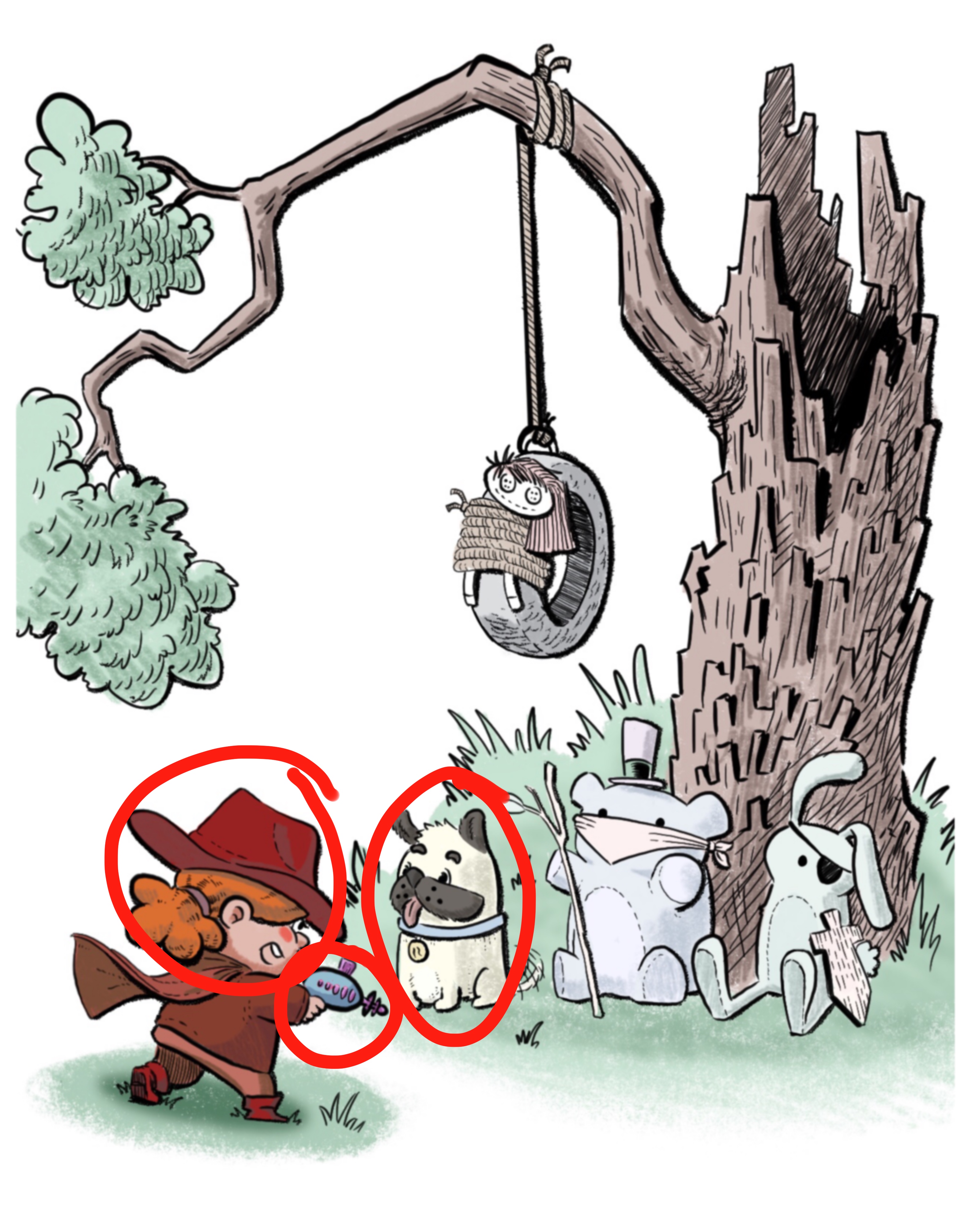
I'm not sure I understand the context in either thumbnail. Can you explain? Looks like a little boy playing cowboys with his toys/pets. But there doesn't seem to be an actual "stand-off" happening here, all the characters seem to be just standing and the fact that there are so many makes me more confused as to which of them is having a stand-off with the little boy (especially since they all seem non-threatening and none of them are in the middle of an action). The elephant and hat are also fighting with each other and you're losing the little boy's silhouette. It seems like a very cute idea that could be refined, and the composition re-tooled to clarify the stand-off part.
vanessastoilova.com
instagram.com/vanessa.stoilova/Check out my Youtube channel for tips on how to start your career in illustration! www.youtube.com/c/ArtBusinesswithNess
-
@NessIllustration hey yeah sure, he's playing pretend.
The toys are a gang of bandits and he's playing cowboy. Is that not translating well?
instagram and twitter: @artofaleksey
alekseyillustration.com -
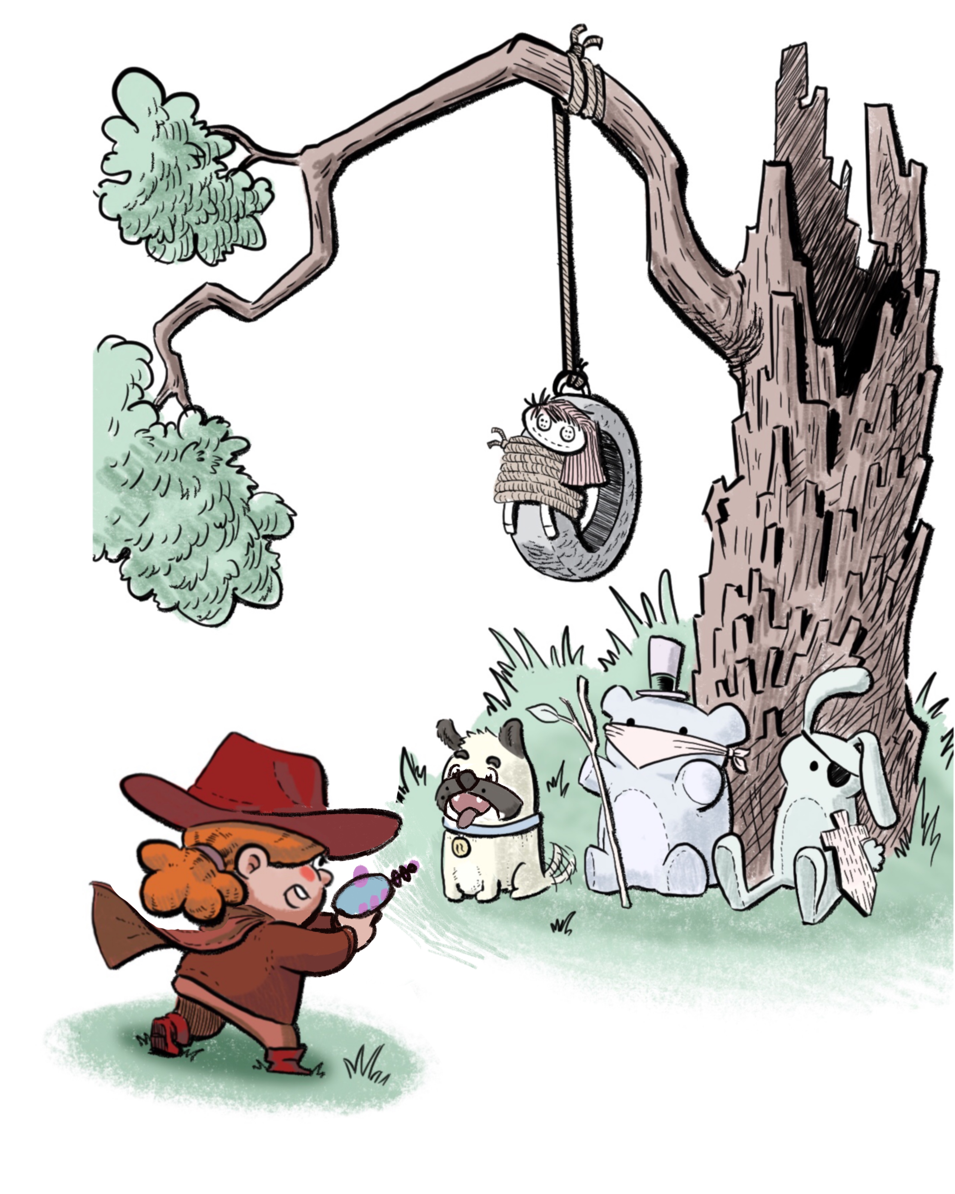
@Aleksey It's clear he's pretending to be a cowboy - that translates very well! The toys as bandits, I didn't get that. But I feel the "stand-off" part is what's least clear. It mostly look like a bunch of friends hanging out together. The little boy doesn't seem to be in confrontation with his friends/toys, nor they with him. The rabbit and dog look especially relaxed. The little boy doesn't look cornered, he's pointing his gun at the ground and if anything he looks like the ring leader of this little band. That may be accentuated by the triangular composition, very static and symmetrical, which conveys stability and balance instead of a sense of danger or confrontation...
vanessastoilova.com
instagram.com/vanessa.stoilova/Check out my Youtube channel for tips on how to start your career in illustration! www.youtube.com/c/ArtBusinesswithNess
-
oh ok i see what you're saying. The placement and position of the toys around him aren't communicating that sense of standoff and the composition is too symmetrical. So it's boring basically

I want to keep the toys looking limp and silly and put the intensity of the scene onto the kid. Do you have suggestions on how that may work better? Or am i digging myself a hole here. -
@NessIllustration OH! nevermind I think rereading what you posted helped me come up with a solution! Thank you!
-
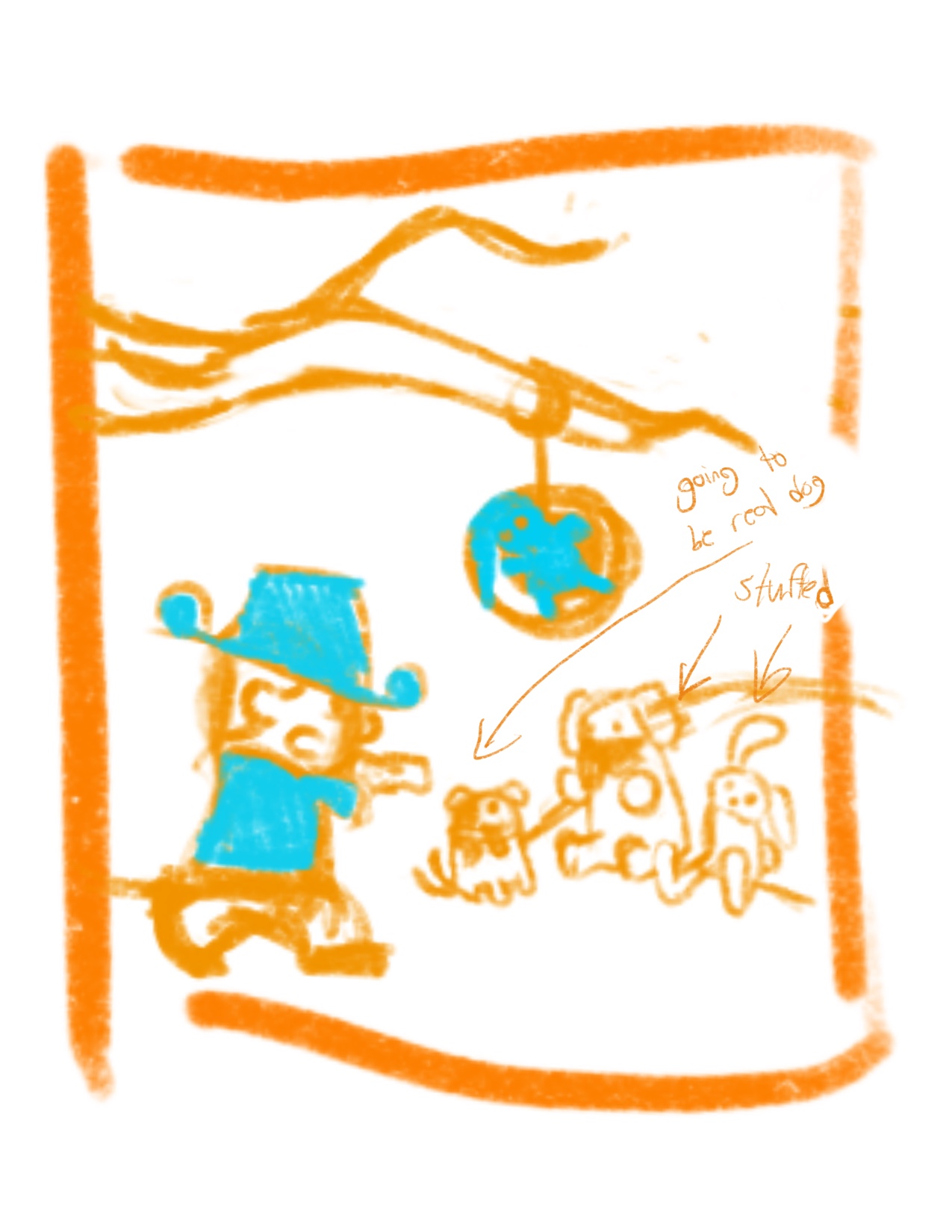
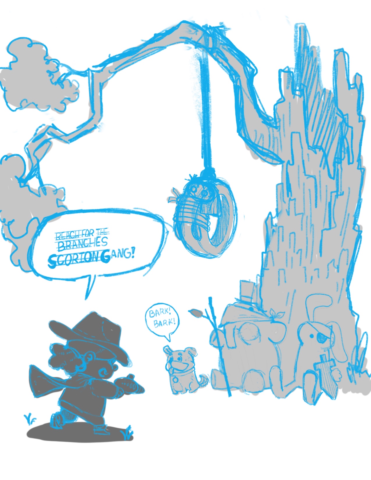
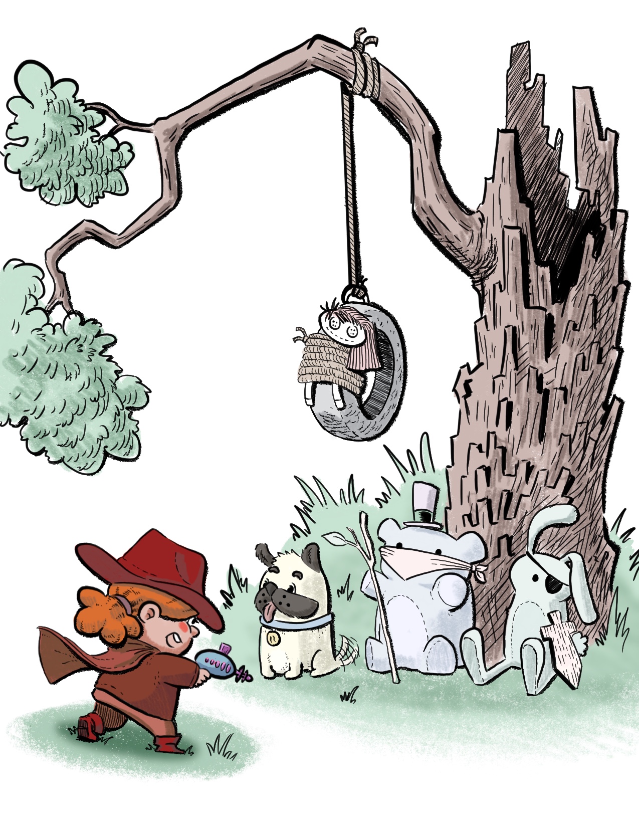
@NessIllustration how’s this?
I’m going to make the dog real and excited to wanna play pretend with the kid. The faces of the stuffed animals are going to be derpy and I’m going to try to make them look fake while the dog more in symmetry with how I’m going to stylize the boy.
I did the doll in the wheel swing in blue just to separate the shapes when I was drawing the thumbnail tiny. But now that I think about it doing a 2 color scheme might be fun to try.
I also want to put a chat bubble of the kid yelling “reach for the clouds, cactus gang!” Or something because when I think stand-off I automatically thought old silly westerns.
-
@Aleksey Ouuuhhh I like that!! It's very dynamic and I like the fact that all the bandits are facing us, it really drives home that feeling of being cornered! Great job!
vanessastoilova.com
instagram.com/vanessa.stoilova/Check out my Youtube channel for tips on how to start your career in illustration! www.youtube.com/c/ArtBusinesswithNess
-
@NessIllustration Thank you for the help it really made a difference.
-
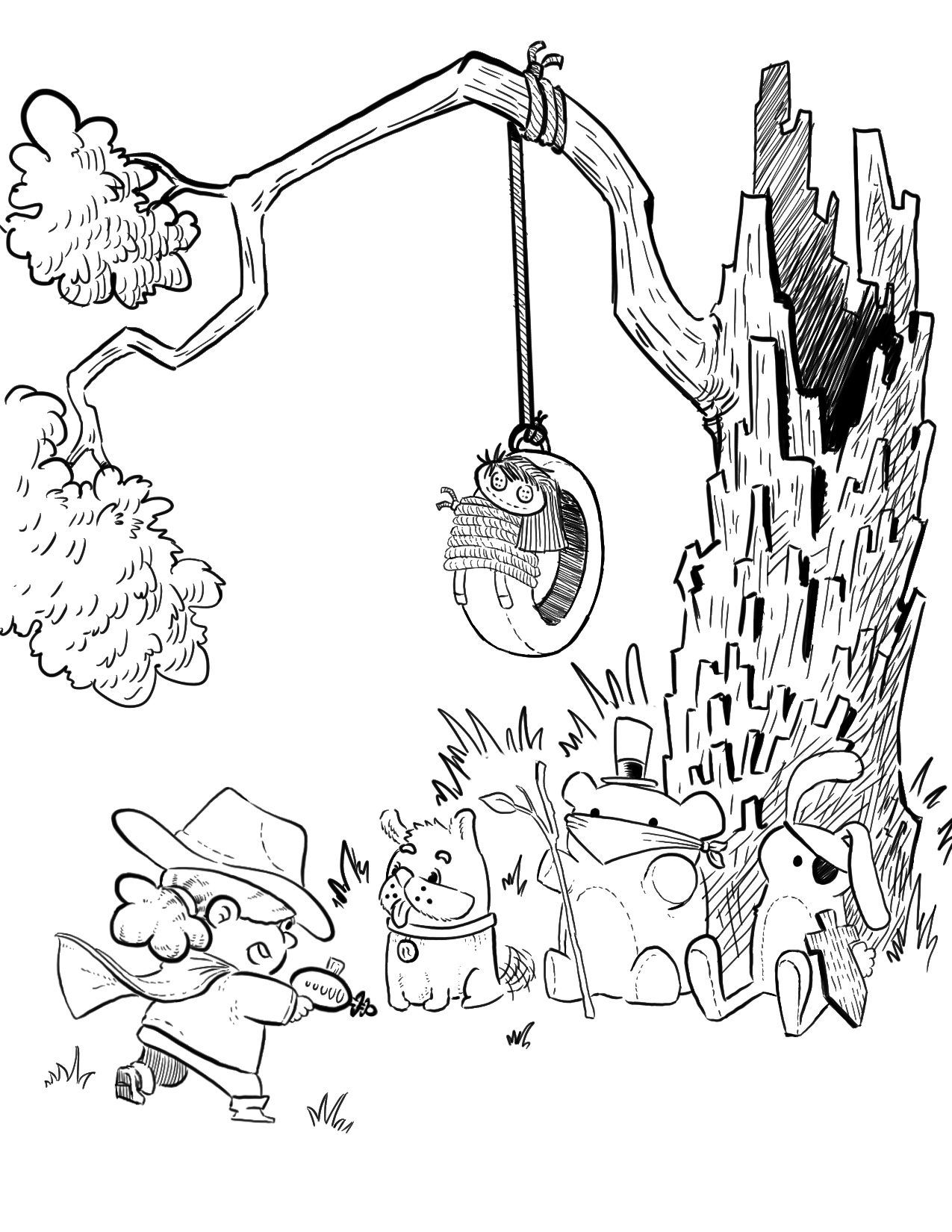
@NessIllustration Ok this is what I have so far. Would you be willing to share more thoughts?
instagram and twitter: @artofaleksey
alekseyillustration.com -
@Aleksey Awwww that is so cute! I really like it, the contrast between the seriousness of the character and composition compared to how innoffensive and cute the bandits are makes the image really charming! I think this angle sells your concept really well, and even your values like putting the main character darker, all work towards your story. I also like the perspective on the tire a lot!
-
@Aleksey This composition's much stronger, I think
")
-
@Braden-Hallett @NessIllustration thanks guys!
I took away the word bubbles because I think it reads well without them. What are your thoohghts?
-
Ok how does this read?
-
Hi! I think you have great piece here. Great concept and really fun too. I only have a few issues. Here they are:
- The girl’s gun. Instead of making it look she’s pointing it to her toys, it seems like she’s holding it out to the side.
- The angle of her face. I think that her face is angled a bit too low and it seems like she’s not quite facing them.
- Her dog. You mentioned it a while ago that only her pet dog is the one who seems to be thrilled with all of this. I think you can still push his look such that he really seems that he’s enjoying everything. Make him smile more.
Below is a my quick paint over of your piece. I hope this helps drive my point and help you improve your illustration. So far, it’s already looking great. It just needs a few tweaks.
Portfolio: nyrrylcadiz.com
Instagram: https://www.instagram.com/nyrryl_cadiz/
YouTube: https://www.youtube.com/channel/UCbJCF1Im8ZO7hpGWTKOJMuA -
@nyrrylcadiz yeah these are really good suggestions. I thought about these issues too. Sadly I already submitted the piece but next time I'll pull up these mental notes again. I was really happy with the result to realize i should look over it again and do the fine tuning.