Society of Visual Storytelling

    SVSLearn Forums

    • Register
    • Login
    • Search
    • Recent
    • Tags
    • Popular
    • Users
    • Groups
    • Search

    Children's Poster Critique

    Artwork
    5
    7
    419
    Loading More Posts
    • Oldest to Newest
    • Newest to Oldest
    • Most Votes
    Reply
    • Reply as topic
    Log in to reply
    This topic has been deleted. Only users with topic management privileges can see it.
    • Naters.Art
      Naters.Art last edited by

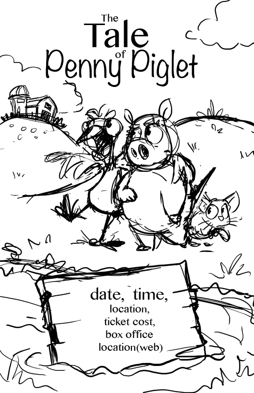
      I'm looking for critiques as I work through this poster. it's a play for children about these three farm animals working through self image issues. This is the layout sketch. any thought on the composition? Thanks in advance 🙂
      TaleofPennyPiglet1.jpg

      my Sketch Blog
      https://www.instagram.com/naters.art/

      Erin.Cortese Kevin Longueil ThisKateCreates 3 Replies Last reply Reply Quote 5
      • Erin.Cortese
        Erin.Cortese Moderator @Naters.Art last edited by

        @Naters-Calderone It reads so nicely, and my eye moves through it effortlessly. Unfortunately I don’t have any critiques to offer, I don’t think I would change a thing. The characters are adorable!

        1 Reply Last reply Reply Quote 0
        • Kevin Longueil
          Kevin Longueil SVS OG @Naters.Art last edited by

          @Naters-Calderone I always enjoy your work! Only thing that popped into my mind for this is scale. Possibly having the pig be a different scale than the rooster.

          Portfolio: kevinlongueil.com
          https://www.instagram.com/kevinlongueil/

          Naters.Art 1 Reply Last reply Reply Quote 0
          • avfarrar
            avfarrar last edited by

            I agree with Kevin. Also, what partially makes your picture flow so well are the hills in the background that lead up to the pig's eyes, and then the eyes point you to the rooster's face, which then leads you back down the hill-line to the rooster's foot then across to the mouse's eyes. So, if you change the size of the pig and/or rooster you may want to keep that in mind to keep the flow. Great job! I can't wait to see how it turns out!

            There is beauty in life!

            WWW.AVFILLUSTRATION.COM
            www.instagram.com/avfillustration/

            1 Reply Last reply Reply Quote 0
            • ThisKateCreates
              ThisKateCreates @Naters.Art last edited by

              @Naters-Calderone It looks like you may have used three fonts? I'm not sure but the text feels off, like there is an inconsistency. I like the design but might change the font on the sign. It feels a teeny bit off and maybe not fast reading enough.

              https://www.instagram.com/thiskatecreates

              Naters.Art 1 Reply Last reply Reply Quote 0
              • Naters.Art
                Naters.Art @ThisKateCreates last edited by

                @ThisKateCreates @avfarrar Thanks for the input, I totally agree with you. Fortunately the text is just a place holder for the clients clarity, I won't actually be adding the info text, the space on the wooden board will be left blank for the playhouse to fill in.

                my Sketch Blog
                https://www.instagram.com/naters.art/

                1 Reply Last reply Reply Quote 1
                • Naters.Art
                  Naters.Art @Kevin Longueil last edited by

                  @Kevin-Longueil Thanks. Now that you mention it I think the thing bothering me about the the scale. I'll make the kitten larger and maybe the three characters will fit together better.

                  my Sketch Blog
                  https://www.instagram.com/naters.art/

                  1 Reply Last reply Reply Quote 0
                  • First post
                    Last post