Big WIP
-
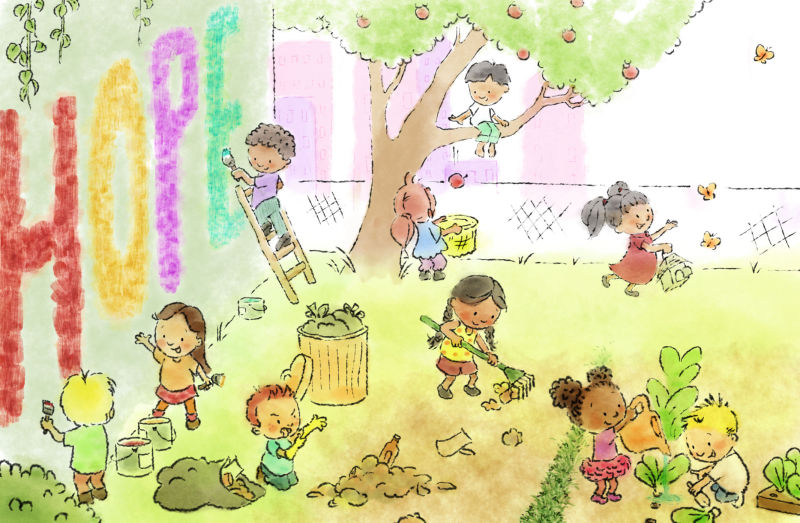
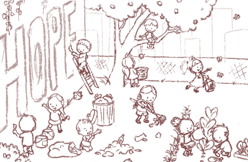
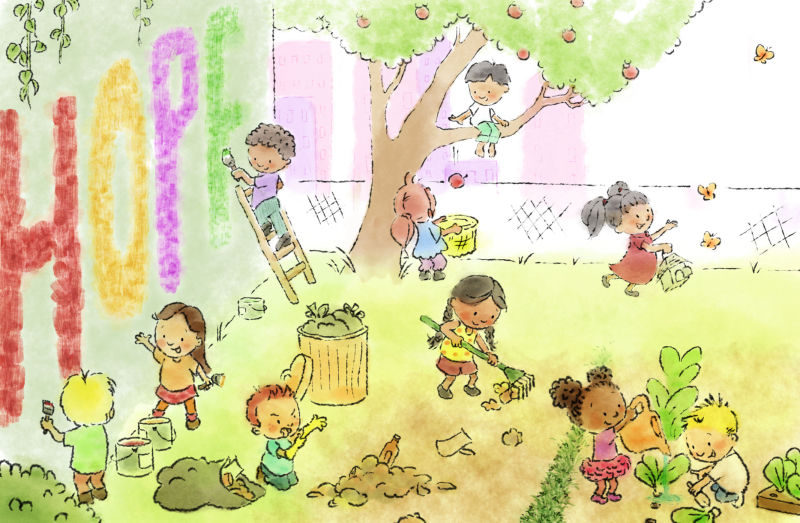
I chose to see big as an idea, and I can't think of an idea bigger than hope. I plan to paint in the word Hope as well as the city skyline, so they won't have ink line in the final. Or I might change the color of the ink on those, I'll play with it. At any rate, here's what I'm working on.
www.rhirschillustration.com
https://www.facebook.com/rhirschillus
Instagram: rhirschillus -
Hey
") I really like this piece, especially with all the different things going on with the children, they're facial expessions are brilliant and I love your concept of 'hope'. This is already a strong piece that I don't think you need to add a skyline, I'm sorry if you weren't looking for any suggestions or anything but I love this the way it is and to me the main focus is the word hope on the wall
I really like this piece, especially with all the different things going on with the children, they're facial expessions are brilliant and I love your concept of 'hope'. This is already a strong piece that I don't think you need to add a skyline, I'm sorry if you weren't looking for any suggestions or anything but I love this the way it is and to me the main focus is the word hope on the wall
Look forward to seeing it in colour! -
@hannahmccaffery I always appreciate feedback - frequently someone else sees something I missed. Thanks!
-
@rhirsch This is looking good. I agree with @hannahmccaffery the faces are just great and they make the eye move from one kid to another. Very interested to see it colored. Good work.
-
@rhirsch Wonderful concept and your drawing looks strong. Looking forward to seeing your progress.
-
Small people making a big difference. I love this concept. Drawing looks strong to me. Can’t wait for it to develope.
-
Here we are with paint. Still adjusting some levels. Playing with brush tips for the painted "Hope" on the wall, not sure if I'll redo that yet.
www.rhirschillustration.com
https://www.facebook.com/rhirschillus
Instagram: rhirschillus -
@rhirsch super cute
-
This is so enjoyable to explore and see what all the kids are doing. The details are great, and I think the brush stroke you used for the letters matches the brushes you've given the children very well! In case it's helpful, the green "E" isn't reading very well for me... at first glance, I read, "Hop", but I'm sure a slight adjustment could easily make the "E" stand out more. I like how it's technically an "F" in the painting, but it's clear that the kids are writing "hope".
-
@kathrynadebayo I see it now, thanks. I'll fix that. My intention was to make that look like it was still being painted, but I think I can make that point and still make it look more like an E than an F. Thanks for the suggestion.
www.rhirschillustration.com
https://www.facebook.com/rhirschillus
Instagram: rhirschillus -
@rhirsch Just to be clear, I was trying to emphasize how much I liked the "still being painted" look the "F" gives. Sometimes I'm far too vague to be helpful... my apologies.
I was trying to suggest that the color be different somehow, or a more contrasting value, so that the "E" is immediately noticeable. Now I see how my wording wasn't clear. I really love the piece and the concept behind it. Thanks so much for sharing it! -
@kathrynadebayo You made two good points then. I have fixed the color and the readability of the letter. Thanks!