Watercolor Critique
-

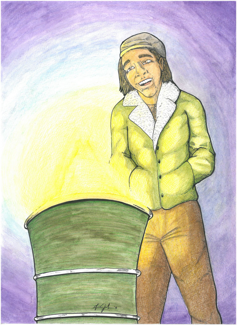
Good morning svs fam, Here is my project from the last two days. Inspired by the opening scene in rocky 1. No reference for either the pose, lighting, or colors. This is traditional not digital.
I am pleased with the linework, proportions, and perception. My hope is feedback on the coloring.I dig the jacket coloring but the background and pants kind of bother me.
Any feedback is welcomed as stated in the brutally honest thread! haha #brutallyhonest i will consider that logical feedback. thank you in advance for your consideration, patience, and time.
-
Hey there. I like the lighting that you added here. It looks pretty good.
But being brutally honest, here's what I see:
-
Concept: Overall, not many people are going to really respond to this image because it really doesn't tell any kind of interesting story. It's just a guy looking at a fire. You said it was inspired by Rocky, but that doesn't come through at all. Your character or story needs to have some kind of emotion that we are supposed to respond to. Homeless guy trying to get warm is one idea. Survivalist who just made a fire to avoid freezing is one. It can be anything really, but ultimately even if this painting were painted perfectly, it would still be sort of boring. Try to tell more story with your illustrations. Then people will start responding.
-
Value:/color Overall, this scene is void of any real dark values. This is often a problem that watercolorists face when using too much water and not enough pigment. Don't be afraid to go dark with that background and areas that don't face the light. Indigo is a wonderful pigment that goes very dark and not too saturated.
When fire or any type of warm light is in an image, the color typically gets more orange-red as you move away from the light source. So in this image only the actual fire would be bright yellow, but the glow would actually be a warm orange red getting less intense as it moves away from the fire.
- Character design/drawing: This guy doesn't feel that stylized, but he also isn't realistic. So he exists in what is sometimes referrred to as the "uncanny valley". That is the awkward space between not being real enough or cartoon enough (the polar express movie is a great example of this). Your characters eyes don't appear to be looking at the fire. And they don't appear to be gazing in the same direction either. So some more character studies are definitely encouraged.
So ultimately my guide for reworking this is:
- Come up with an interesting story and then let the pose, details, values, and angles support that story.
- Do numerous character and value studies before painting.
- Do a small color study so you know which paints and values to use. (plan carefully with watercolor).
Hope that helps some. : )
Good luck.
-Lee -
-
Thanks for the detail information about how fire light effects its surrounding area. I had an #inktober work for #roast that would have really benefited from knowing this. I have a friend who really enjoyed that image none the less and I plan to gift her with a improved version. This will help me thanks.
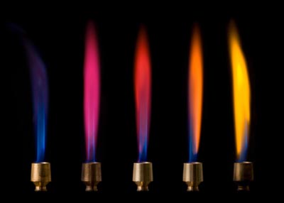
However some really hot fire burns blue, what type of fire creates blue flame that could be used in an illustration and how would the surrounding area be effected colour wise if yellow fire creates warm orange and reds? Would it differ or no?
 Thanks and I hope its not inappropriate to ask about your feedback on someone else work that I didn't comment on but I think you responded well too.
 -
@heather-boyd The same color info holds true even in fires that are hot enough to have blue in them. Typically the blue is right at the fuel source and then the flame turns traditional yellow - then orange red as it gets away from the source. Even stove top gas units that are totally blue will do this. If you turn them all the way up, the very tips of the flames will go yellow. In situations where you aren't sure, typically just make the color go warmer as you get away from the source. It will always look "right" even if it doesn't totally do that in real life.

-
@dafoota
Specific to your work: you have included an object sitting in the foreground with a start to create a story but I think it falls short because their is no further context to help your viewer to connect. You may know Rocky 1 but I do not have that experience with that movie (I assume) nor can I see what your impressions are concerning a scene or your feeling towards it are. Show us more of what you like about Rocky 1 or bring something from yourself or life experience to make it more yours.
You can push this a lot further and I hope you do. Story is important. If your going to work hard and create a work, really make it your own.
 Happy storytelling.
 -
@dafoota well, maybe my family is a little obsessed with rocky as well. Now I’m watching it. Thanks for the lovely distraction! Ah. Can’t wait to see creed 2.
I don’t know if I’m really right on this, but when you’re just focusing on one character don’t pull the color all the way to the edge. Spot illustrations don’t have to have a full background. Can’t change it in this one, but something to think about.
I agree with lee with the value (of course because he amazing). Indigo is a great dark. I also like sepia. And together they are fabulous. You can go deeper with your values and give the fire a little more impact.
As for the scene... try making all those guys. Go back and pause the movie. Take a picture of it on your phone. No need to reinvent the wheel. I think the feel of how cool those guys were just singing on the street would be much easier to get with all of them there. And maybe a hint of the brick building. It’s a cool scene and all of them in your style might be a great painting. Put a hint of rocko with that fadora and that may be a nice piece of fan art!
-
@lee-white yes! Yes like the same yes drax gave mantis when mantis told everyone peter quills secret (guardians of the galaxy vol 2) haha.
Thank you for your time and patience. It will not go unused and I am grateful.
I see what you are saying about telling a story. I understand now after taking the visual storytelling class. Thanks again.
-
@whitney-simms I like that i idea of pulling all the guys...It appears i was thinking to small on capturing the story behind the joy at the barrel. Thank you for your honesty. I appreciated much.
-
@heather-boyd Thank you for you focus of "push a lot further". It is a lesson still being learnt. i cannot be afraid to break it. Thanks a lot.
-
If i were to be brutally honest here, i think the character’s eyes make him look like he’s high. Lol
 i’m really sorry.