Critique - Does my linework work?
-
SO I think that I'm gradually dialling in a process for linework and colour that I think meshes/scans/harmonizes/belongs/works.
My question for the forum is: does the linework harmonize with the rendering style or does it look like over-rendered comic art?
Bonus question: If the linework DOES work, ultimately, is this kind of style worth pursuing (kind of an unanswerable question, I guess)? I've tried to do some research on what's current and popular locally but my library seems to only have children's books written in the 80's (I think I found 4 copies of Polar Express scattered about in the stacks), a dizzying array of Captain Underpants books and a freakish number of copies of Amulet.
Several images from my current personal art challenge thinger.
Thanks in advance
")
-
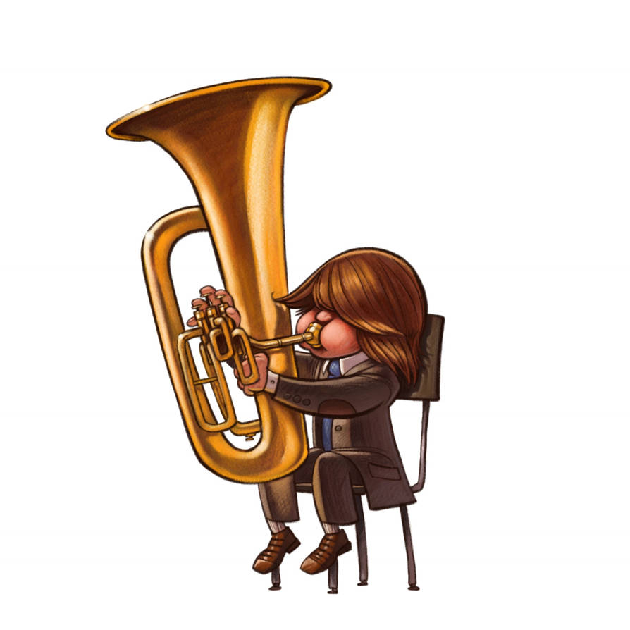
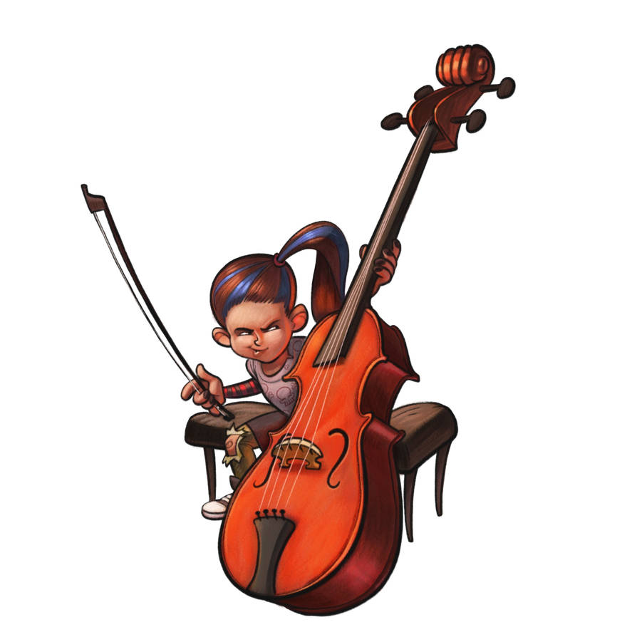
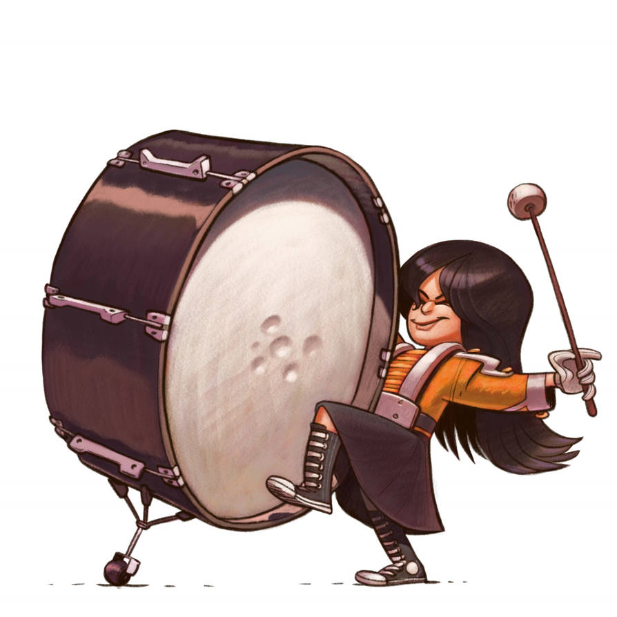
Ok so I’m not the best with critique but what i noticed was on the last one my eye is drawn to the character before the instrument. On the first 2 my eye is drawn to the instruments first. And i think that is because the color of the instruments is standing out more on the first 2 and the color of the jacket stands out more on the 3rd.
(Also apologies I know you wanted line work feedback not color feedback)
instagram and twitter: @artofaleksey
alekseyillustration.com -
Your work keeps improving and it's a pleasure to follow. The digital comic style seems to be your bread and butter but you comment about it looking over rendered makes me wonder if you don't want it to look that way. What comes to mind, and what I've been trying to do, is something along the style of Tom Lichtenheld. The trick, I think, is that often he doesn't completely finish the line around characters and objects but leaves a broken line for accents. It's proving harder for me than it looks. I'm not sure if that's what you're looking for but maybe it can spark something.
-
I love your stuff and it's a compliment to your characters that I hadn't even thought about your line work or rendering until you asked. I was drawn immediately to what the characters were doing and feeling.
Thinking about it more, though, for me the line work and rendering work well together but I would also agree that your illustrations have a more comic book style. Not being a professional, I don't know what the market is for that but interestingly, it is a style I see a lot in kids' church material. (I'm a minister.)
Laurie DeMott
instagram.com/demotlj -
Well, I think your stuff is fantastic. I can see the over rendered aspect you speak of... Maybe pull back on the shadow layer?
-
Hmm. I think if you just had these three images in your portfolio people would think that they look more comic-y
 because they are very saturated spot illustrations with defined line work (not a bad thing). But thinking back to your full bleed work that you’ve done for the monthly contest I think that it, your work/line art, does not read as comic. I’ve always liked your line work. You have a good style that’s fun and easy to read visually.
Lisa Burvant
www.lisaburvant.com
Instagram & Twitter & SVS: @burvantill -
Your line work is very nice. The only suggestion I can make for line work that I sometimes do is indicate texture by cutting into the line on the inside edge of thing like hair that have soft edges. I try to use some of the same brush work I use in the halftone I also use the trick Jake Parker teaches about duplicating your line work and blurring one of the copies. One other critique based on these three images is that your two young girls would look like males if the hair was changed. Your work is some of the best on this site.
-
@swordofodin Thanks
All feedback is good feedback! -
@jon-anderson Oh I totally want it to look this way
I'm liking the way it's starting to turn out. The question is, do OTHERS like the way it looks. Sometimes I tend to get just a wee bit o' tunnel vision when it comes to this kind of thing.Thanks for the name suggestion, too! I'll totally look at his work. I'm slowly adding names to a list of illustrators to check out
-
@demotlj said in Critique - Does my linework work?:
I was drawn immediately to what the characters were doing and feeling
Well that's a good thing

Thanks for the feedback
-
@kylebeaudette I do definitely tend to paint too dark
There's a still a disconnect in my brain between the value stage and the colour stage. -
@burvantill Thanks for the feedback
Maybe next to other portfolio images they'll blend a bit -
@rcartwright said in Critique - Does my linework work?:
the trick Jake Parker teaches about duplicating your line work and blurring one of the copies
Absolutely a good idea
I'm trying to incorporate something like that, but instead of totally smooth inky linework being blurred, I'm trying to build in some grain and fuzziness into the brush (more of a pencil than a pen if you get what I mean).Thanks for the feedback and the kind words
@rcartwright said in Critique - Does my linework work?:
your two young girls would look like males if the hair was changed
True! This is one of those things where my character design isn't quite good enough to distinguish girls and boys without relying on things like long hair, and lips and such. But the physical things you can accentuate in order to scream 'this is a girl' (hips, bust, makeup? etc) is limited when it comes to illustrating children. As I draw more kids I think I'll slowly get better out picking out the details that really lend character.
-
@art-of-b Yes I like to use a pencil also so it has some texture
-
Your style reminds me a lot of traditional coloring pencil laid on thick! Personally, I think it's lovely
There's something about it that feels "heavy", both with the dark line work and the saturated, dense and rich colors you use. Not the light, soft and fluffy that we see a lot in children's books, but there's a need for many different "feels" and I think this makes you stand out. If an art director is in need of a style that feels heavier, richer, you'll be the obvious choice. I can see this style working really well for a story set in medieval times, full of dark saturated colors and velvet dresses, or maybe some sort of old time circus, or a deep lush jungle!vanessastoilova.com
instagram.com/vanessa.stoilova/Check out my Youtube channel for tips on how to start your career in illustration! www.youtube.com/c/ArtBusinesswithNess
-
I think they all look great. The only thing I would say is the drummer looks like she has a moustache because of the line... Cool graphic style though I like

-
@jason-bowen Ah the dreaded munchkin-stache :smiling_face_with_open_mouth_cold_sweat: it seems to sneak in from time to time. (seriously, it does,! I was doing a commission at a convention once and the client red-facedly demanded that I remove her moustache while her friend insisted she was crazy) But not everyone sees it! It's like a magical elf or somethin'. But it's a moustache. Where there should be no moustache. Damn magical pixy staches.
Thanks for the feedback
-
@nessillustration Thanks for the feedback and the kind words :smiling_face_with_open_mouth:
It's interesting that you find that the art feels heavy. That may be an area where I need to show that I can do 'lighter' things as well! It'd be good to show that I can both be heavy (syrupy?) and light 'n floofy.
-
Hey @Art-of-B ! I like your linework in the finished look of illustrations of this post. It isn't overpowering or strong as in comic books . I also like the dynamic movement you have in your characters' poses. A lot of energy & action going on.
The only crit I have (if I may) is that I find the illustrations tend to have quite a few hot spots that make the eye bounce off different areas of the design very quickly. E.g with the girl playing the cello? (I hope I got the instrument right
), we have hot-spots(high contrast) on the girl's hair, the top of the instrument & at the side of the instrument. Maybe two hot-spots instead of 3 is a possibility or reducing the intensity of the contrast in areas of lesser importance. (maybe bottom of the cello in this example)
Not to sound rude or anything, as I tend to do the same thing in my illustrations as well :/.Or maybe it's because the base tones & colors are darker to start off with, and you feel the need to brighten things up a little?
Love the linework, the shapes & the gestures :D. Looks great!
-
First of all i would like to say these are amazing! I’m still an ametuer. The thing that comes to mind are the values. I do the exercise of taking a screen shot and putting the mono effect on it to see how heavy or light it is. When i did this i noticed the tuba outfit was a little dark; The, what i think is a chello, where the seat meets the instrument blends together in value; and the drummers hair seems to be one value. It might be a saruration thing but im not sure. Again it is not bad but if your like me you notice something but cannot pinpoint it. You can try this and see if that is it. I hope you figure it out and share your findings! Im still a whatever is before an ametuer so my word isnt much right now. Much love and God bless!
Much love and God bless!