Custom Holiday Card Critique
-
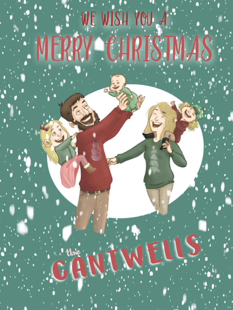
I created a Christmas card for my family. My goal was to make something fun and original, while also creating something I could use to generate more business. I posted this on my local Facebook buy/sell/trade group. But marketing isn't my strong suit, and I haven't had any luck so far.
I welcome a critique on this piece, as well as any advice for how to more successfully market this idea!
-
The illustration is really pretty and charming, and I feel like a lot of people would love that kind of custom portrait! The graphic design though, is where you fall a bit short I think. The fonts and their colors, and that background as well, don't really show your beautiful illustration under its best possible light!
vanessastoilova.com
instagram.com/vanessa.stoilova/Check out my Youtube channel for tips on how to start your career in illustration! www.youtube.com/c/ArtBusinesswithNess
-
Neat idea!
Marketing I can't really help with
")
HOWEVER, when one desaturatea the colours on your card...
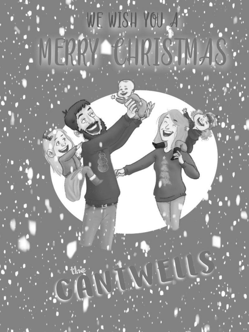
One can see that the text blends with the background. The green and red are complimentary colours, yes, but when they're the same value they kinda blend together. Remember that either you're making a light background with dark objects (I like the white frame behind the family, by the way) or a dark background with light objects. Right now the text is a a neutral object on a neutral background.
Nice work so far
-
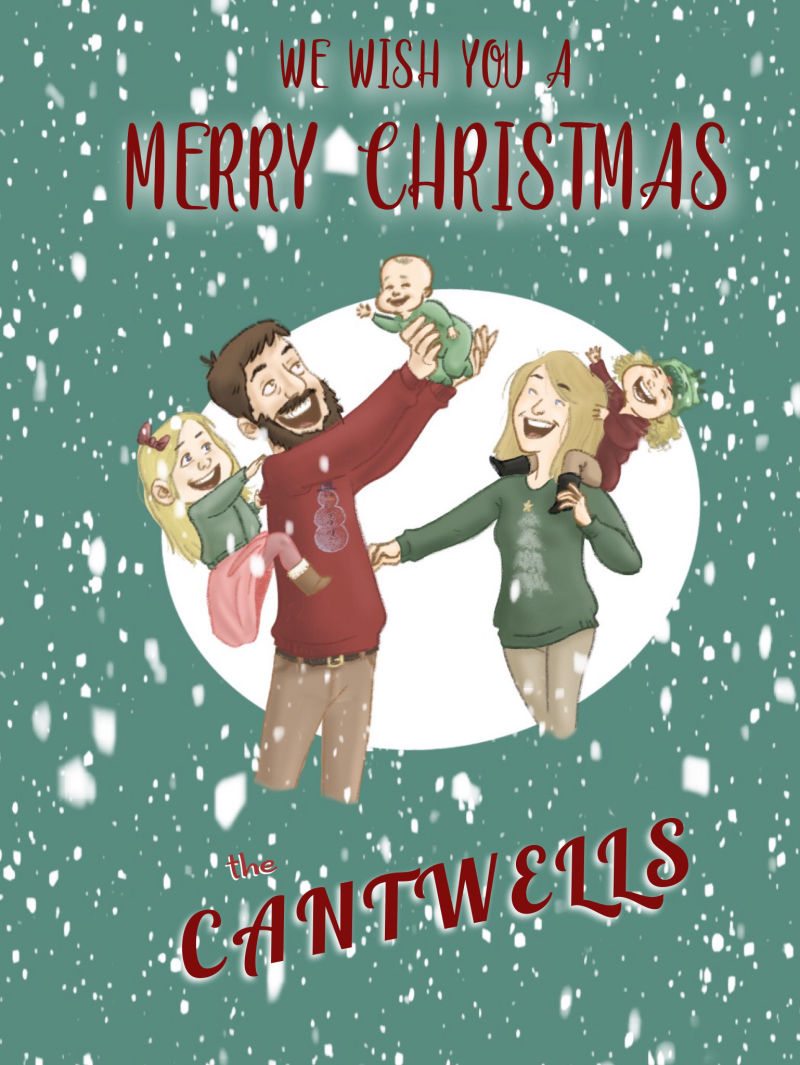
@nessillustration @Art-of-B thanks for the helpful words! Admittedly, I am not the best at graphic design, and I spent way less time on the text.
-
I made a couple of quick adjustments. Hopefully, this is an improvement!
-
A custom card is such a great idea.
One of the first things I look at when I glance at the card is how the legs of the parents fade away. Perhaps complete the legs and feet or have the characters "emerging" from the oval by tucking the legs behind the bottom edge of it?I like the energy of your characters. Best of luck with getting commissions!
-
@kathrynadebayo Great point! I will definitely make that change
-
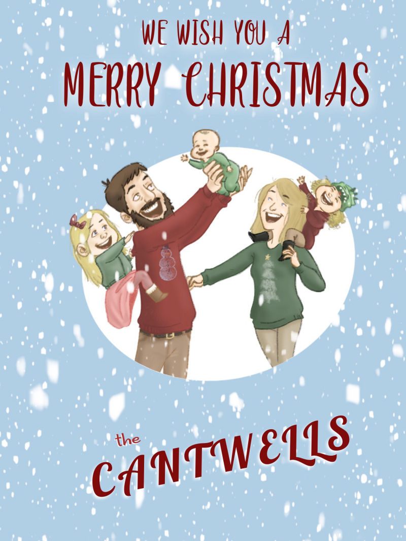
The background color is a problem though I think. It's very dark and a bit garish. I think you may have better luck with something more neutral. Maybe a pale blue or even white?
-
It kind of bothers me that the legs are cut off. I wonder how it would look if you kept the legs inside (behind?) the circle and just had the tops of their bodies sticking out over the white circle as they are.. So, I guess the legs would "underlap " the bottom of the circle and be hidden. How would it look with a dark blue background-like a royal night sky blue?
-
Thanks for the suggestions! I think this one is much improved from the original
-
@jcantwellart looking through all the comments, you nailed it with this version. Looks great. Only thing I would suggest is to remove the snow flakes on the people in the circle. There seems to be a lot falling outside the circle but only a few inside because of it being white.