short comic WIP
-
Hello there... I am not 100% sure of doing this, but I thought I would like to show there what I am working on. Put it out there just to keep me accountable and as I am aware of all the flaws that it probably has I would be thankful for every feedback or comment.

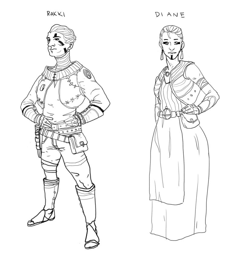
So I am working on a comic fantasy story about a character that is trying to protect what has been stolen from his years ago - his loved ones. It can happen again and it is about how he will deal with this threat.
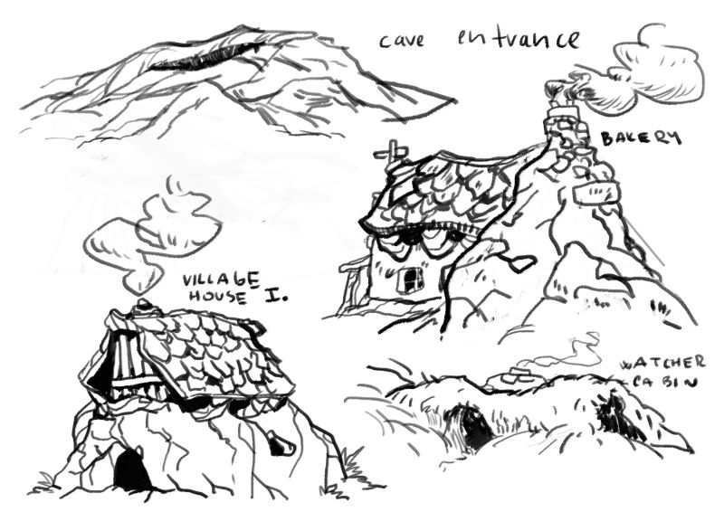
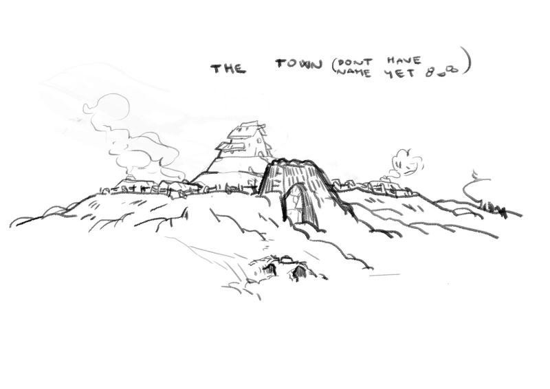
Background: Years ago one particular person found a hidden cave of mirrored lake. This lake is a gate to an afterlife and from the afterlife to the normal world.
This person has become a protector of the place and build a village around it. This village is where the main character was born. When he was 10 years old. A clan that heard about that lake came to the village with an intention to use it for their own sake. They come up short, but they burned the village and killed the parents of the main character. He was feeling guilty and he swore to himself that he will at least protect everybody else from the same thing.The story begins 10 years later when he is a ranger now, but the peaceful times they had for last 10 years probably come to an end.
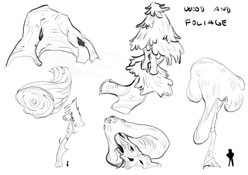
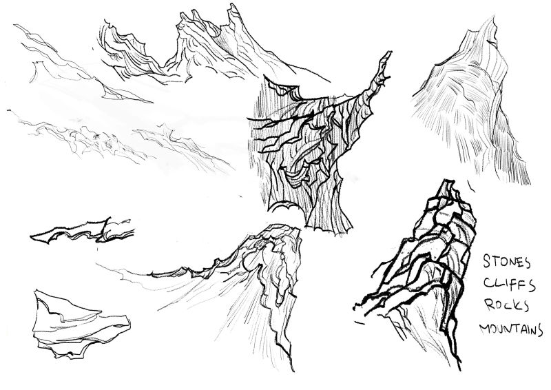
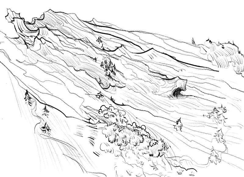
and I attach some visuals I have
")
-
and first page
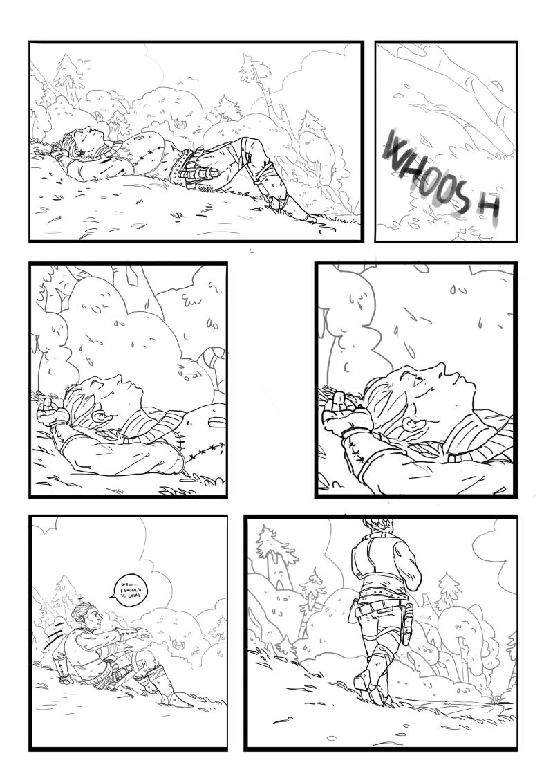
-
@jonas-zavacky There's a lot that I like
You obviously take a lot of time in figuring things out and really exploring the world you're creating (something I tend to avoid, which is no good.) Nice linework, too!If you'd like some feedback and suggestions, read further.
After looking at your first page, there's a couple of things I'd think about changing.
-Font and speech bubbles. Unless you have the most absolutely perfect hand-lettering it's always a good idea to go find a font you like and use a text tool for your speech bubbles. Blambot has lots of good free fonts.
-Panels and gutters. This may be a personal preference thing, but I found the varying line width of the panels distracting. I'd keep the borders of the panels the same size
Neat stuff so far
I look forward to seeing more.Are you going to be colouring this project?
-
@art-of-b thank you for nice comment!
Thank you for mentioning it. I just need to find the right one, becuse i dont want it to have too much technical if you know what i mean.
The borders noted and I will take a look on that and experiment with some variantions i think (I`ll pick just one tho)
Yes I want this to be colored, because i have certain feel of it in my head and thats not possible without color. With that said I am still not sure how i will choose to color it.
and thanks again for nice comment !
-
I agree with what @Art-of-B mentioned. Great start so far. I also agree with keeping things more natural and not technical. Looking at the sound effect you have for the whoosh is wonderful. It flows naturally with the art and doesn't look like some type plopped into the panel.
keep up the good work!
-
@Jonas-Zavacky Nice start! I like seeing how you've tried to work through things and then how those explorations come out on the page. Agree with what @Art-of-B said. Looking forward to see how this evolves!
-
@Justin-Moss @robgale Thanks a lot! I am happy you like it. I'll try to update as soon as possible
-
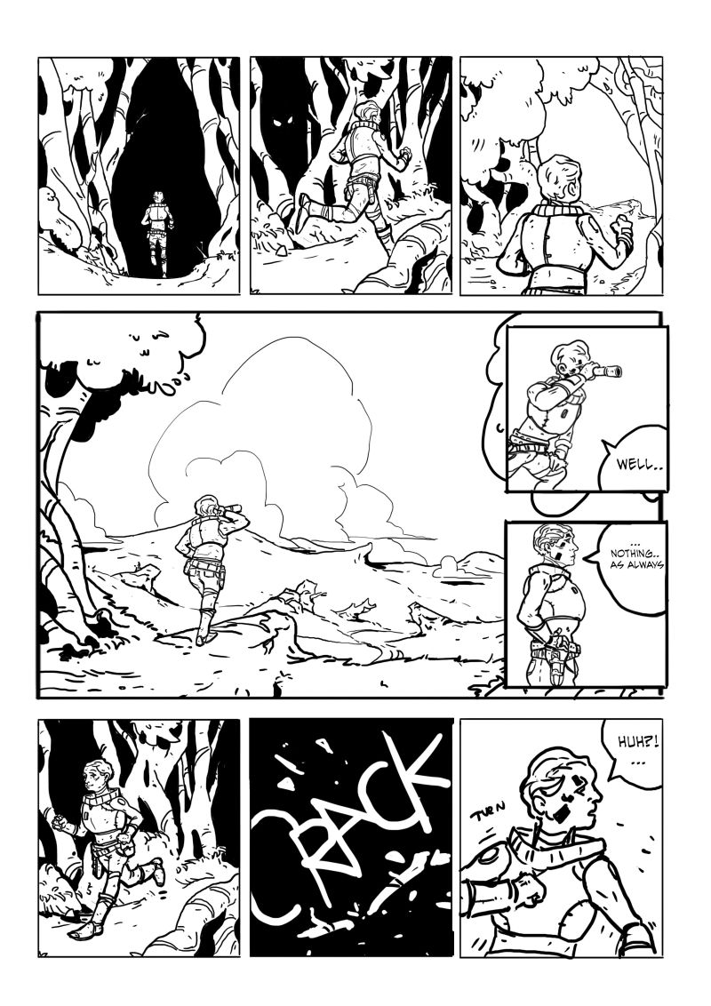
Hi
some panels from the second page... My question is - how do you look on that compared to the first page. Doesn't it feels different in drawings or do you feel it is okay? Or if you have anything to point out please do so Thank you!!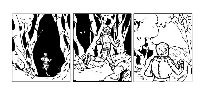
-
@jonas-zavacky this looks great but it definitely looks different from 1. First of all, your lines. In the first page the background lines are of a lighter value while your character has darker but in the second panel both the character and the background are of the same color/value. I suggest choosing which style you really want and sticking with it throughout the comic. Having uniformity is great for sequential art such as this. My second, critique is your character’s post as he runs into the forest in the second page, first panel. It’s as if he’s jumping sideways on one foot rather than running forward. There are tons of photo reference in google for this pose. Give it a try. I hope this helps. I can’t wait for more of your work.
Portfolio: nyrrylcadiz.com
Instagram: https://www.instagram.com/nyrryl_cadiz/
YouTube: https://www.youtube.com/channel/UCbJCF1Im8ZO7hpGWTKOJMuA -
@nyrrylcadiz thank you and thank you for your time and critiquing. Yeah that is what i though so thank you for confirmation! I Think I will give a try with the second one... the first page need rework anyways so :D.
O shoot i didnt see that with the pose. That is the beauty of sharing it so fresh eyes can look at it.
-
alright.. page 2 "done" - we are getting somewhere with the story..
I will have to do something with the panels in the forest so they read better, but I will share it in this stage... again! point out everything you have in mind thanks!and its okay I share it this often? like per page? Maybe I will update with more workload from now on i don't want to bother you guys so often xD
oh and the last panel is in sketch form, but I like the dynamics of it..
-
These are all so great! I love comics. I have nothing helpful to say, but I hope you keep working on this and posting your progress. It’s really good!
-
Hello, the first page is really good and has a nice style, I really like the back grounds and how it's very faint looking (I'm sure there is a name for it but I'm self taught
 ).
).
I also feel the level of detail and the characters positioning is spot on.But I feel that this is all missing on the second page, even from panel to panel the style changes.....for example the way you do the hair changes.
If you could do the second page like the first I think you may be on to something very nice indeed.
Also I'm new here so not sure of the rules but I'm happy seeing all work in progress and look forward to it.
-
@Kristin-Wauson Thank you so much!
I will. Just maybe not so often.@Craig-Imrie Hi! mmm I guess I`ll have to do some thinking again. I discussed this with nyrrycadiz in this thread and i though I will go with the style of second page
... but! As I am thinking about it while typing this.. for the purpose of the mood I am trying to depict and other reasons I will try the first one indeed but with some changes tho.(yes you can say i am very indecisive hehe)
Thank you a lot for comment!
-
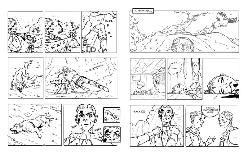
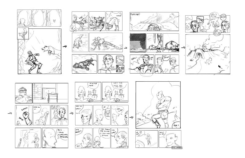
Hi there!
last days I was working on sketching out the "full" comic (its just prologue). It's really rough, but at least I have something I can work on top of from. I am not sure if its readable for you. I hope it is
So again don't let yourself back ! any comment appreciated
-
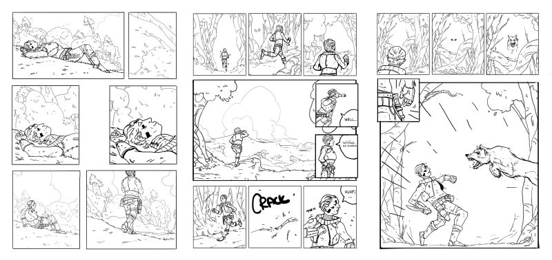
Greetings fellow SVS people.
I remade the first 2 pages + the third one I am just updating .. but again.. any comment appreciated!
-
another update..
next 2 pages. I spent a lot of time on the 4th page... the next pages should go smoother I think