WIP; feedback welcome and encouraged!
-
Hello all! First post here; I discovered the forum via 3 Point Perspective and I'm really interested in checking out the community as a place to better grow my skills. I've been a professional illustrator and comic artist for a few years now, but haven't really found a place that feels like a peer community, so....hi! hello! I'm happy to be here.

I have one project in particular that I'm chipping away at, which is an illustration for an anthology that is themed around queer historical adventuring. The deadlines are generously spaced out to allow for the fact that the book is about 50% comics, so I'm taking my time and trying to make this as thorough and deliberate as possible as a narrative image. My illo is themed around women in love in the golden age of piracy [late 1600s], so I really want to touch on the concepts of 1. female members of a pirate crew not being able or have the desire to be openly feminine and 2. needing to be at least a little discreet about having a relationship [more of an implication than anything, I know, but this is just one image and it's gotta be safe for work].
In the interest of ~showing my work~, these are the thumbnails I submitted for consideration.
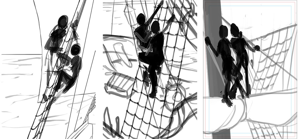
The editors selected the thumbnail on the far right for further development, which I think is probably the strongest choice, since this illo isn't About The Ship but rather the characters.
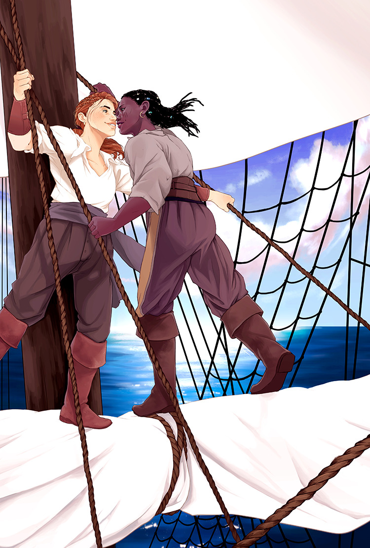
So now I'm here:
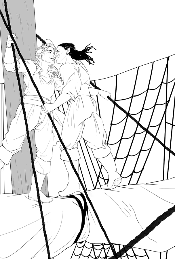
Things I like:
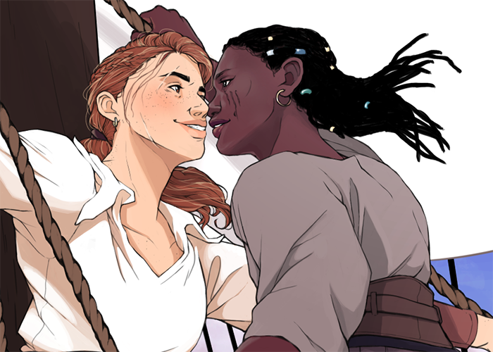
- I really like the emotive quality of my characters right now. A lil zoom [where I now see that I left a sloppy little mark on my left character's hair; ignore that]:
- I like the play of body lines happening right now; I know the visual weight of the rigging is CRAZY right now, but the foreground ropes won't stay flat black throughout the coloring process.
- I like the fact that it feels secluded, even though ships are small spaces; it feels like a ship but it also feels removed from the world of the deck.
Things I don't like:
- I'm afraid that the illustration mostly works here when it's zoomed in. Once it pulls out to the larger area of the illo, it loses some of its power and feels like there's a lot of underutilized space. I don't think that would necessarily be solved by occupying the emptier spaces with more rigging or texture, since that would make it somewhat overwhelming, but I also think zooming in would lose some of the sense of place and context that I've achieved so far.
- I'm not sure I'm pushing the poses enough. I can't tell y'all what I'd give to be able to string up some mock-rigging in my house to be able to test how weight distribution would affect the lines of the body when you're just hanging onto a line with a smidge of give to it.
I think a lot of this might also change once I start putting values behind all this, so that might also be a consideration. For instance, I know the big white space behind them might not read as a sail right now....but with values, it'll still just be a Big White-ish Space, so I don't even know if that will help to decode the visual information or not. Keep in mind you will be able to see the sea beyond the rigging, so that might ALSO go a long way.
Honestly, at this point, I'm still pretty open to the concept of going back to my editors and lobbying for another thumbnail to get developed [the far left one is promising, I think]. I've been puzzling over this for a few days and would really love to get someone's thoughts.
Thank you all in advance!
- I really like the emotive quality of my characters right now. A lil zoom [where I now see that I left a sloppy little mark on my left character's hair; ignore that]:
-
@thousandwrecks Welcome to the forums.
This is coming along really nicely! I checked out your website as well, lots of great stuff on there.
Couple thoughts on the "things you don't like"
-
One of the things that I'm getting, is that because the rigging is so black right now, it's drawing the eye, so I think when you're zoomed out, it's hard not to keep looking at that stuff. You mentioned that they won't be black in the final, but that would definitely be something to knock back. Also wondering what you're thinking the lighting will be like for the two characters? It might be helpful to do a quick value pass or several studies just to answer those questions, I find it hard to judge composition by mostly line work.
-
As for pushing the poses, one thought that came to mind is that both characters are kind of leaning into each other equally right now, it might be interesting if there was more of a give and take between them... ie one leaning back while the other leans in more. That's just one idea, but in general both of them are standing fairly straight up and down, especially where hips and shoulders are concerned, so you could get more dynamism if you play with that some more. Maybe try sketching overly exaggerated poses and see if there's somewhere in between that feels right?
All in all though, really nice work! Can't wait to see how the final turns out.
Rob Gale
instagram: www.instagram.com/robgalestudio/
website: www.robgaleillustration.com -
-
I really like the intimacy you're showing and I think you could push it a little step further by having one of the women look down at the other's lips instead of eye contact, it really makes things spark!
I really enjoy that you're not trying to make the women sexy and feminine, but I think maybe you're taking it a teensy bit far by having some parts of the anatomy look very male, like the lips and necks for instance. A lot about femininity is about attitude and pose (which you have going on here!) and I wonder if it's really necessary to give them very male anatomical traits to portray your point, which isn't necessarily a point about anatomy... Just some thoughts!vanessastoilova.com
instagram.com/vanessa.stoilova/Check out my Youtube channel for tips on how to start your career in illustration! www.youtube.com/c/ArtBusinesswithNess
-
I agree with all of @NessIllustration 's points, especially about anatomy. I like the way they are dressed and that you didn't make them "girly" but until I read your text, I thought the one on the left was male. Very cool piece--it's sensual but it's playful as well.
-
@robgale Thank you so much! That's a really good point about the rigging....I think I'll skim out some of those values and see how that effects the look. I think for lighting, it'll be pretty vibrant, bright sunlight, with them both in the light with nice crisp shadows cast from more or less a noon-position sun. Tomorrow I'll do a pass with some values and maybe thumbnail out lighting to get a better idea. A great suggestion, thank you.
Also a very good point about shoulder/hip line-ups. I'll curve them a bit more and see how that effects things!
-
@nessillustration Ooh, that's a great idea about sight lines. I'll definitely adjust that.
[replying to @Eli here too] I think with anatomy, I'm of two minds. On the one hand, I completely understand what you're both saying with regard to faces/bodies reading at least low-grade masculine, and the pitch/brief was initially two women, BUT......I'm actually very comfortable with it being read as genderqueer, if the lens feels appropriate to the viewer, especially since within the illustration's narrative they should be able to pass as men. [And of course, if these two have been on ships long enough to accumulate scars, I think it also stands to reason that they should also build up some significant shoulder muscle.] I really appreciate you both bringing it up, though, because that's definitely something that should get deliberate consideration. Thank you!
All in all, I think I'm gonna do a bit of a rough pass at pushing the poses a bit more, which would incorporate more of a curved line to their stances, so that might also help knock off the very masculine straight edges. And looking this over again, I think Mx. Left there actually does have a bit more of an anvil-jaw than I meant to draw.

-
Welcome! This is very cool and I look forward to seeing more from you. You are obviously a great draftsman. I love the way you have them posed, but one thing I’m not so sure about is the right character’s hand behind the other character’s head. It’s kind of tangenty ... and a little bit distracting to me. I’m not sure if there is a better place to put it because I really like the interplay you have going between them where they have gotten crossed up in the rigging, but maybe see if there is a better option. Great work so far!
-
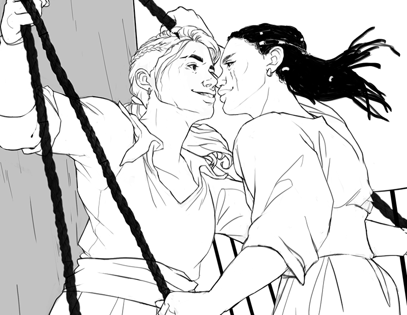
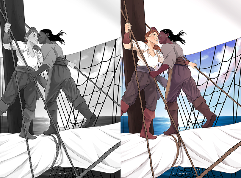
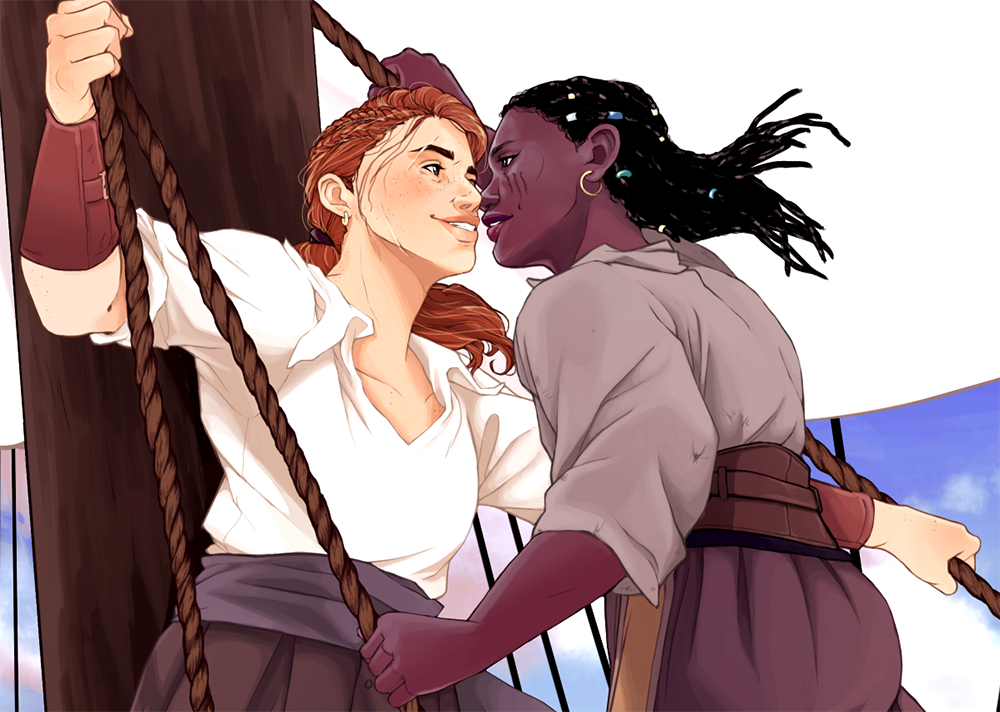
Hello all! I've been working on this and refining based on everyone's feedback, and I'm feeling much better about how it feels now.
The lines are currently like so:
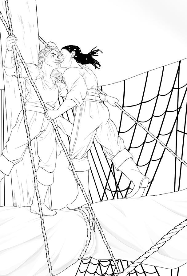
....which, in contrast to the original I posted here, changed like this:

I backed off the ropes to no longer be flat and, just for work purposes here, just took out the mast shading. You can see that I mostly just shifted the posing of Mx. Right, but dang that made a big difference. I also worked on their faces to refine expression, and I think it feels a lot more....approachable now??
I've been working on both value and some color and I feel really good about how they're both playing. I would have posted the values here before I dove into color, but I did a lot of going back and forth to tweak both sides, so it really was a simultaneous development, haha.
You can see the work I've done here:
aaand here's a closer look at my color WIP:
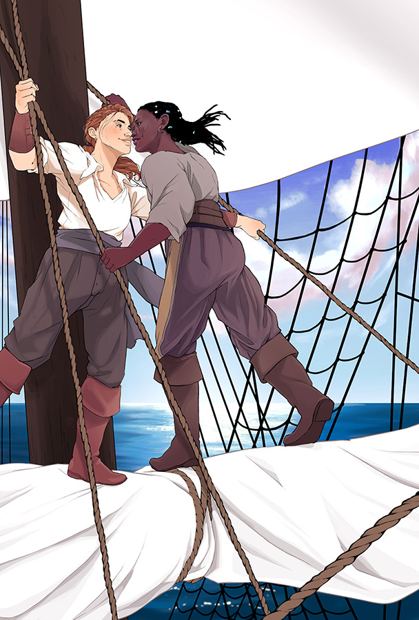
My values aren't quite there yet, and I'm working to find a middle ground between a faithful rendering of dark skin while keeping the visual literacy of the image intact. The mast is a bit of a struggle as well; I like how it's visually very heavy, since it's a bit of an anchor for all the other hard lines in the image, while my figures are very organic and curvilinear in contrast. I might bump up its values to keep it from being such a punch in the face, though. I'm also still mulling over @Kristin-Wauson's comment about Right's tangenty hand....I might shift it down (or up??) a bit, but that might make it even less readable as a detail; I think it makes for a good anchor for the physics of the pose, and the rope is there anyway, so the tangent might exist whether the hand is there or not. :|a I'm open to suggestions, though.
And of course, my colors are still in development, so that'll be deepening as I go. I am really liking the balance of vivid blues and kind of worn warm tones of my figures, so I'm hoping to keep that as well as keeping a bit of a nod to the types of colors that can survive out on the seas. (Cue me studying color keys from Pirates of the Caribbean and Black Sails.)
Thoughts still welcome! I really appreciate everyone's feedback and time.

-
@thousandwrecks this is looking great and I think now that you’ve added color, the hand looks less tangenty to me because of the dark skin color of the hand. When it was lines it looked more like an extension of the lighter skinned character’s head, but now with the value difference there is a clear delineation. Sorry if I made you focus on it too much.
 I love the color palette!
 -
This is looking awesome! I am excited to see the final.
-
@kristin-wauson oh, good!!! I'm really glad that sort of faded in priority and isn't quite as much of a snag. Thank you for bringing it up, though, because it's really important to keep it in mind!
-
@sarah-luann thank you so much! I think I'm starting to be able see the final piece taking shape!
")
-
Hello all! I'm rounding the bend on this piece and am feeling really good about it. Thank you to everyone for your feedback over the course of this loooong patient process. Any last comments totally welcome, too.
-
I love how this illustration feels transformed once you add the colors and values. Don't have any substantial critique for you sadly- this looks great to me!
-
@thousandwrecks Wow! This turned out fantastic!
-
@thousandwrecks This is looking great! It's so fun to see it from the original sketches and line drawings to the finished (near finished?) piece.
One tiny thing that jumped out at me is the clouds in the background, they feel a bit like they're being distorted by a fisheye lens in the way that they angle down along the right edge. I'm not sure if you were trying to use it as a compositional element, it just looks a little unnatural. It's really nitpicky, but that's the thing that jumps out the most.
Awesome job!