WIP- Critiques please
-
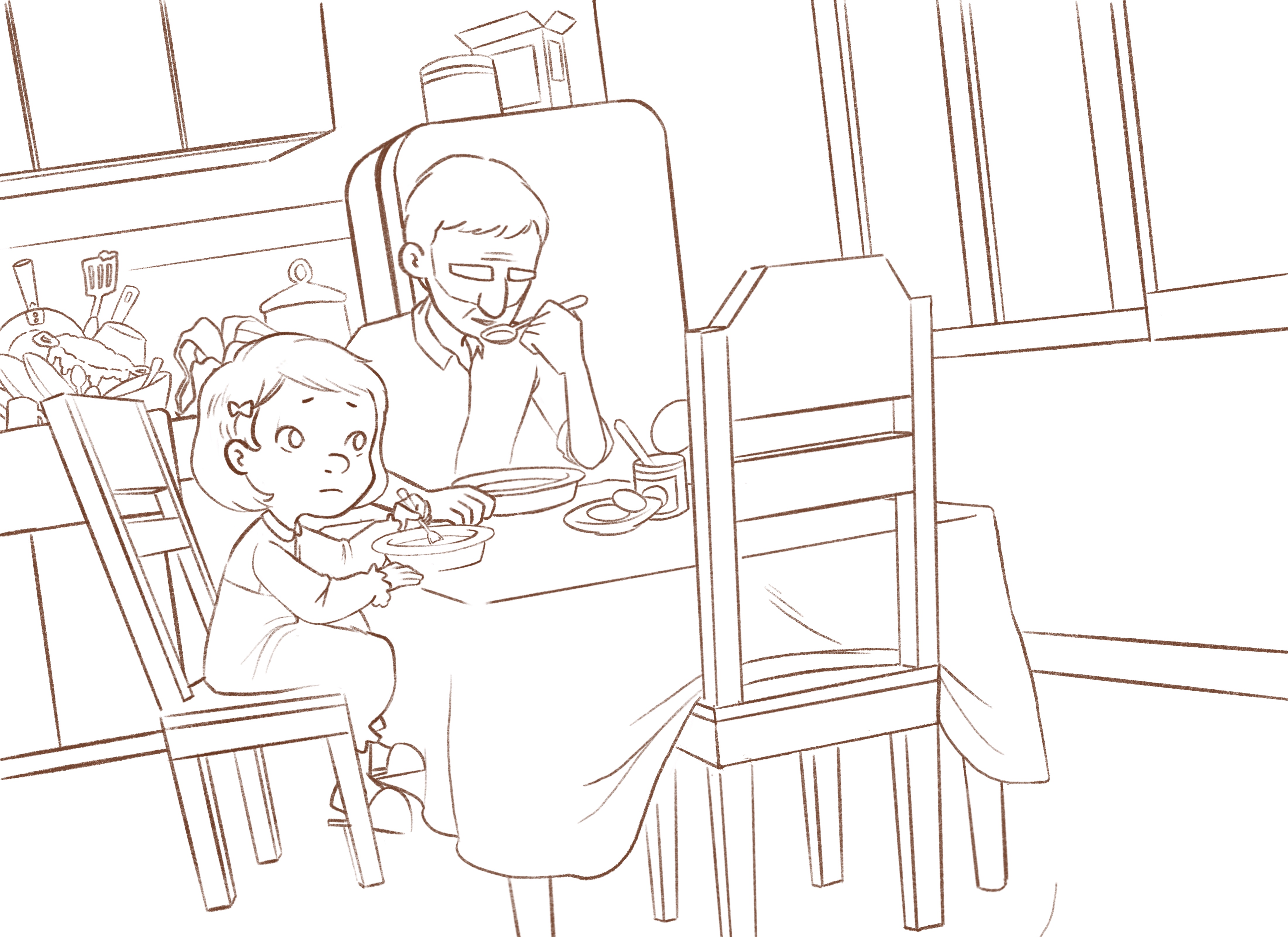
Hi, everyone! Since I have some time to spare recently, I decided to work on an illustration. Influenced by my misunderstood monster illustration, I wanted to create a more somber piece. Below is my sketch. The illustration is about a family coping with the loss of a love one. I haven’t made up my mind who they’re mourning for or why that person is not present. I guess i’ll leave it for the audience to decide.
I would really love to hear your critiques. Please let me know what you guys think. Thank you.
Portfolio: nyrrylcadiz.com
Instagram: https://www.instagram.com/nyrryl_cadiz/
YouTube: https://www.youtube.com/channel/UCbJCF1Im8ZO7hpGWTKOJMuA -
@nyrrylcadiz I like this. The openness of the right side suggests emptiness. I like that the girl is looking that direction but it seems very intense. If she's mourning, maybe just her eyes could be looking down a little towards the empty dinner place instead of up high. And maybe the man could be looking at her, helplessly? Just suggestions. It looks great already.
Lisa Burvant
www.lisaburvant.com
Instagram & Twitter & SVS: @burvantill -
Great concept, and I like where this is going a lot!
Some suggestions:- The right of the picture is kind of empty and open, leaving the eye to wander off the page. I t would be nice to add something there to frame the image and close the composition, like for instance a close up of a garbage bag or something
-I like the concept of having all the dishes piled up in the sink, but I would remove the thing right above the girl's head as we can't really tell what it is and it clogs up the girl's silhouette. - There's something odd with the little girl's chair, it kind of seems to be floating! She also seems too big for the image, especially compare to the table or her father
- The right of the picture is kind of empty and open, leaving the eye to wander off the page. I t would be nice to add something there to frame the image and close the composition, like for instance a close up of a garbage bag or something
-
Really lovely! It looks like the girl is looking at the chair (and thinking of the person who isn't in it?). I think when you add color you can play with light & shadow to emphasize the emptiness of the chair to have that idea come across a little stronger. Also, I just noticed the pile of dirty dishes in the sink- a nice detail to imply grief/people feeling overwhelmed.
-
Nice picture overall. I would look at the right eye and move it in a bit towards the nose I would also move her eyebrows down
-
@nyrrylcadiz I like the character design of the child and father??? A few tweaks might be to move the girl's right (our left) eye closer to the nose, I would give her foot which is higher up a bit more leg, it looks unusual. Also, I think the clutter in the back is drawing my eye away a bit too much when the focus is on the family. To give more grief I would put her head to shoulder lower that is to say to give her more body language. Google grieving child. Perhaps she could be slumped back in her chair. I hope this helps.
-
I didn't want to respond to this until I had had a chance to look at it carefully. I really like the image. Yes, the right side is a bit empty, but to me that emphasizes the empty chair. I'm not 100% sure I like all the rectilinear angles, though. Maybe put in one larger untidy object on that side?
I also like the girl's expression and even her posture. This suggests to me that she is still in a somewhat hopeful stage, thinking that if she just looks again, the missing person will be there. Yes, move the eye just slightly, but that's a detail. I'm also sure a lot of this will get worked out in the painting stage.
I would de-emphasize some of what's going on in the sink. I get the point that in their grief, the remaining members of the family are neglecting the home, and probably once you add values and color it will push this stuff more into the background. It's just that there is so much going on around the girl's head and nothing elsewhere. I gather that this piece should be primarily about the people and that the objects only support the story about the people.
And finally, I know this is primarily an illustration about the girl and the dad is emotionally preoccupied. But even if he has glasses and is looking down, I'd love to see some hint of his eyes. I'd love to see him a little bit more developed overall, and perhaps that will happen as you work.
I really like this little girl and the way you've developed her, from her worried yet innocent expression to her hand dreamily holding the spoon (she's a lefty!) to the way she's shifting her feet in hers slippers. I would love to see this piece finished!
-
@burvantill thanks! I’m really happy you like it.
 I’ll definitely try working on the girl’s gaze. As for the father though, I was planning to leave his face as is so as to give off a sense of distance between himself and his daughter. It’s not that he’s indeferrent to her grief but rather he’s trying to hide his suffering from his child. In the process he unintentionally isolates himself further from his little girl, blinding himself from her suffering as well. Thanks!
@NessIllustration Hi! Thank you so much for the input! Yeah, I deliberately left the right side empty so as to further emphasize the sense of absense and emptiness this family feels. I do agree on the girl’s chair though. Hahaha.... she does seem floating.
 I’ll tweak that one. I’ll also tweak her size. She does seem too big in proportion to her father. Again, thanks.
@CaroStoltz Yeah, she is. I’ll try to emphasize it more when I’ll reach the coloring stage. As for the dishes, yeah, they’ve really slacked off on the house-keeping part.
I’m really happy you noticed these small details. I really hope they help they the story more.@rcartwright Thanks for the input! Eyes— definitely noted!

-
@chris-perry-0 Hi! Yes, i’ll definitely work on her eyes. Her legs too. Hehehe
 They do look a bit odd. Hopefully, the newer version will look more normal. I also agree with the clutter behind the characters. I’ll try to move it away from them so that they won’t be that distracting. However, I think I’ll stick to the girl’s pose though with a little altercations based on your pointers. I’m really satisfied with how she looks. Again, Thank you for the critique!
@LauraA Thank you for your detailed response. It’s really nice to hear your interpretation of thie piece. You’ve contributed more details to the story than what i initially started with. That’s really awesome. I’ll definitely try to move the clutter in the background away from the characters. As for the father’s face, I was hoping to leave him as is to further imply that he and his daughter don’t see eye to eye, that this loss has rendered them emotionally distant from each other. I also really like that you noticed the girl is a lefty. To be honest, I literally did not notice that when I was drawing her. I’ll try my best on the revisions. Again, thank you so much for the critique!
-
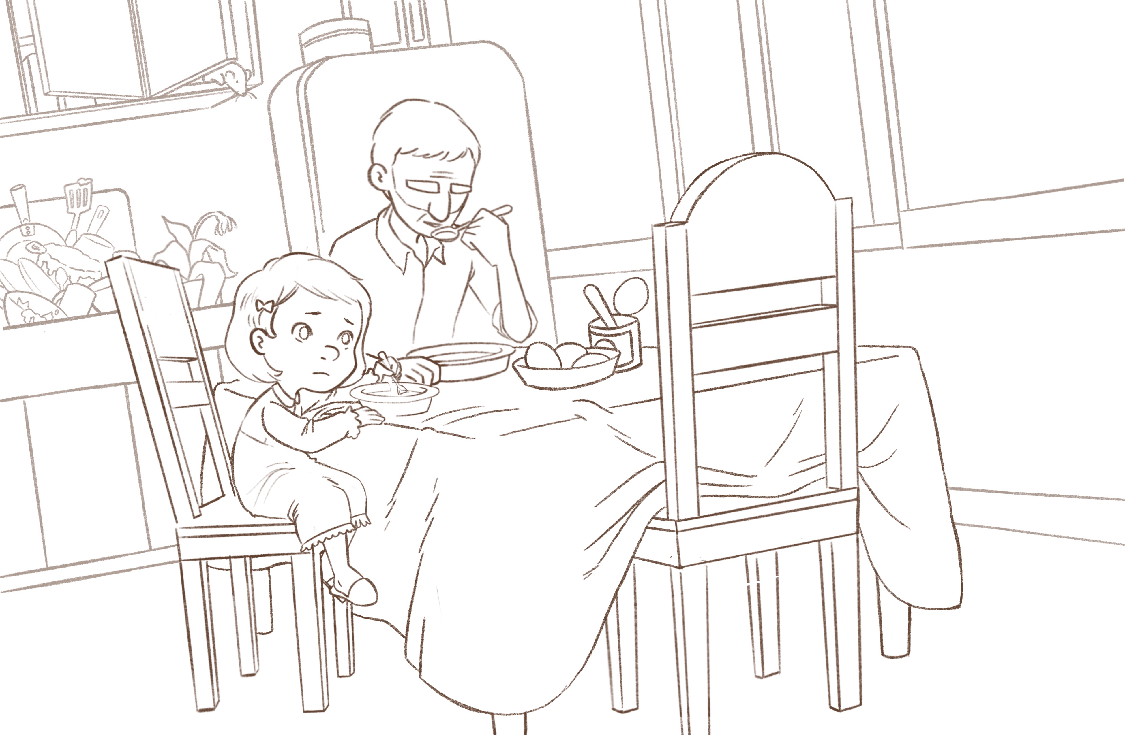
Hi, guys! Here’s the revised sketch. I listened to your pointers and I moved the dishes further away from the characters, i adjusted the girl’s size, her expression and worked on some perspective issues. I also used a longer canvas to ad.more space on the right side. I hope you like this version.
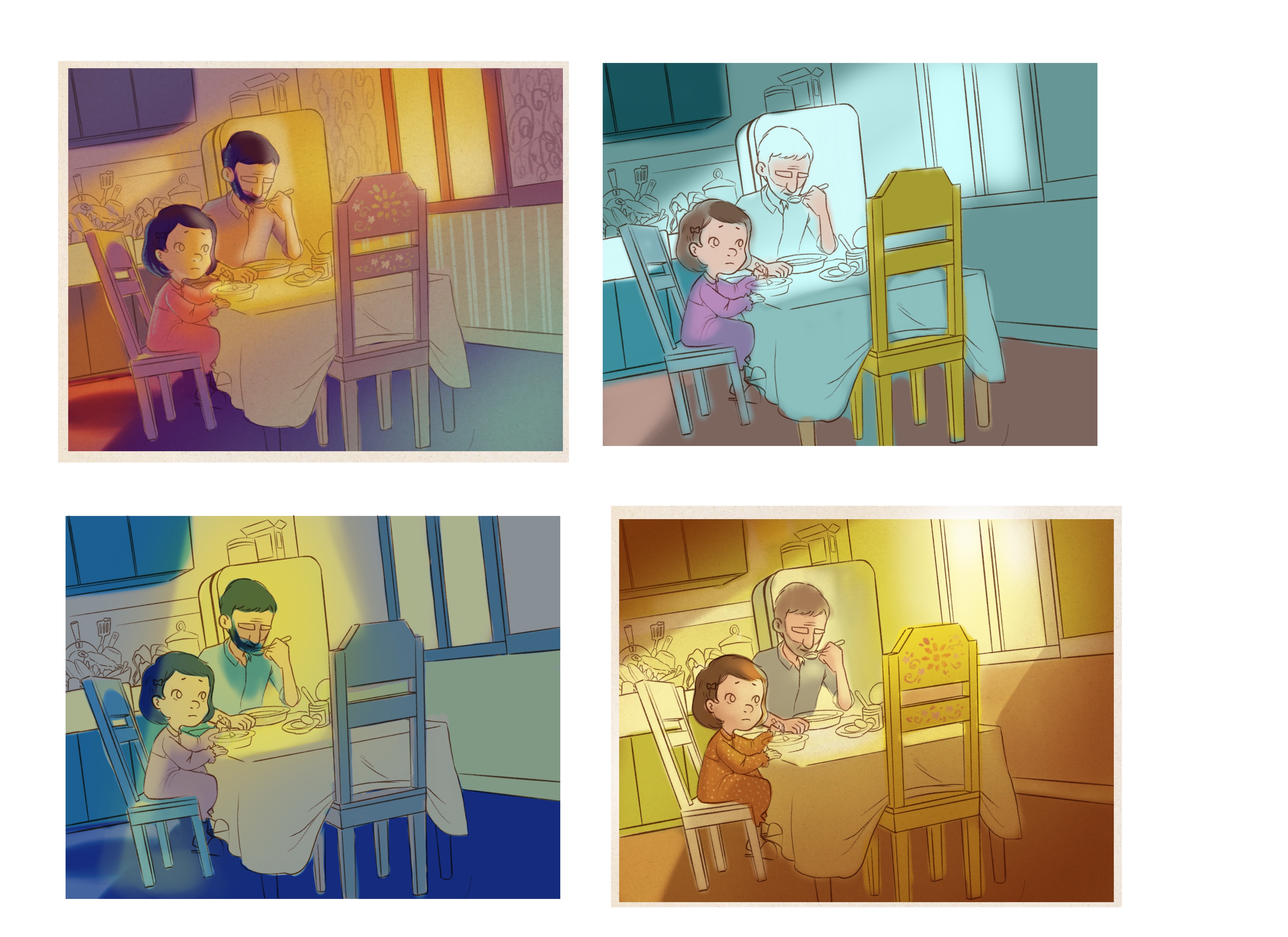
I also did some color comps. I like that yellow one at the bottom right. I was initially planning to have a darker atmosphere but i figured I should try something bright and make it look more gloomy instead as a challenge. I used the older sketch with the color comps because I did them before got to all of your comments though. I’ll post again soon. Bye!
-
Very cool! What's jumping out to me is the left side of the empty chair is lining up exactly with the line of the refrigerator.
")
-
@martha-sue hi! I see what you mean but i’ve posted a new version. However, i do notice that the chair in the new illustration is again making a tangent but with the window this time. I’ll have to fix that one. Thanks!
Portfolio: nyrrylcadiz.com
Instagram: https://www.instagram.com/nyrryl_cadiz/
YouTube: https://www.youtube.com/channel/UCbJCF1Im8ZO7hpGWTKOJMuA -
@nyrrylcadiz oh I keep missing images, I think they are slow to load ... I like the colors on the first in set of 4 you posted.
-
@martha-sue thanks! That’s also my second bet. Well, that was the first one I made and worked on it longer than other because I really liked it but then I experimented more and I found a new combination that I loved even more. How fast my mind change. Lol
-
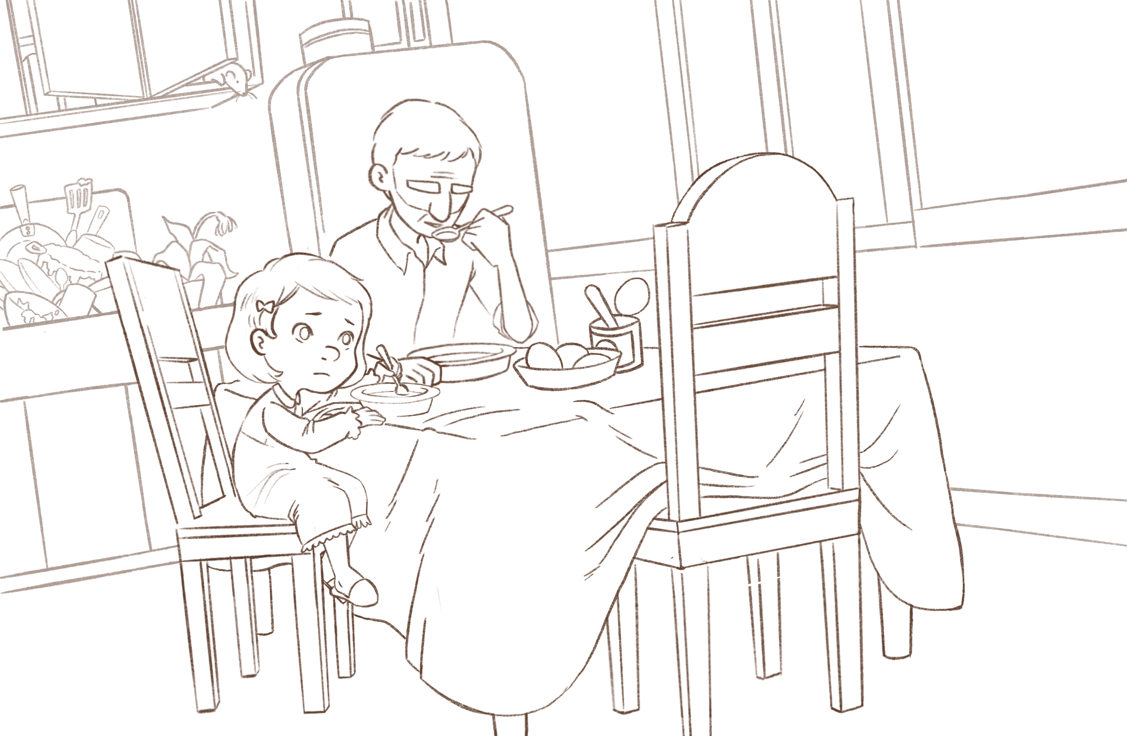
Here’s a newer-newer version of the sketch.
Portfolio: nyrrylcadiz.com
Instagram: https://www.instagram.com/nyrryl_cadiz/
YouTube: https://www.youtube.com/channel/UCbJCF1Im8ZO7hpGWTKOJMuA -
@nyrrylcadiz looks great! That mouse is grossing me out!
-
@nyrrylcadiz, this is lovely. So sad. Your pieces have a lot of emotional impact!
Well done. I hear what @holleywilliamson is saying about the mouse and I think it's a bit large for a mouse. So is it a rat? I am wondering if it's a little over the top. I think the dishes and dying plant are probably sufficient to get the point across. Just wondering if the rodent is overkill? Also, I am NOT a master of composition by any stretch of the imagination, but I wonder if the dying plant would balance things out if it were on the windowsill instead. Everything is kind of concentrated on the countertop behind them. -
Also color scheme A is my favorite--maybe with elements of D, like less intense hair color on both of them. Just my thoughts--beautiful work.
-
Looks great! Love it. Just a suggestion, because I can imagine my son in this, he would not be hungry. Wouldn't even want to eat. So his arms would probably be at his side or elbow on the table holding his head up while staring at the chair. Might be more impactful.
Keep at it! It's almost there.
-
@holleywilliamson @Eli @Branden-Brushett Thank you! I’m very happy you like it. I do see what you mean about the rat though. It is overkill. Hehe
 i’ll remove it. Also, I’ll try your suggestion with the potted plant, @Eli. I don’t want to put it directly on the window sill since it’s also looking crowded but perhaps hanging beside the window, near the fridge? @Branden-Brushett Thank you so much for the suggestion but I really like her current pose. I’ll give it a try though and see if I like it. Again, thank you so much everybody! I’ll post some updates soon.