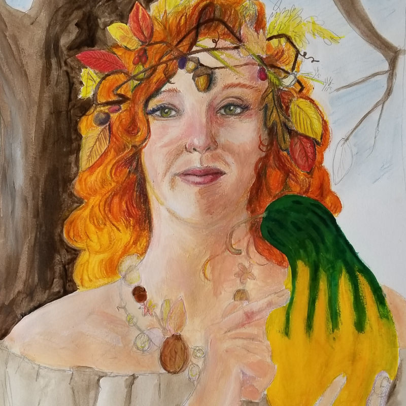
FALL WIP wasn't sure I wanted to post...
-
I decided to play to my strengths instead of trying out new mediums. Working on a mixed media painting of a character from my book. Her name is Loreili and she ages as the day goes on. In the morning she is young and goes by Flora and is garbed in spring. Midday she is summer and goes by Murielle. As sun sets she is fall and I have not as yet given her a name. The picture is loosely based on my wife, a beautiful redhead. I am a
 attaching the before as well.
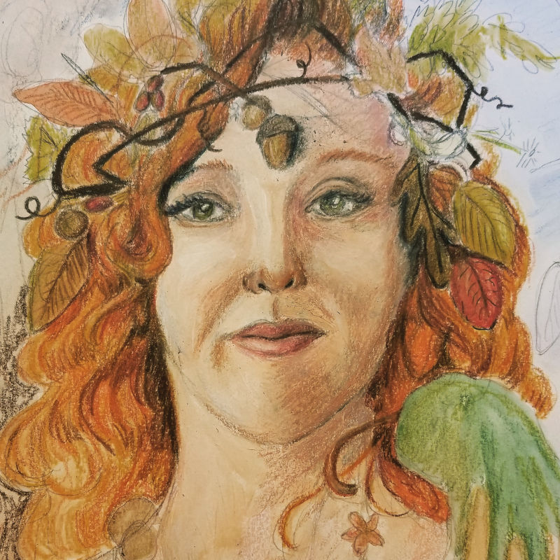
-
Cool concept!
Website: www.tessawrathall.com
Instagram: www.instagram.com/tessawrathall_art/
-
@tessaw thanks!
-
Here is the finished product. I am debating if I should go back and ink it digitally. It would make it look more like a comic book and less like a portrait. I know there are things wrong with it, but I like it. So should I ink it or not?
 Also the picture quality stinks. It is very grainy compared to the smooth line I see in the original.
 -
@chrisaakins I would try doing the ink on it and see. I love the colors you have in it already. I think maybe the ink would really make some of it pop even more.
-
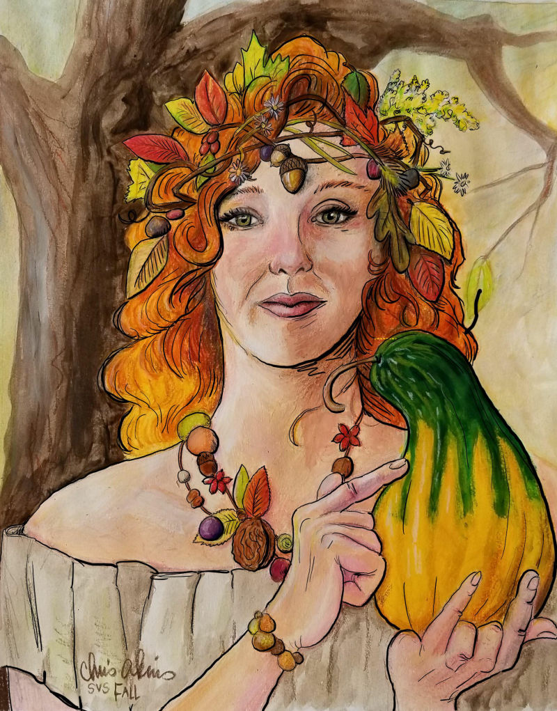
Here it is inked. I think you are right @Chip-Valecek It really pops.
-
@chrisaakins really cool portrait! I like the inked version better.
Just curious - is there any meaning to the way her fingers are holding the gourd? almost looks like sign language shape - not sure if it is trying to communicate something? -
@MissMushy I play with my fingers as I hold things. I figured she could do the same. She is a supernatural creature so she might be enchanting the gourd.
-
@chrisaakins Nice! I love the concept of this supernatural woman changing as the day progresses. I like the inked version better as well, it gives it a little more pop.
-
@chrisaakins for sure it looks great!
-
Have you added an extra finger in the right hand on purpose?
Some nice line work here")
-
Wow, it looks really good with the linework. It makes the colors feel richer. Did you enhance them after you added the linework, or is it just the linework that's making them pop? I'm really feeling the style it's created.
Website: www.tessawrathall.com
Instagram: www.instagram.com/tessawrathall_art/
-
@jason-bowen not sure what you are referring to. I count 10 fingers total.
-
@tessaw all I did was add ink digitally and voila it came together. I am pretty amazed myself.
-
@chrisaakins oh sorry I was tired and my eye must have been confused. Apologies.
-
@jason-bowen haha no problem. Thanks for taking the time to look at my artwork.
-
When you initially asked whether to ink it, I was going to say I liked it as it is but now that you’ve posted the inked version, I love it more. As others have said, the colors become more vibrant with the ink and the whole thing looks like an illustration from the early 1900s. It’s a great style.
Laurie DeMott
instagram.com/demotlj -
@demotlj Wow! Thanks for that. I actually love the illustrations of illustrators like N. C. Wyeth and J. C Leyendecker.
-
I think this looks really nice! The anatomy could be a little polished going forward (the hands especially, and the face is a little asymmetrical) but the facial features look really nice and the rendering is great too! The inking gives it a really nice look as well, and your line work is well done. Great work!
vanessastoilova.com
instagram.com/vanessa.stoilova/Check out my Youtube channel for tips on how to start your career in illustration! www.youtube.com/c/ArtBusinesswithNess
-
@chrisaakins looks beautiful! If you used your wife as a model she should be very pleased. There is a lot of love in your painting. Love the veriations of color in her hair.