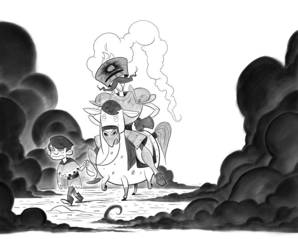
Does this look too digital?
-
Hiya! This is a WIP for the SCBWI narrative contest. I've been fiddling with some watercolour brushes in Painter. So question is:
Does the smoke look like it could be traditional? Like a graphite and water kind of thing? Is it crazy obvious that it's digital?
Thanks
")
-
No, not really, but just a heads up, these last two years I have met a lot of agents and art directors in publishing, and at the last two SCBWI summer conferences have gotten to speak with people who have gotten critiques as well as had a critique the previous year. The #1 thing they are pushing is more texture in images. It is like the only thing I am hearing from everyone. I added more texture to my work a year ago, and started getting jobs via social media, and their comments have been “love the texture”. Just keep that in mind when considering the what looks too digital.
-
This post is deleted! -
I think it almost passes for traditional. I think the usual give aways in digital vs. traditional are in fades and gradient tones. (I started working digital, and am now returning to traditional myself.) For instance, the curled wisp bit in the bottom center is the most digital of the smoke, in m opinion.
Like @Eric-Castleman said, the other area that digital tends to struggle with are organic textures simply because the randomizing algorithms just aren't as random as nature. Haha. I think your stuff above it getting pretty close though.
The smaller linework on the ground looks very Bill Watterson, and he worked with ink and paintbrush, so +1 for that!!
~Andrew
My stuff: http://andrewdc.com/illustration/
Teh dribs: https://dribbble.com/adc -
@art-of-b Smoke on the left looks like it could be traditional - a few edges of the smoke on the right look like they lean more toward digital - the image itself is great! - you seem to work very quickly and produce really high level work - perfect recipe for a youtube channel! I would love to watch process videos of your work!
-
As a graphite and water sort of thing kind of guy, the tightness (or cleanness) of the lines is what is more of a giveaway. It would be really difficult to create such clean rounded curves with watercolor graphite. Also, when you use watercolor graphite with a pencil some of the pencil lines show through and give a really nice texture. Besides the texture in the black smoke, the only other thing I think that would help is to add some texture and value to the smoke coming from his head. Or contrast it with a lightly toned background? I agree with Eric. Textures are what I am seeing that separate the really finished looking pieces in the digital works from the rest. That is just me as an observer since those that can't, teach. I have no idea how to get all those textures digitally since I am really a traditional artist. But I like to think that I have an eye for quality in other's work.
That being said...I love your work. I love the style and tone of it. Hope to see more of it.
-
@art-of-b I would say graphite with a texture paper or black watercolour same with textured background.
-
I agree with what everyone else is saying.
Adding more texture would certainly help. I have seen some artist actually scan texture and then add that into there work. To add texture to the smoke you could try printing out the lines of the illustration and using charcoal to create the smoke. Afterward, scan the image and see what works. Adding it with a low opacity and then painting on top to help combine it with the illustration.
Just a suggestion. I've tried this in the past with mixed results.
Anyway, love the image so far! Keep up the good work!
Justin Moss
JMossCreations
https://cara.app/jmosscreations
www.instagram.com/jmosscreations -
@eric-castleman Thanks for the tip! I struggle with adding texture when I work digitally. I'll redouble my efforts now.
-
@art-of-b Let me first say that I love your character! great drawing skills, emotions, and values.
that said...only in digital media can you mix styles/brushes in 1 illustration and keep every thing so clean and separated. the characters look like paper cut outs which is not a bad thing in itself but it is if you want it to look traditional.
If you use ink, grey marker/pencil and charcoal, they will have to bleed into each other or smudge a little. also you won't normally find a white halo around the boy unless you purposefully pick it out with a kneaded eraser or something.
my suggestions:
-
avoid using the blur tool on edges.
-
try to find list item a textured brush that mimics charcoal and shade most of your darks with it. lowering the opacity or flow could help a little with adding a softer edge to your smoke.
-
keep the smoke behind the boy lighter to match the same tone as the halo or make the gradation more gradual over a larger distance.
I hope this helps
-
-
@eric-castleman Oh wow! That's really good to know about texture. I think that what I consider too much texture almost everyone else considers way too little XD.
I'll have to try and up the texture a fair bit from now on
-
@justin-moss said in Does this look too digital?:
try printing out the lines of the illustration and using charcoal to create the smoke
Good suggestion! I am, however, far too lazy. Digital has ruined me in some ways...
-
Thanks Heidi! Rest assured everything'll be more blended and less cut-out once it's done (lots of work left to do on the characters and such).
-
@adc 'Very Bill Watterson' is one heck of a compliment! Thanks
-
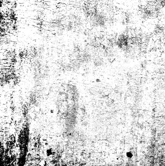
@art-of-b I think by texture they meant real images of texture like grunge and rust that you can blend with your image using layer modes.
-
@kevin-longueil said in Does this look too digital?:
I would love to watch process videos of your work!
I keep meaning to do that. Don't have time right now, though
-
@heidigfx Right! I keep forgetting I use textures like that :)_
I'll try that once I'm near the end of my whole process.
I've tried using textures with layer modes in the past (waaaaay back when I was starting digital) but I could never make it look natural. It always looked kind of tacked on when I tried it.
-
Awesome advice, thank you
-
@art-of-b less is more
") when it comes to textures, lowering the opacity of the texture layer can help. Use a mask and erase some of the texture to confine it to a certain area. Your work is amazing, we're talking specific style now, you got this... i don't need reassuring
when it comes to textures, lowering the opacity of the texture layer can help. Use a mask and erase some of the texture to confine it to a certain area. Your work is amazing, we're talking specific style now, you got this... i don't need reassuring 
-
Wonderful image: characters, shapes, line quality: all awesome!
I’d recognize it as digital because of the regularity of the texture...but I’m not sure everybody would. I do digital art exclusively, so I know how the brushes look like and recognize them when I see them.
Applying overlay textures is a common way of avoiding that and I do it myself. An excellent source of textures is Textures.com. You need an account, but after you login you can download up to 16 mid-res textures for free per day. If you want high res, you need to pay something, but mid-res is often enough. Another source I found recently is called PixelSurplus. It´s a marketplace, so you buy the files, but there are quite a few freebies and there´s a guy there who specializes on textures.
Applied textures have a problem though: they don’t follow the forms, so they don’t really look as if they were made by hand. I can definitely recognize them too, though it’s not so easy if it´s done well.
The best approach to avoid the “digital look” for me is to use highly textured brushes that have an inbuilt texture “variance” in their stroke. Many of Kyle´s brushes are like that, so I tend to use them exclusively. Also avoiding to “clean up” too much - leave the edges a bit irregular, leave the pencil strokes partly visible, etc...
There are other tricks with colors and process, but maybe the subject of another post!