Music WIP
-

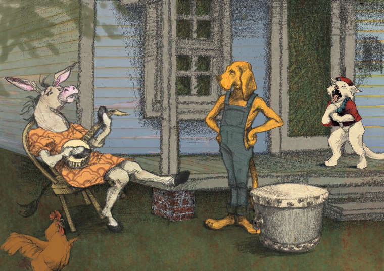
I have always wanted to do one of these monthly contests but for some reason or another never do. This time I realized I had a piece already started...and then promptly went away on a long trip to the US without my Cintiq.
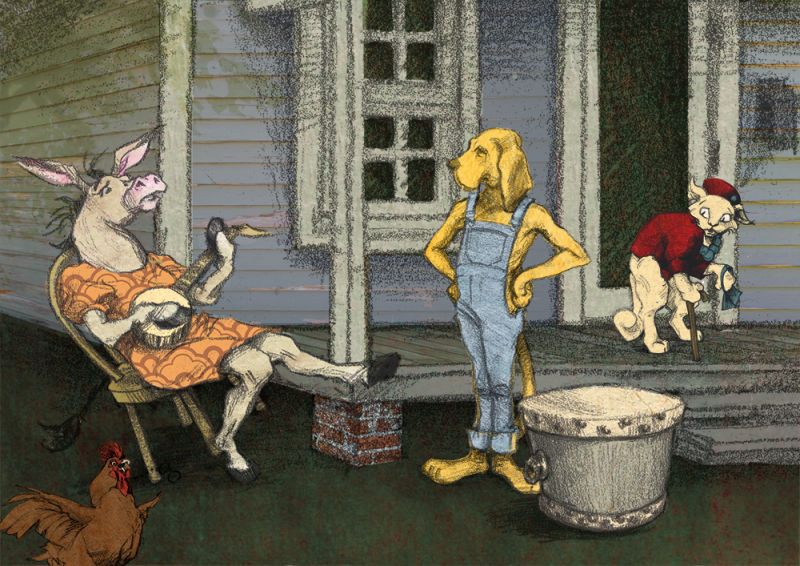
Anyway, here we are on the last day I have to work, with a piece more or less assembled, but it still needs a good bit of massaging. There was no way I could submit each stage for critique because I couldn't work on it again until a couple of days ago. At this point I can move around and resize the characters, adjust colors and values, etc., but it will be hard to completely redraw anything because each element is drawn by hand and then scanned. Most of the colors are textures that I have scanned in and used as collage.
Anyway, given my limited capabilities for change at this point, I am quite open to critiques. I just want to use the monthly contest as an impetus to finish something.
The idea for the image is taken from The Musicians of Bremen. I was storyboarding this in July when I realized there is a humorous flaw in the animal anthropomorphosis. In my illustration, it's the end of the story and the dog is realizing it too. Extra points if you can guess what it is, because that would mean I was able to convey my realization clearly enough for someone to guess it!
-
Hi, Laura. Here are my thoughts. Composition-wise, I think the piece is already great. Color-wise, I think we can still work on it some more. I understand that the focus of your illustration is the donkey, right? However, our donkey is being out-shone by the background characters. The hound and the cat’s colors are just more vibrant than the donkey. My eyes are more drawn to them instead. What I suggest is that you desaturate their colors a bit while increasing saturation and contrast on our donkey. Or perhaps choose another more vibrant color. I hope this helps. Thank you.
-
@nyrrylcadiz Good points all! I had had the thought of darkening the wall behind the donkey, but then got wrapped up in drawing the cat this morning and didn't do it. Agree that the cat is too prominent. I had designed all the characters beforehand, and THEN put them into the scene, because that's what you'd do in a book. But there should be something I can do to adjust them.
-

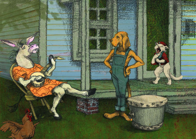
I made some changes, but making it so green wasn't one of them! The color in the first post is more correct. Most of what changed was relative values and saturations.
-
@lauraa I saw your post in the Music thread, is this a traditional piece that you scanned in or is it digital. I would check your color profile to make sure it is RGB and not CMYK.
-
@chip-valecek Thanks, Chip. In fact, it was created in CMYK. But it was CMYK both times and the first time it's right. I'll see what happens if I create a copy and change the profile.
The piece is made of traditional elements, drawings, and papers scanned in and then modified.
-
