Music WIPP
-
Hi everyone,
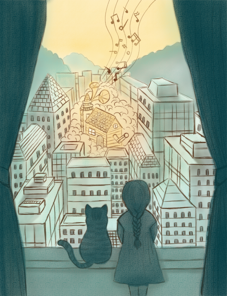
I'm trying to complete this work for the competition. But I'm still new at this. So I'm not too sure how to progress on the music box house. I think I'm doing it wrong.
I want to make the music box house stand out, and have a magical feeling and glow, but I think maybe something is missing.
Not sure if it's the light and shadow, or I'm approaching it the wrong way.
Does anyone have any ideas?
Sorry. This is my first time posting a WIP, so I hope I'm asking the right questions.
Thank you for the advice!
-
Awesome idea! I like it so far.
I'm still newish at this too, so take advice with a grain of salt.
Ways I make something stand out include in descending order of importance.
Value contrast: If I take the saturation of your piece to zero and look at it as black and white, the music box and all its surrounding area are the same value.
Saturation: Things that use highly saturated colours can draw the eye.
That didn't need to be in descending order of importance... Anyhoo!
So my solution! I would make the music box house backlit. Imagine there a massive light behind it in the fog. You can get an awesome ethereal glow in the fog and darken the house a little. Then you could also make those windows really glow.
I may be at my tablet long enough today to do a quick draw over.
Either way, great work so far
")
-
This is beautiful, nice work! I love the soft limited palate.
-
I think this is working quite well. Using color to draw the eye should work. Full disclosure: Also new. But, it looks like you've got a warm palette for the house and a cool palette for everything else. My only suggestion would be to make the surrounding buildings a touch darker, especially near the bottom. I get a sunset feeling from it just now. I like the warm glow being cast by the music house.
-
@art-of-b
Thank you Art of B for the advice! It is very valuable in helping me find the feeling of the piece. I am starting to incorporate it right now.
Thanks again.
Thank you!
Thank you! That is a very interesting suggestion. I never thought of it as a sunset. And maybe lacked idea on the specific time.
I will try to make it have more of a sunset feeling.
Many thanks!
-
I think if you change the color of either the house or the sky, right now they are the same so there is not that much distinction between them. What if the house was purple or even a blue. Just a thought to play around with.
-
I love the mood you’ve set up here. I think the composition is great and the colors, amazing. Even though the sky and the house are of similar colors, I think you can definitely make it work by adding details to the house along with some vibrant colors while leaving the sky bare. However, I think you can work more on the house’s design. Your piece has perspective but your house doesn’t seem to follow it. Instead, it is designed as if it were in isometric view which distorts the entire look of the illustration. So, yeah. Those are my thoughts. I hope they help. Thanks
-
@chip-valecek Thank you! I will try to adjust the look of the house.
@nyrrylcadiz Thank you.
I will try to make adjustments to that. My skill level is still not high enough, so I'm still having difficulties with adding details to things.Ok. I will try to work on the house's perspective more. Still getting the basics down.
-
I think the concept is pretty solid and I think it will grow into a lovely piece. I might be repeating what others have already said, but you have a few perspective issues with the angle of the buildings and with the characters in the scene. I'm not a master of perspective, but as the girl and the cat are below the horizon line they should follow the same perspective rules as the buildings and we should be seeing more of a top down view on them. If you look at the bottom of the dress the ellipse should be greater than what it is and we should see more lines laying over each other.
I think the color scheme is nice and will work well when you add detail in, but I would probably recommend trying a quick black and white tonal study to work out your lighting and see what works best. Good luck with it and looking forward to seeing future updates
-
Thank you for the insights. I just realized now that you mentioned it.
I need to go back into the Perspective course. :S
Do you have any small tips for improving on perspective work?
Been trying to fix the perspective for the past few days, and never seems to come out right.
visit my website: https://turnip.co/
-
@laura-yong Draw a bounding box around your more complex objects to see it as a basic form. That will help you see how the perspective of the object should be. Also it looks like the majority of your buildings are parallel so that means they should each go to the same v.p but at the moment they dont, some go to the center whereas others go more to the right or left. Use the line tool and extend all the lines you have already drawn to see where there v.p's are and it will help you fix them