Music Wip- Update- Color Help
-
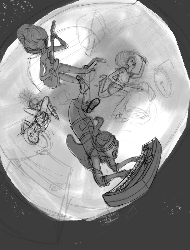
Those girls are totally jamin' !! I like “A” because the figures pop. the wires create an interesting pattern and provide a counter to the strong radial perspective lines of the walls. Fascinating composition, eye catching.
-
Hi guys! First, a big thanks to all those who voted!
@Miriam - Thank you! Expressions for this piece are especially tricky for me, because there's quite a range to play with when it comes to music. I still haven't quite figured out what I'm going for with mood. I'm going to hold off until the last minute before finalizing the expressions. I think that if I'm trying to express the bigger idea of music, than you are right on the money. I've been listening to and watching live performances of more angsty performances, so that's probably influencing me somewhat!
@burvantill Ah, nice catch.
@Naters-Calderone Oh, good idea. I've never thought of putting faces at different levels as a compositional consideration! Though now it seems obvious. Thanks for giving me another tool for my art tool belt.
@kylebeaudette Thank you! At this point I'm probably going to stick with top down- just because I want to move on, but I am definitely thinking about your critique of the living room as I'm working on this thing.
Ok, I don't want critiques at this specific stage, because I'm still sorting all the elements out, and processing the latest batch of critiques, but I just wanted to update. Honestly, I'm still playing with the composition with the top down view. I keep turning it around so the characters are at different orientations and trying out slightly different warps of the perspective. At one point I had the top of the walls breaking apart and flying out of frame, brick by brick. Right now they are starting to fly out of the room into space or some weird music dimension.
Now when I look at my last post, I'm kind of liking the simplicity of comp A again. It's hard to know whether to keep playing away at all the elements and not worry about the deadline or just stick with something and try to get it done for the competition.

-
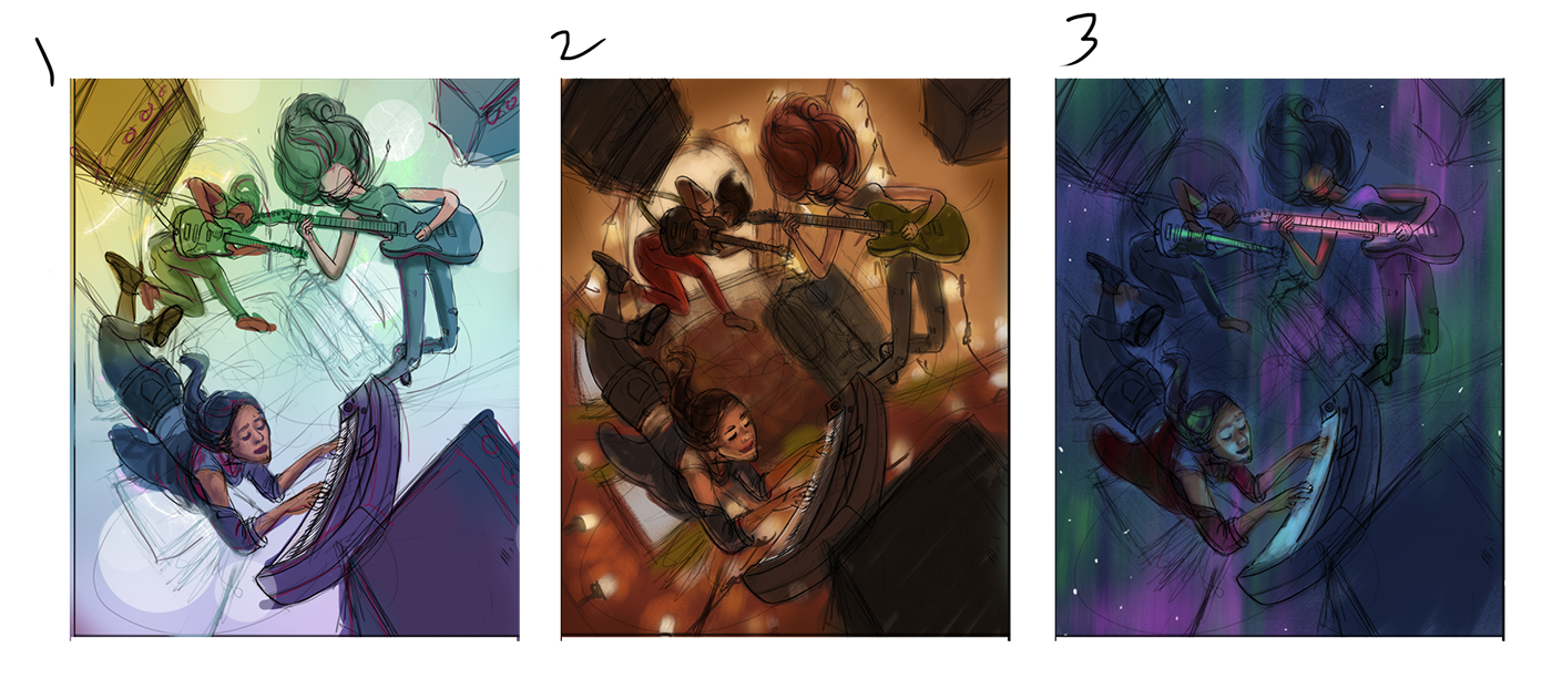
I've come up with 3 color comps. Wish I could do more, but I'm running out of time. These are basic color rough-ins and the value structure is not completely worked out. Does anyone have an opinion on which one I should go with?

-
@tessaw Hiya Tessa!
I can sense three distinct moods here between the color roughs, with the first and third being much more fantastical than the second. Yet even though the first and third are the more fantastic of the three, there's a relatability to the second which, for a young adult such as me, feels more real; more easily identified with. I think one reason I feel this way is just that you've already established the situation as fantastic with the general composition and the gestures of your characters. By that I mean to say that the contrast between the more realistic tone, what with the Christmas lights and colors/space which is more familiar to a young adult, (which is to say that young adults spend a lot of their time living and sharing small spaces, thereby making the small space here more familiar) and the floaty gestures/equipment is refreshing, and seems to denote the power music has to change the ordinary in a more concrete fashion. The other two are certainly excellent takes on that same statement, but I feel you will have more people who identify with the middle comp than the other two.
...though I will admit that I am a sucker for warm color palettes.
-
I choose 1
-
@tessaw My choice of 1 may have more to do with value than color 1 reads instantly where the other two made my brain work more to understand what was happening
-
@jabbernewt Interesting point. Thanks for the analysis!
@rcartwright Good point. I have to remember that others can't see the potential I'm seeing in my head. I should be more careful that my roughs are reading well to others. I was more focused on establishing a color palette and overall mood, but it would have been better to sort it out more fully for presenting it here.
-
I really like the etheral feel of number 3. Looks great.
-
Very conclusive results so far

-
@jason-bowen Thank you!
@Jabbernewt lol, I know.
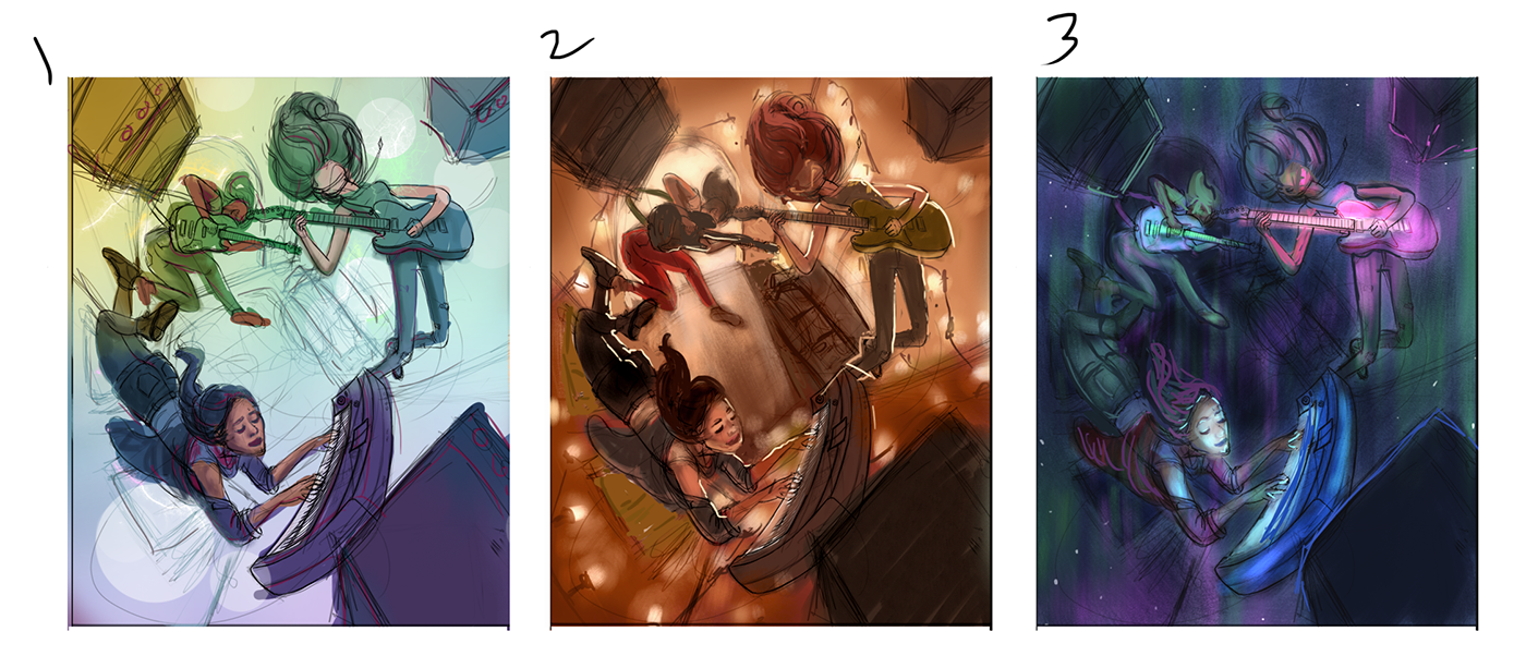
I tried to make 2 and 3 a little more clear to read. Don't know if it's better. It's hard for me to get it to read well without putting in a lot of time, so hopefully you can see a general idea of where they might go.

-
I agree with @Jabbernewt about number 2
-
I like 2 also.
-
I’m on team 2 but like 1 a lot also.
-
2 is my favorite, 1 is also nice. 3 just doesn't have great silhouettes.
-
@tessaw Can't wait to see where this one goes. You can feel the energy. The perspective, the characters are very dynamic.
I see everybody is leaning towards the second one and I see that that one has the most specific mood and atmosphere. However, to me there is a slight disconnection between the warm colors, the cozy Christmas lights and the energy in the characters. I would further emphasize the characters' imagination with lighting and colors. I would merge somehow the cozy room interior with harsh lighting and futuristic colors of a grandiose concert.
I am rooting for this one
-
I like #2 the best. I can see how #1 would be a lot easier to pull off, though.
Either way, it's gonna look awesome!
-
@art-of-b said in Music Wip- Update- Color Help:
I like #2 the best. I can see how #1 would be a lot easier to pull off, though.
Either way, it's gonna look awesome!
Agreed!
-
@tessaw 2! I liked it before and now I like it more.

-
@TessaW I like #2 and #3. #3 feels more like a dream to me where #2 feels more real.
-
I like #1. It has more of a surreal feeling. Which helps sell the floating. When I look at #2 I find myself trying to figure out if they are jumping or how they are laying on the floor or what is going on in general, just because the colors feel more real.