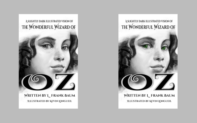
I think i finally have a book cover that looks like book cover.
-
This is a rough draft of my cover that i think i will go with (done on iPad so far) - all of the fonts are from Google Fonts (https://fonts.google.com) so they are good to go - the OZ part is the same font with some added scrolls at the end of the letters... i need to make these into vector and clean them up i think.... pretty sure?...anyways - The strange dimension of the cover is the 1:1.6 ratio that kindle likes best - my main question is the eyes - Dorothy has blue eyes..... thought i might have them be "Emerald" for obvious reasons - i feel like this reads much better than my previous attempts especially when viewed at the postage stamp size (which is about the size folks see it on Amazon)...I am so close now to being finished! - just a bit of a redo on the Wicked Witch of the West drawing and i think i'm done - starting to think of what to do next
 - thank you to everyone!!!
-
@kevin-longueil So this will be a real book cover? Did you choose mainly greys because of what the thumbnail on Amazon will look like?
-
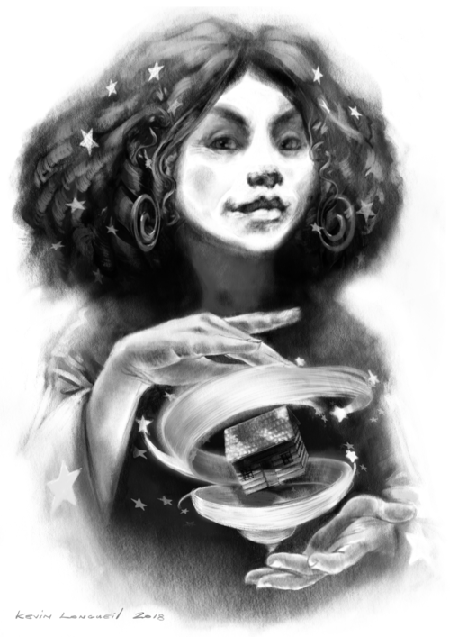
Kevin, don't hate me Kevin, but I think you should try a mock up using this image, specifically the hands and house, to see how it works:

To me it gets double points for it's recognizable Wizard of Oz imagery and it's magical quality. I think it's a better teaser for what makes this illustrated version unique.
Just my 2 cents!
-
Wow, Kevin! How does it feel to be just working on final touches??
As for the eyes, the color is cool but I think I prefer the all-grey version.
-
@michaelmattocks This will be the Kindle version of the book - the paperback KDP version will be in a different format with front, back, and spine - Kindle has a template creator that calculates spine width for you ...pretty helpful. I chose to go with greys mainly because all of my illustrations for the book are black, white, and grey and adding color seems to belie the contents and spirit of the book. - you can check them out the rest of the portraits at kevinlongueil.com - this is a project i decided to complete after participating in an SVS "3rd Thursday" a while back -
@TessaW Thank you so much for the feedback Tessa! I really appreciate it - i actually came by this current version by swapping Dorothy for Glinda in this same composition ...i had a "There!! thats it!!" moment when i pasted Dorothy in there and felt i had something that looks like a real book cover. Your idea of focusing on the hands and house of the Glinda drawing is a good one... i will try that out for sure. One very cool thing about KDP is that i can update at any time - change a cover or illustration... or even add an illustration in the future... wouldn't that be cool to get an update of a book that you own on Kindle and find a new illustration or two - Thank you again for the feedback

@SarahLuAnn Thank you for giving feedback on the eyes Sarah LuAnn! It feels strange really to be almost finished with it. It has been a great project for me and i think i may miss it. But i am thinking of what book or story to work on next which is kind of exciting

-
@kevin-longueil wow coming to an end. I think I been here for your whole journey on this project. Congrats on that. I think the cover with the green eyes is more eye catching.
-
@chip-valecek Yes you have!! And thank you for the feedback Chip, very much appreciated

-
Love the idea of having that little glimmer of green. It goes perfectly with the "slightly dark" idea. Very cool. Well, you know I'm a big fan of this project and am so happy for you that it's coming to completion. It's a stellar accomplishment.
-
I like! I think the emerald eyes make it pop nicely.
-
@eli Thank you Eli! I appreaciate your feedback and your kind words too

@Art-of-B Thank you for the Feedback! Another vote for green

-
Just applied to Artist Alley for Seattle’s Emerald City ComicCon ....i’m Sure I don’t have a much of a chance ....but it would be cool and very fitting! (would be cool too to meet Will if I did get in
