Looking For Critique!
-
Hello!
I've posted exactly once before, but the last time I posted this big, existential cry for help which, looking back even at just those five months ago, is cringey. This time I'm on better footing, and looking for critique on a little illustration I finished today.
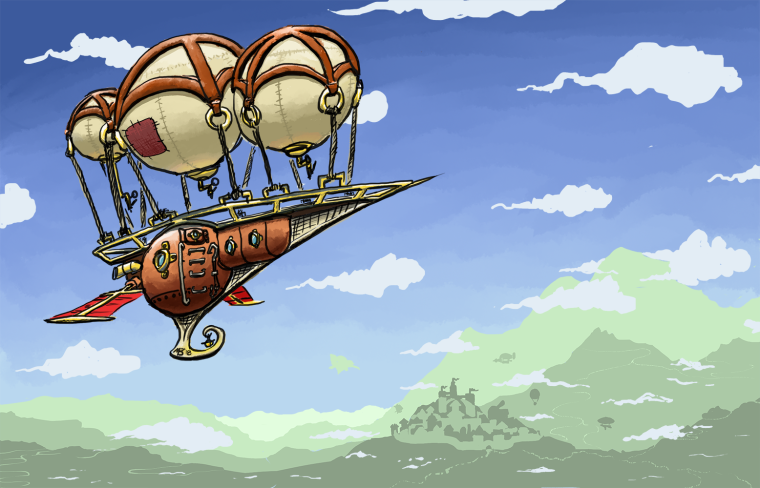
Just a little background, I am an Illustrator and a Metalsmith, and a novice to both at that, but I'm told I've got an eye for each field respectively. That's just to explain that I love copper, so visually emulating the properties of it, as well as brass, were two things I was looking to grow in during the course of this piece, so if you've got hard input for those, please go all out!
Pax
-
@jabbernewt Drawing metal is challenging. I find that you don’t draw the metal object as much as you draw what is reflecting in it. I did some studies of chrome objects and was fascinated by the fact that my brain was telling me to draw one thing while my eyes saw something completely different. Right now the copper seems dull because there are no distinctive reflections. Try doing some quick study sketches in pencil, no color. So you can see the value changes. That might help.
I love steampunk so I’m hoping that you can master this.

Lisa Burvant
www.lisaburvant.com
Instagram & Twitter & SVS: @burvantill -
@jabbernewt I'm just guessing that perhaps you need more reflections, more highlights, more throwing back the light from the surroundings ... if that makes any sense. You may want to check out YouTube for some ideas on how to draw metal.
-
@burvantill Hm, I see! I agree that metal shows its surroundings much more than it shows itself, but I was going here for a more patinated sort of copper. I have realized that copper which has oxidized into the darker, warm browns often has more diffuse properties than polished copper, and so the metal is, as you said, dull. That said, I do think I will try to include more in the way of reflections, no matter how diffuse, so thank you for that! I think it'll mean a looot of subtle, diffuse colors on the surface, so that'll be real tricky to master
")
The brass, however, will entirely benefit from that critique, because I meant it to be well-polished, so I'll be keeping your words in mind as I work on my next project!
Thank you for your critique!
-
Hi Jabbernewt! That's cool that you are getting into metal-smithing. I don't know many people who do that! You've got a really fun illustration here and I love the mood it gives off. I have a few suggestions and I hope you don't mind that I did a paint-over. Please disregard if I've missed the mark, I just think they are fun to do.
-
With your color palette and the vibe of your ship design, I thought that softening the color of your line work to a dark brown would help with the style of the image.
-
To make the balloons feel buoyant and light, I feel you don't need to include the crosshatching on their undersides. If you do include cross hatching there, I'd keep the lines thinner with a lighter value "ink". I also added some subtle cast shadows onto the balloon from the straps holding them down.
-
I'm not sure if I improved the copper on the main chamber of the ship, but I thought you could perhaps let the environment influence it more. I made it lighter on the underside and shifted the hue a little toward yellow to indicate that it was reflecting the ground below, and I desaturated the top and made it go from dark toward light to indicate the reflection from a sky that has a gradations from dark to light. I also added a slight highlight to indicate the sun.
-
I changed the format of your piece just a bit. I gave it more sky and less earth to push the feeling of height and space a bit. I also thought the the city was a nice second focal point and moved it to the side to give it a bit more space to shine. The change may have made it too much of a focal point though, so I probably should have lessened the contrast. I also made the top of the sky a bit darker and warmer.
Anyway, those are my suggestions. Again, really lovely piece and thanks for sharing.
Website: www.tessawrathall.com
Instagram: www.instagram.com/tessawrathall_art/
-
-
@maureen Thank you for the crit! I think I'll be seeing what I can do to work on those things, either in my next project or if I return to this one in the near future. I'm thinking maybe some studies on how military aircraft handle light, since they're usually up pretty high seem to have a more diffuse sort of paint on them, which will provide information for how the copper patina will reflect objects.
Thank you for your critique!
-
@tessaw No worries, I think, personally, paintovers are a great way to convey critique because you can convey much better information by showing and not telling! I think you hit the nail on the head with the lighting, and illustrated what the other folks who have commented before you very well.
I also appreciate the lighting in the paintover because I have a very limited knowledge of painting in general. I plan on taking the SVS course on it ASAP, but in the meantime this has been a wonderful study, and I appreciate that you've contributed to it!
-
Interesting. Thankfully I've got the linework on a separate layer, so changing the color will be a cinch. For the sake of clarity, can you define how the dark brown informs the style?
-
Oh thanks so much for that. I think I'll end up doing a variation on what you've done here, but that's a marvelous point you've made there. I also noticed that there's a bit of a yellow glow from the brass, yes?
-
I think the copper coloring benefits from being dark, but vibrant. I think you've made great points by freeing up the lighting from the relatively single-source lighting I've got going in the first draft. I'll definitely give a go at working those changes in!
-
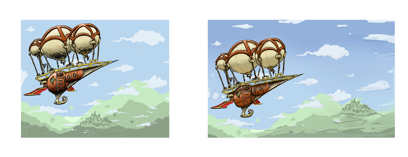
Totally agree on the format change there. I actually widened it out from the original size, but I was pretty conservative in how much space I gave the ship and the sky to breathe. I think personally I prefer the little castle where it is in the mountain range, but I could definitely stand to move it to the right so it provides a subtle contrast but give the ship more room, like you did in your paintover.
Well thank you for taking time out of your day to critique here, and for doing a paintover, no less. I know it might come easy and go quickly, but I appreciate it all the same. I'll post the revised version here when it comes off the pipeline
-
-
You're welcome. I think giving other people critiques is a good way to learn, so I try to jump in, but I often feel silly after I've given a critique! To add or clarify on some of the points. . .
-
I saw you had a steampunk influence and I associate brown with steampunk I guess. If you google "steampunk illustration" you'll see a lot of brown in the search images. Browns can evoke the sense of age that I think steampunk attempts to capture- old paper, brown iron gall ink, leather, metal, golden light, etc. I thought it would warm up your ship a bit giving it more of a nostalgic glow.
-
Yeah, I put a slight yellow glow. I figure you'd get that either because the brass is bouncing the light into that shadow, or because the sunlight is able to pass through the material of that balloon and that light is making the balloon glow a little within (subsurface scattering). Either scenario, it adds subtle variety in color.
-
There are so many variables when it comes to metal, including rendering style! I think that you were pretty successful in your original version. I would think about adding just a slightly sharper highlight, even if you are going for a more burnished finish.
-
Yeah, you might be right about your castle placement. My version gives way too much emphasis on the castle.
-
-
I love the idea of this! The ship has such creative design, and the comments above are really thought provoking. The only thing that I would add is that a great way to tie the piece together with itself is to allow the colors to be found in other places in the painting. So maybe bring some of that copper color down, and mix that with your green to make some of the green shadows and low lights. That will tie it together and make the shadows look more natural.
-
@juliepeelart Hello, thank you for the feedback!
I think that, subtly, I agree with you there. I've already begun experimenting with shading the brass with a dark, bluish green for the shadows, but I hadn't thought about the ship being shaded like that. Part of me is wary of pursuing mixing greens and blues into the copper and the red fabric because they're the direct color contrast to the rest of the piece, and I think the boldness of the colors is part of what strengthens the piece.
The miracle of digital art, however, will let me experiment, so we'll see what I can rustle up. Going to work on it today for a little bit, so I hope to post something when I've made my edits!
-
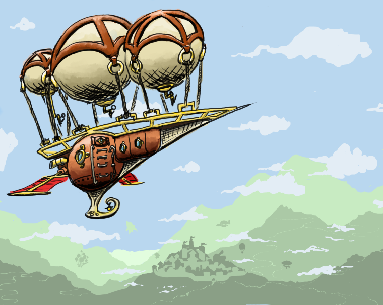
Alright y'all, I've taken the critique and tried to implement most of it. Not set on this being the final revision, but It's getting closer. Again, thanks so much!
-
I think it's much improved
Reflected light and a graded sky makes a lot of difference.
-
@art-of-b Thanks! Seen your work here on the forums, so I appreciate the assessment quite a bit!